Computer Vision Technology Professional Website Template
Perceive is a precision computer vision training landing page template built for EdTech programs that teach engineers and industrial teams to train real computer vision models. The split-screen layout, Tech Glass visual identity, and Stats-First Impact direction create a data-forward experience that guides ML engineers, robotics teams, and QA managers toward enrolling in a production-ready curriculum.
by Rocket studio
Quick summary
The Perceive template is a 50/50 split-screen landing page designed for computer vision training and certification programs. It pairs a live-style dashboard preview on the left with hard outcome stats on the right. The Slate and Sky color system, instrument-lit design, and persistent Comparison/Versus layout make this template feel purposeful, precise, and built for serious practitioners.
Who this template is for
This template is built for EdTech programs that train technical professionals in computer vision. It serves programs where the audience already knows the domain and expects real depth, not surface-level explanations.
- ML engineers in NLP roles who want to pivot and train computer vision models on production datasets
- Robotics teams that need hands-on upskilling in object detection architectures and segmentation pipelines
- QA managers at manufacturing plants operating defect-detection systems that nobody on the team knows how to tune
What problem this template solves
Generic course landing pages fail technical audiences. They bury curriculum details, skip toolchain specifics, and offer no evidence of real outcomes. Visitors who identify objects in their daily work and deal with noisy, incomplete datasets need to see that a program understands their reality before they trust it.
- Time consuming annotation workflows and dataset quality gaps are never addressed by generic templates
- The before-versus-after contrast is missing, so visitors cannot identify the actual differences between this program and others
- There is no structured data presentation that lets a skeptical engineer analyze value at a glance
What you get with this template
You get a complete single-page layout that leads with hard numbers, sustains a Comparison/Versus architecture throughout, and closes with a low-friction email gate. Every section is built to generate trust with a technically literate audience.
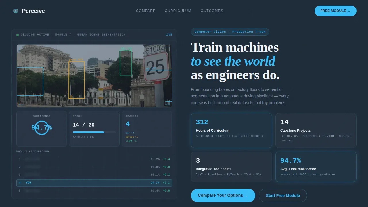
- A hero section with a dark-themed training dashboard preview showing a partially annotated street scene with sky-blue bounding box overlays, a confidence score climbing at 94.7 percent, an epoch progress bar, and a blurred leaderboard
- A persistent left-right split where the left column shows the before state in muted slate and the right column visualize the Perceive path in sky-blue-highlighted cards with metrics and toolchain references
- A social proof and call-to-action section with employer logos, graduate role transitions, and a "Start Your Free Module" gate that captures only an email and a current role dropdown
Feature list
This template includes purpose-built sections and interaction patterns that help a computer vision training program present its curriculum with clarity and credibility.
Stats-First Impact Scroll Architecture
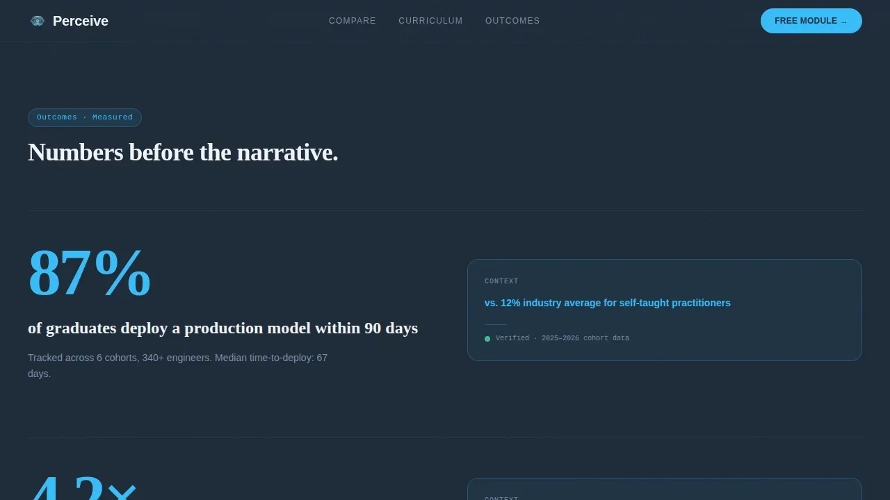
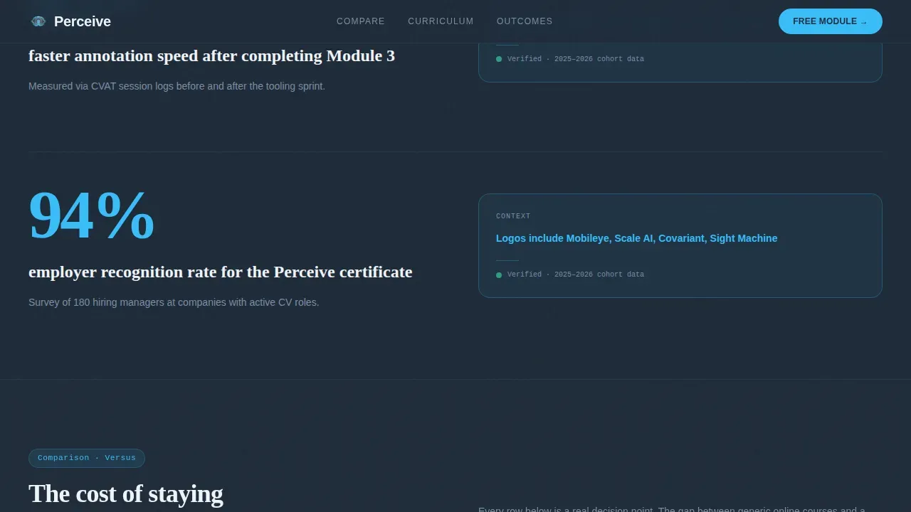
Each scroll transition opens with a measurable outcome before any explanation. Example: "87% of graduates deploy a production model within 90 days" appears before the methodology paragraph. "4.2x faster annotation speed after Module 3" precedes the tooling breakdown. Hard numbers lead every section so that visitors can analyze value before reading the context.
Animated Dashboard Hero Preview
The header renders a functional-looking training dashboard mid-session. The left panel shows input images from a street scene with bounding box annotations drawn in sky blue. A confidence score counter climbs toward 94.7 percent. An epoch progress bar advances. The right panel displays stat cards covering 312 hours of curriculum, 14 real-world capstone projects, and integrated toolchain references. The dashboard is designed to feel like a live workspace, not a static illustration.
Comparison/Versus Section Architecture
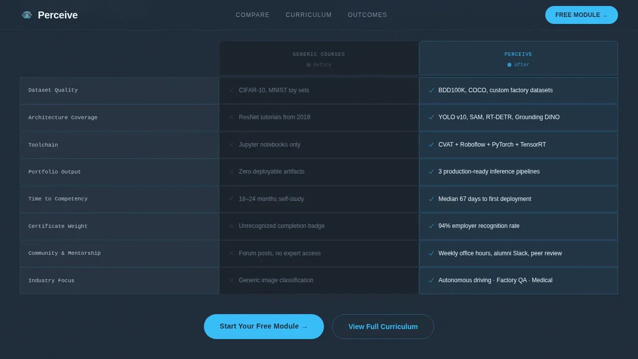
The Comparison/Versus layout is the structural backbone of this template. Every major section maintains a left column representing the before state and a right column showing the program path. The contrast is analyzed section by section across pricing, time-to-competency, and certificate recognition. Visitors discover the differences clearly, and the gap widens with each scroll until choosing not to enroll feels like a deliberate step backward.
Curriculum and Toolchain Preview Cards
The curriculum section uses real toolchain cards to explain what students will train on. Cards reference the specific tools and methods used across the program. Each card gives enough practical detail to help a prospective student understand the class of problem they will learn to solve, from bounding box annotation workflows to semantic segmentation pipelines.
Low-Friction Email Gate Form
The primary conversion path resolves into a simple form that captures an email address and a current role dropdown. The call to action uses a single, clear sky-blue button that stands out against the deep graphite background. The form is designed to remove every unnecessary field so that the process of starting a free module feels immediate.
Social Proof with Deployment Metrics
The social proof section uses specific outcome stats, employer logos, and graduate role transitions rather than vague testimonials. Deployment metrics, annotation speed benchmarks, and role-pivot examples are displayed as structured data cards. This section lets prospects validate the program's claims against their own situation.
Page sections overview
| Section | Purpose |
|---|---|
| Hero Dashboard Preview | Opens with animated split-screen dashboard showing live annotation session and outcome stat cards |
| Stats Impact Row | Leads each content block with a hard deployment or speed metric before the explanation paragraph |
| Comparison/Versus Split | Maintains left-before / right-after architecture across pricing, curriculum, and outcomes |
| Curriculum Toolchain Cards | Displays the real tools and methods students train on across the 14 capstone projects |
| Social Proof and call to action | Presents employer logos, graduate outcomes, and the email-gated free module entry point |
| Footer Linear Row | Single-row footer pattern with navigation and legal links |
Design & branding system
The visual identity follows a Tech Glass theme. The palette is inspired by an instrument-lit aircraft cockpit, cool and precisely measured. Every color choice has a functional role in the layout.
- Deep graphite (#1E2A38) for primary section backgrounds, mid-tone steel (#4A5568) for card surfaces, atmospheric sky blue (#38BDF8) for buttons, progress rings, bounding box overlays, and data highlights, and frost white (#F0F4F8) for body text and negative space
- Typography pairs DM Sans for body readability, Fraunces display serifs for high-contrast headlines, and JetBrains Mono for code snippets and metric values
- Scroll-linked reveals, staggered stat counters, bounding box draw animations, and a confidence score climbing animation create a high level of interactivity throughout the page
Mobile & speed optimization
This template is designed desktop-first because the split-screen dashboard interface needs horizontal space to communicate clearly. A mobile fallback is included for users on smaller screens.
- The layout stacks vertically on smaller screens, preserving the stat cards, toolchain references, and call to action button in readable order
- The lead-capture form uses large, tappable buttons consistent with mobile-optimized landing page best practices, keeping the entry point accessible on any device
- Static sections use Server Components while animated dashboard and counter elements use Client Components, separating rendering concerns to support a responsive experience
How this template helps you convert
This template is structured to make the cost of not enrolling feel concrete. Every design and copy decision is aimed at narrowing the gap between "browsing" and "starting."
- The Stats-First Impact method leads every section with a hard number, so visitors who skim still receive the core value argument before reading any explanation. Deployment rates, annotation speed gains, and project counts are all analyzed before the supporting text appears.
- The Comparison/Versus architecture makes the differences between this program and generic alternatives impossible to ignore. The left column presents the before state in muted slate so the contrast with the sky-blue right column is immediate. Visitors discover what they are missing with each scroll, and the gap compounds until the conclusion is obvious.
- A single prominent sky-blue call-to-action button above the fold and a minimal email gate at the bottom of the page create two clear entry points. The concise lead capture form with only two fields reduces friction and helps the program generate qualified leads without overwhelming potential students.
Other information about this template
This template is built around the reality that computer vision training programs face a specific credibility challenge. Prospective students have often wasted time on courses built around toy datasets and outdated curricula. The Perceive precision computer vision training landing page template addresses this directly by making curriculum transparency and measurable outcomes the structural foundation of the page.
- The page is suited for programs covering a broad domain: from image classification and object detection on industrial lines to semantic segmentation in autonomous driving pipelines and medical imaging applications across life sciences
- Data science and research teams who want to train computer vision models on structured data will find the curriculum preview section and stat cards give enough context to evaluate fit
- Synthetic data is increasingly important in computer vision because traditional data collection can take months, while synthetic data can be generated overnight with pixel-perfect annotations. The template supports messaging around synthetic data workflows, data augmentation strategies, and the use of training data that covers edge cases and variation
- Hyperparameter tuning, transfer learning from pre-trained model weights, and model training workflows involving real annotated data are all domain topics this template's curriculum card section can reference naturally
- Programs using tools like Google Colab for notebook-based model training will find the JetBrains Mono typography and code-metric styling well suited to showcasing those workflows
- The model performance dashboard concept built into the hero mirrors how dedicated dashboards display metrics like Precision, Recall, and F1 scores, making the header feel credible to engineers who already understand what those numbers mean
- Platforms like LandingLens demonstrate that data-centric AI approaches can help users build and train computer vision models significantly faster by focusing on data quality rather than model complexity alone. This template supports similar messaging for programs that emphasize high-quality data curation over architecture experimentation
- The template's video and animated preview sections are well suited to showcasing computer vision applications, including bounding box detection on cars and other objects, segmentation masks, and confidence score generation
Theme
Tech Glass
Creative direction
Stats-First Impact
Color system
Slate & Sky
Style
Split Screen (50/50)
Direction
Comparison/Versus
Page Sections
Animated Split-screen Dashboard Hero
Stats-first Scroll Impact Sections
Persistent Comparison/versus Layout
Real Toolchain Curriculum Cards
Low-friction Email Gate with Role Dropdown
Deployment-metrics Social Proof Section
Related questions
Who is the target audience for this template?
Can I use this template for a program covering multiple computer vision tasks?
Does the template include the comparison table and email gate form?
How does the social proof section work?
Is this template suitable for programs that cover synthetic data or augmentation methods?



