Conceive - Powerful Fertilitycrm Landing Page Template
Conceive is a fertility CRM landing page template built for clinics that need one clear view of every active cycle. It combines a live dashboard header, a problem-to-solution scroll arc, and a head-to-head comparison table to show exactly how Conceive outperforms spreadsheets, generic EMRs, and paper charts. The result is a page that earns the trial click before visitors fill in a single field.
by Rocket studio
Quick summary
Conceive is a single-page, comparison-table landing page template for a fertility CRM platform. It opens with a pixel-perfect dashboard preview, walks visitors through a problem-to-solution narrative, and anchors the pitch with a twelve-row feature comparison. Three strategically placed calls to action and a two-step sign-up form guide clinic teams toward a free trial with zero credit card friction.
Who this template is for
This template is designed for fertility clinics and reproductive health practices that need a focused, conversion-ready landing page. It speaks directly to the people who feel the daily pressure of managing dozens of active patient cycles at once.
- Clinic operations managers overseeing 200 or more active cycles across multiple reproductive endocrinologists
- Front-desk coordinators who handle urgent patient calls and need instant access to cycle status
- Practice owners and administrators who need outcome data ready for board-level reporting
What problem this template solves
Fertility clinics routinely piece together patient care from spreadsheets, fax confirmations, sticky notes, and disconnected electronic medical record systems. That fragmentation creates dangerous gaps. This template frames that exact pain for visitors the moment they land.
- Critical patient data gets lost when it moves between mismatched tools and systems
- Coordinators waste time on phone tag instead of focusing on patient care and protocol follow-up
- Practice leaders cannot access reliable outcome analytics when they need them most
What you get with this template
You get a fully structured, single-page layout that takes a visitor from "we have a problem" to "this product solves it" without any dead ends. Every section is purposeful and sequenced to reduce hesitation.
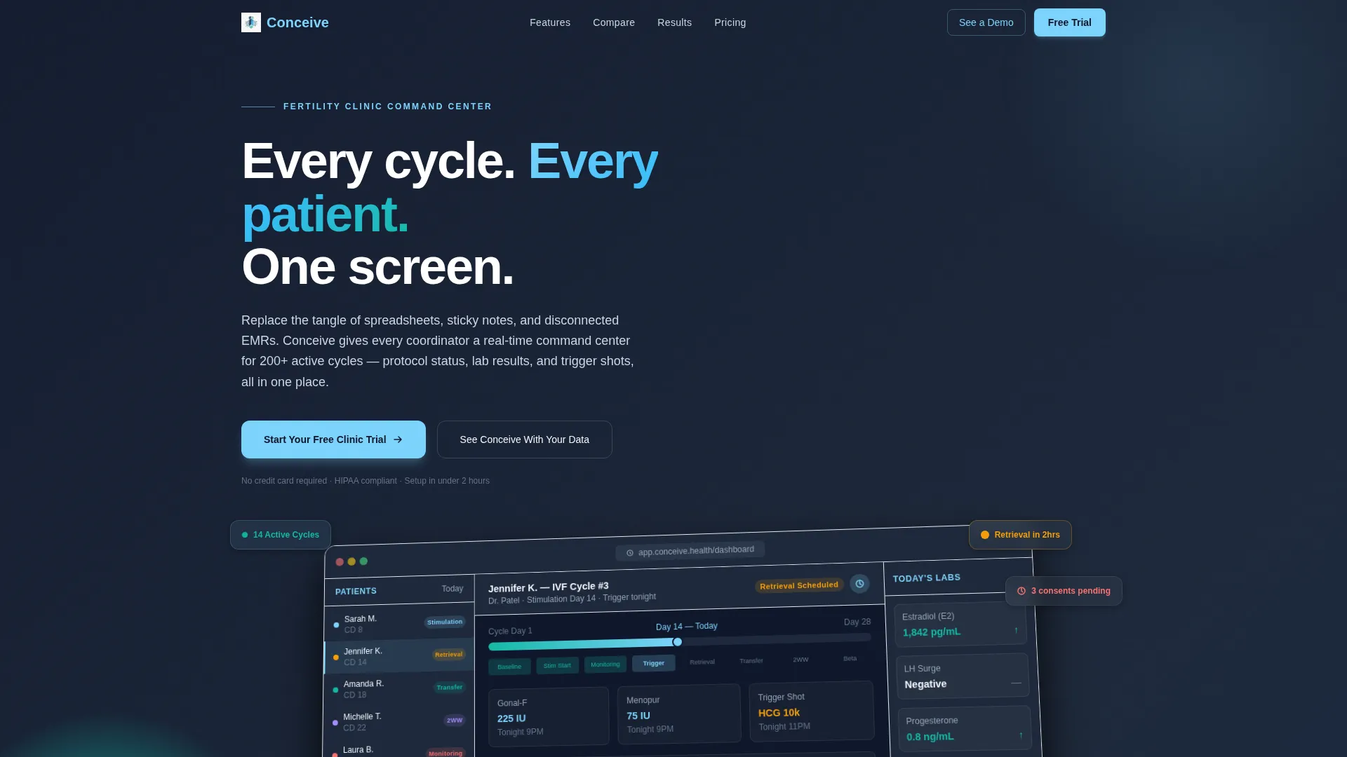
- A header section with a rotated dashboard screenshot, a depth shadow treatment, and a single fade-in headline on a slate background
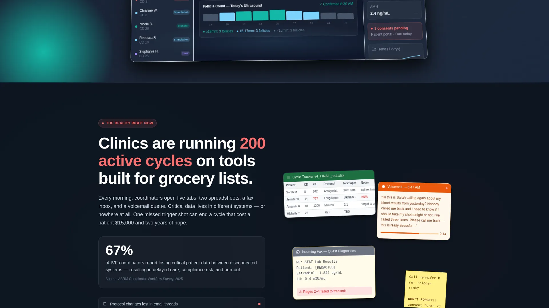
- A problem visualization section using a fragmented-tools collage paired with a supporting clinic-data statistic
- A twelve-row comparison table, a progressive two-step sign-up form, a personalized demo booking path, and a sticky bottom call-to-action bar
Feature list
This template is built around components and layout decisions that serve a very specific sales story. Each one earns its place in the page flow.
Living Dashboard Header
The header renders a realistic, anonymized clinic day inside the Conceive interface. A left sidebar lists fourteen patients color-coded by cycle phase. The central timeline highlights an imminent egg retrieval in sky blue. A right panel shows rising estradiol levels and a badge for three pending consent forms. The screenshot sits slightly rotated on a slate background with a soft depth shadow.
Problem-to-Solution Scroll Arc
Below the fold, the page opens with a visual recreation of clinic chaos. A fragmented-tools collage shows a generic spreadsheet, a fax confirmation, and a voicemail transcript side by side. A supporting statistic anchors the pain. Each subsequent section dissolves one problem and replaces it with a clean product screenshot showing the solution.
Twelve-Row Comparison Table
The comparison table sits at the center of the page. It places Conceive against three alternatives: a generic electronic medical record system, spreadsheets, and paper charts. Twelve feature rows cover items like medication protocol templates, two-week-wait automated check-ins, Society for Assisted Reproductive Technology (SART) reporting integration, and a patient portal with cycle visualization. Sky-blue checkmarks stack decisively in the Conceive column.
Progressive Two-Step Sign-Up Form
The primary call to action leads into a two-step form. The first screen asks only for clinic name and work email. After submission, the second screen asks for monthly active cycle volume and current electronic medical record system from a dropdown menu. No credit card is required at any point.
Triple Call-to-Action Placement
"Start Your Free Clinic Trial" appears three times across the page: after the header, below the comparison table, and inside a sticky bottom bar that activates after forty percent scroll depth. The repetition keeps the conversion path visible without feeling aggressive.
Personalized Demo Booking Path
A secondary conversion option invites visitors to book a personalized demo with a calendar embed. This path serves clinic leads who want to see the platform using their own data before committing to a trial.
Page sections overview
| Section | Purpose |
|---|---|
| Dashboard header | Introduces the product with an immersive, realistic interface preview |
| Headline fade-in | Delivers the core value message above the dashboard screenshot |
| Problem collage | Visualizes the fragmented-tools pain that clinics recognize immediately |
| Statistic callout | Adds credibility to the problem narrative with a clinic-specific data point |
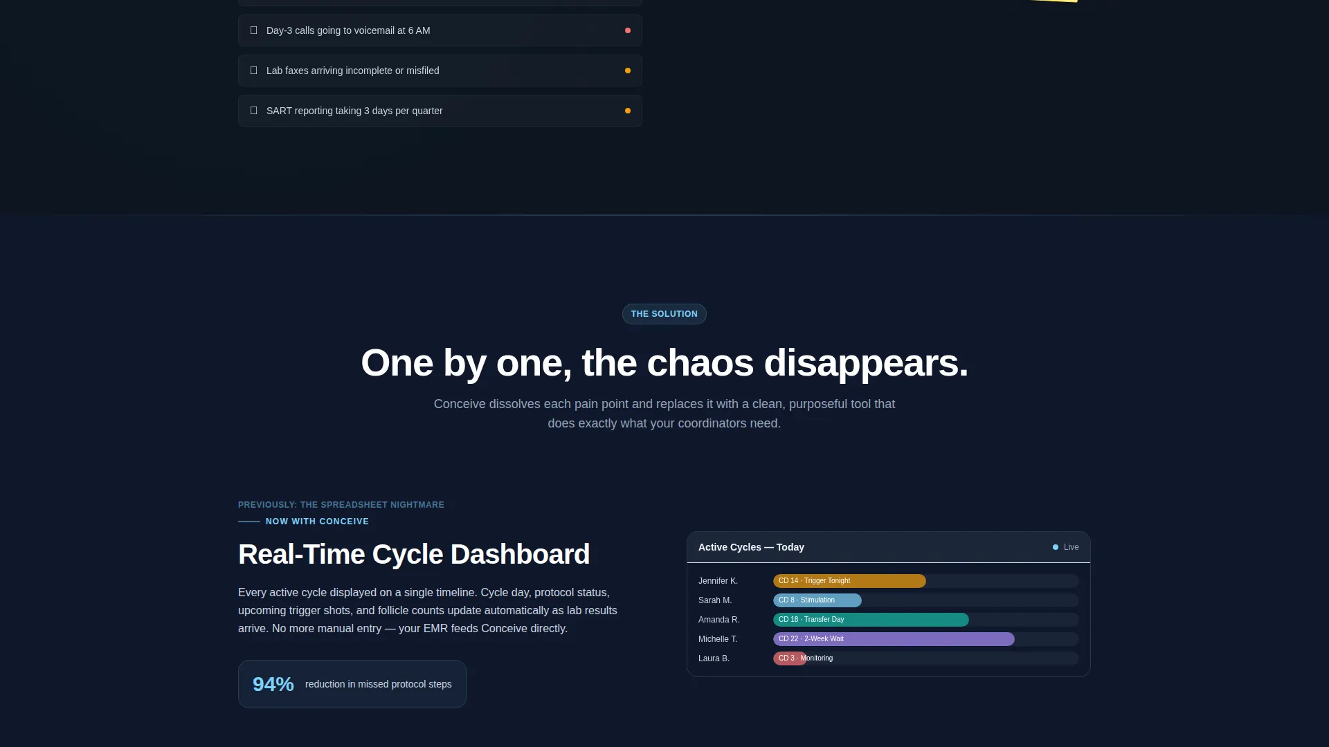
| Cycle tracking solution | Shows how the product replaces the spreadsheet with a clean alternative |
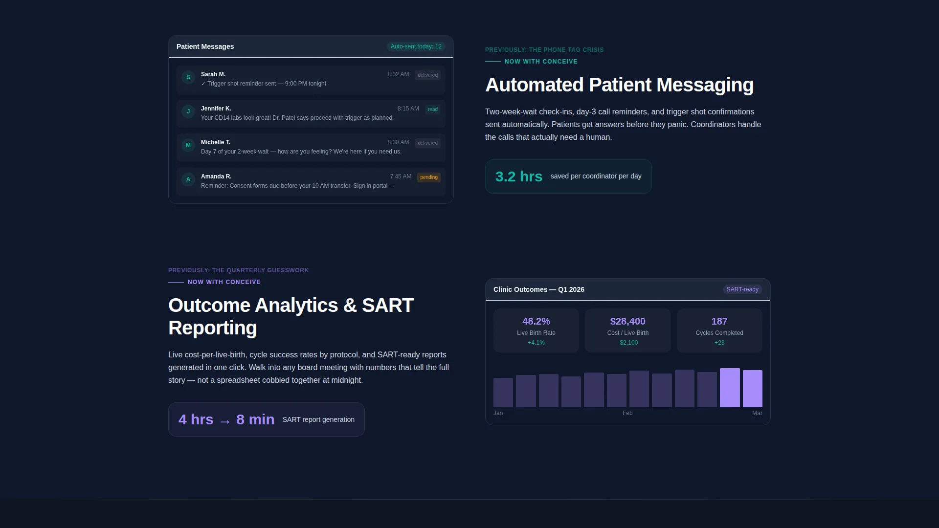
| Messaging solution | Demonstrates automated patient communication replacing phone-tag workflows |
| Analytics solution | Replaces quarterly guesswork with an outcome analytics product screenshot |
| Comparison table | Stacks Conceive against generic EMR, spreadsheets, and paper charts |
| Primary call to action block | Drives free trial sign-ups below the comparison table |
| Two-step sign-up form | Captures clinic name, email, cycle volume, and current EMR system |
| Demo booking section | Offers a personalized demo path with an embedded calendar |
| Sticky bottom bar | Keeps the free trial call to action visible after forty percent scroll depth |
Design & branding system
The visual identity follows a Dashboard Pro theme built on a Slate and Sky color system. The palette is designed to feel like medical-grade software: precise and trustworthy without being sterile or cold.
- Deep clinical slate (#1E293B) handles primary backgrounds and navigation chrome; soft sky blue (#7DD3FC) marks primary actions, data highlights, and comparison-table checkmarks
- Cool cloud gray (#F1F5F9) surfaces card backgrounds and table rows; reassuring teal (#14B8A6) signals positive status events like confirmed pregnancies and completed cycles
Mobile & speed optimization
The layout is designed so that every key message and conversion element works at any screen width. Clinic staff reviewing the page between patient calls need the same clarity on a phone that a practice owner gets on a desktop.
- The dashboard screenshot treatment, collage sections, and comparison table are built to reflow cleanly on smaller viewports
- The sticky bottom call-to-action bar and two-step form maintain their usability on touch-based devices
How this template helps you convert
The page is engineered to shrink trial hesitation by making the product feel familiar before anyone signs up. Every layout decision serves that goal.
- The dashboard header shows a fully realized clinic day in the interface, so visitors understand the product on arrival and arrive at the sign-up form already confident
- The comparison table removes the need for a visitor to do independent research by placing every relevant feature side by side, with sky-blue checkmarks making the answer obvious
- Three calls to action at measured scroll intervals, paired with a no-credit-card requirement, keep friction low and the path to trial consistently visible
Other information about this template
This template sits at the intersection of fertility vertical software as a service and conversion-focused landing page design. A few additional details are worth noting for teams evaluating it.
- The template style is a comparison table layout, which suits any vertical SaaS product that competes against legacy tools and manual workflows
- The Freemium and Trial landing page direction means the entire page is structured to lower the barrier to a first session, not to close a paid contract immediately
- The progressive two-step form pattern is a recognized approach for reducing initial form abandonment while still collecting qualification data for the sales team
- The page works equally well for teams building on modern no-code or pro-code stacks, as the layout structure and component hierarchy are clearly defined in the template
Theme
Dashboard Pro
Creative direction
Problem→Solution Arc
Color system
Slate & Sky
Style
Comparison Table
Direction
Freemium/Trial
Page Sections
Immersive Dashboard Header
Problem-to-solution Scroll Arc
Twelve-row Comparison Table
Progressive Two-step Sign-up
Sticky Bottom Call-to-action Bar
Personalized Demo Booking Path
Related questions
Can I customize the comparison table rows for my own feature set?
Does the template include the calendar embed for demo booking?
Is the two-step form logic built into the template?
How many times does the primary call to action appear on the page?
Who is this template designed for?



