Hospitality Help Desk Landing Page Template
Concierge is a bento grid landing page template built for hospitality help desk and ticketing platforms. It targets operations directors, food and beverage managers, and regional hospitality leads who need a modern, high-energy page to showcase their guest request management software. The design uses an Electric Indigo color system with dynamic motion and a versus-style conversion flow.
by Rocket studio
Quick summary
Concierge is a single-page bento grid template designed for hospitality help desk and ticketing platforms. It pairs a kinetic scroll experience with a clear versus narrative, showing potential customers exactly why their current workflow is holding them back. The Electric Indigo palette and Dynamic Motion theme give the page a focused, modern energy.
Who this template is for
This template speaks directly to software teams and founders building tools for the hospitality industry. It works best when your platform solves real operational pain across hotels, resorts, or restaurant groups.
- Operations directors managing large multi-room hotel properties
- Food and beverage managers who need fast issue routing during live service
- Regional hospitality leads overseeing multiple locations at once
What problem this template solves
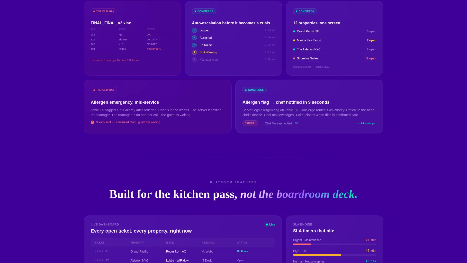
Hospitality operations teams lose time and miss guest issues because their current tools were never built for this environment. Sticky notes, group chats with dozens of unread messages, and spreadsheets named FINAL_FINAL are real workflows in real properties today. This template gives you a page that makes that contrast impossible to ignore.
- Visitors immediately see the gap between legacy workflows and a structured ticketing system
- The versus layout builds a case row by row, turning scroll depth into persuasion
- The interactive comparison call to action converts curiosity into a qualified, personalized lead
What you get with this template
You get a fully structured bento grid landing page ready to present your hospitality ticketing platform with confidence. Every section is designed to carry a specific part of the story, from the first code snippet in the header to the final comparison scorecard prompt.
- A dynamic bento grid layout with kinetic scroll animations and off-canvas card entrances
- A header code snippet block styled to show a live API call in real time
- A primary interactive call to action flow and a secondary sticky demo call to action for mid-page visitors
Feature list
This template includes the following purpose-built features for hospitality software positioning.
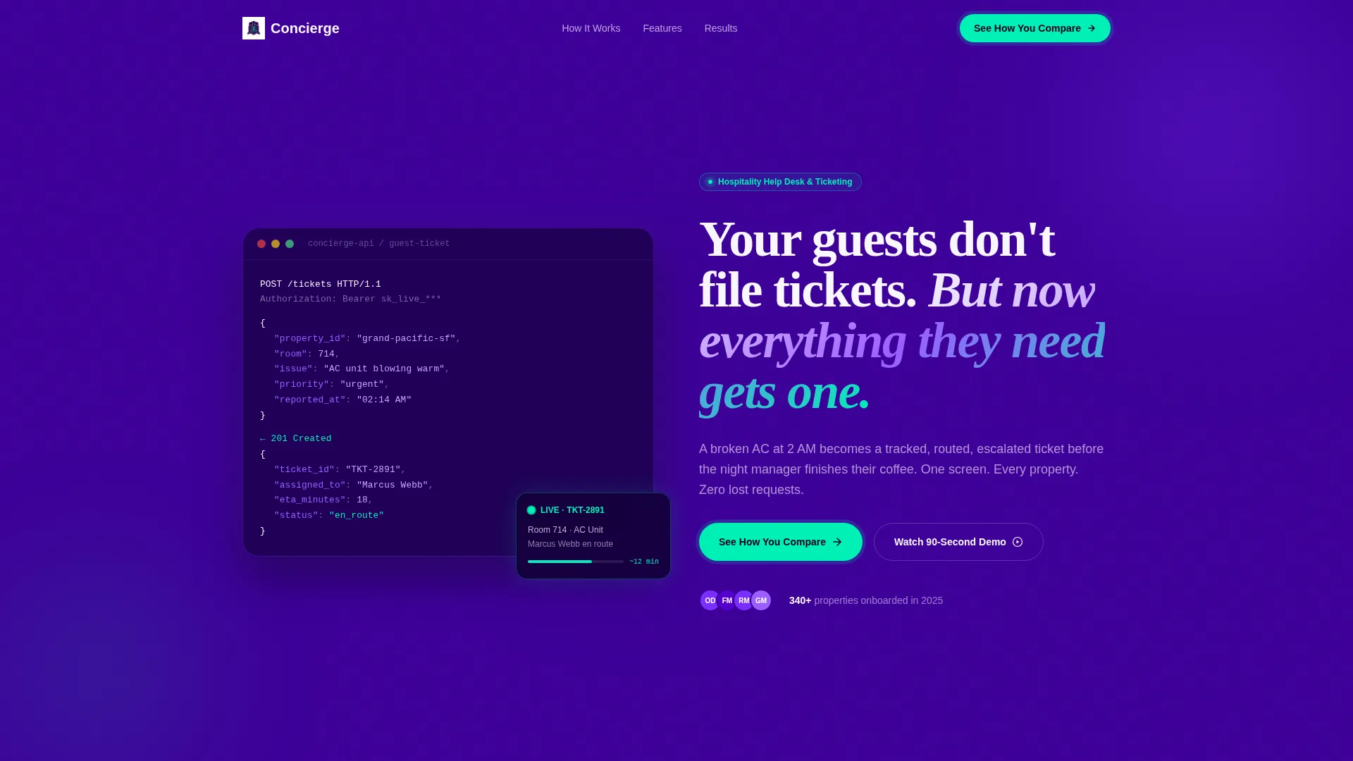
Animated Code Snippet Header
The header opens with a syntax-highlighted API call block styled in violet and mint against a deep indigo background. Lines animate in one by one as if being typed live, showing a guest complaint being submitted, assigned, and resolved. It sets the tone immediately: this platform works fast.
Bento Grid Layout with Kinetic Scroll
Every cell in the grid snaps into the viewport with kinetic easing. Cards rotate or slide in from off-canvas, giving the page an assembling-in-real-time feel. The grid layout grows from small two-cell comparisons at the top into full-width feature showcases at the bottom.
Versus Architecture Narrative
Each row pairs a cell showing a broken legacy workflow against a matching cell showing the same scenario handled inside the platform. The contrast is intentional and escalating. By the midpoint of the page, the visitor's current approach looks genuinely unsustainable.
Interactive Comparison call to action
The primary call to action reads "See How You Compare" and triggers a short three-question diagnostic. Visitors choose their property type, their current ticketing method, and their average daily guest request volume. On submit, they receive a personalized comparison scorecard via email.
Secondary Sticky Demo call to action
A secondary sticky call to action labeled "Watch the 90-Second Demo" appears at the grid's midpoint. It captures visitors who are not ready to fill out the diagnostic but are willing to watch a short proof of concept. Both calls to action work together to cover different readiness levels.
Electric Indigo Color System
The page uses a carefully controlled four-color palette. Deep screen indigo dominates the canvas, charged violet activates hover states, crisp lilac-white fills card surfaces and text, and neon mint appears only on status indicators and call to action pulses. Color is used as a signal, not decoration.
Page sections overview
| Section | Purpose |
|---|---|
| Header Code Snippet | Opens the page with a live-styled API call animation and the platform's core headline |
| Versus Row One | Compares a legacy workflow cell against the platform's clean resolution view |
| Versus Row Two | Escalates the contrast with a second scenario pairing, building the narrative |
| Feature Showcase | Full-width cells that present the platform's core capabilities in detail |
| Interactive Comparison call to action | Presents the diagnostic tool and prompts visitors to see their personalized scorecard |
| Sticky Demo call to action | Anchors at midpoint to capture visitors not ready for the diagnostic |
| Footer Close | Reinforces the value proposition and presents a final conversion prompt |
Design & branding system
The Electric Indigo color system is the visual backbone of this template. Every color has a defined role, and that discipline is what makes the page feel controlled rather than chaotic.
- Deep screen indigo (#3D0099) as the primary canvas background across all sections
- Charged violet (#7B2FFF) reserved for hover states, active cards, and interactive elements
- Neon mint (#00F0B5) used exclusively for status indicators and call-to-action pulse effects
- Crisp lilac-white (#F8F7FF) for body text, card surfaces, and breathing space inside bento cells
Mobile & speed optimization
The bento grid layout is designed to adapt across screen sizes without losing its structured visual logic. The kinetic scroll animations are purposeful and contained, keeping the experience focused on each cell as it enters the viewport.
- Bento cells restack cleanly for narrower screens while preserving the versus narrative flow
- Animation entrances are tied to scroll position, so each card activates only when it is visible
- The sticky secondary call to action remains accessible throughout the scroll on all device sizes
How this template helps you convert
The conversion strategy here is built around making the visitor's current workflow look increasingly unsustainable, then offering relief rather than a hard sell.
- The versus architecture creates progressive persuasion with every row, so the visitor arrives at the call to action already convinced something needs to change.
- The two-call to action system captures both high-intent visitors ready to submit their data and lower-intent visitors willing to watch a short demo, so fewer people leave without engaging.
Other information about this template
This template is part of a broader set of Dynamic Motion bento grid designs built for technology and software landing pages. It is well-suited to hospitality software vendors positioning their platform against manual, chat-based, or spreadsheet-driven workflows.
- The template style is Bento Grid with a Dynamic Motion theme and Launch Energy creative direction
- The header concept is a Code Snippet block, a format that signals technical credibility to operations and IT buyers
- The landing page direction is Comparison/Versus, optimized for visitors who already know they have a problem but have not yet committed to a solution
- This template fits within the Technology category under the Hospitality Software subcategory and Hospitality Help Desk and Ticketing niche


Theme
Dynamic Motion
Creative direction
Launch Energy
Color system
Electric Indigo
Style
Bento Grid
Direction
Comparison/Versus
Page Sections
Animated Code Snippet Header
Kinetic Bento Grid Layout
Versus Architecture Narrative
Interactive Comparison Diagnostic
Two-cta Conversion System
Electric Indigo Color System
Related questions
Who is this landing page template designed for?
Can I customize the color palette and branding?
What does the interactive comparison call to action do?
Do I need developer skills to use this template?
Is this template suitable for a SaaS product launch?


