Concierge - Effortless Wedding Landing Page Template
Concierge is a hub-and-spoke wedding AI chatbot landing page built for couples, planners, and maids of honor who are tired of answering the same guest questions on repeat. The page uses a Problem-to-Solution arc, animated chat demonstrations, and a direct app download call to action to turn exhausted visitors into confident installs.
by Rocket studio
Quick summary
Concierge is a single-page, anchor-navigated landing page for a wedding AI chatbot. It opens with a wall of frantic guest messages, cuts to one clean chat window, and builds evidence section by section until downloading the app feels like the only logical next step. The design is sharp, dark, and deliberately unlike every soft watercolor wedding template you have ever seen.
Who this template is for
This template is built for people who are drowning in wedding logistics, not enjoying them. If you spend more time answering texts than celebrating, this page was designed with you in mind.
- Overwhelmed couples fielding the same question from dozens of guests every day
- Type-A maids of honor managing group chats, RSVPs, and last-minute dietary updates
- Boutique wedding planners running multiple events at once who need one less inbox to watch
What problem this template solves
Wedding guests ask the same questions on repeat: parking, dress code, shuttle times, dietary restrictions, and gift registry links. Someone always has to answer at 11 PM, or 2 AM, or during the rehearsal dinner. This template gives that problem a face and then immediately shows the solution.
- Guests get instant, accurate answers without calling the couple
- Planners stop juggling six inboxes across six different weekends
- The chatbot handles dietary updates, shuttle schedules, and registry redirects so no human has to
What you get with this template
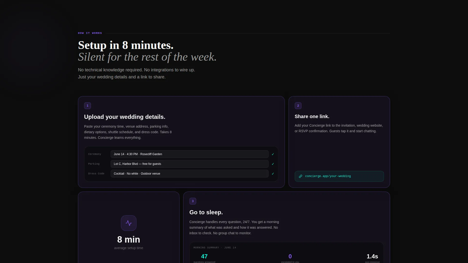
You get a fully structured, single-page landing page built around a clear narrative arc. Every section is a pre-built spoke anchored to a specific guest-panic scenario, and each one resolves with an animated chatbot demonstration.
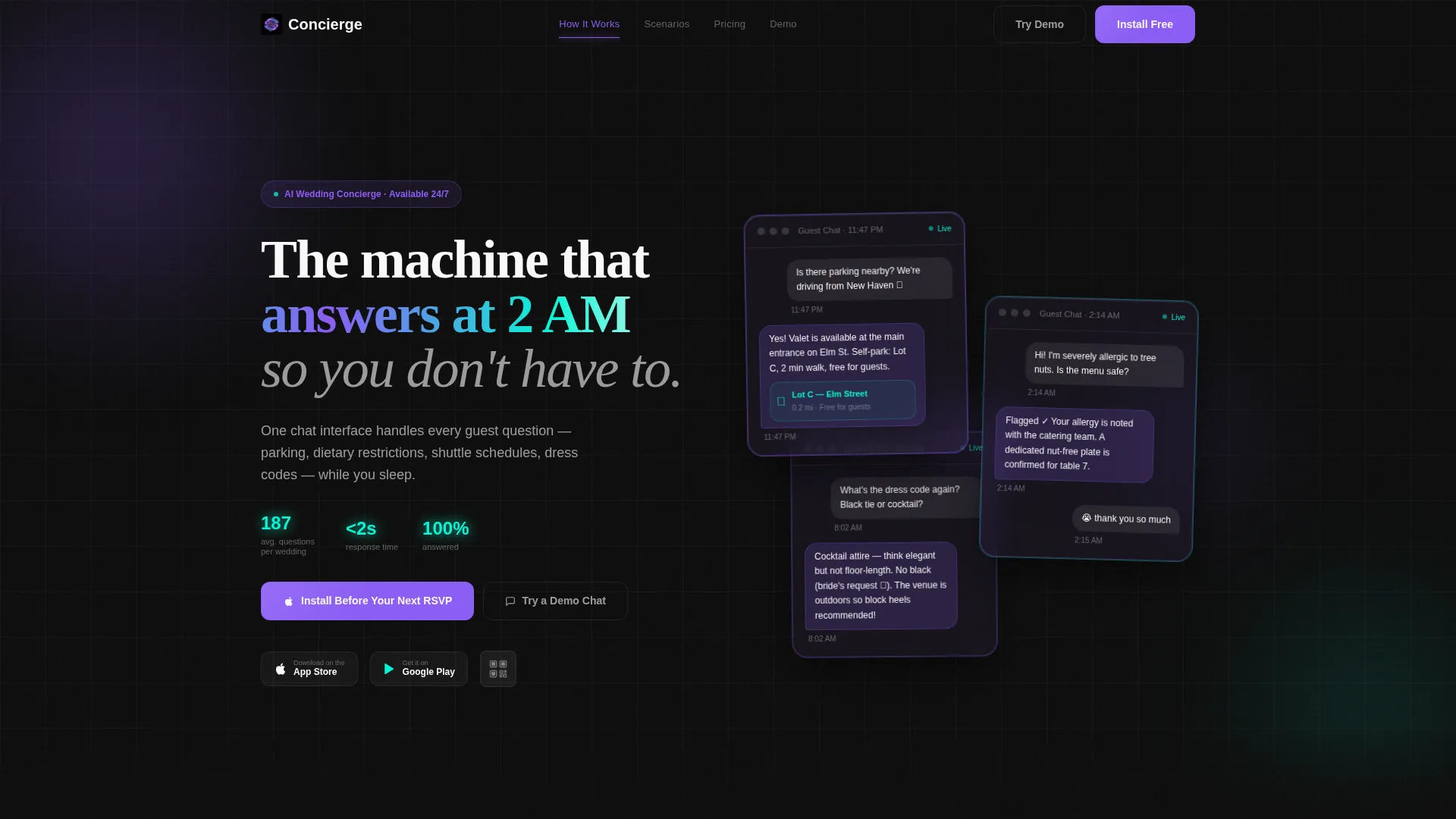
- A dark-glass header with three frosted chat panels showing real guest exchanges
- Animated spoke sections covering parking crises, dietary allergy emergencies, and RSVP chases
- A primary app download call to action with App Store and Google Play badges, a QR code, and a live demo chat trigger
Feature list
This template ships with purpose-built components that serve one goal: making the app download feel inevitable.
Dark Glass Panel Header
Three frosted translucent cards float over a pitch-black viewport, each displaying a real chat exchange. A guest asks about parking, the AI drops a pin in under two seconds, and a satisfaction reaction closes the loop. Subtle parallax depth and violet-edged lighting make the product itself the hero visual.
Problem-to-Solution Scroll Arc
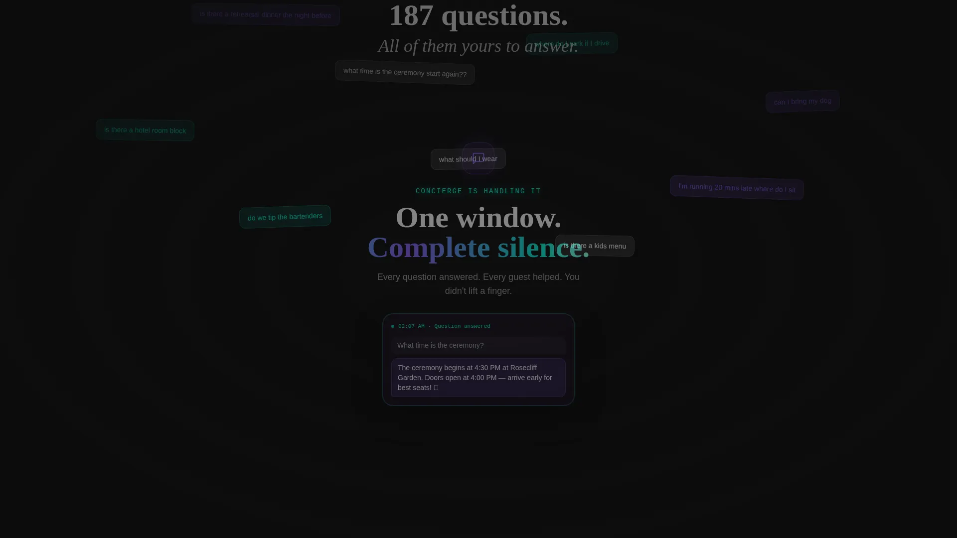
The page opens with a scrolling wall of overlapping, frantic wedding-week text messages. The pace accelerates until the screen feels suffocating. Then a hard cut delivers silence: one clean chat window, one answered question. The emotional contrast does the selling before a single feature is listed.
Animated Spoke Sections
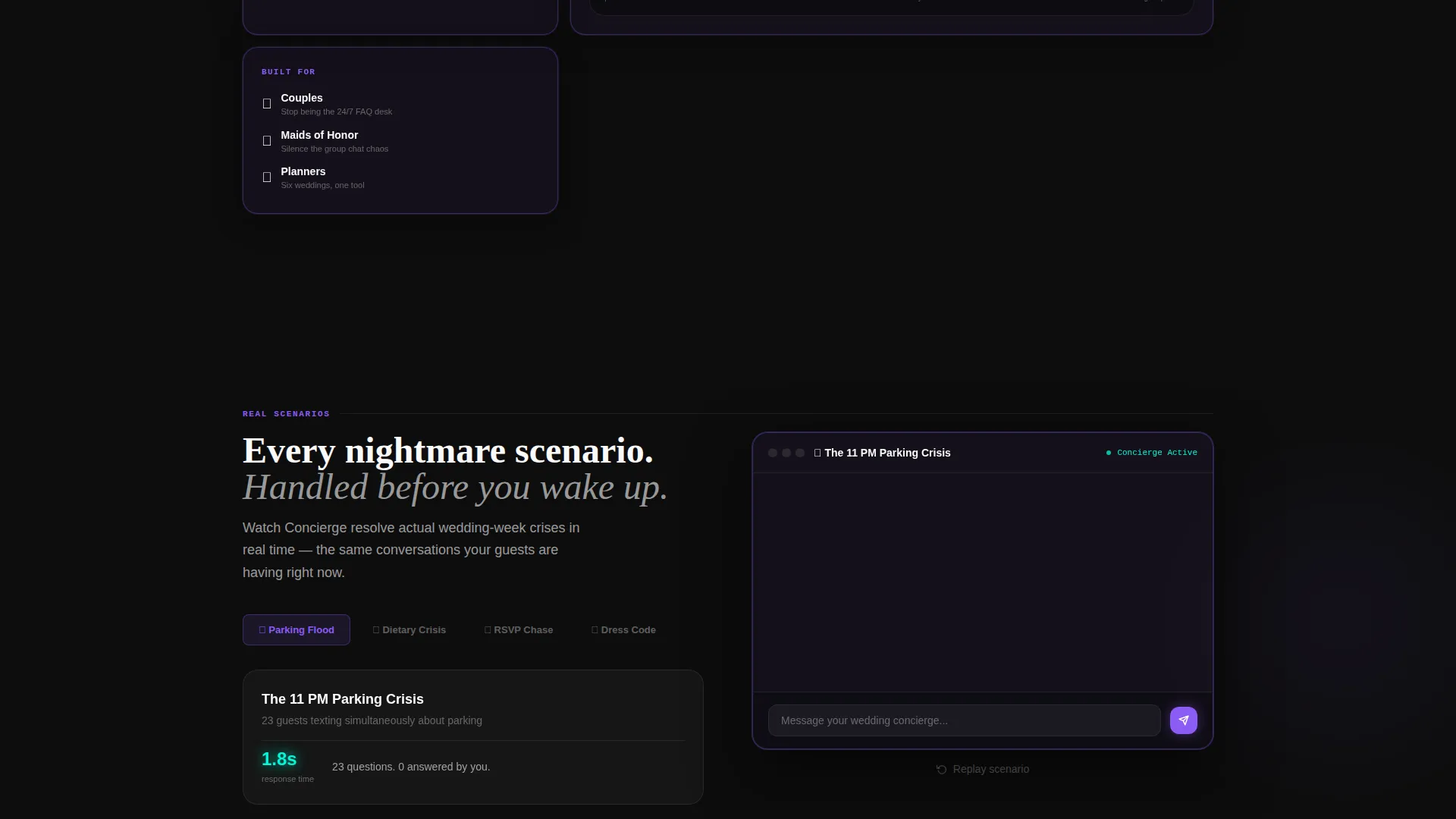
Each anchor-linked spoke targets a specific nightmare scenario: the dietary allergy crisis, the late-night parking flood, the RSVP chase. Animated chat bubbles resolve each scenario in real time, building a stack of evidence that removes doubt progressively.
Live Demo Chat Trigger
A secondary call to action opens a bot simulation directly on the page. Visitors can watch the chatbot handle a tricky plus-one question before committing to a download. The demo earns the install rather than demanding it.
App Download Call to Action Block
The primary conversion block carries the headline "Install Before Your Next RSVP" with paired App Store and Google Play badges and a QR code for instant mobile capture. Every element points toward one action with no competing distractions.
Anchor Navigation Hub
A sticky hub navigation links every spoke section so visitors can jump directly to the scenario most relevant to them. The structure keeps long-scroll fatigue low and lets planners, couples, and guests self-select their entry point.
Page sections overview
| Section | Purpose |
|---|---|
| Dark Glass Header | Introduces chatbot via three live chat panel previews |
| Problem Scroll Wall | Visualizes guest message overload to create emotional urgency |
| Hard Cut Silence | Delivers the relief moment with a single clean chat window |
| Parking Crisis Spoke | Shows the bot resolving late-night parking questions in real time |
| Dietary Allergy Spoke | Demonstrates instant dietary restriction and allergy handling |
| RSVP Chase Spoke | Illustrates how the bot manages follow-up and guest confirmations |
| Live Demo Trigger | Lets visitors test the chatbot before downloading the app |
| App Download Block | Drives installs with badges, QR code, and a direct download headline |
Design & branding system
The visual identity runs on an Acid Digital color system built to feel like a phone screen glowing on a nightstand at midnight. Every color choice is deliberate and sharp, cutting through the soft aesthetic that wedding design usually defaults to.
- Void black (#0D0D0D) backgrounds make every user interface element float like glass in dark space
- Electric violet (#8B5CF6) owns all interactive states, buttons, and calls to action
- Reactive cyan (#06F5D6) marks data confirmations, map pins, and success moments; bare white (#FAFAFA) handles all body typography for maximum contrast
Mobile & speed optimization
The template is built with a mobile-first mindset because the primary conversion action is an app download. Visitors are likely already on their phones when they arrive.
- The QR code in the download block gives phone users a zero-friction path directly to the app store
- Frosted glass panels and animated chat sections are designed to stay readable and visually intact on small screens
- The anchor navigation hub collapses cleanly for thumb-friendly scrolling on mobile viewports
How this template helps you convert
Every creative decision in this template is structured to reduce hesitation and accelerate the moment a visitor decides to download.
- The problem scroll wall creates genuine emotional urgency before the product is introduced, so visitors are already motivated when they reach the solution.
- The animated spoke sections resolve real, recognizable scenarios one by one, replacing abstract feature claims with concrete proof.
- The live demo chat lets visitors experience the product firsthand, making the install feel like a natural conclusion rather than a cold ask.
Other information about this template
This template sits at the intersection of technology and wedding planning, a combination that is still rare enough to stand out in any feed or marketplace listing.
- The hub-and-spoke anchor navigation structure suits teams presenting the chatbot to wedding planners or venue partners as a service offering
- The Startup Velocity theme and Acid Digital palette are intentional departures from traditional wedding aesthetics, signaling that this product belongs to the tech category
- The template supports a single-page flow with no secondary pages, keeping the visitor path linear and focused on one outcome
- All page sections are pre-labeled and anchor-linked, making it straightforward to swap scenario copy for different wedding contexts or regional markets
Theme
Startup Velocity
Creative direction
Problem→Solution Arc
Color system
Acid Digital
Style
Hub & Spoke (Anchor Nav)
Direction
App Download
Page Sections
Dark Glass Panel Header
Problem-to-solution Scroll Arc
Animated Spoke Sections
Live Demo Chat Trigger
App Download Conversion Block
Anchor Navigation Hub
Related questions
Who is this landing page template designed for?
Can I customize the chat scenarios in each spoke section?
Does the live demo chat require a real backend connection?
What makes this template different from a standard wedding landing page?
Is this template suitable for an app launch campaign?



