Concierge - Intelligent Retail Landing Page Template
Concierge is a bento grid landing page template built for retail AI customer service platforms. It targets VP-level e-commerce operators drowning in support tickets and agent costs. The layout combines an animated logo bar, interactive capability tiles, a live ROI calculator, and a simulated chat demo to let prospects validate the product before ever speaking to sales.
by Rocket studio
Quick summary
Concierge is a high-intent landing page template designed for AI-powered retail customer service tools. It opens with a slow-moving logo bar of recognizable retail brands, drops into an interactive bento grid of capability tiles, and closes with a self-serve ROI calculator. Every section is built to let skeptical operators prove the value themselves.
Who this template is for
This template is built for teams selling AI customer service software into the retail and e-commerce space. The typical buyer persona on the other side of this page is a VP of Operations or VP of Customer Experience managing thousands of support tickets weekly.
- Retail AI platform founders and product marketers who need a page that speaks directly to cost-conscious operators
- Growth and demand-generation teams targeting e-commerce businesses struggling with high agent costs and declining satisfaction scores
- Agencies and no-code builders creating conversion-focused landing pages for technology clients in the retail sector
What problem this template solves
E-commerce support teams running at scale face a brutal math problem. Outsourced agents are expensive, satisfaction scores drift downward, and generic product pages fail to convince operations leaders who need to see numbers before they buy.
- Visitors leave without understanding the real cost difference between their current stack and an AI-native alternative
- Static feature lists do not demonstrate how the product resolves tickets in real time, leaving skeptical buyers unconvinced
- There is no self-serve path for operators to calculate projected savings without booking a sales call first
What you get with this template
This template gives you a fully structured, interaction-led landing page that guides prospects through a self-directed proof experience. The layout is built around a bento grid where every tile is a distinct capability module, and the page rewards exploration over passive scrolling.
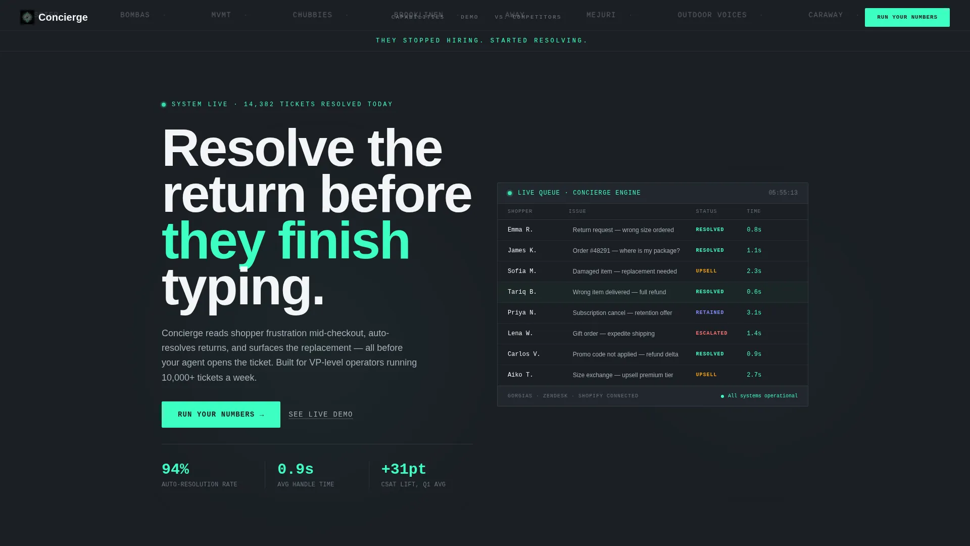
- An animated logo bar header that uses social proof as the primary visual statement, followed by a timed mint-colored tagline reveal
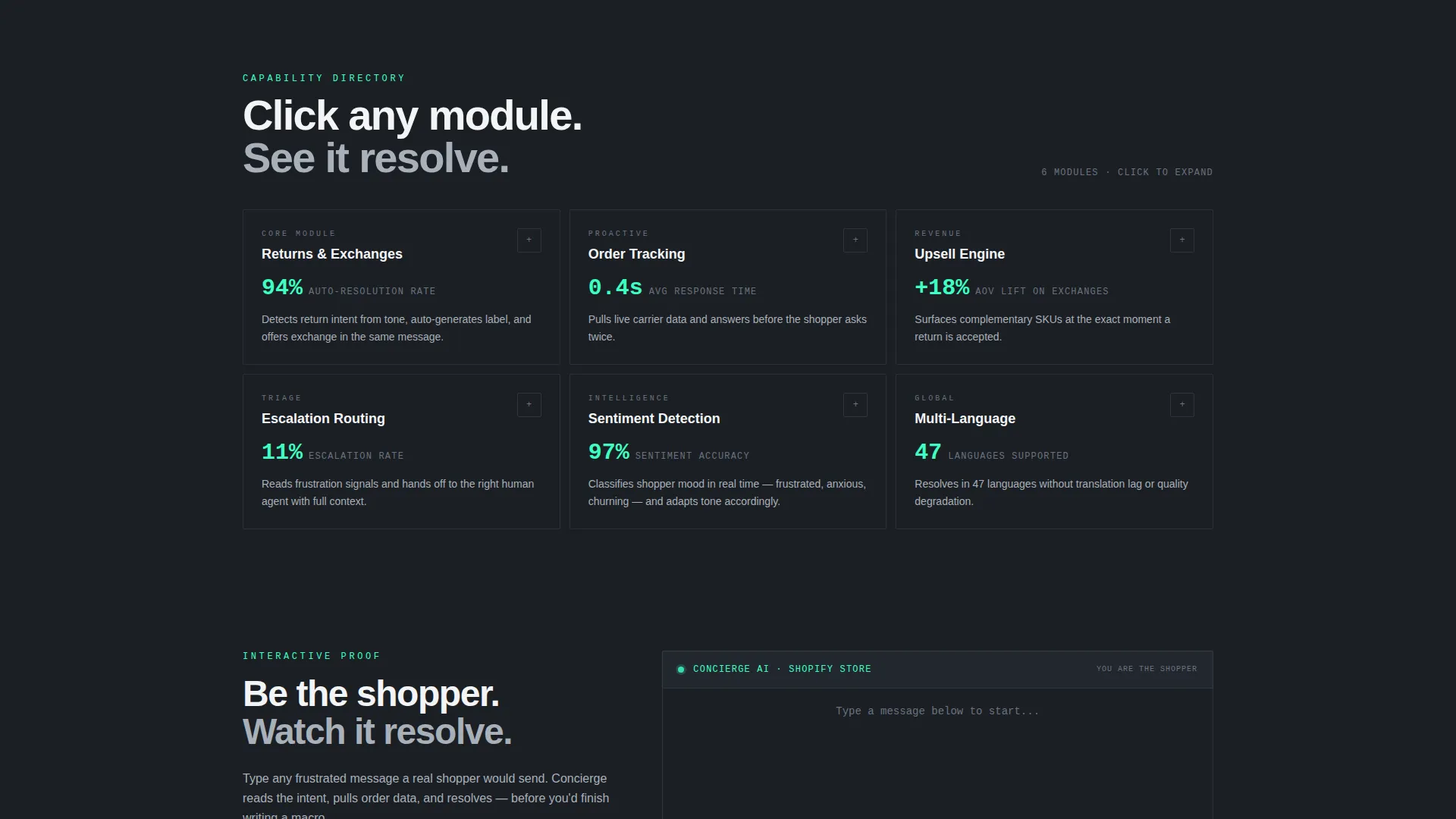
- A clickable bento grid of capability tiles that each expand into mini-demos, including simulated transcripts, resolution-time graphs, and satisfaction score deltas
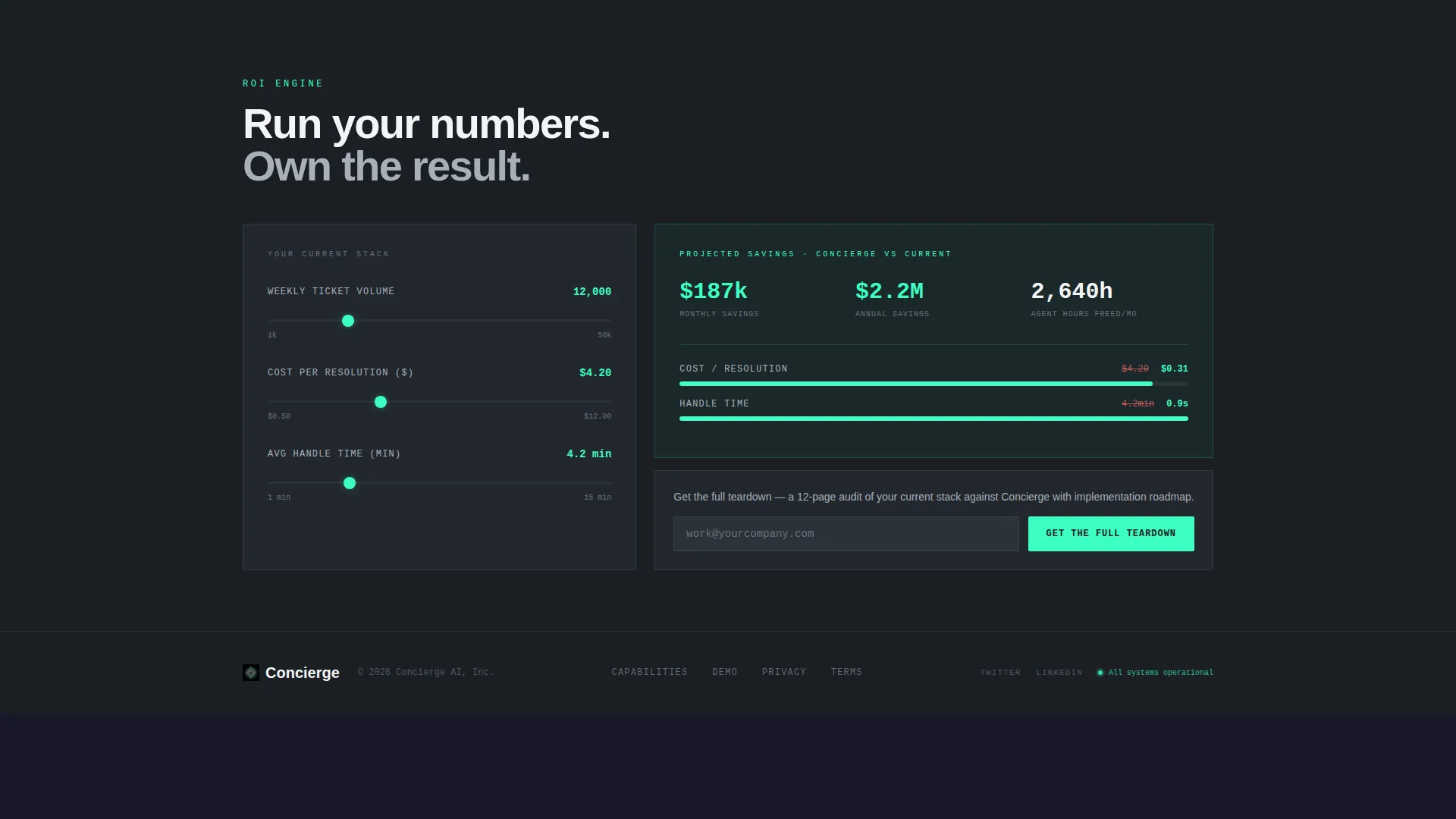
- A sticky-bar ROI calculator that surfaces after two tile interactions, rendering a projected savings card and a head-to-head scorecard against the visitor's current setup
Feature list
This template is built around a set of tightly defined components, each serving a specific role in moving a skeptical operator toward conversion.
Animated Logo Bar Header
A horizontally scrolling strip of forty-plus retail brand logos rendered in monochrome chrome on a gunmetal background. The bar moves at a slow, mechanical pace and never stops. After two seconds, a single line of mint-colored text types itself in below the logos. The logos function as ambient proof before a single word of copy appears.
Interactive Bento Grid Capability Tiles
The core of the page is a clickable grid of discrete capability modules. Each tile covers a specific function such as returns and exchanges, order tracking, upsell engine, escalation routing, sentiment detection, or multi-language support. Clicking a tile expands it into a mini-demo view while surrounding tiles compress and dim, letting visitors build their own investigation path.
Versus Comparison Stat Cards
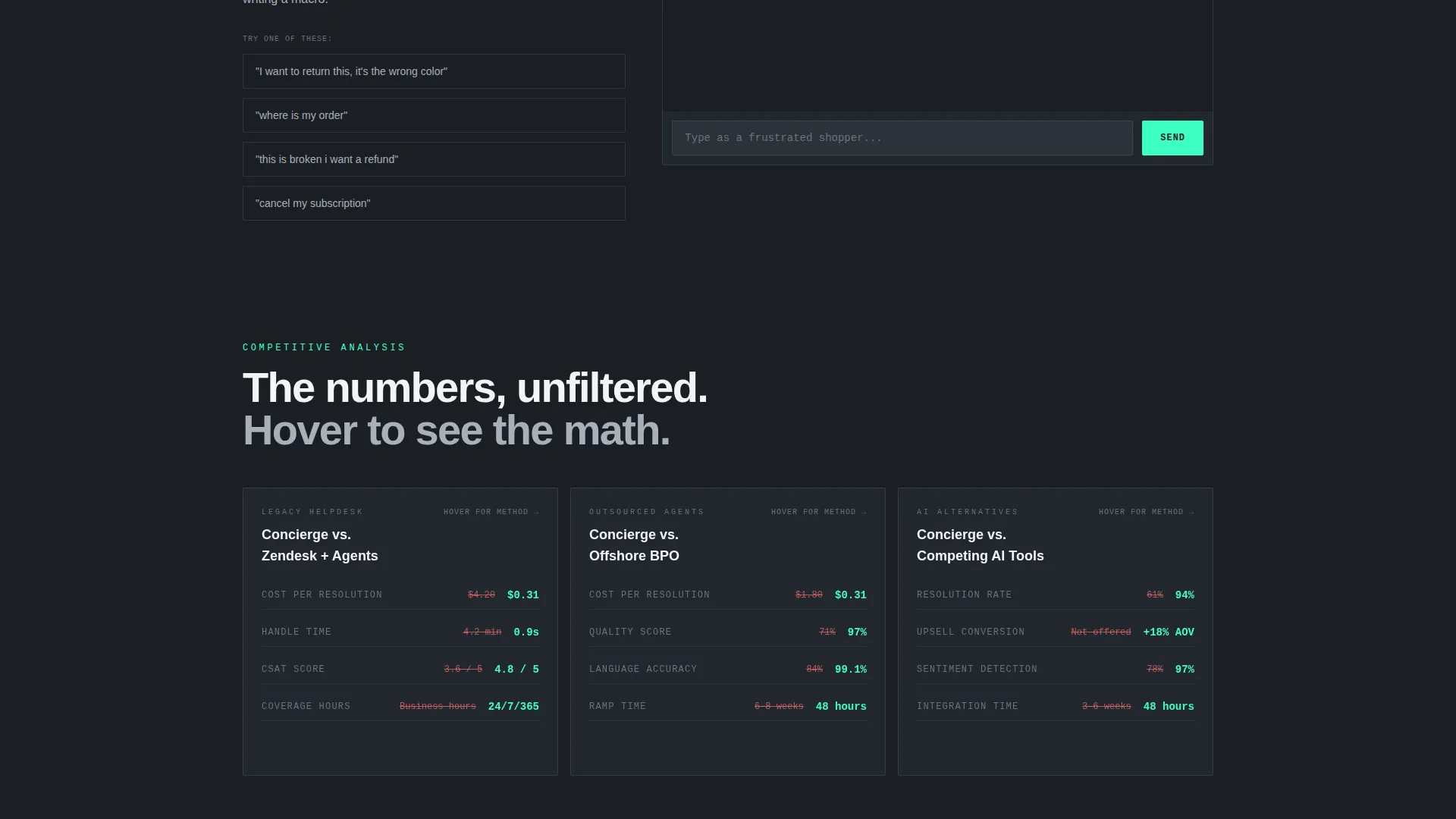
Deeper in the grid, tiles shift from feature demonstrations to side-by-side comparisons. These stat cards pit the platform against legacy helpdesks, offshore outsourcing, and competing AI tools. Each card flips on hover to reveal the methodology behind the figure being shown.
Sticky ROI Calculator Bar
After any two tiles have been explored, a sticky bottom bar appears anchored to the viewport. Clicking it opens a lightweight calculator where the visitor enters monthly ticket volume, current cost per resolution, and average handle time. The tool instantly renders a projected savings card and a comparison scorecard.
Simulated Live Chat Demo
A persistent secondary call-to-action link opens a simulated chat window. Visitors can act as the shopper and watch the AI resolve their issue in real time. This path runs parallel to the calculator and gives product-led buyers a hands-on proof experience without involving sales.
Mint Accent Conversion Surfaces
Electric mint is used exclusively for live-state indicators and primary call-to-action surfaces throughout the template. The primary call-to-action reads "Run Your Numbers" and lives in the sticky bar. The result screen closes with a single email field and a button reading "Get the Full Teardown," keeping the conversion moment clean and low-friction.
Page sections overview
| Section | Purpose |
|---|---|
| Logo Bar Header | Establishes social proof through a slow-scrolling row of retail brand logos before any headline copy appears |
| Mint Tagline Reveal | Delivers the page's single positioning line in electric mint after a two-second delay |
| Capability Tile Grid | Lets visitors self-select the pain points they care about and explore each as an interactive mini-demo |
| Versus Comparison Cards | Provides head-to-head stat comparisons against legacy helpdesks, offshore agents, and rival AI tools |
| Sticky ROI Calculator | Surfaces a self-serve savings projection tool after two tile interactions to anchor the conversion moment |
| Email Capture Card | Collects a work email below the ROI result and routes the visitor toward a full teardown report |
| Live Demo Trigger | Opens a simulated chat window so visitors can experience the AI resolution flow firsthand |
Design & branding system
The visual identity follows a Directory and Discovery theme built on a Monochrome Steel color system. The palette is deliberately industrial, referencing polished server hardware rather than consumer software. Every surface carries a functional role; there is no decorative color use anywhere in the layout.
- Core palette: deep gunmetal (#1B1F24) dominates card backgrounds, brushed chrome (#A8B0B9) carries secondary text and divider lines, and panel white (#F4F5F7) provides breathing room between grid cells
- Electric mint (#3DFFC2) is reserved exclusively for live-state indicators, the sticky call-to-action bar, and the typed tagline reveal; it never appears as a decorative element
- The bento grid layout follows an Interactive Explorer creative direction, meaning tiles are clickable modules rather than passive content blocks, and the grid compresses and dims around an active tile to focus attention
Mobile & speed optimization
The bento grid structure is designed to translate cleanly across screen sizes, with tile interactions and the sticky calculator bar adapting to touch-based navigation. The layout prioritizes function over decorative weight.
- Grid cells reflow for narrower viewports so capability tiles remain tappable and readable without horizontal scrolling
- The sticky ROI calculator bar is anchored to the bottom of the screen on all device sizes, keeping the primary conversion action within thumb reach at all times
How this template helps you convert
The entire page is engineered around a single conversion philosophy: let the prospect prove the ROI to themselves before sales enters the picture.
- The interactive tile grid keeps high-intent visitors engaged longer by letting them explore only the capabilities relevant to their specific pain points, which builds contextual confidence in the product before the calculator appears.
- The self-serve ROI calculator transforms an abstract value proposition into a specific projected savings figure tied to the visitor's own numbers, making the decision to share an email address feel logical rather than speculative.
Other information about this template
This template is part of a broader set of conversion-focused layouts built for technology and AI product categories. A few additional details worth noting for teams evaluating fit:
- The template is designed for single-page, section-led flow and is categorized under the AI for Retail subcategory within the Technology category on the marketplace
- The Monochrome Steel palette and bento grid structure make it particularly well-suited for platforms positioning against Zendesk, Gorgias, or other established helpdesk and customer support tools commonly used by direct-to-consumer retail brands
- The Comparison and Versus landing page direction means the template is optimized for prospects who are already evaluating alternatives, not discovering the category for the first time
- The template style is Bento Grid and the theme is Directory and Discovery, which together produce a layout that feels more like an interactive product catalog than a traditional marketing page
- Teams using this template alongside platforms such as Shopify, Klaviyo, or similar retail infrastructure tools will find the logo bar header particularly effective at establishing immediate category familiarity
Theme
Directory & Discovery
Creative direction
Interactive Explorer
Color system
Monochrome Steel
Style
Bento Grid
Direction
Comparison/Versus
Page Sections
Animated Logo Bar Header
Interactive Bento Grid Tiles
Versus Comparison Stat Cards
Sticky ROI Calculator Bar
Simulated Live Chat Demo
Related questions
Who is this template built for?
How does the ROI calculator work?
Can I edit the bento grid capability tiles?
Is this template suited for a product-led growth strategy?
What conversion actions does this template include?



