Connect — Carrier Landing Page Template
Signal is a telecommunications point-of-sale landing page template built for wireless retail teams. It showcases a live-style dashboard preview, an interactive activation flow, a competitive comparison grid, and a reporting layer with a date slider. The design uses a dark Data Command visual system that feels built for the telecom retail floor from the first scroll.
by Rocket studio
Quick summary
Signal is a single-page template designed for telecommunications point-of-sale platforms. It opens with a living dashboard that displays activation counts, commission tiers, and accessory attach rates. Visitors scroll through an interactive product tour, a side-by-side competitor comparison grid, and a dynamic reporting view before reaching a segmentation-aware lead form.
Who this template is for
This template is built for software teams and operators who sell into wireless retail. The copy, layout, and interactive sections all speak directly to the people running physical telecom stores or launching new retail channels.
- Regional wireless dealers managing multiple store locations across several carriers
- MVNOs (Mobile Virtual Network Operators) building their first retail storefront presence
- National wireless chains whose current point-of-sale workflow still requires reps to juggle multiple browser tabs per transaction
What problem this template solves
Telecom retail software is notoriously hard to sell on a flat webpage. The product is complex, the buyer is skeptical, and generic screenshots rarely communicate speed or simplicity. Signal closes that gap by making the product experience the page itself.
- Reps and managers cannot visualize how a new system improves their daily workflow from a static feature list alone
- Competitive comparisons typically live in PDFs that buyers never open, so frustration with legacy tools goes unaddressed
- Lead forms that ask nothing about carrier mix or store count feel irrelevant and generate low-quality inquiries
What you get with this template
You get a fully structured, interaction-rich landing page that doubles as a live product demo. Every section is purpose-built to move a skeptical telecom operator from curiosity to a qualified conversation.
- A pixel-accurate dashboard header showing activations, carrier commission tiers, and attach-rate gauges with hover interactions and a live activation animation
- A five-step simulated activation flow, a toggled competitor comparison grid, and an interactive profit-and-loss reporting view with a draggable date slider
- A dual-path conversion system with a sticky primary call to action and a three-field qualifier form that segments leads by carrier mix, store count, and current point-of-sale system
Feature list
This template layers several distinct interactive components into one cohesive page. Each one is designed to replace a sales conversation, not just describe the product.
Living Dashboard Header
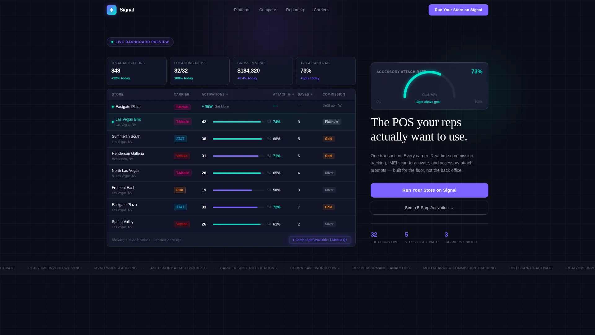
The header recreates the point-of-sale command center at mid-day scale: 847 activations across 32 locations, the top-performing store highlighted, commission tiers color-coded by carrier, and a pulsing carrier spiff notification. Columns sort on hover, a tooltip reveals per-rep performance, and a small animation drops a new activation into the feed in real time.
Simulated Activation Flow
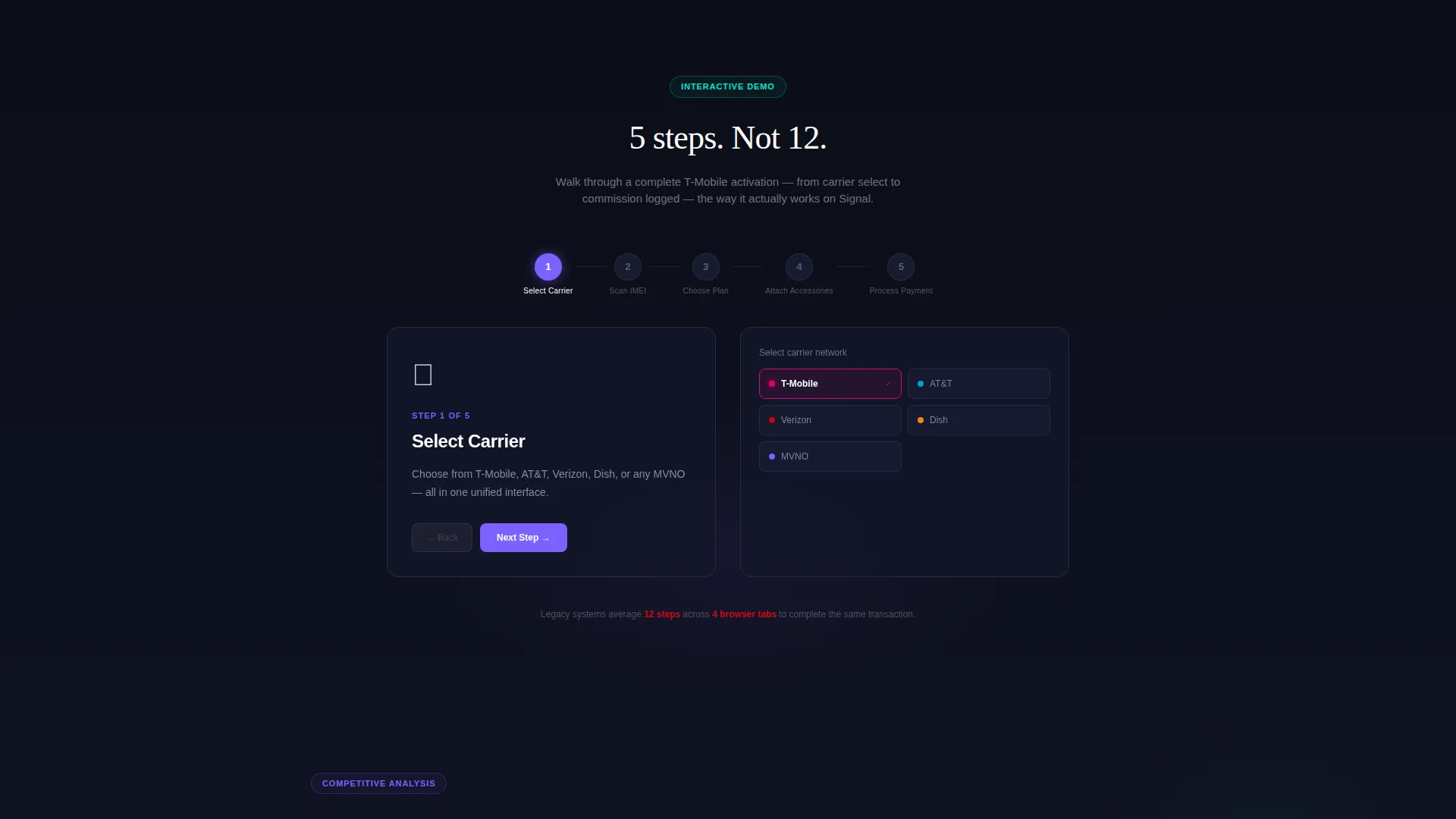
Section one walks visitors through a complete five-step activation: carrier selection, IMEI scan, plan choice, accessory attachment, and payment processing. The flow runs in roughly five steps where comparable workflows in other platforms can require twelve or more, making the speed advantage immediately felt rather than described.
Competitive Comparison Grid
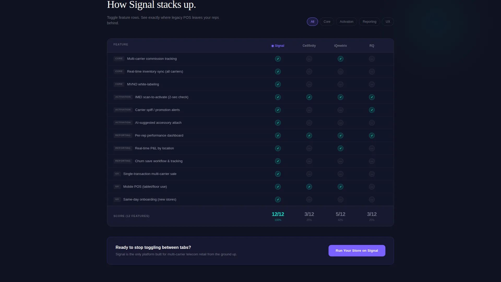
The versus engine pre-loads a live feature comparison against named competing platforms. Visitors toggle individual feature rows, including multi-carrier commission tracking, real-time inventory sync, and MVNO white-labeling, and watch checkmarks and indicators populate. The interaction builds the conviction that Signal already handles what current tools do not.
Interactive Reporting Layer
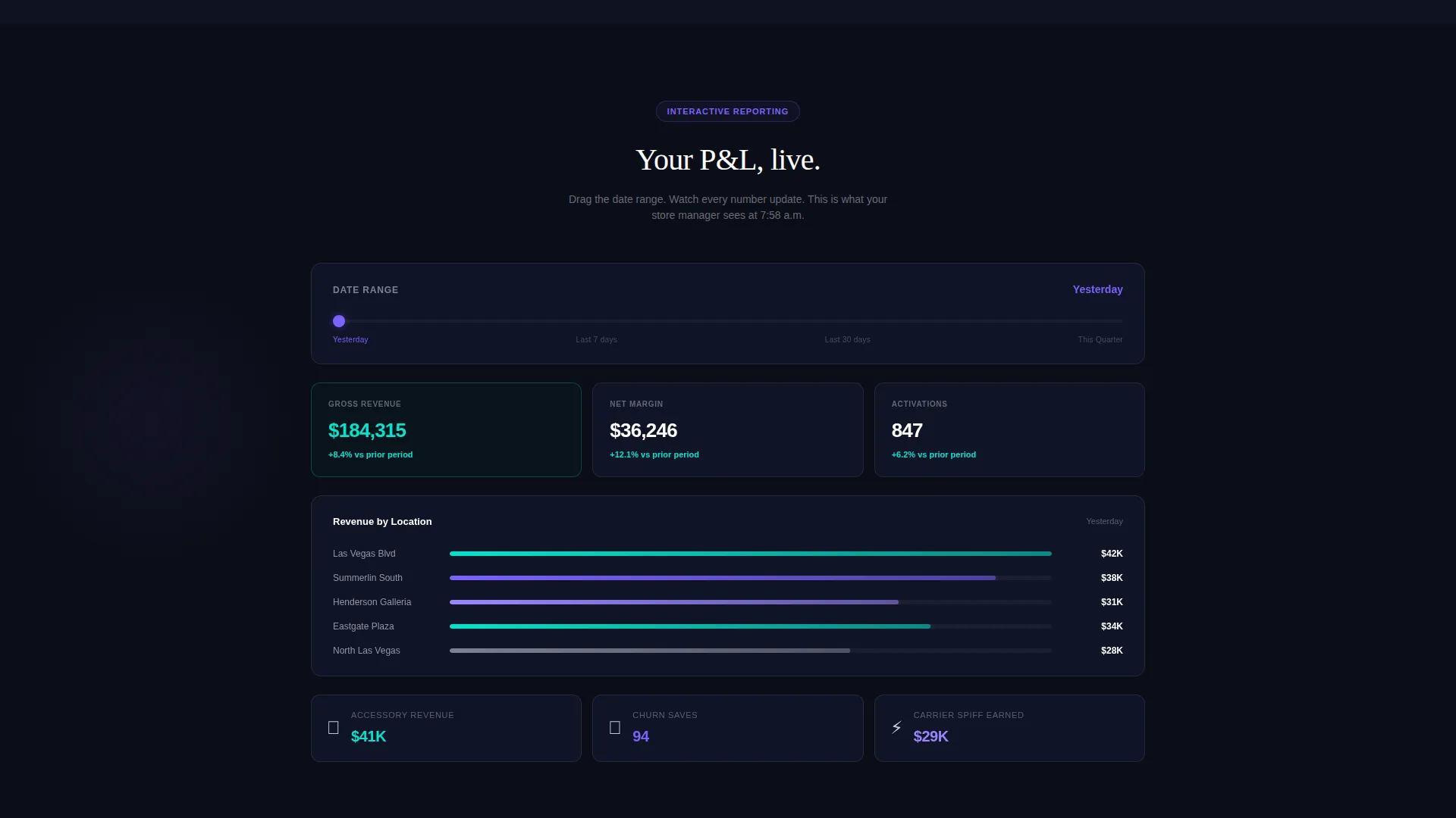
Section three presents a profit-and-loss view where dragging a date slider updates revenue, margin, and churn figures. Visitors experience the reporting depth directly, without needing a product demo call to understand what the data layer looks like.
Segmented Lead Qualifier Form
The secondary conversion path opens a three-field form asking carrier mix, store count, and current point-of-sale system. The form simultaneously segments the lead for the sales team and makes the visitor feel understood rather than processed.
Sticky Dual-Path Conversion System
The primary call to action persists in the navigation bar throughout the entire scroll and reappears after the comparison grid, where competitive frustration peaks. This placement strategy ensures a conversion option is always visible at the moments of highest intent.
Page sections overview
| Section | Purpose |
|---|---|
| Dashboard Header | Show live-style activation and commission data with hover interactions |
| Headline Block | Reinforce the product promise immediately below the dashboard |
| Activation Flow | Let visitors simulate a five-step device activation in real time |
| Comparison Grid | Toggle feature rows against competing POS platforms side by side |
| Reporting Layer | Drag a date slider to explore revenue, margin, and churn views |
| Lead Qualifier Form | Capture carrier mix, store count, and current system in three fields |
| Sticky Navigation call to action | Keep the primary call to action persistent across the full page scroll |
Design & branding system
The visual identity follows a Data Command theme using an AI Iridescent color palette. Every color in the system carries a functional meaning, so the interface never feels decorative for its own sake.
- Void black (#0B0D17) backgrounds every surface, creating the feel of dark glass in a flagship carrier store after hours
- Holographic violet (#7B61FF) marks active states, data highlights, and the pulsing carrier spiff notification, while shimmer teal (#00E5CC) signals positive metrics and confirmation states
- Cool silver (#C5CAD3) handles secondary text and grid lines, keeping the data grid readable without competing with the primary color signals
Mobile & speed optimization
The template is structured so that the interactive sections remain functional and visually coherent on smaller screens. The dark-glass aesthetic translates cleanly to mobile without losing the data-density feel that makes the dashboard compelling.
- The dashboard header scales its multi-location grid to a readable single-column format on narrow viewports
- Interactive components including the activation flow stepper and comparison toggle are touch-friendly by design
- The sticky navigation call to action remains accessible at the bottom of the viewport on mobile, keeping conversion intent within thumb reach
How this template helps you convert
Signal is built around the idea that the scroll is the sales conversation. Every section hands the visitor a reason to stay and a path to act, with the comparison grid doing the persuasion and the form simply opening the door.
- The living dashboard creates immediate credibility by showing the product at realistic operating scale, with real-feeling data and live micro-interactions that signal professional depth before the visitor reads a single headline.
- The competitor comparison grid surfaces the frustration buyers already feel about their current system and resolves it with visible checkmarks, making the case without requiring a sales call to deliver the argument.
- The dual-path conversion structure captures both the ready buyer and the evaluating buyer: the sticky "Run Your Store on Signal" call to action closes the decision-ready visitor, while "See Your Carrier Setup" qualifies and segments everyone still exploring.
Other information about this template
This template sits at the intersection of the Dashboard and Data Grid style with an Interactive Explorer creative direction and a Comparison/Versus conversion focus. It is designed for the Telecommunications Software and SaaS category, specifically for point-of-sale platforms serving wireless retail operators.
- The template style, theme, and color system are matched together from the AI Iridescent design set, so no additional theming work is needed to achieve visual coherence
- The qualifier form is pre-structured to accept T-Mobile, AT&T, Verizon, Dish, and MVNO or Other as carrier mix options, with store count bands of 1, 2 to 10, 11 to 50, and 50 or more
- The headline "The POS your reps actually want to use" is included as part of the typed animation directly below the dashboard header
Theme
Data Command
Creative direction
Interactive Explorer
Color system
AI Iridescent
Style
Dashboard/Data Grid
Direction
Comparison/Versus
Page Sections
Living Dashboard Header
Five-step Activation Flow
Competitive Comparison Grid
Interactive Reporting View
Segmented Lead Qualifier Form
Sticky Dual-path Conversion
Related questions
Who is this template built for?
Can I update the competitor names in the comparison grid?
Does the dashboard header use a static image?
How does the lead qualifier form work?
Is this template suitable for single-location wireless retailers?



