Industrial Supplier Marketplace Landing Page Template
The Forge industrial supplier discovery mobile app landing page template is a comparison-focused, glassmorphic landing page built for manufacturing tech brands. It puts a scroll-animated side-by-side table, an interactive role explorer, and a diagnostic quiz on a single mobile-first page, helping procurement professionals feel the friction of the old way before they reach the download call to action.
by Rocket studio
Quick summary
Forge is a customizable landing page template designed for manufacturing mobile apps. The industrial landing page uses a glassmorphic design system, a kinetic logo bar, and a scroll-animated comparison table to convert procurement managers, plant engineers, and operations directors into app downloads, no demo call required.
Who this template is for
This industrial landing page template is the perfect solution for software teams and founders launching a procurement or supply-chain mobile app. Industrial buyers value technical accuracy, and this page delivers it through role-based personalization and precise comparison content.
- Procurement managers who need to replace spreadsheets and rep callbacks
- Plant engineers sourcing replacement parts during unplanned shutdowns
- Operations directors benchmarking vendors across multiple facilities
What problem this template solves
Finding verified suppliers fast is still painfully slow for most industrial buyers. Phone calls, PDF catalogs, and rep voicemails add hours or days to a sourcing task that should take minutes. This landing page template helps bridge that gap visually and structurally.
- No single place to compare supplier lead times, certifications, and ratings
- No mobile-ready interface for 2 AM emergency sourcing decisions
- No clear way to show visitors why the app is better than their current process
What you get with this template
This page template ships with ten well-organized sections and fully customizable elements, so your team can go from idea to live landing page without writing a line of code. The design is production-ready and the layout is structured to provide maximum clarity for industrial buyers.
- A kinetic dual-row logo bar showcasing 60-plus supplier and manufacturer logos
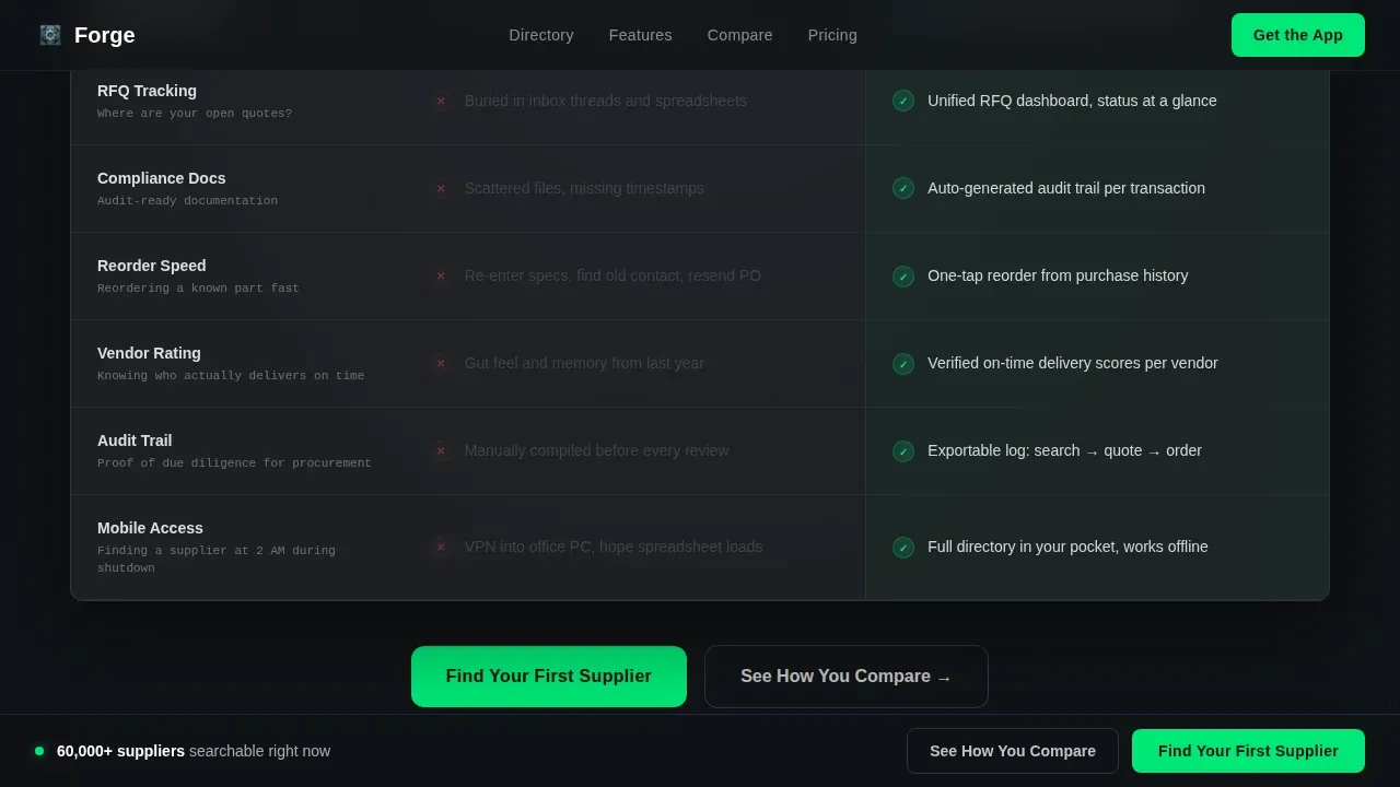
- A scroll-animated eight-row comparison table with signal-green checkmark blooms
- An interactive role and scenario explorer plus a diagnostic quiz section
Feature list
This template includes prompt-backed design and interactive components built specifically for industrial supplier discovery.
Scroll-Animated Comparison Table
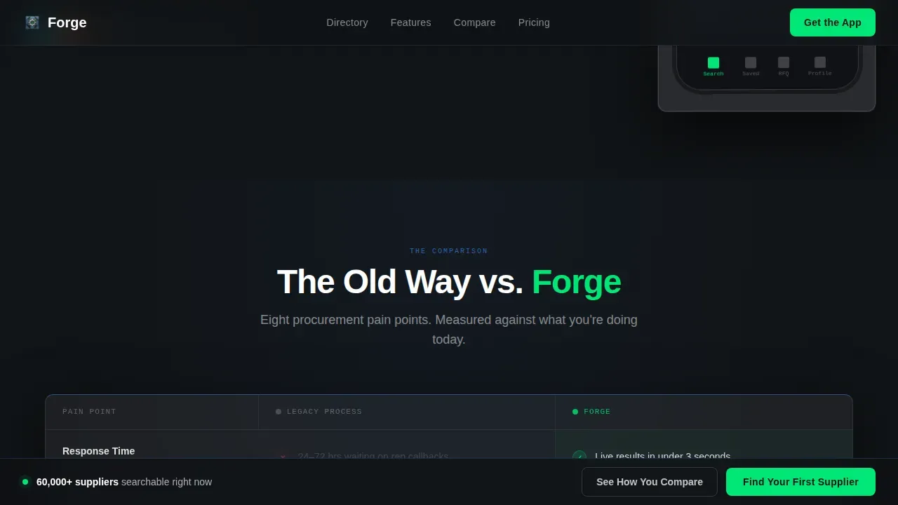
Eight procurement pain points are displayed side by side, old process versus the app, with each row animating into view on scroll. Checkmarks bloom in signal green on the app column while the legacy column grays out, making friction visible and the solution obvious.
Interactive Role and Scenario Explorer
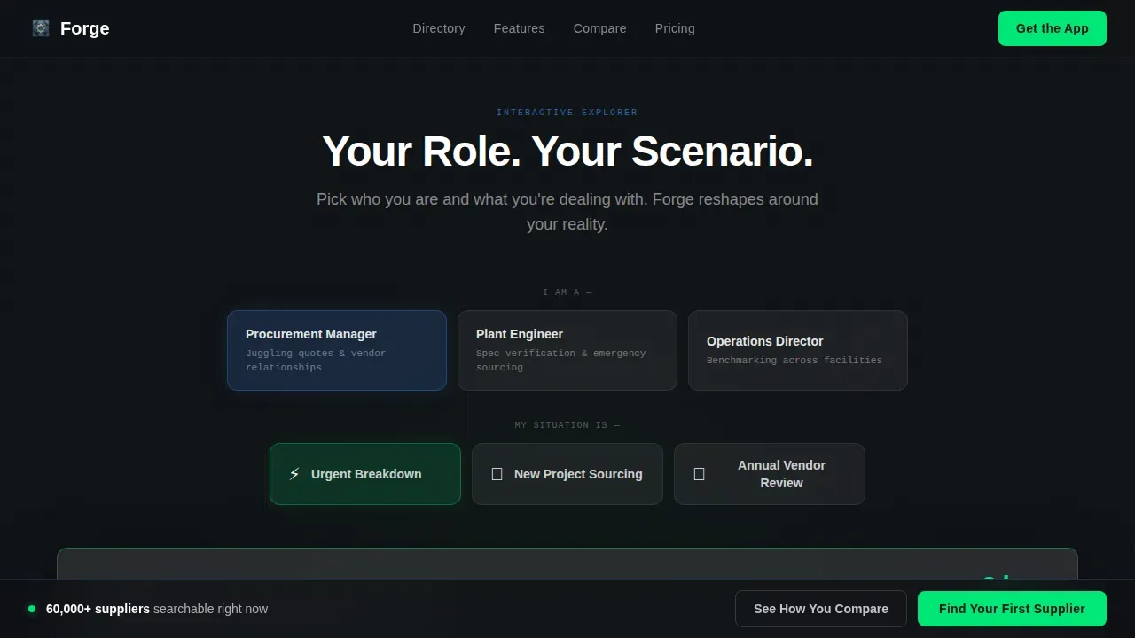
Visitors pick their role, buyer, engineer, or director, then choose a scenario such as urgent breakdown or annual vendor review. The page reshapes its walkthrough content around that selection, replacing a generic feature list with a tailored description.
Diagnostic Quiz Section
A short quiz asks visitors about their current vendor count, average quote turnaround, and biggest sourcing frustration. It returns a personalized benchmark score before prompting the app download, giving the call to action real context.
Kinetic Logo Bar Hero
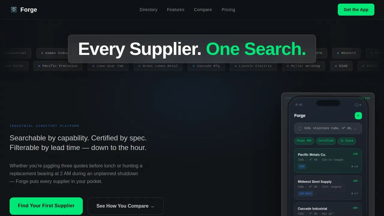
A horizontal marquee of 60-plus recognizable supplier logos runs in two opposing rows at different speeds above the headline and phone mockup. This build of social proof runs automatically, creating a scrolling wallpaper of the industrial ecosystem.
Sticky and Repeated Call to Action
The primary call to action, Find Your First Supplier, is anchored at the bottom of the viewport and repeated after the comparison table. A secondary path, See How You Compare, leads directly into the diagnostic quiz.
Page sections overview
| Section | Purpose |
|---|---|
| Logo Bar Hero | Kinetic wallpaper with headline and app mockup |
| Comparison Table | Old way versus app across 8 pain points |
| Role Explorer | Tailored walkthrough by buyer role and scenario |
| Diagnostic Quiz | Benchmark score before app download prompt |
| Final Call to Action | Sticky and repeated download call to action |
| Footer | Linear single-row footer pattern |
Design & branding system
The design follows a glassmorphic industrial heads-up display aesthetic. Frosted glass cards float above a faintly gridded dark substrate, and every layer communicates depth and precision without visual clutter. The sleek aesthetic keeps users focused on the comparison content and the call to action.
- Frosted panel white at 60% opacity, deep machinist charcoal, translucent steel blue, and signal green for active states
- Manrope for body and headings, JetBrains Mono for data labels and spec strings
- Luminous borders, subtle background blur, and glassmorphic card depth throughout
Mobile & speed optimization
This landing page is mobile-first by design, because the product itself is a mobile app and visitors frequently arrive during emergency sourcing on small screens. The intuitive interface scales cleanly, keeping buttons large and text legible across all devices.
- Seamlessly responsive layout adapts from desktop to phone without layout breaks
- Client components handle interactive sections while the static shell loads instantly
- High-contrast signal green call to action buttons remain prominent on small screens
How this template helps you convert
A marketing landing page works only when it earns the click, and this industrial landing page is structured around that goal from the first scroll to the final download prompt.
- The comparison table makes visitors feel the exact cost of their current process before offering the zero-cost alternative, no credit card, no demo call.
- The role explorer and diagnostic quiz add a flawless user experience by making the page feel personal, which reduces objections and builds trust before the call to action appears.
Other information about this template
This template is ready to customize in Figma, Sketch, and Adobe XD. No-code and low-code tools make it straightforward for non-technical users to build and deploy the page quickly, saving time and resources. The template ensures every section can be edited to match your brand vision and content needs.
- The Forge industrial supplier discovery mobile app landing page template is compatible with major design tools and no-code platforms
- Add your own supplier logo set, swap color tokens, and update copy without touching source code
- The template can support social sharing links to improve net reach and draw traffic from industry communities
- Security and verification badge placements are included as customizable elements in the hero and comparison sections to protect trust signals and help users understand supplier credibility at a glance
- Payments and app store badge slots, Apple App Store and Google Play Store, are built into the final call to action section
Theme
Directory & Discovery
Creative direction
Interactive Explorer
Color system
Glassmorphic
Style
Comparison Table
Direction
Comparison/Versus
Page Sections
Scroll-animated Comparison Table
Interactive Role and Scenario Explorer
Diagnostic Quiz with Benchmark Score
Kinetic Dual-row Logo Bar
Sticky and Repeated Call to Action
Fully Customizable Glassmorphic Sections
Related questions
Can I edit the comparison table rows to match my app's actual features?
Does this landing page template work for both mobile and desktop visitors?
How does the diagnostic quiz help improve conversion on the landing page?
Can I add my own supplier logos to the kinetic logo bar?
Does this template include placements for security badges and supplier verification marks?



