Advanced Directory & Marketplace Platforms Appointment Booking Website Template
Fluent is a hub and spoke landing page template built for language teacher directories. It pairs a glassmorphic dark dashboard aesthetic with high-energy interactive elements: live stat counters, smart filter toggles, flippable teacher cards, and a match quiz. Every section is designed to compress the gap between a visitor's first impression and their first booked lesson.
by Rocket studio
Quick Summary
Fluent is a single-page, anchor-nav landing page template built for language tutor marketplace sites. The page design leads with a live stats dashboard, moves through smart filter demos and teacher card previews, and closes with verified social proof. Every layout decision drives visitors toward one action: clicking through to browse the full teacher directory.
Who This Template Is For
This template speaks directly to EdTech founders, marketplace operators, and independent platform builders who need a landing page that converts browsers into learners. The page is crafted for teams launching or scaling a language teacher directory where matching speed matters as much as matching quality.
- Marketplace operators running a platform that connects students with vetted language tutors across multiple languages and time zones
- EdTech product teams who want a landing page that demonstrates platform features visually before asking visitors to sign up
- Independent builders creating a directory site for a broader audience of language learners, from adult expats to parents sourcing structured course options for their children
What Problem This Template Solves
Finding the right language tutor online usually means opening several tabs, reading vague profiles, and scrolling through results that were never filtered for your actual schedule or teaching style. Most directory landing pages fail to show the depth of their inventory or the speed of the experience before asking visitors to commit. That creates friction early, and friction kills conversion.
This landing page template solves that problem by front-loading proof and interactivity. The page earns trust before it asks for anything. Visitors see real numbers, interact with real filters, and preview real teacher cards before they ever click through to the full directory.
- Learners lose trust when a directory page looks thin or static, and this template replaces that doubt with live metrics, social proof, and interactive examples
- Conversion drops when a sign up form appears before the value is clear, and this page delays the ask until visitors already feel the product works
- Operators lose their target audience when the landing page cannot communicate scale, variety, and speed at a glance
What You Get With This Template
You get a complete, ready-to-customise landing page built around a hub and spoke anchor navigation structure. Each spoke section represents a distinct platform capability, revealed in sequence as visitors scroll. The entire page is designed as a click-through landing page, meaning no sign up form blocks the path to the directory. The primary goal is earning the click, not capturing a lead upfront.
- Full hub and spoke page layout with anchor navigation links that let visitors jump to smart filters, teacher cards, quick-start steps, and the social proof section from any point on the page
- Interactive filter mock-up, flippable teacher card, and a three-question match quiz built into the page as live demonstrations that help users feel the product before they browse
- A glassmorphic dark dashboard design system with frosted card components, a deep indigo background, electric mint call-to-action buttons, and bokeh gradient animations across the entire page
Feature List
This template is built around a set of deliberate, high-impact capabilities drawn from the brief. Each feature serves a specific role in creating a landing page that can convert visitors by making the directory feel immediate and real.
Live Stats Dashboard Header
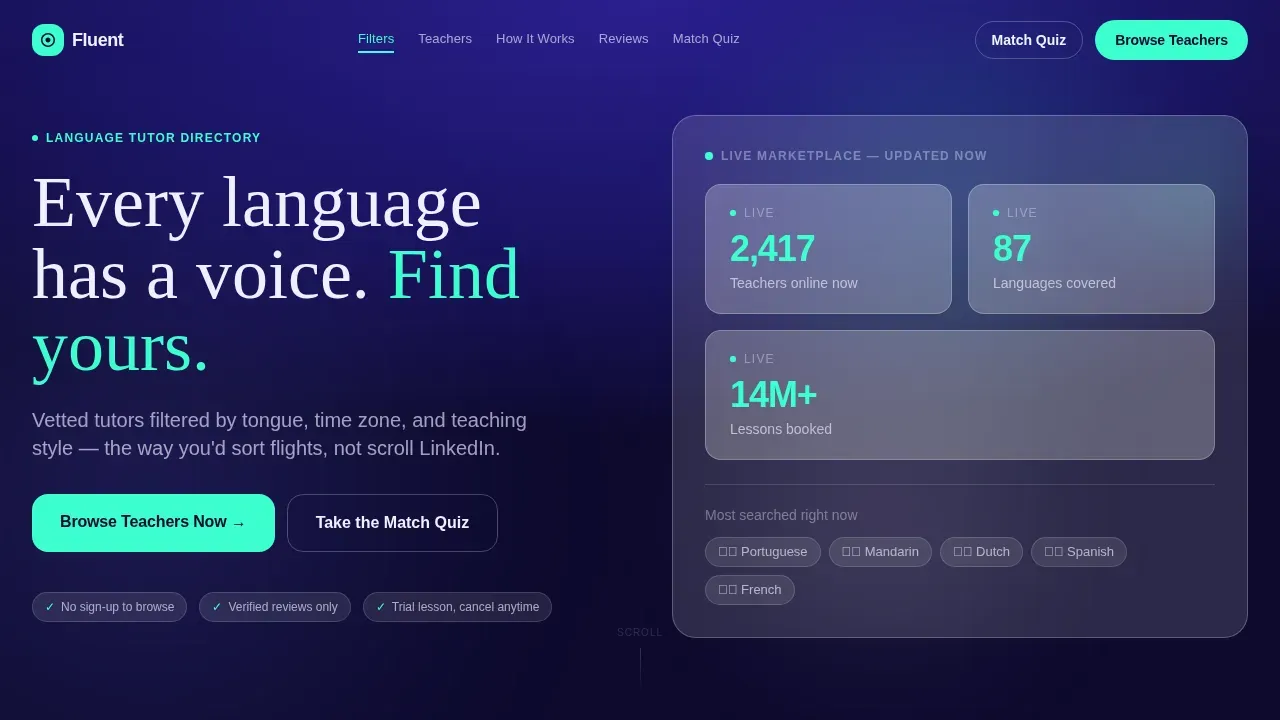
The header is a glassmorphic panel that displays three animated metrics: active teachers, languages available, and total lessons booked. Each stat lives in its own frosted card with a count-up animation. There is no hero photo or illustration. The data itself is the visual, and the implicit story it tells is one of scale and activity. This approach gives the page design an energy that static headers cannot match.
Smart Filter Interactive Demo
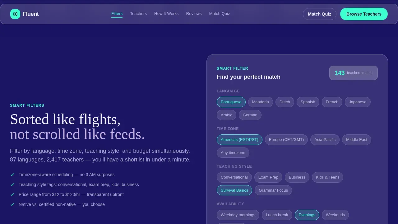
The filter section contains a working mock-up that visitors can actually toggle. Language, time zone, and teaching style filters are all represented. This interactive element lets users experience the filtering logic before they reach the full directory. It is one of the most powerful trust-building elements on the page because it shows the product working in real time rather than describing it in words.
Flippable Teacher Cards
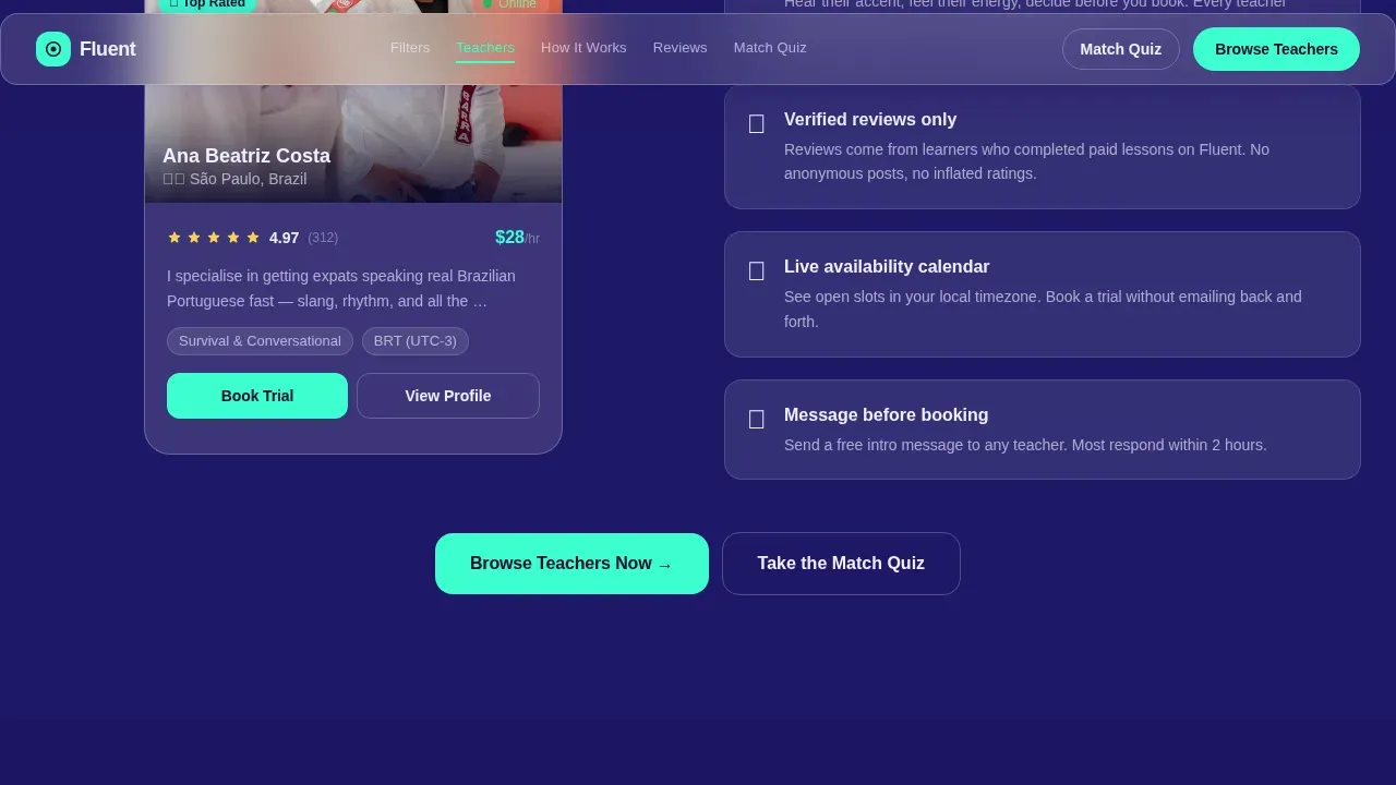
Each sample teacher card flips on interaction to reveal ratings, availability slots, and lesson details on the reverse face. This card-flip interaction is a compact and visually appealing way to show depth without expanding the layout. Visitors get a realistic preview of what the directory experience looks like. The card format is one of several examples of the page's commitment to demonstration over description.
Match Quiz Path
A secondary call-to-action offers visitors a three-question language-goal selector. Answering the short quiz routes them to a pre-filtered results page within the directory. This feature gives users who are not yet ready to browse freely a guided onboarding process that still ends in the directory. It is a low-friction path that serves learners who need a little more direction before they commit.
Anchor Navigation System
The hub and spoke layout is held together by anchor navigation links at the top of the page. Visitors can jump directly to any spoke section: smart filters, teacher cards, how-fast-you-start, or social proof. This easy navigation structure makes the landing page feel more like an app interface than a scrolling brochure. It also helps users on the mobile version jump to the section most relevant to their decision stage.
Verified Social Proof Section
A dedicated section houses verified review quotes alongside lesson count metrics and live teacher stats. Video testimonials are referenced within this section to give the social proof layer additional depth. This section uses specificity over generality. Rather than vague praise from happy customers, the reviews are tied to outcomes, languages learned, and teaching styles experienced. That level of detail makes the social proof land harder.
Page Sections Overview
| Section | Purpose |
|---|---|
| Hero Stats Dashboard | Opens with live metrics and the primary headline |
| Smart Filter Demo | Interactive filter mock-up visitors can toggle |
| Teacher Card Preview | Flippable card showing ratings and availability |
| How Fast You Start | Compresses the curiosity-to-first-lesson journey |
| Social Proof Reviews | Verified quotes, video testimonials, lesson metrics |
| Footer (Linear) | Single-row footer with quick access links and secondary nav |
Design & Branding System
The visual language of this landing page is built on a glassmorphic dark theme. The overall color scheme is layered: a deep app-shell indigo (#1B1464) forms the background, frosted translucent cards sit on top at rgba(255,255,255,0.15), and electric mint (#3CFFD0) drives every primary action element. Frosted lilac (#C3B1E1) handles hover states. The result is a page design that feels like a rain-wet phone screen at night, backlit and legible, with depth created through blur rather than traditional shadow.
Typography pairs DM Sans for interface copy and body text with Fraunces, a serif display typeface, for the main headline. This pairing grounds the high-tech visual in something warm and human. The design aligns intentionally with the emotional experience of language learning itself: precision meeting personality.
- Color scheme: Deep indigo background, electric mint for primary actions, frosted lilac for hover states, translucent card white for all frosted panel surfaces
- Typography: DM Sans for body and user interface copy, Fraunces for display headlines, creating a contrast between technical clarity and expressive warmth
- Motion design: Bokeh gradient drift in the header, count-up stat animations, card flip transitions, staggered section reveals, and filter toggle animations throughout the page
Mobile & Speed Optimization
The page is desktop-first by design, reflecting how many users initially discover and evaluate a language tutor directory from a larger screen. However, the mobile version is a fully supported layout with strong attention to touch interaction and readability on smaller viewports. Interactive elements like the filter mock-up and teacher card flip are adapted for tap rather than hover.
The template uses a Server Components approach for static sections of the landing page and Client Components for interactive filters, stat animations, and the match quiz. This division keeps the page feeling fast without sacrificing the interactivity that makes the design compelling.
- Desktop-first with full mobile support: The layout, feature grid, and interactive demos all adapt cleanly to smaller screens
- Component rendering strategy: Static sections load with server rendering; interactive sections use client rendering to keep animations smooth
How This Template Helps You Convert
This landing page is built specifically to convert visitors into directory users without relying on a traditional lead-capture sign up form at the top of the page. The conversion logic follows a clear sequence: prove depth, demonstrate speed, lower friction, earn the click.
- Prove scale and activity immediately: The header's live stat dashboard shows visitor after visitor that this is a living marketplace, not an empty shell. The count-up animation makes the numbers feel real and current, which is a key trust building element for first-time visitors.
- Simulate the product before the browse: The interactive filter mock-up and flippable teacher cards let visitors feel the experience before they commit. This demonstration-first approach is one of the most effective ways to create high converting pages because it collapses the uncertainty that normally blocks clicks.
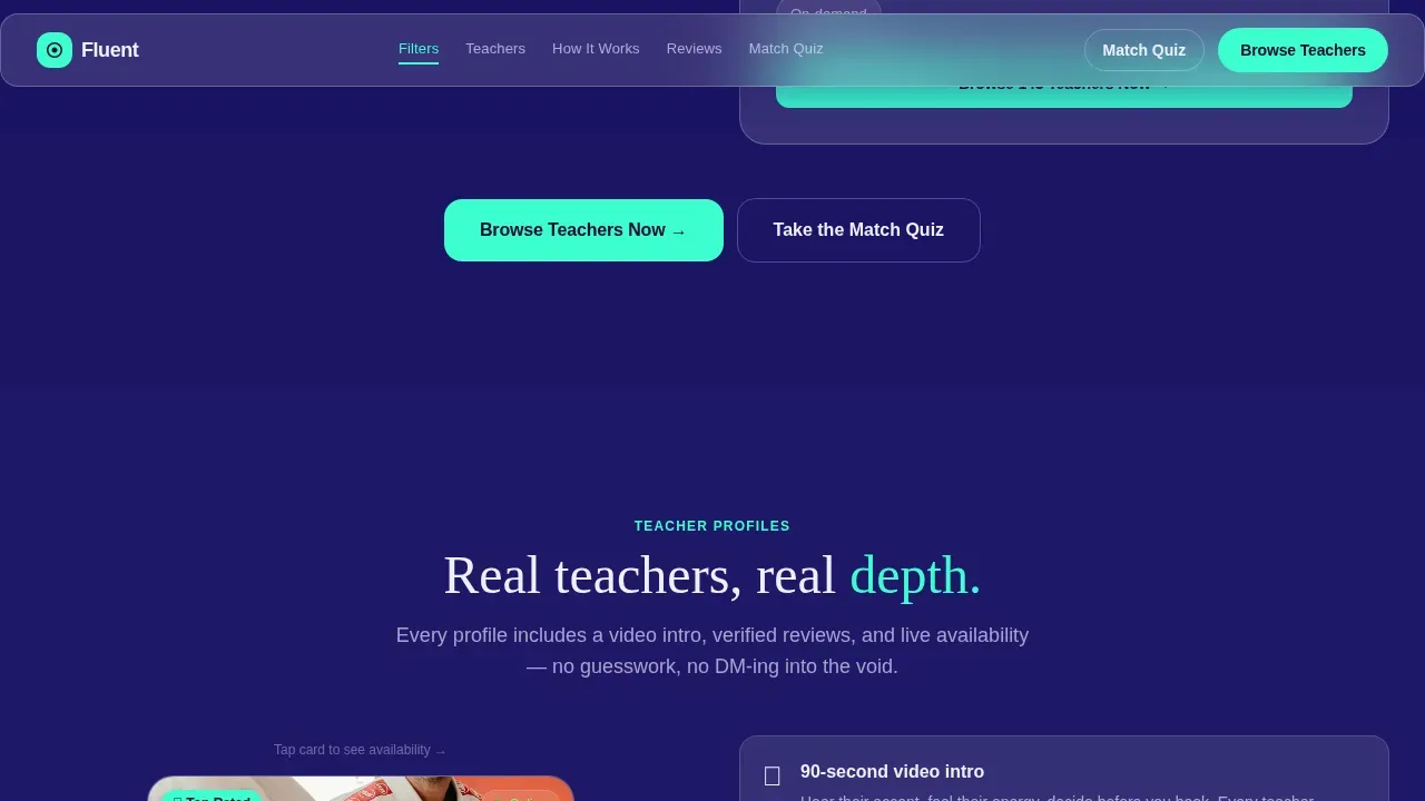
- Give every visitor a clear next step: The electric mint "Browse Teachers Now" call-to-action repeats at the header and after each spoke section. The secondary path through the match quiz gives hesitant visitors an alternative route. A clear call to action at every decision point means visitors never have to hunt for what to do next, and the call to action pop of the electric mint color ensures they always see it.
Other Information About This Template
This section covers additional practical details about working with and deploying this landing page template. These points are useful for anyone evaluating whether this template fits their current build or brand requirements.
This template is part of a broader library of landing page templates designed for directory and marketplace platforms. The Fluent smart hub language teacher directory landing page template was built specifically for the EdTech niche but its layout, feature grid structure, and interaction patterns can be adapted for other service-based directory sites.
The page design is rooted in a minimalist design philosophy applied through a dark background visual system. While many page templates rely on a white background or white space to create clean layouts, this template achieves a clean layout through contrast, blur, and layered depth instead. The dark background actually makes the electric mint call-to-action and frosted lilac hover elements more visually appealing, and the overall visual appeal of the design is higher than what a standard light-mode directory template achieves.
- Customization options: The color scheme, typography, stat values, filter labels, teacher card content, and quiz questions are all editable. Teams can tailor the landing page to match their brand without altering the underlying layout or animation logic.
- No sign up form barrier: The page is deliberately designed as a click-through landing page. Visitors reach the directory without filling in a sign up form first, which reduces drop-off significantly in real-world deployment across many users.
- Drag and drop compatibility: The template structure is compatible with drag and drop editors that support component-based layouts. Operators can reorder spoke sections, swap out feature grid items, and adjust bullet points within section blocks without writing code.
- Design ideas for customisation: Teams can swap the frosted lilac hover color for their own brand accent, replace the stat values with their actual platform numbers, and add a blog link or resources link to the footer navigation links on the right side of the linear footer row. Drag and drop tools make these changes fast and easy. Additional drag and drop adjustments allow operators to add a course catalog teaser or a contact sales prompt for enterprise inquiries.
- Sales team and enterprise use: If your platform serves institutional clients such as schools or corporate language programs, a contact sales call-to-action can be added alongside the primary browse button. The page's intuitive design and clean layout make it easy to introduce additional conversion paths without cluttering the experience. A dedicated section can be added for enterprise inquiries if needed, and this approach has been used to reach a broader audience beyond individual learners.
- Full disclosure on interactivity: The interactive filter mock-up and card flip are front-end demonstrations. They are designed to simulate the directory experience visually and build learner confidence. They route visitors to the actual directory rather than processing real queries on the landing page itself.
- Social proof depth: The social proof section supports video testimonials alongside text reviews. Happy customers who provide video testimonials tend to generate stronger trust signals than text alone, and the section layout accommodates both formats. The design of the social proof area uses specificity and context to make each review feel earned.
- Onboarding process alignment: The match quiz functions as a lightweight onboarding process for learners who need direction. It asks three quick questions about language goals and routes users to a pre-filtered directory view, making the first session of browsing feel curated rather than overwhelming.
- Easy navigation across the page: The anchor nav structure gives visitors easy navigation to any section of the landing page instantly. Every section is easily accessible from the top of the page, so visitors who arrive with a specific question can jump directly to the answer. Quick access to the social proof section, the smart filter demo, or the teacher card preview is always one click away.
- Platform features and teaching context: The template is designed to highlight teaching style as a filter dimension alongside language and time zone. This matters for students who learn differently: some prefer conversational practice, others want structured course delivery, and the filter system and card flip interaction both surface these differences clearly. The landing page ensures that the platform features feel tangible and relevant to every learner type, whether they are studying for a course exam or preparing for a job abroad.
- Language and course coverage: The template's stat dashboard is pre-configured to reference 87 languages and a large lesson volume. When deploying the template, operators should replace these with their actual platform numbers to maintain honesty and accuracy. The same applies to any course category labels used in the filter mock-up.
Theme
Dashboard Pro
Creative direction
Launch Energy
Color system
Glassmorphic
Direction
Click-Through
Page Sections
Live Stats Dashboard Header
Interactive Smart Filter Demo
Flippable Teacher Card Preview
Three-question Match Quiz
Anchor Navigation Hub and Spoke Layout
Verified Social Proof Section
Related questions
Does this template include a sign up form?
Can I change the colors, stat values, and filter labels?
Is the interactive filter a real search tool?
Does the template work well on mobile devices?
Can I add a course catalog or blog section to the template?



