Connect — Powerful Communications API Landing Page Template
This is a bento grid landing page template built for developers and startup teams who want to showcase programmable communications. It combines a dark terminal aesthetic with iridescent accents, interactive code toggles, an animated API flow diagram, and a friction-minimal sign-up form. The result is a high-impact, conversion-focused page that turns curiosity into action fast.
by Rocket studio
Quick summary
This single-page template gives developers and startup decision-makers a ready-made landing page that demonstrates the power of programmable communications. It uses a bento grid layout, iridescent design, and interactive elements to display real code samples, guide visitors through an API flow, and drive sign-ups with minimal friction.
Who this template is for
This template is built for technical audiences who need a landing page that speaks their language. It suits teams evaluating SMS and messaging infrastructure, and developers who want to prove a concept quickly.
- Junior developers and bootcamp graduates building their first real-world API project
- Startup founders and CTOs comparing build-versus-buy options for voice and SMS
- Developer advocates and technical marketers launching campaigns for a communications product
What problem this template solves
Most landing page designs talk around the technology. This one leads with it. A developer landing page that buries its code or hides its value proposition loses the visitor in seconds. This template solves that directly.
- Visitors get live, toggleable code samples immediately so they can evaluate without clicking away
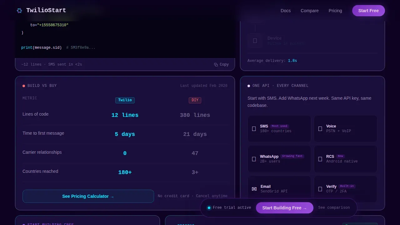
- The comparison card makes the build-versus-buy case visually, with animated counters instead of static claims
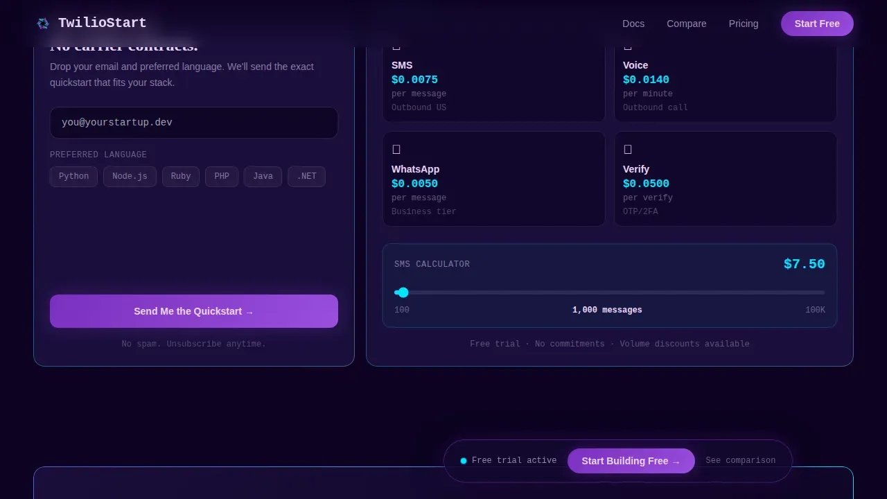
- The sign-up form asks only for email and preferred language, stripping friction to the minimum
What you get with this template
You get a complete, production-ready bento grid landing page with every section pre-built and wired for interaction. Each component is a self-contained discovery zone that rewards curiosity with a micro-interaction.
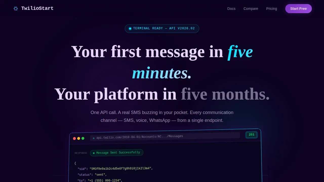
- Hero section with a 3D browser chrome product screenshot and a floating status badge
- Bento grid body with a live code snippet card, an API flow diagram card, and an animated comparison card
- Trust bar, sign-up form, pricing transparency card, and a linear single-row footer
Feature list
This template ships with the following built-in features. Each one is designed to display information clearly and move a visitor toward action.
Live Code Snippet with Language Toggle
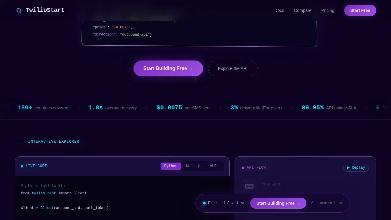
The code card lets visitors switch between Python, Node, and cURL with animated syntax highlighting on each switch. Code renders in cyan on a near-black background, making every line easy to scan. Visitors can paste or copy samples directly without leaving the page.
Animated API Flow Diagram
A mini flowchart shows the journey from API call through to the end device. Each node lights up sequentially as the visitor scrolls, turning a dry technical concept into something that feels alive. This card functions as both education and a soft sales argument.
Animated Comparison Card
This card stacks the template approach against building raw infrastructure in-house. Animated counters display lines of code, time to first message, and carrier relationships managed side by side. A secondary call-to-action button links to a pricing calculator directly inside the card body.
Minimal Sign-Up Form
The form captures email and preferred programming language only. No credit card, no company name. After a visitor submits, the page displays a confirmation message. Form variables are kept to the minimum needed to route the right quickstart content to each new user.
Floating Primary Call-to-Action Bar
A "Start Building Free" button is pinned to a floating bottom bar that becomes active after the first scroll. This keeps the primary call-to-action visible across the full page body without cluttering the hero. It follows best practices for keeping a single focused call to action above constant visibility.
Trust Bar Marquee
A scrolling ticker displays headline data points such as global reach across 180-plus countries, developer community size, and delivery metrics. The marquee loads automatically and keeps the page body from feeling static between bento cards.
Page sections overview
| Section | Purpose |
|---|---|
| Hero with Screenshot | Display the product in action with a 3D browser chrome image and headline |
| Live Code Card | Let visitors toggle and review real code samples across multiple languages |
| API Flow Diagram | Animate the full message journey from call to device on scroll |
| Comparison Counter Card | Display build-versus-buy data with animated counters and a pricing link |
| Trust Bar Marquee | Show global reach stats and developer community data in a scrolling ticker |
| Sign-Up Form | Capture email and language preference with minimal required fields |
| Pricing Transparency Card | Present pay-as-you-go details in a clear, scannable card format |
| Single-Row Footer | Close the page with a clean linear footer pattern |
Design & branding system
The visual style follows a Dynamic Motion theme using an AI Iridescent color system. The palette is engineered to read as serious engineering first, with iridescence as the reward for attention rather than the default state.
- Background color is void black (#0D0221); bento card borders use 1px iridescent lines with a shimmer effect on scroll, with border color shifting between holographic violet (#7B2FBE) and electric cyan (#00E5FF)
- Typography uses JetBrains Mono for all code display, DM Sans for body text with controlled line height and font size, and Fraunces for display headings; font weight varies between regular and bold to create clear hierarchy
- Call-to-action elements pulse in violet with pearl (#E8D5F5) text; background color stays consistently dark so every accent reads with full contrast; max width and text align values are set per section to keep the layout tight and readable
Mobile & speed optimization
This template is desktop-first by design, built for developers working at terminals. It also supports full mobile display so visitors browsing on phone can still engage with the page without losing context.
- Layout adjusts to device width so the bento grid reflows into a single column on smaller screens, keeping max width and margin left values clean at every breakpoint
- Animations use GPU-accelerated transforms and an Intersection Observer pattern so counters and node lighting only trigger when the relevant div enters the viewport, reducing unnecessary load
- The page is structured to load the hero image and primary call-to-action first, keeping initial render fast; a slow loading page deters technical visitors, so the template prioritises above-the-fold speed
How this template helps you convert
This template applies established high-converting landing page principles throughout every section. Each design and copy decision pushes the visitor toward one action.
- The hero headline immediately addresses the visitor's core question with a benefit-oriented statement, and the floating call to action bar keeps the primary action visible without interrupting the discovery experience as the visitor scrolls deeper into the bento grid.
- The comparison card accumulates evidence across animated data points, making the decision feel obvious before the visitor reaches the form; the sign-up form then presents only two fields, email and preferred language, so abandonment stays low and data collected stays actionable.
- Running A/B tests on call to action phrasing, headline wording, and card visuals helps teams use analytics data to iterate quickly; analytics can track visitor behavior, conversions, and cost-per-lead so every campaign version improves on the last.
Other information about this template
This template sits within the Documentation & Support category under the Twilio Getting Started Guide niche. The following notes cover practical context for anyone customising or deploying it.
- The twilio build programmable communications api landing page template is designed around the developer-first philosophy described in twilio docs, where an account sid and auth token are the only credentials needed to authenticate your first API request
- The twilio console provides access to the content template builder, where users can create and save content templates for messaging campaigns; content templates support variables for personalisation and go through a whatsapp approval process before they can be used on whatsapp channels
- Whatsapp review and the broader whatsapp approval workflow require submitting template samples for meta review; the approval process can take time, so plan campaign timelines accordingly and save approved templates for reuse across future campaigns
- The twilio console also lets you review, test, and delete content templates; after a whatsapp review passes, the template status becomes active and messages can post to whatsapp at scale
- No-code landing page builders such as those with drag-and-drop interfaces can be used alongside this template if your team prefers a visual editor; platforms with built-in analytics tools help track visitor data and optimise campaigns without programming knowledge
- This template can support facebook and whatsapp campaign flows when connected to the appropriate messaging channels via a twilio account; check twilio docs for the latest json response formats, https endpoint requirements, and parameter details
- You can build your landing page on dedicated builders, but this template gives technical teams a pre-styled, interaction-ready starting point that no generic builder matches for developer-focused content type and style
- Analytics insights lead to better data-driven decisions; track page metrics including visitors, conversion rates, cost-per-visitor, and cost-per-lead to keep campaigns performing and justify your plan to stakeholders
Theme
Dynamic Motion
Creative direction
Interactive Explorer
Color system
AI Iridescent
Style
Bento Grid
Direction
Comparison/Versus
Page Sections
Live Code Toggle with Syntax Highlighting
Scroll-triggered API Flow Diagram
Animated Build-versus-buy Comparison Card
Friction-minimal Sign-up Form
Floating Persistent Call-to-action Bar
Iridescent Bento Grid Layout
Related questions
What sections does this landing page template include?
Can I change the code language samples shown in the snippet card?
Does the sign-up form require a credit card from visitors?
How does the comparison card communicate value to technical visitors?
Is this template suitable for WhatsApp campaign landing pages?



