Business Communication Cost Calculator Website Template
Dial is a bento grid landing page template built for virtual phone number services. It combines a Feature Tab Switcher hero, an interactive cost calculator, a world map coverage tile, and a three-step lead capture form into a single, editorial-grade page. The Monochrome Steel palette and Directory & Discovery theme give every section the authority of a well-researched industry brief.
by Rocket studio
Quick summary
Dial is a single-page bento grid landing page template designed for cloud telephony and virtual phone number services. It presents local, toll-free, and international phone number options through a tabbed hero, data-rich bento tiles, and a progressive three-step form. The result is a landing page that feels less like a marketing pitch and more like a trusted industry reference.
Who this template is for
This landing page template is built for teams and founders who need to communicate the speed and reach of a virtual phone number service. The tone is authoritative and data-led, which suits businesses that want to convert informed buyers rather than casual browsers.
- Startup founders setting up their first business phone line and needing instant local presence
- E-commerce operations managers who juggle phone numbers across multiple countries and need a single landing page that explains coverage clearly
- Remote sales teams that need a recognizable local area code without committing to a physical office lease
What problem this template solves
Getting a virtual phone number should feel effortless, but most landing pages in this space either bury pricing behind a demo form or present features without proof. Visitors arrive, scroll once, and leave without converting. This template solves that by front-loading every trust signal a buyer needs before they fill in a single field.
- Buyers can see live number availability, sample phone numbers with flags, and mini pricing badges all inside the hero, so there is no reason to leave the page and search a competitor's site
- The calculator bento tile lets visitors determine their own estimated cost from actual call volume, removing price anxiety before the call to action appears
- The compliance checklist tile and social proof quote card answer objections that typically require a demo call, keeping the conversation on the page
What you get with this template
This template delivers a complete, fully structured landing page built around the specific needs of a virtual phone number service. Every section has a defined role, and every interactive element serves the core goal: turning a curious visitor into a confirmed lead. The page is designed so that visitors can access the information they need, answer their own questions, and reach the sign-up form without friction.
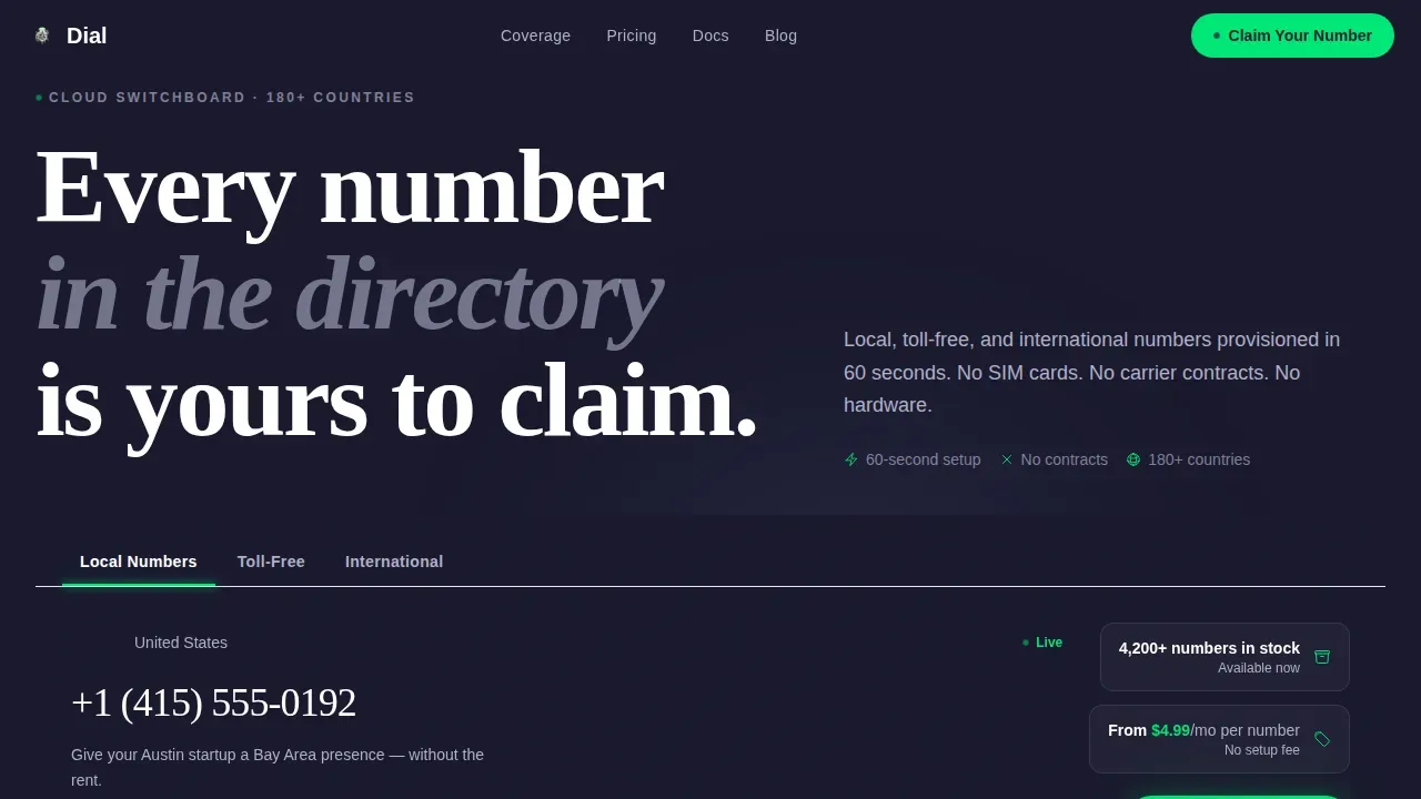
- A Feature Tab Switcher hero with three tabs (Local Numbers, Toll-Free, International) that each display a sample phone number, country flag, live availability count, pricing badge, and a one-line use case description
- Five fully built bento sections covering coverage mapping, carrier comparison, social proof, compliance, cost estimation, and a three-step progressive lead capture form
- A secondary conversion path inside the calculator tile that offers a full pricing report in exchange for an email address, capturing visitors who are not ready to claim a number but are deep in evaluation
Feature list
This landing page template ships with six distinct interactive and visual components. Each one is described below with enough detail for you to understand what it does and why it belongs on a page selling a virtual phone number service.
Feature Tab Switcher Hero
The header is structured as a wide bento card containing three clickable tabs labeled Local Numbers, Toll-Free, and International. Clicking any tab reshuffles the content panel below: a sample phone number with its country flag appears alongside a live availability counter showing how many numbers are in stock, a mini pricing badge, and a short use case line. The tab indicator animates with a sliding underline in signal-green, and the content swaps with a card-flip motion. This gives visitors an immediate, tactile sense that thousands of numbers are available and ready to claim right now, which is far more persuasive than a static hero image.
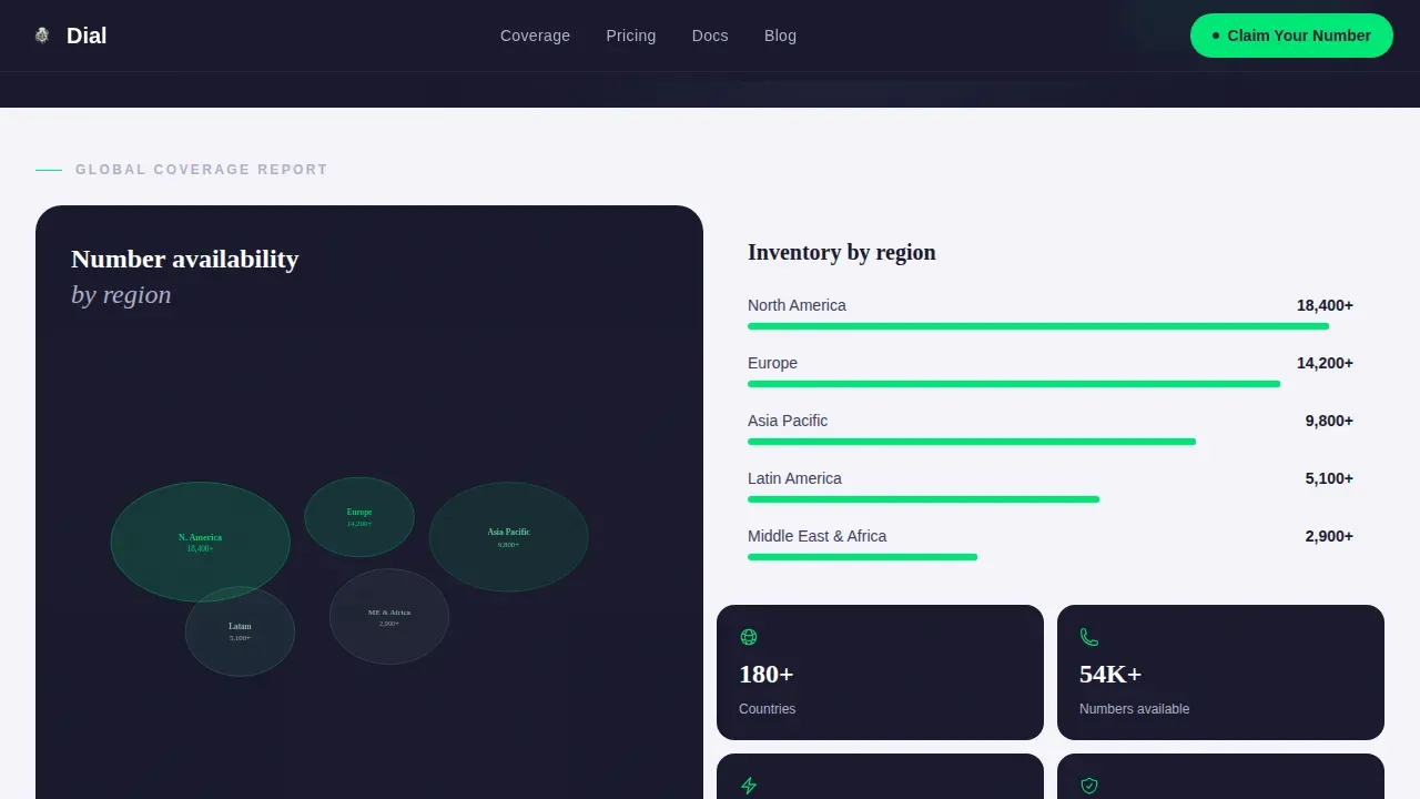
World Map Coverage Tile
A dedicated bento tile displays a heat-mapped world map that plots phone number availability by region. Visitors can see at a glance which countries have deep inventory and which regions are expanding. Companion stat tiles sit beside the map, displaying headline metrics such as 4,200-plus numbers in stock and 180-plus countries covered. This tile communicates global reach without requiring a visitor to scroll through a country list or contact support, making it one of the most efficient trust-builders on the page.
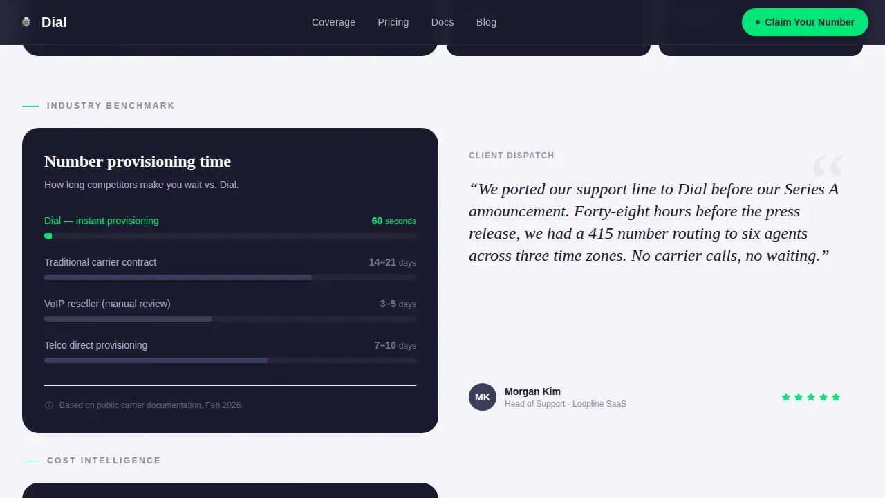
Carrier Comparison Bar Chart
A bento tile presents a bar chart comparing traditional carrier porting times against the instant provisioning time this service offers. The visual contrast makes the value proposition concrete. When visitors can see the difference between waiting days for a traditional phone number to port and receiving a virtual phone number in under sixty seconds, the decision to sign up becomes much easier. This tile earns credibility by presenting honest benchmark data rather than vague marketing claims.
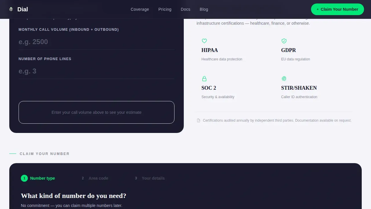
Interactive Cost Calculator
The calculator tile invites visitors to type their estimated monthly call volume and see a live cost estimate update on screen. No page reload is needed. After the estimate displays, a secondary call to action offers visitors a full pricing report in exchange for their business email. This two-step micro-conversion is ideal for buyers who are evaluating the service seriously but are not yet ready to claim a number. It captures intent at a deeper stage of the evaluation process and gives the business a second touchpoint.
Three-Step Progressive Lead Form
The primary lead capture section uses a progressive disclosure format across three steps. In step one, the visitor selects a number type: local, toll-free, or international. In step two, a searchable dropdown lets them choose a country and local area code, with real-time availability shown inline. In step three, they enter their business email and company name. There is no credit card field and no commitment language. The form feels like a search engine rather than a checkout, which significantly reduces drop-off at the conversion point.
Compliance and Social Proof Tiles
Two additional bento tiles handle the trust layer of the page. One tile displays a compliance checklist showing Health Insurance Portability and Accountability Act (HIPAA) and General Data Protection Regulation (GDPR) badges for regulated-industry buyers. The adjacent tile is a quote card from a Head of Support at a software-as-a-service (SaaS) company, giving the page a credible first-person voice. Together, these tiles answer the two most common late-stage objections: "Is this service compliant?" and "Does it actually work for real businesses?"
Page sections overview
| Section | Purpose |
|---|---|
| Hero Tab Switcher | Display local, toll-free, and international phone number options with live availability, pricing badge, and signal-green tab indicator |
| World Map Coverage | Show heat-mapped phone number availability across 180-plus countries with headline metric stat tiles |
| Carrier Comparison | Bar chart contrasting traditional porting time versus instant virtual number provisioning |
| Social Proof Quote | Testimonial card from a SaaS Head of Support to validate real-world service quality |
| Cost Calculator | Interactive tile where visitors enter call volume and receive a live cost estimate with a secondary email capture |
| Compliance Checklist | HIPAA and GDPR badge tile addressing regulatory requirements for business buyers |
| Three-Step Form | Progressive lead capture sequence: number type, area code selection, business email entry |
| Footer Row | Single linear row with brand links, legal pages, and contact information |
Design & branding system
The visual identity follows a Directory & Discovery theme executed through a Monochrome Steel color system. The palette was chosen to feel like the interior of a precision server rack: cool, structured, and quietly authoritative. Backgrounds alternate between forge black and clean-sheet white to create a newspaper-density rhythm across the bento grid. Signal-green appears only on active tab indicators, toggle states, and primary call to action buttons, which keeps it visually charged every time it appears on screen.
- Colors: forge black (#1A1A2E) for primary backgrounds, brushed gunmetal (#3D3D5C) for subheadings and divider lines, milled aluminum (#B0B0C8) for body text on dark panels, clean-sheet white (#F4F4F8) for light-background tiles, and signal-green (#00E676) reserved exclusively for active states and call to action elements
- Typography: Fraunces editorial serif for all headings (giving the page an industry-report authority) paired with DM Sans for body copy and user interface labels, which keeps body text clean and readable at small sizes
- Layout: a bento grid with generous white space between tiles so each data point gets its own breathing room; matte and subtly reflective surface treatments on cards echo the server-rack aesthetic without resorting to gradients or noise textures
Mobile & speed optimization
This landing page template is designed desktop-first but ships with a fully mobile optimized layout. On smaller screens, the bento grid reflows into a single-column stack, and the primary call to action reappears as a sticky bottom bar so the "Claim Your Number" button is always within thumb reach. The mobile layout preserves the tab switcher interaction and the calculator tile so visitors on mobile devices lose none of the core conversion functionality.
- The sticky mobile call to action bar keeps the primary sign-up path visible at all times, preventing visitors from losing the conversion point while scrolling through data tiles
- Interactive components including the tab switcher, cost calculator, and three-step form are built as client-side components, while static bento tiles use server-rendered markup to keep initial load weight low
- Prominent click-to-contact links are placed where appropriate so visitors on a smartphone can initiate contact without needing to type a full URL or navigate away from the landing page
How this template helps you convert
This landing page is engineered around two conversion paths: a primary path for visitors ready to claim a number now, and a secondary path for visitors still evaluating cost and fit. Both paths are visible without requiring any additional scroll or navigation.
- The Feature Tab Switcher hero delivers a prominent, above-the-fold call to action alongside live availability data, so the first thing a visitor sees is proof that the right number is already waiting for them. A signal-green "Claim Your Number" button appears immediately in the hero and again as a sticky bar on mobile, ensuring the call to action is never more than one tap away regardless of how far down the page a visitor has scrolled.
- The calculator tile creates a second conversion moment deeper in the page. After visitors input their call volume and see a cost estimate, they are offered a full pricing report in exchange for their business email. This secondary call to action captures high-intent visitors who are comparing services and not yet ready to commit, turning a bounce into a warm lead. Integrating this kind of SMS marketing and cost-awareness content into the landing page experience can significantly enhance customer engagement and improve overall conversion rates.
Other information about this template
This template sits in the Telecom and Connectivity category under the Communication and Unified Comms subcategory, targeting the virtual phone number niche. It is relevant for any business building a landing page around cloud telephony, virtual phone services, or online phone number provisioning. The following points cover additional context, design philosophy, and practical usage notes that did not fit earlier sections.
- Virtual phone numbers are linked to an online account rather than a specific physical location or device. This means users can make and receive calls across mobile devices, desk phones, or computers connected to a Voice over Internet Protocol (VoIP) service, and this template's copy tiles are written to explain that distinction clearly to first-time buyers who are comparing virtual options against traditional phone numbers.
- The template is built to support SMS-enabled number services. Because one-third of consumers prefer to reach a business via text message rather than any other channel, the landing page copy tiles are structured to surface SMS capabilities alongside voice, giving visitors a complete picture of what their virtual number can do. This supports broader SMS marketing goals and bulk SMS messaging use cases.
- A virtual phone number keeps a personal number separate from business calls and messages. The compliance tile and privacy language built into the form step are intentionally worded to reassure users that their personal number stays private throughout the process.
- Businesses can use a virtual number to forward calls to any device, which means a remote team member can receive calls on their mobile app, laptop, or desk phone without the caller ever seeing a personal number. The carrier comparison tile illustrates this benefit visually.
- The three-step form is designed around best practices for lead capture landing pages: a clear value proposition at every step, a searchable dropdown for area code and country selection, no credit card requirement, and no commitment language. These choices directly support higher conversion rates by removing friction at every decision point.
- The bento tile layout uses deliberate white space between cards so that each tile communicates one idea cleanly. This newspaper-density grid approach means the page can display a high volume of information without feeling cluttered, which is important for buyers who scroll quickly and need to scan rather than read.
- Tracking metrics such as click-through rates on the tab switcher, calculator engagement rates, and form completion rates across all three steps can provide actionable feedback on how well the page is performing. The modular bento structure makes it straightforward to test individual tiles independently.
- The secondary conversion path inside the calculator tile is a practical example of how to capture email addresses from visitors who are in a research mindset rather than a buying mindset. Offering a pricing report or spreadsheet as a lead magnet in exchange for a business email is a common and effective approach for B2B services.
- This template was generated on the Rocket.new platform, which allows users to build full, production-ready apps and landing pages from natural-language prompts. That means you can modify any tile, adjust the color system, swap placeholder copy, and deploy the page without starting from a blank file.
- The dial instant virtual phone number landing page template is categorized under the Bento Grid template style and follows the Industry Report creative direction, which treats every data tile as a piece of evidence rather than a sales argument. This approach is particularly effective for buyers who distrust traditional marketing pages and respond better to benchmarks, maps, and real-world metrics.
- Landing page themes like this one are ideal for marketers, founders, and operations teams who need a focused, goal-oriented page that guides visitors along a single conversion path. Because the page avoids internal navigation links that lead to other site pages, visitors are less likely to drift away from the account creation goal.
- The template supports a pay-as-you-go pricing display structure. The calculator tile and the mini pricing badge in the hero tab can be updated to reflect any pricing model, from flat monthly rates to per-minute billing. A transparent pricing approach on a landing page builds trust faster than gating all cost information behind a sales call.
- For teams running SMS marketing campaigns, the message match between an SMS link and this landing page is intentionally tight. The landing page opens directly on the number search experience, which mirrors the promise made in a typical virtual number SMS campaign. This alignment between the initial SMS message and the landing page content helps maintain user interest and improve click-to-lead conversion rates.
Theme
Directory & Discovery
Creative direction
Industry Report
Color system
Monochrome Steel
Style
Bento Grid
Direction
Lead Generation
Page Sections
Feature Tab Switcher Hero with Live Availability
World Map Heat-mapped Coverage Tile
Carrier Comparison and Social Proof Section
Interactive Cost Calculator with Secondary Lead Capture
Three-step Progressive Lead Capture Form
Compliance Checklist and Trust Badge Tile
Related questions
What types of phone numbers does this landing page template showcase?
Can visitors use this landing page on mobile devices?
How does the virtual phone number provisioning process appear inside the template?
Does this template address compliance for regulated industries?
Can I capture leads from visitors who are not ready to sign up immediately?


