Internet Service Provider Reviews & Testimonials Website Template
Uplink is a split-screen landing page template built for temporary event internet providers. It combines a terminal-style hero, escalating spec sheet sections, a deployment scale grid, social proof metrics, and a fixed app download call-to-action bar. The Dashboard Pro theme uses a Midnight Blue color system with teal accents, creating a network operations center aesthetic that speaks directly to AV directors and event production managers.
by Rocket studio
Quick summary
Uplink is a single-page, 50/50 split-screen landing page template for temporary event internet providers. It opens with a live-style terminal deploy sequence, escalates through spec-driven content tiers, and closes with a fixed "Download the Site Survey App" call-to-action bar. Every section is built to earn trust from technical buyers before asking for a tap or a click.
Who this template is for
This template is designed for teams and businesses that deliver hardened internet connectivity to live events, temporary venues, and high-pressure productions. It speaks to buyers who need proof before they commit, not marketing language.
- Event production managers who source connectivity for multi-day music festivals and need hard throughput figures, node counts, and failover documentation before they sign a scope of work.
- AV directors configuring redundant uplink paths for keynote stages, who need to understand how each access point connects into a single network mesh and how the system handles a failover event in real time.
- Corporate event planners who cannot afford a disconnected livestream during an executive presentation and need zero-downtime assurance backed by visible infrastructure depth.
What problem this template solves
Selling temporary event internet is a trust problem. Your clients are technically literate buyers who have been burned by providers that oversold capacity and underdelivered when ten thousand devices hit the network simultaneously. A generic landing page cannot close that gap. A spec-driven, infrastructure-first page can.
- Most landing pages for connectivity services bury their technical values in marketing copy. Buyers who need to determine node density, failover time, and per-access-point throughput have to request a separate document just to get the numbers they need to make a decision.
- Event internet providers often lack a structured path from spec discovery to app download. Desktop visitors and mobile planners get the same flat experience, even though their intent and workflow are completely different.
- Without a clear visual hierarchy that surfaces critical information above the fold, technical buyers disengage before they reach the call-to-action. An F-pattern design approach addresses this directly by keeping the most important configuration and performance data immediately visible.
What you get with this template
You get a fully structured, single-page layout with five distinct content zones, each serving a specific role in the buyer journey from first impression to app download. The design is production-ready and built around the Dashboard Pro theme with a Midnight Blue color system.
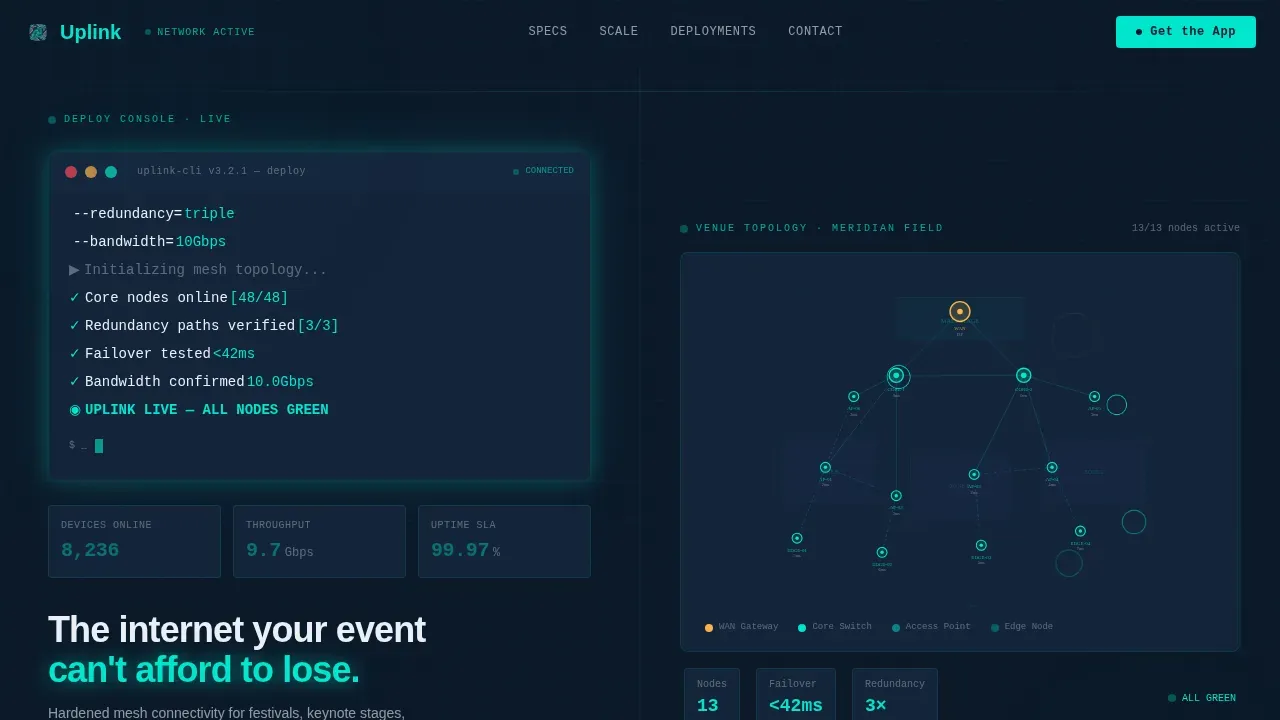
- A 50/50 split-screen hero with a monospaced terminal deploy sequence on the left and an animated network topology map on the right, so the product interface is the first thing every visitor sees.
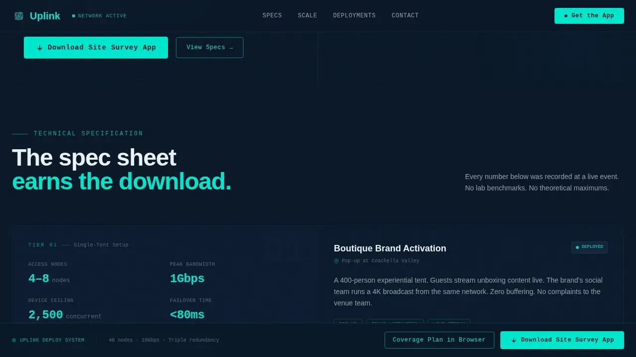
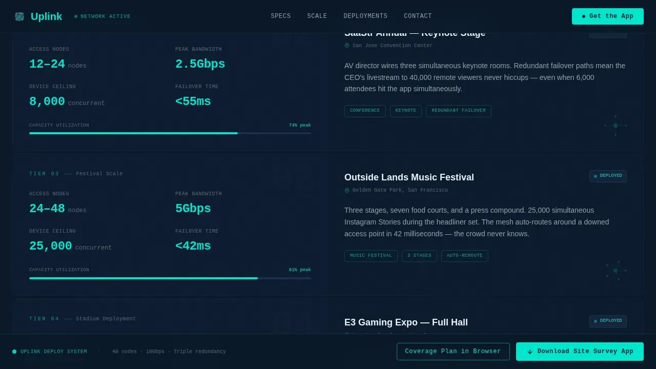
- An escalating spec sheet that pairs hard technical values on the left with named event-type scenarios on the right, scaling from single-tent setups to stadium-scale deployments with increasing node counts, bandwidth figures, and interconnect detail.
- A fixed bottom call-to-action bar that appears after the first scroll, a deployment scale bento grid, a social proof metrics bar with event-type proof cards, and a two-field app download modal that routes visitors to the correct app store based on their device.
Feature list
This template packages several distinct design and interaction capabilities into one coherent, conversion-oriented layout. Each feature is purpose-built for the event connectivity niche and reflects the infrastructure-first positioning of the Uplink brand.
Terminal Hero with Live Deploy Sequence
The hero section renders a monospaced code block using JetBrains Mono that simulates a live deployment command. The following command runs across the screen with teal highlights firing on each flag as a cursor blinks through: uplink deploy --venue="Meridian Field" --nodes=48 --redundancy=triple --bandwidth=10Gbps. This format immediately signals technical credibility to AV directors and network engineers who recognize the interface language. The left panel hosts the terminal block; the right panel displays a real-time animated network topology map showing nodes connecting across a venue floorplan, with latency numbers ticking below each access point. No stock imagery is used. The product is the interface.
Escalating Spec Sheet with Split Tiers
The core scroll experience is a configuring-style spec sheet where each split section pairs a hard technical specification on the left with a contextual deployment scenario on the right. Example tiers include per-node throughput figures, failover time measured in milliseconds, and the maximum number of simultaneous devices supported per access point. As the visitor scrolls, the scale escalates from a single-tent pop-up to a full stadium configuration. Each tier reveals more infrastructure, more fiber cable runs, more ethernet ports, and larger bandwidth values. The layout is designed so that numbers do the persuading. The design simply keeps them honest and legible against the dark panel background.
Deployment Scale Bento Grid
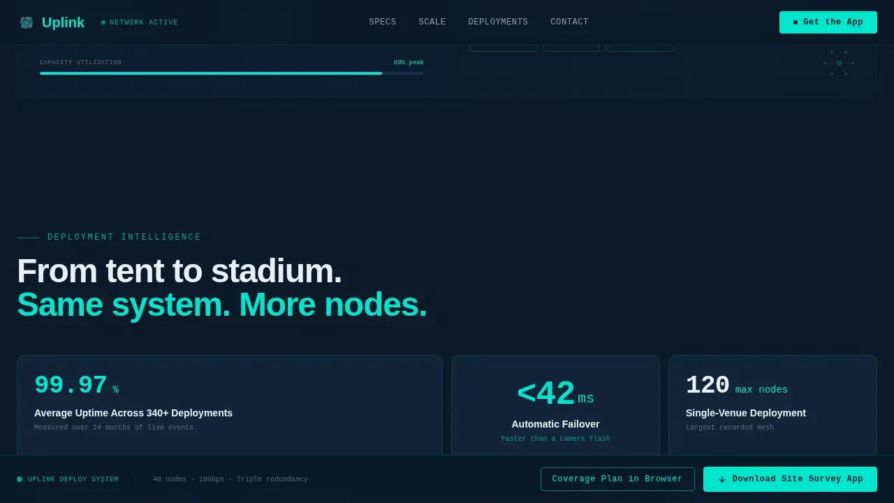
Below the spec sheet, a bento grid maps the full range of deployable configurations, from a compact single-tent setup with a limited number of nodes to a stadium-scale deployment with dozens of interconnected access points and dedicated fiber uplink paths. Each cell in the grid represents a deployment tier with visible node counts, cable topology indicators, and bandwidth labels. This section helps clients quickly determine which configuration tier matches their venue type and expected device load without needing to request a separate site survey document.
Fixed App Download Call-to-Action Bar
After the visitor scrolls past the hero, a fixed call-to-action bar locks to the bottom of the viewport. The primary action reads "Download the Site Survey App." Tapping or clicking opens a lightweight modal with exactly two input fields: event name and estimated headcount. The modal then routes the visitor to the correct app store automatically. A secondary path, "Build a Coverage Plan in Browser," catches desktop visitors and sends them into a web-based venue mapper. This two-path structure ensures both mobile planners and desktop AV directors find a relevant next step without friction.
Social Proof Metrics Bar and Proof Cards
A dedicated social proof zone displays hard metrics including devices served, uptime percentage, and total number of events deployed. Below the metrics bar, event-type proof cards provide contextual credibility, each card corresponding to a real category of deployment such as music festivals, enterprise conferences, and corporate livestreams. This section is positioned after the spec sheet so that the numbers in the proof cards reinforce the technical values visitors already encountered while configuring their mental model of the service.
Dashboard Pro Midnight Blue Visual System
The entire template is built on a Midnight Blue color system that uses deep terminal navy (#0B1929) as the dominant background, live-status teal (#00E5CC) on interactive elements and live data points, muted grid gray (#1C2E4A) to separate content panels, and alert white (#EAF0F6) for typography and data labels. JetBrains Mono handles all terminal and code-style typography. DM Sans serves body text and data labels. The result is a visual language that feels like the glow of a network operations center at 2 a.m., cool, precise, and immediately trustworthy to a technical audience.
Page sections overview
| Section | Purpose |
|---|---|
| Hero Split Screen | Launch terminal deploy sequence and animated topology map side by side |
| Spec Sheet Tiers | Escalate technical values paired with named event deployment scenarios |
| Deployment Scale Grid | Visualize node and bandwidth tiers from tent to stadium scale |
| Social Proof Bar | Display hard uptime and device metrics with event-type proof cards |
| App Download Modal | Capture event name and headcount, then route to correct app store |
| Browser Mapper Path | Guide desktop visitors into a web-based venue coverage planner |
| Fixed call to action Bar | Persist the primary download action after the first scroll |
| Footer Flow | Close with horizontal Vercel-pattern footer layout and secondary links |
Design & branding system
The visual identity of this template is built around one idea: the interface is the proof. Every design decision reinforces the sense that the visitor is looking at a live system, not a marketing page. The Dashboard Pro theme applied through the Midnight Blue color system achieves this by treating color, typography, and layout as functional signals rather than decorative choices.
- The color system uses four values: deep terminal navy (#0B1929) for backgrounds, live-status teal (#00E5CC) for interactive states and live data highlights, muted grid gray (#1C2E4A) to define panel boundaries, and alert white (#EAF0F6) for all typography and data labels. Navy dominates so that teal reads as a true status signal, not just an accent color.
- Typography is split between JetBrains Mono for all terminal blocks, code snippets, and spec values, and DM Sans for body paragraphs, section labels, and call-to-action text. This pairing creates a clear visual language: mono equals system data, sans equals human explanation.
- Animation is high-intensity and purposeful: terminal typewriter effects in the hero, node pulse animations on the topology map, live counter ticks on the social proof metrics, and scroll-linked section reveals. All animations use GPU-accelerated transforms and Intersection Observer triggers so the page feels alive without sacrificing render performance.
Mobile & speed optimization
This template is desktop-first by design, reflecting the reality that AV directors and network engineers typically work from laptops when specifying event connectivity infrastructure. However, the layout is fully responsive and optimized for mobile event planners who need to access specs and initiate an app download from a phone on a venue floor.
- The fixed call-to-action bar is thumb-friendly by default, placing the primary download action within easy reach at the bottom of the mobile viewport without requiring a scroll back to the top.
- The two-field app download modal keeps data input minimal, asking only for event name and estimated headcount. This follows the principle that using simple forms which only ask for essentials maximizes conversions on event registration and app acquisition flows.
- Animation rendering is handled via GPU-accelerated transforms only, with Intersection Observer used for all scroll-linked reveals, so interactive elements appear and perform correctly across device types without layout shift.
How this template helps you convert
This template is engineered around a specific conversion sequence: prove infrastructure depth first, then ask for the download. Every section builds a layer of technical trust before the call-to-action ever becomes the focus. The spec sheet earns the tap; the fixed bar simply makes it easy.
- The hero section establishes credibility in the first three seconds by showing a live-style terminal deploy command and an animated network topology map. Buyers who recognize the interface immediately understand they are looking at a real system. Critical information is visible above the fold without scrolling, following the principle that landing pages for event connectivity should surface technical trust signals immediately.
- The escalating spec sheet walks buyers through increasing deployment complexity, allowing them to self-qualify by finding the tier that matches their venue type and device load. By the time they reach the social proof metrics bar, they have already absorbed the technical values that define the service. The focused design limits distractions and guides visitors directly toward the download action, increasing the likelihood that the call-to-action bar converts on first view.
- The two-path call-to-action structure ensures no visitor leaves without a next step. Mobile visitors tap through to the app store. Desktop visitors enter the browser-based venue mapper. Both paths feed into the same downstream workflow without requiring the visitor to determine which path is correct; the template handles the routing automatically based on context.
Other information about this template
This section covers additional technical and structural context that buyers and builders may find useful when evaluating this template against their specific deployment or production needs.
- The uplink hardened event connectivity landing page template is categorized under Telecom and Connectivity, specifically the Temporary Event Internet niche, making it a focused tool for a specific class of service provider rather than a general-purpose connectivity page.
- The template style is Split Screen at a strict 50/50 ratio throughout the hero and spec sheet sections. This layout pattern is particularly effective for pairing technical specification values with real-world scenario context, because each panel has equal visual weight and neither side dominates the reading order.
- An uplink set defines a single, dedicated network or a group of networks and physical ports on a set of interconnects in an enclosure. Understanding this concept is relevant for teams who need to explain their infrastructure architecture to clients during the sales process that this template supports.
- An uplink set enables you to attach the interconnects to the data center networks. It also enables multiple ports to support port aggregation and link failover with a consistent set of virtual local area network (VLAN) networks. For tagged Ethernet networks, an uplink set enables you to identify interconnect uplinks that carry multiple networks over the same cable.
- If you do not define any uplink sets, the servers in the enclosure cannot connect to data center networks. The total number of ports that you can assign to uplink sets cannot exceed 12 ports per interconnect for certain modules. A network can be a member of one uplink set per logical interconnect group only.
- Within a logical interconnect group or logical interconnect, all VLAN IDs must be unique across uplink sets and internal networks. For Fibre Channel over Ethernet (FCoE) networks, an uplink set enables you to carry multiple Fibre Channel and tagged Ethernet networks over the same set of Ethernet cables. RoCE networks cannot be marked as native in the uplink sets.
- You can define zero or more uplink sets for each logical interconnect. When you create an uplink set, you can directly add network sets. You can associate network sets containing overlapping networks to the same uplink set. Changes you make to the uplink sets for a logical interconnect group are not automatically propagated to existing logical interconnects.
- The subjectaltname field is relevant for teams configuring certificate-based authentication across access points. Ensuring the subjectaltname field is correctly populated prevents connection errors during deployment validation.
- Zero touch provisioning is a capability that allows network devices to configure themselves automatically upon first connection to the network. When configuring a large-scale event deployment, zero touch provisioning removes the need for manual per-device setup at each access point, which is a key time-saving mechanism when you are deploying dozens of nodes across a venue with limited pre-event window. Zero touch provisioning also helps ensure configuration consistency across every node because each device receives its configuration from a central source rather than from manual input at the point of installation. Teams that enable zero touch provisioning can deploy faster, reduce configuration errors, and modify settings across the entire mesh from a single interface without physically touching each device on the floor.
- Traffic shaping is an important control mechanism when configuring connectivity for high density environments where a large number of devices compete for bandwidth simultaneously. Effective traffic shaping ensures that priority services such as broadcast video uplink, production communications, and executive livestreams receive dedicated bandwidth allocation before general attendee traffic. Without traffic shaping rules, a single network can become congested even when total throughput appears adequate on paper. Teams should define traffic shaping policies during the planning phase and validate them against the expected device load before the event begins.
- The enterprise campus network model provides a useful reference for event connectivity design. The enterprise campus provides access to network communication services and resources to end-users and devices over a single geographic location. Event deployments function as temporary enterprise campus networks, where traffic identification and control are essential functions implemented to support higher-level services. A network diagram helps identify choke points and sub-optimized areas in the network that must be fixed to improve performance before the event goes live.
- Planning is key for a successful deployment. The design process should be done in iterations, revising each stage and refining the design elements until the desired outcome is achieved. Identifying and understanding chokepoints on the network is important for planning and modifying the network before the first device connects.
- AI-powered tools can streamline the process of creating event connectivity solutions at scale. No-code and low-code environments enable users to build supporting applications without extensive programming knowledge. Natural language prompts can be used to generate code for applications in AI-powered platforms, which can assist teams in building custom configuration dashboards and deployment management tools alongside this landing page template.
- Configuration updates made to a logical interconnect group after deployment do not automatically propagate to existing logical interconnects. Teams should plan a configuration update schedule and define a review process for validating that all nodes reflect the current intended state.
- The footer uses a horizontal Vercel-style flow pattern (Pattern 3) that keeps secondary links accessible without cluttering the primary conversion path. This footer layout supports clean information hierarchy while still providing access to support documentation, legal pages, and contact resources.
- The template is localized for English-language markets, with pricing and date formats set to USD and United States conventions by default. Teams operating in other markets will need to modify localization values manually.
- From a fiber infrastructure standpoint, the template's spec sheet sections can be used to communicate the distinction between fiber to the home grade connectivity and the temporary event-grade fiber deployments that use portable fiber cable runs, ethernet distribution switches, and dedicated uplink ports to connect each access point back to the core network. Understanding the difference between a static residential fiber installation and a dynamic temporary event fiber layout helps clients set accurate expectations for what the service delivers.
- The template's design system does not rely on static images. Every visual element is either animated interface data or a live-status indicator, which means the page remains current and credible without requiring image asset updates between events or client engagements.
Theme
Dashboard Pro
Creative direction
Spec Sheet
Color system
Midnight Blue
Style
Split Screen (50/50)
Direction
App Download
Page Sections
Terminal Hero with Animated Topology Map
Escalating Spec Sheet with Named Event Tiers
Deployment Scale Bento Grid
Fixed App Download Bar with Two-field Modal
Social Proof Metrics Bar and Event Proof Cards
Dashboard Pro Midnight Blue Design System
Related questions
Who is the primary audience for this landing page template?
Does this template support both mobile and desktop visitors?
What is the purpose of the two-path call-to-action structure?
Can I adapt the spec sheet sections for different deployment scales?
What design theme and typography does this template use?


