Robust PLM Landing Page Template
Ledger is a modular card-grid landing page template built for decentralized product lifecycle management platforms. It targets supply chain architects, procurement leads, and compliance officers at mid-market hardware companies. The layout pairs dark-glass header panels with interactive capability cards, guiding visitors toward a live sandbox demo through a focused, form-free click-through flow.
by Rocket studio
Quick summary
Ledger is a single-page, card-grid landing page template designed for decentralized product lifecycle management platforms. It visualizes complex supply chain data, bills of materials, change orders, and compliance trails, through an interactive card layout with hover-triggered micro-interactions. The page drives visitors toward a guided demo environment without asking them to fill out a form.
Who this template is for
This template is built for technical and operational teams at mid-market hardware companies who need to communicate a complex protocol clearly and confidently. It speaks directly to people who live inside messy, multi-system data environments every day.
- Supply chain architects evaluating decentralized product data infrastructure
- Procurement leads managing reconciliation across multiple spreadsheets and enterprise resource planning systems
- Compliance officers who need an immutable audit trail that holds up to regulatory review
What problem this template solves
Product lifecycle data at hardware companies is usually fragmented across suppliers, original equipment manufacturers, and contract manufacturers with no single source of truth. Existing pages for platforms like this either oversimplify with stock imagery or overwhelm visitors with technical documentation upfront. Ledger solves both problems.
- Fragmented data narratives that confuse technical evaluators before they even reach the demo
- Landing pages that rely on hero images instead of letting the product interface speak for itself
- Visitor drop-off caused by premature form gates before trust is established
What you get with this template
You get a fully structured, single-page layout that doubles as a product demonstration. The template is built around a card-grid system where each card represents a real capability node in the platform.
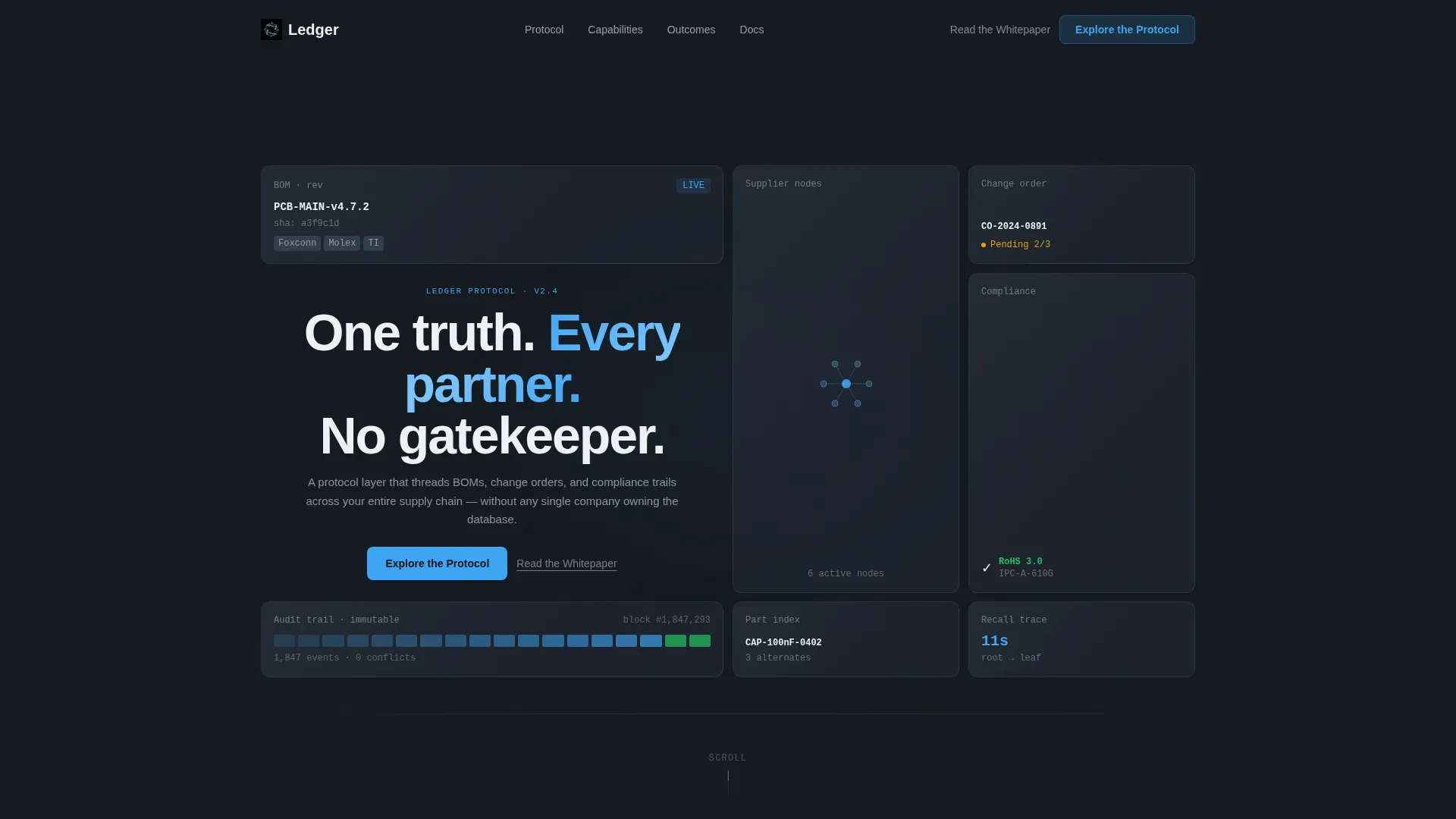
- A dark-glass asymmetric header with six to eight frosted panels, each holding a live-feeling data fragment such as a part number, revision hash, or compliance badge
- A modular card grid below the fold where each card expands on hover to reveal an animated micro-interaction: dependency graphs, field-level diff views, or real-time node maps
- A click-through conversion flow with a primary "Explore the Protocol" call to action and a secondary "Read the Whitepaper" text link, both leading to a demo environment without any form
Feature list
This section describes the core built-in capabilities of the Ledger template as defined by the source brief.
Dark Glass Panel Header
Six to eight translucent, frosted rectangles sit in an asymmetric grid against a near-black background. Each panel holds a single glowing data fragment, a part number, a revision hash, a supplier node map, or a compliance badge with a green checkmark. Edge lighting produces a dark-glass refraction effect. A tight sans-serif headline fades in over the center gap.
Modular Interactive Card Grid
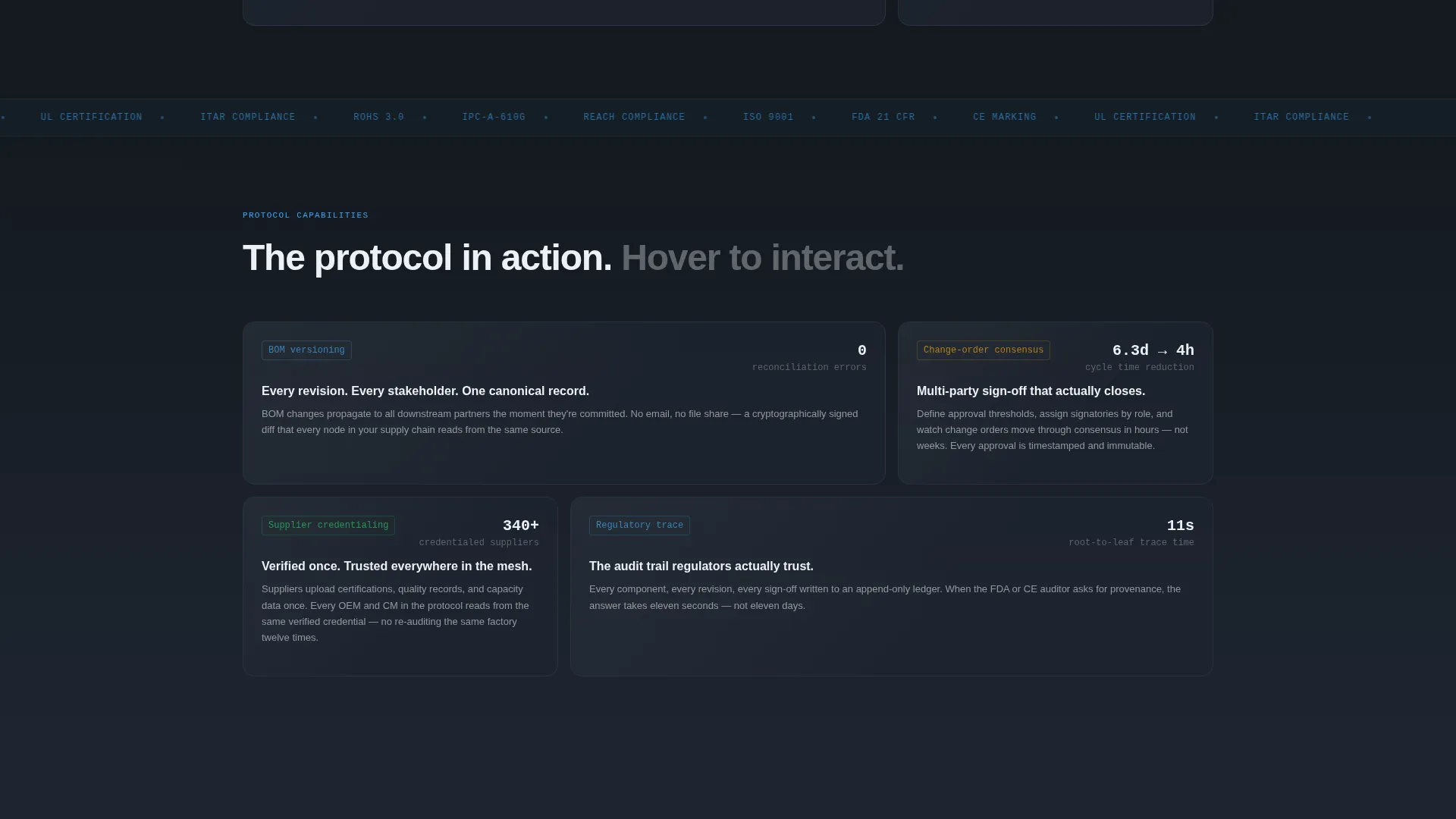
Cards below the fold each represent a capability node such as bill-of-materials versioning, change-order consensus, supplier credentialing, or regulatory trace. On hover, each card expands and triggers a micro-interaction: an animated dependency graph, a diff view highlighting field-level changes, or a node map that adds participants in real time.
Narrative Card Rhythm
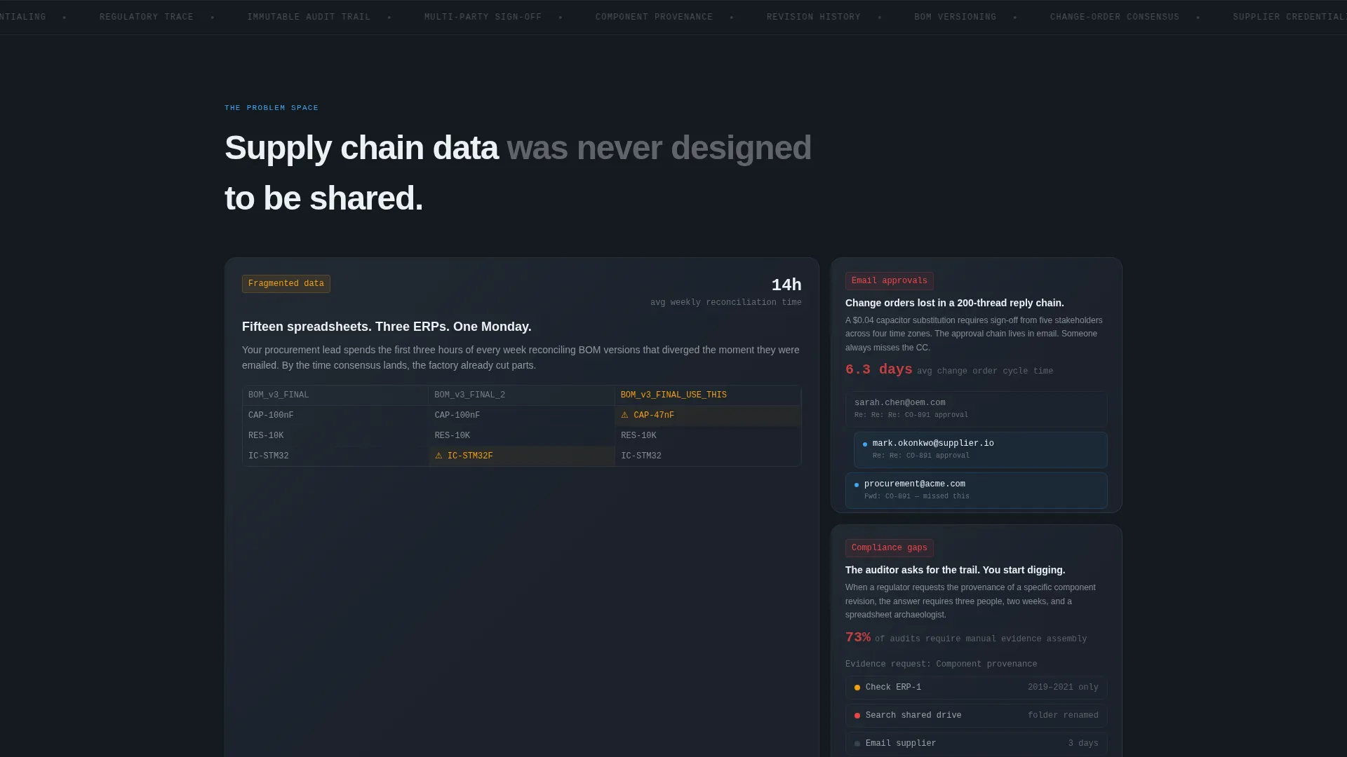
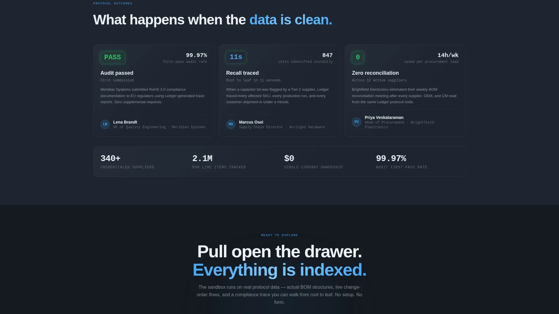
The card sequence follows a deliberate three-act structure. Early cards frame the problem, fragmented data and email-based approvals. Middle cards show the protocol in action. Final cards display outcomes such as a passed audit or a recall traced in eleven seconds.
Form-Free Click-Through Flow
There is no form on this page. The primary call to action is a sky-blue ghost button in the header labeled "Explore the Protocol," repeated as a solid button after the final card row. A secondary text link, "Read the Whitepaper," sits beneath it for technical evaluators who want architecture details first.
Slate and Sky Color System
The full four-color palette ships with the template: deep graphite (#1E2530), cool slate mid-tone (#3B4A5C), pale cirrus white (#EDF1F5), and a sharp sky-blue accent (#3DA5F4). Card surfaces use cirrus white with hairline slate borders. Every interactive element uses the sky-blue accent so visitors always know where to act.
Directory and Discovery Theme
The overall layout feels like browsing a living catalog of infrastructure. Cards are self-contained but clearly part of a larger mesh. The scrolling rhythm accelerates as the narrative progresses, creating a sense of depth and system coherence without requiring the visitor to read dense documentation.
Page sections overview
| Section | Purpose |
|---|---|
| Dark Glass Header | Establishes tone, displays live data fragments, presents headline and ghost call to action |
| Problem Card Row | Frames fragmented data and email-approval pain points for the target audience |
| Protocol in Action | Shows capability nodes: BOM versioning, change-order consensus, supplier credentialing |
| Outcome Card Row | Demonstrates results such as audit completion and rapid recall tracing |
| Primary call to action Block | Solid "Explore the Protocol" button drives visitors to the guided demo environment |
| Whitepaper Text Link | Secondary conversion path for technical evaluators needing architecture context |
Design & branding system
The template uses a Directory and Discovery visual identity built on the Slate and Sky color system. Every design decision reinforces the feeling of a pre-dawn control tower: dark surfaces, calm instrument light, and one electric blue frequency cutting through the gray.
- Backgrounds run in subtle graphite-to-slate gradients; card surfaces float in cirrus white with hairline slate borders
- The sky-blue accent (#3DA5F4) is reserved exclusively for interactive states, links, and data highlights so the eye always knows where to go next
- Typography is tight and sans-serif; the header headline fades in over the center panel gap, keeping the interface itself as the primary visual
Mobile & speed optimization
The card-grid layout is structured to translate cleanly from large-screen environments to smaller viewports. The modular nature of the card system means each capability node remains readable and self-contained regardless of screen width.
- Card grid columns reflow to a single-column stack on mobile, preserving the narrative arc from problem through outcome
- Hover-triggered micro-interactions adapt to touch devices so the interactive experience remains accessible on mobile
How this template helps you convert
Ledger earns the conversion before the visitor reaches the call-to-action button. The page is structured so that interaction precedes commitment, building familiarity and trust through the card experience itself.
- Visitors engage with real data patterns inside the cards, animated dependency graphs, diff views, and node maps, so they are already using the product in miniature before they see the primary call to action
- The form-free flow removes friction entirely; the only ask is a single click to enter the guided interactive demo environment, lowering the psychological barrier for technical evaluators
Other information about this template
This template is categorized under Technology, specifically within the Decentralized Enterprise Software subcategory and the Decentralized PLM niche. It is designed for teams building or marketing protocol-layer platforms that sit between suppliers, original equipment manufacturers, and contract manufacturers.
- The template style is Card Grid (Modular), making it straightforward to extend or reorganize capability nodes as the platform evolves
- The Interactive Explorer creative direction means the cards function as product demonstrations, not decorative elements
- The Click-Through landing page direction means the entire page is optimized for a single action: moving the visitor into the demo environment
- The header concept (Dark Glass Panels) replaces traditional hero photography with interface-as-visual, which is particularly effective for technical audiences who distrust stock imagery
Theme
Directory & Discovery
Creative direction
Interactive Explorer
Color system
Slate & Sky
Style
Card Grid (Modular)
Direction
Click-Through
Page Sections
Dark Glass Panel Header
Interactive Capability Card Grid
Three-act Card Narrative
Form-free Click-through Conversion
Slate and Sky Color System
Directory and Discovery Layout Theme
Related questions
Who is this template designed for?
Does the page include any forms or lead-capture steps?
What makes the card grid different from a standard feature section?
Can I customize the color palette and typography?
What kind of platform is this template best suited for?



