Volunteer Management Landing Page Template
Rally is a construction volunteer management landing page template built as a dashboard-style comparison engine. It showcases live-style metrics, a head-to-head platform comparison grid, and a sticky call-to-action bar. Designed for Habitat for Humanity chapter directors, disaster-relief coordinators, and church mission-trip leaders, it turns raw deployment data into a compelling case for signing up.
by Rocket studio
Quick summary
Rally is a single-page, dashboard-style landing page template built for construction volunteer management platforms. It leads with an animated stats wall, moves through a structured comparison grid, and closes with a sticky conversion bar. Every visual element reinforces one message: precision-scheduled build days beat chaotic spreadsheets.
Who this template is for
This template is purpose-built for organizations that coordinate skilled and unskilled volunteers on active construction sites. It speaks directly to coordinators who lose volunteers between signup and show-up day.
- Habitat for Humanity chapter directors managing 200 or more Saturday volunteers
- Disaster-relief coordinators deploying skilled tradespeople to storm-damaged areas
- Church mission-trip leaders tracking signups across weeks of pre-event communication
What problem this template solves
Most volunteer coordination tools were built for bake sales, not build days. The gap between a generic spreadsheet and an engineered deployment system costs organizations no-shows, skill mismatches, and failed grant reports.
- Spreadsheets and group texts create last-minute confusion about station assignments and crew leads
- Generic volunteer platforms cannot demonstrate site-specific scheduling or skill-matched crew placement
- Organizations struggle to produce post-event reporting data needed for grant compliance
What you get with this template
You get a fully structured, single-page layout that argues the case for your platform before a visitor reads a single line of body copy. The data does the persuading.
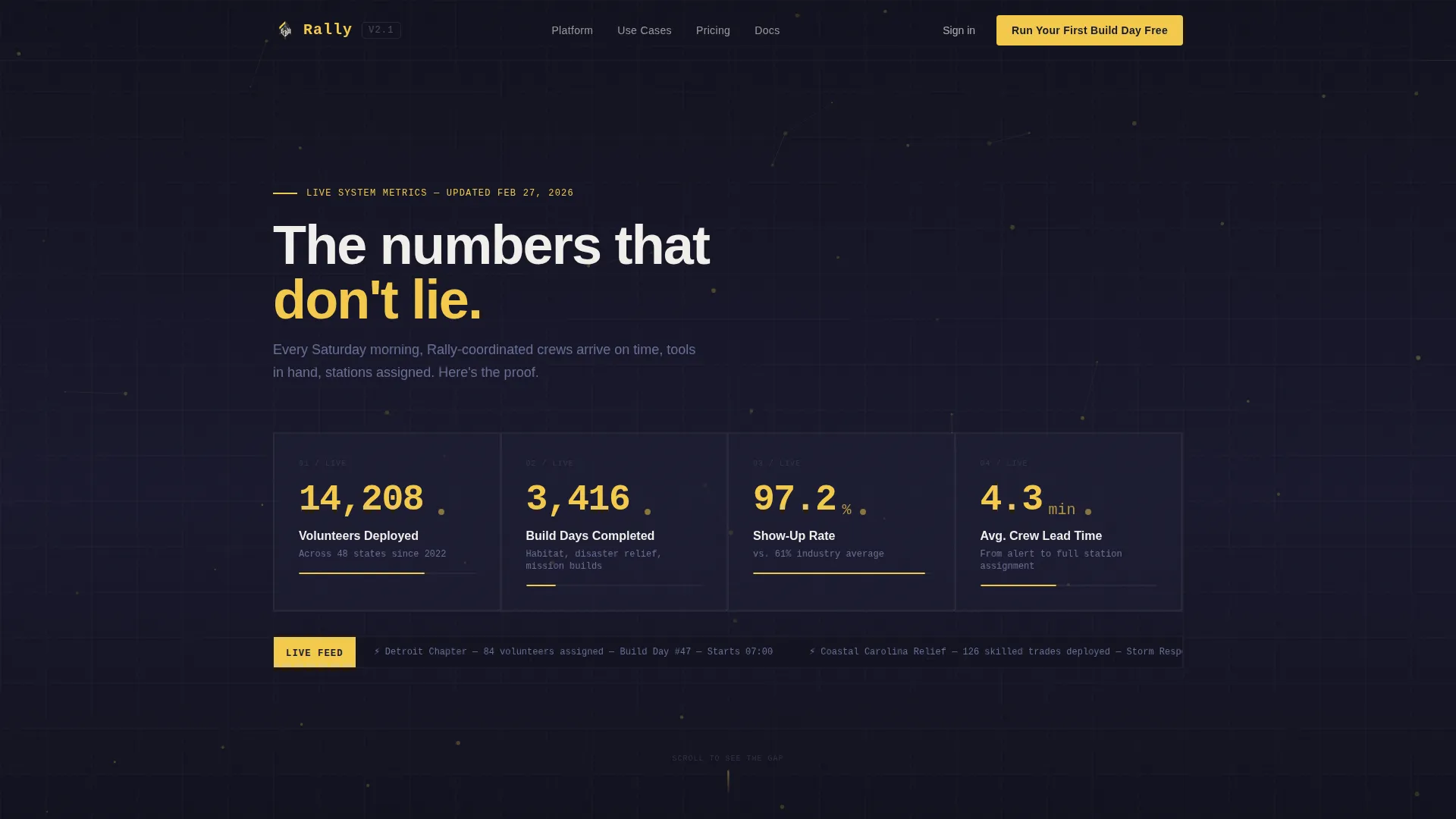
- A full-width animated stats wall with rolling counters and a particle-flow background
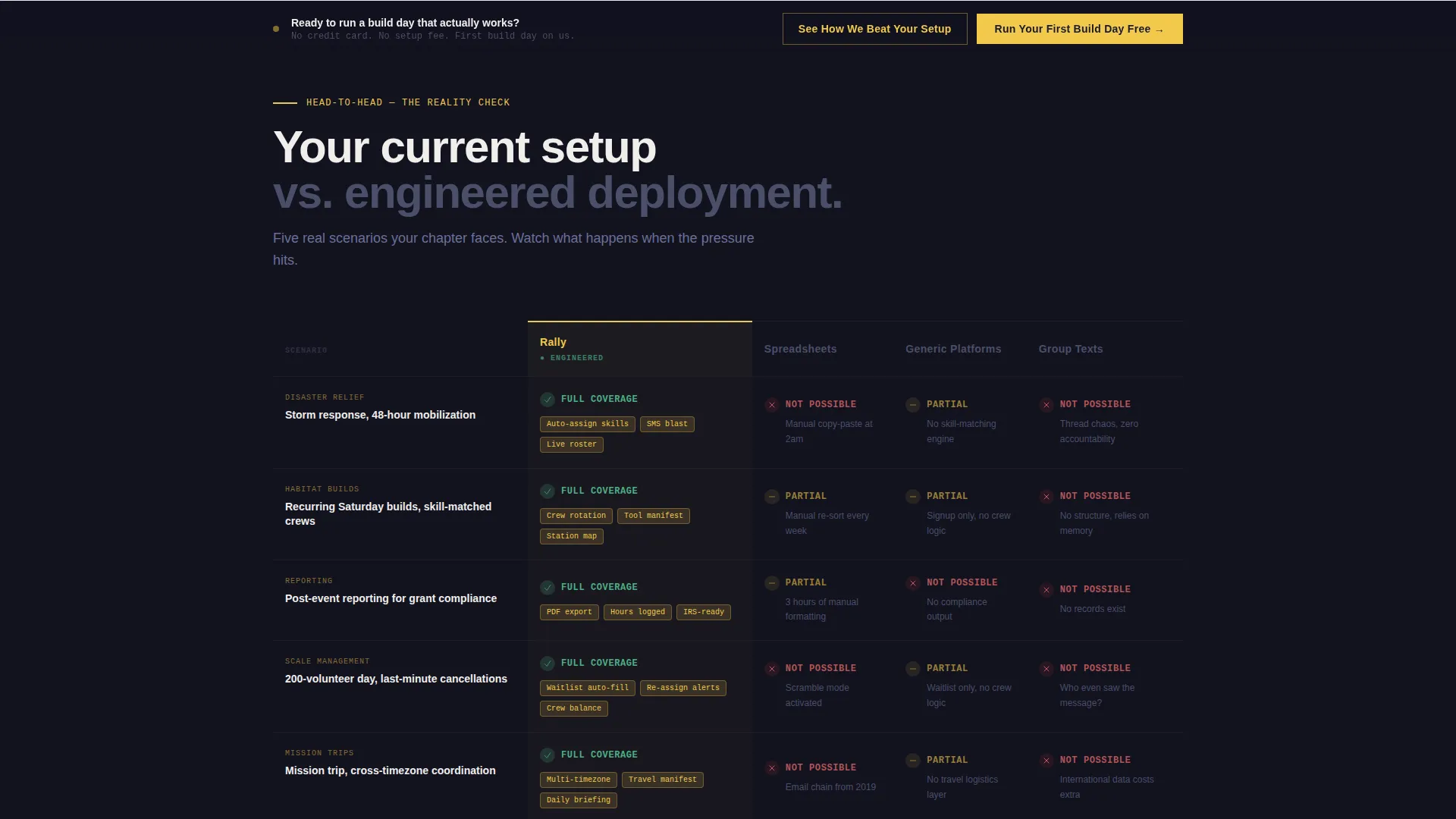
- A head-to-head comparison grid covering real coordination scenarios against spreadsheets, generic platforms, and group texts
- A sticky bottom conversion bar and a secondary diagnostic tool for qualifying prospects
Feature list
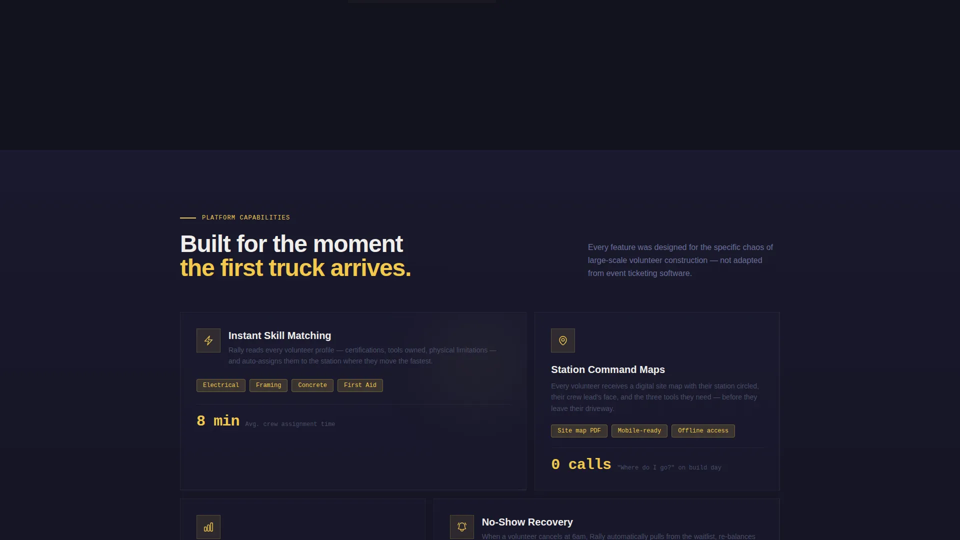
This template ships with purpose-built components designed specifically for the construction volunteer management space. Each one serves the comparison-driven conversion flow from top to bottom.
Animated Live Metrics Header
The header displays key deployment statistics as rolling counters that tick upward on page load. Figures like total volunteers deployed, build days completed, and show-up rate animate with eased motion, giving visitors immediate proof of platform scale before they scroll.
Head-to-Head Comparison Grid
The core section pits the platform against spreadsheets, generic volunteer tools, and group texts across specific real-world scenarios. Each row covers a situation such as storm-response mobilization or grant-compliance reporting, and competitor columns visually collapse while the platform column lights up with capability indicators.
Lateral Slide Row Animations
Each comparison row enters the viewport with a lateral slide animation, building momentum as visitors scroll. The effect mimics crews arriving on-site one vehicle at a time, making the cumulative weight of evidence feel earned rather than stated.
Sticky Conversion Bar
A fixed bottom bar activates after the visitor scrolls past the third comparison row. It anchors the primary call-to-action in view throughout the rest of the page, reducing the distance between conviction and click.
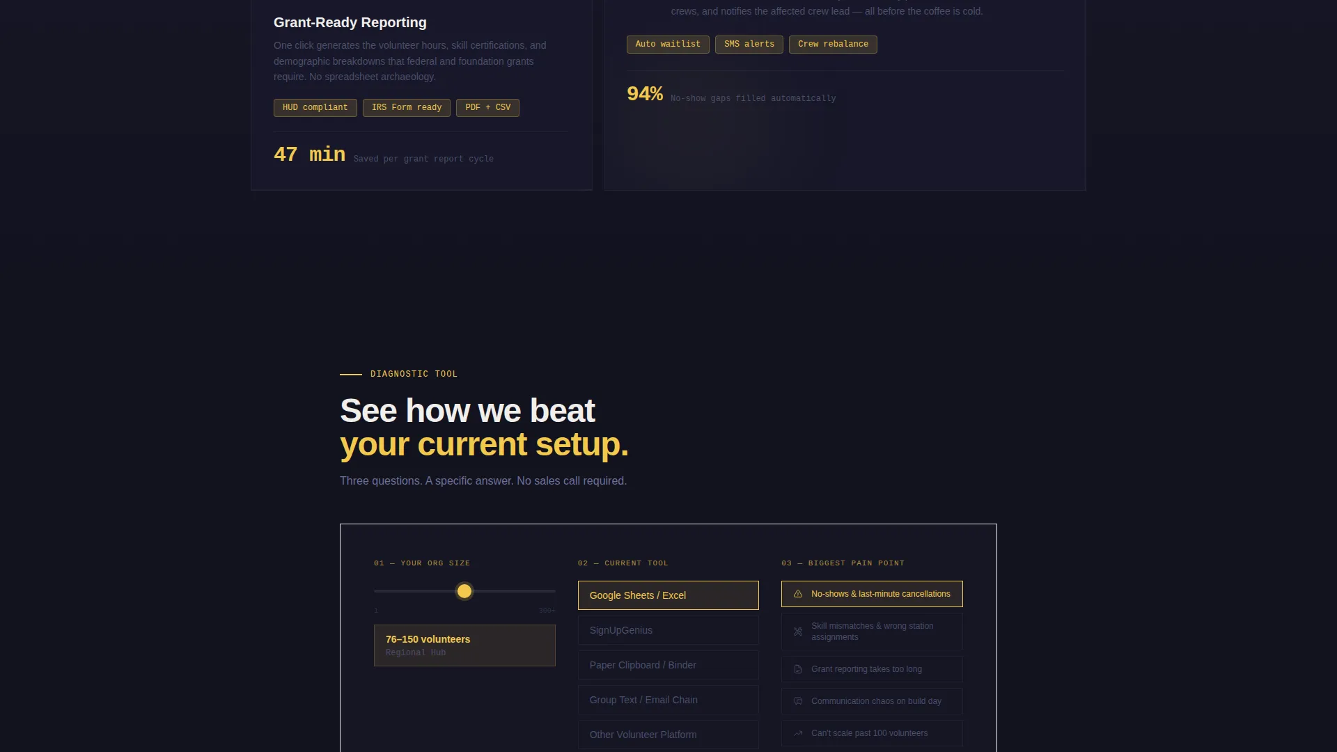
Diagnostic Secondary Path
A lightweight secondary conversion path lets prospects self-qualify. An organization-size slider, a current-tool dropdown, and a pain-point selector help visitors see a personalized gap analysis before committing to the primary action.
Particle-Flow Background Animation
Behind the stats wall, a subtle particle-flow animation traces connection lines between data points. It reinforces the idea of networked, coordinated labor without relying on stock photography or staged imagery.
Page sections overview
| Section | Purpose |
|---|---|
| Stats Metrics Wall | Opens with live rolling counters to establish platform credibility immediately |
| Comparison Grid Header | Frames the versus structure and sets up each scenario row |
| Scenario Row: Storm Response | Shows 48-hour mobilization capability against competing tools |
| Scenario Row: Saturday Builds | Demonstrates skill-matched crew scheduling for recurring events |
| Scenario Row: Grant Reporting | Addresses post-event reporting needs for compliance documentation |
| Sticky call to action Bar | Keeps the primary action visible after the third comparison row |
| Diagnostic Tool Panel | Guides prospects through a self-qualification flow before signup |
Design & branding system
The Carbon Fiber color system gives this template a raw, industrial authority that matches its audience. Every color choice references the physical construction environment rather than generic software aesthetics.
- Deep carbon black (#1A1A2E) dominates backgrounds and data panel surfaces; titanium mid-gray (#4A4E69) carries secondary text and divider lines
- High-vis safety yellow (#F2C94C) activates on every interactive element, progress indicator, and live metric counter
- Clean concrete white (#F0EEEB) holds body copy and card surfaces, keeping text legible against dark panels
Mobile & speed optimization
The layout is structured for readability and usability across screen sizes. The data grid and comparison table reflow cleanly on smaller viewports without losing the head-to-head structure that drives conversions.
- The sticky conversion bar remains accessible on mobile, keeping the primary call-to-action within thumb reach at all times
- Animated elements are designed to complement the scroll experience without requiring heavy interaction to understand the comparison content
How this template helps you convert
This template is built as a comparison engine, not a brochure. Every structural decision moves a skeptical coordinator from curiosity to commitment.
- The stats wall earns attention immediately by leading with real deployment numbers, establishing credibility before any claim is made in copy.
- The scenario-by-scenario comparison grid removes objections row by row, letting visitors self-identify their current pain and watch it get resolved in real time.
- The sticky bar and diagnostic tool create two distinct paths to action, so both ready-to-commit visitors and cautious researchers have a natural next step.
Other information about this template
This template is categorized under Technology and Construction Software, making it a strong fit for platforms operating in the construction volunteer management space. It is designed as a Dashboard and Data Grid layout with a Dynamic Motion visual theme and a Launch Energy creative direction, all drawn from the matched intersection context.
- The template style is optimized for platforms that need to demonstrate operational scale through data rather than narrative storytelling
- The Comparison and Versus landing page direction is intentional: it works best when the platform has clear advantages over legacy tools like spreadsheets or paper-based systems
- The Carbon Fiber color system and construction-site visual language make this template immediately recognizable to tradespeople, site coordinators, and nonprofit construction program managers
Theme
Dynamic Motion
Creative direction
Launch Energy
Color system
Carbon Fiber
Style
Dashboard/Data Grid
Direction
Comparison/Versus
Page Sections
Animated Stats Wall Header
Head-to-head Comparison Grid
Lateral Slide Row Animations
Sticky Bottom Conversion Bar
Self-qualification Diagnostic Tool
Carbon Fiber Visual System
Related questions
Can I customize the comparison rows for my own platform scenarios?
Does the template include the diagnostic tool layout out of the box?
Is this template suitable for nonprofit construction organizations?
What makes this template different from a generic software landing page?
Can the animated stats wall display our own real numbers?



