Consulting Digital Presence Pricing & Packages Website Template
The Consult Bold Brutalist Membership Landing Page Template is a single-page bento grid built for consulting membership sites. It pairs a high-contrast Glassmorphic design with raw brutalist aesthetics, an interactive pricing calculator hero, rapid-fire proof cells, and a sequential application form to move serious consultants from curious to committed.
by Rocket studio
Quick summary
This landing page template is purpose-built for a premium consulting membership site. It opens with an interactive revenue-gap calculator, cascades through asymmetric bento grid proof cells, and closes with a qualifying application form. The bold brutalist design makes the numbers the visual, keeping visitors focused on one honest question: what are you leaving on the table?
Who this template is for
This template is built for operators who already know their craft but have yet to price it correctly. If you are launching or growing a gated consulting community, this landing page gives your site the confidence its offer deserves.
- Solo consultants billing hourly who know their day rate should be far higher
- Fractional executives tired of writing proposals that go nowhere
- Community builders and designers launching premium professional membership pages
What problem this template solves
Most consulting membership landing pages blend into a market of polished, interchangeable sites. They use stock imagery, soft gradients, and safe language. The result is a page that looks professional but says nothing sharp. Visitors leave without feeling the gap between what they earn and what they could earn.
- The page fails to create urgency before asking for an application or email
- Generic layouts do not signal that this community charges differently
- Soft design aesthetics undercut the premium price point the offer demands
What you get with this template
You get a complete single-page layout structured to qualify, convince, and convert consulting professionals. Every section is built to deliver one clear idea before moving the visitor forward.
- A full bento grid landing page with six distinct section blocks
- An interactive hero calculator with card-flip reveal and gap display
- A sequential three-field application form and a ghost-bordered secondary email capture
Feature list
This template is built around six focused features. Each one is drawn directly from the project brief and designed to serve the consulting membership use case.
Interactive Revenue Gap Calculator
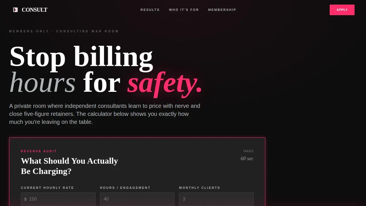
The hero section displays a brutalist glass card titled "What Should You Actually Be Charging?" Visitors enter their current rate, hours per engagement, and monthly client count. On submit, the card flips to reveal their annual revenue alongside the membership-average figure, with the gap shown in oversized stark typography. No stock imagery is used. The numbers are the visual.
Asymmetric Bento Proof Grid
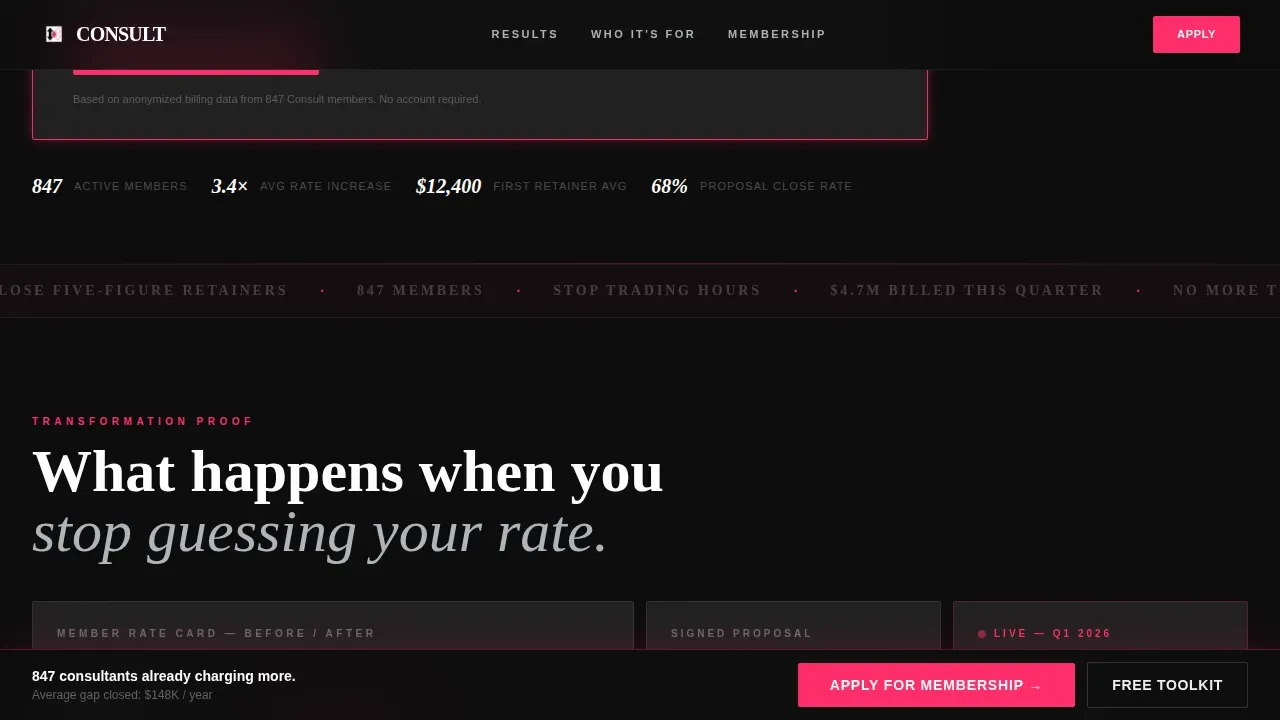
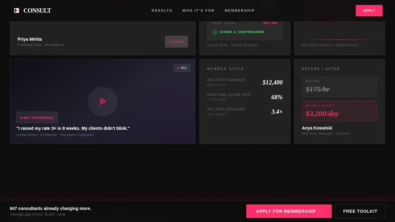
The scroll sequence after the hero fires rapid-fire bento cells, each carrying one piece of evidence. Cells display before-and-after rate cards, signed proposal screenshots, webcam video testimonial cards, and a live quarterly billing counter. Each cell animates in with a hard snap, no easing, matching the raw brutalist motion of the overall design.
Sticky Application Bar
After the calculator interaction, a frosted glass bar follows the visitor down the page. It carries the primary call to action, "Apply for Membership," in electric pink text. The bar stays visible through every proof cell, removing friction at the exact moment a visitor is ready to act.
Sequential Qualifying Form
The membership application is three fields presented one at a time: consulting specialty, current annual revenue from a dropdown, and email address. No password and no payment details are required. This structure keeps the process honest and removes intimidation from the first conversion step.
Ghost-Bordered Secondary Capture
Visitors not ready to apply see a ghost-bordered cell offering a downloadable Rate Card Toolkit in exchange for an email address. This secondary path captures leads at every confidence level. It builds trust before asking for a deeper commitment and keeps the landing page focused on a single goal without losing softer prospects.
Hard-Snap Scroll Animation System
The template is built with IntersectionObserver-driven scroll reveals throughout. Every bento cell snaps into view without easing curves, giving the page a brutalist rhythm that accelerates as visitors scroll. The motion design is intentional and matches the bold aesthetics of the typography and grid layout.
Page sections overview
| Section | Purpose |
|---|---|
| Hero Calculator Card | Reveals the revenue gap with a card-flip animation |
| Bento Proof Grid | Stacks rate cards, proposals, testimonials, and billing counter |
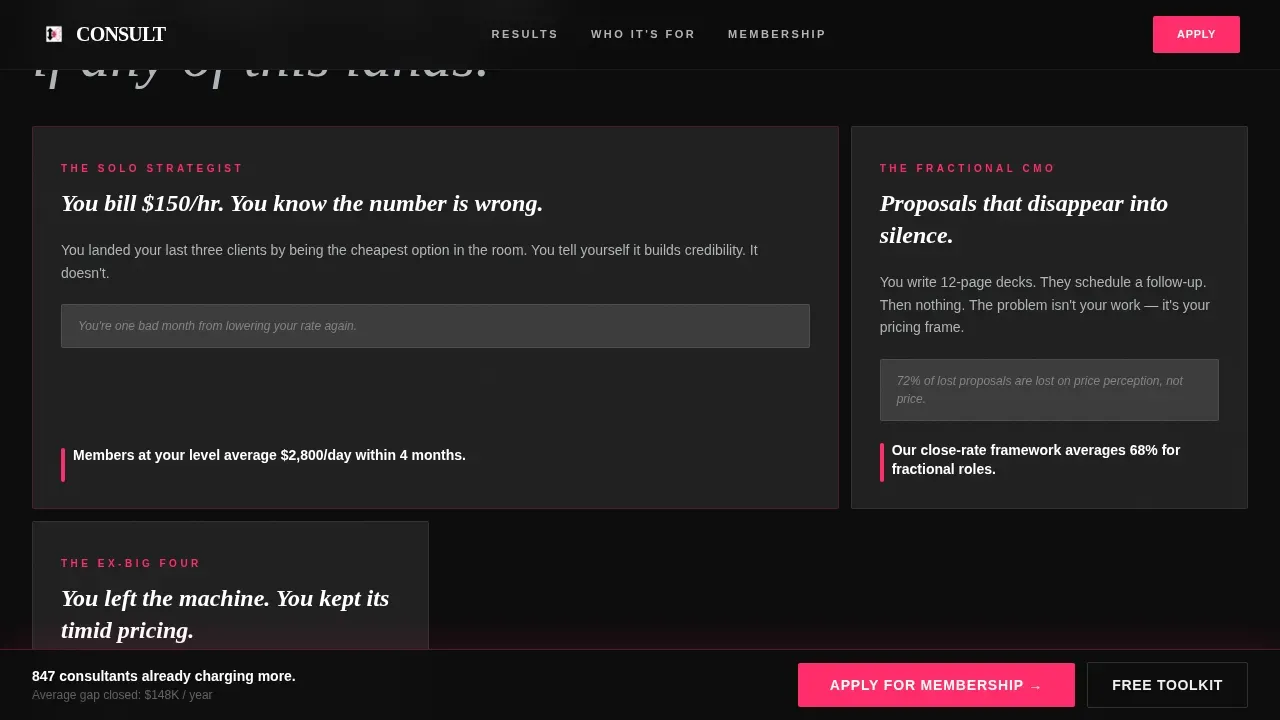
| Who This Is For | Three asymmetric ICP portrait cells for audience recognition |
| Full-Width Offer Cell | Breaks down membership details and hosts the sequential form |
| Rate Card Toolkit | Ghost-bordered secondary email capture for not-ready visitors |
| Footer Row | Single-row linear footer with navigation and brand details |
Design & branding system
The visual identity is a deliberate collision of bold brutalist structure and Glassmorphic depth. The result is a smoked-glass boardroom floating over a city at night. Every surface has translucent weight, and every accent earns its place.
- Color palette: deep slab black (#0D0D0D) base, frosted panel white at 12% opacity (#FFFFFF1F), electric pink (#FF2D6B) for interactive borders and call-to-action pulses, and cool proof gray (#B0B3B8) for secondary body text
- Typography: Fraunces handles numerics and display headings for raw editorial impact; DM Sans handles all user interface and body text for clarity
- Geometric shapes and frosted bento cells use backdrop-blur glass panels, with accent pink reserved for moments where money or action lives
Mobile & speed optimization
The template is desktop-first by design. Consultants evaluate membership offers on large screens, and the bento grid layout is optimized to display its full asymmetric impact there. A responsive mobile fallback ensures the page remains functional and readable on smaller devices.
- CSS scroll-behavior and IntersectionObserver power the snap reveals with minimal code overhead
- The design prioritizes high contrast and large text so every detail reads clearly on any device
- Frosted panel layers and smooth transitions are handled through CSS backdrop-filter, keeping asset weight low
How this template helps you convert
The landing page is built around a single conversion goal: a membership application or an email capture. Every design and structure decision serves that aim.
- The calculator hero creates personal urgency before any sales language appears, making visitors understand their own revenue gap on their own terms
- The rapid-fire proof grid stacks social evidence faster than skepticism can build, using high-contrast cells and stark typography to showcase real member outcomes
- The sticky call-to-action bar and ghost-bordered secondary capture ensure visitors always have a confident next step, whether they are ready to apply or just beginning to explore
Other information about this template
This template is a strong fit for designers and developers who want to build professional consulting membership pages without writing every component from scratch. The layout structure is modular, making it straightforward to customize sections to match a specific brand voice or color set.
- The consult bold brutalist membership landing page template is built as a bento grid single-page layout using clean, well-commented code
- Developers can adapt the color system, set new type scales, or swap section order without restructuring the full project
- The template supports connection to a wide range of ideas, from pre-launch waitlists to full membership portfolio showcase pages
- Google Analytics or any script-based tracking can be added to the page head without modifying the core template code
- The brutalist style communicates confidence and a non-conformist attitude, making it particularly effective for premium consulting brands that want to stand out in a crowded market
- The art of the layout is in its restraint: pink only appears where action lives, and every other color earns its role in the high-contrast hierarchy
- A strong, high-contrast design makes a portfolio or membership offering instantly recognizable when clients compare multiple sites
- The footer follows a linear single-row pattern, keeping the end of the page clean and on-brand
Theme
Bold Brutalist
Creative direction
Launch Energy
Color system
Glassmorphic
Style
Bento Grid
Direction
Lead Generation
Page Sections
Interactive Revenue Gap Calculator Hero
Asymmetric Bento Proof Grid
Sticky Pink Call-to-action Bar
Sequential Three-field Application Form
Ghost-bordered Secondary Email Capture
Hard-snap Intersectionobserver Animation System
Related questions
Can I customize the color system and typography?
Do I need coding experience to use this template?
Is this template only for consulting membership sites?
How does the secondary email capture work?
Can I connect this page to a form handler or email platform?



