Expert Consulting Digital Presence Professional Website Template
Consult is a split-screen landing page template built for strategy consulting community forums. It pairs a live-styled code block on the left with a hard-number stat dashboard on the right. Signal-green calls to action drive freemium trial signups through a minimal two-field form. The Data Command visual theme rewards serious professionals who respond to information density over decoration.
by Rocket studio
Quick summary
Consult is a single-page, split-screen landing page template designed for private consulting community forums. It opens with a code snippet header alongside a live stat dashboard, then scrolls through escalating proof points that move a visitor from curiosity to signup. The visual language is cold, precise, and data-first.
Who this template is for
This template is built for operators who know their audience is skeptical and data-literate. Generic community landing pages will not close strategy consultants. Consult speaks directly to professionals who respond to density, proof, and specificity.
- Senior associates and principals at consulting firms who want peer-to-peer framework exchange
- Independent consultants building a solo practice and looking for a credible community home
- Forum founders or community managers targeting ex-firm operators and in-house strategy leads
What problem this template solves
Most community landing pages rely on warmth, stock photography, and vague value promises. That approach fails with strategy consultants, who distrust soft claims and skip anything that feels like marketing.
- Lack of immediate credibility signals that match a consultant's high bar for evidence
- Friction-heavy signup flows that kill conversion before the value is communicated
- Visuals and copy that feel generic rather than built for a specific, demanding professional audience
What you get with this template
You get a fully structured, single-page layout that leads with data and closes with a low-commitment trial offer. Every section is built to escalate conviction, not just inform.
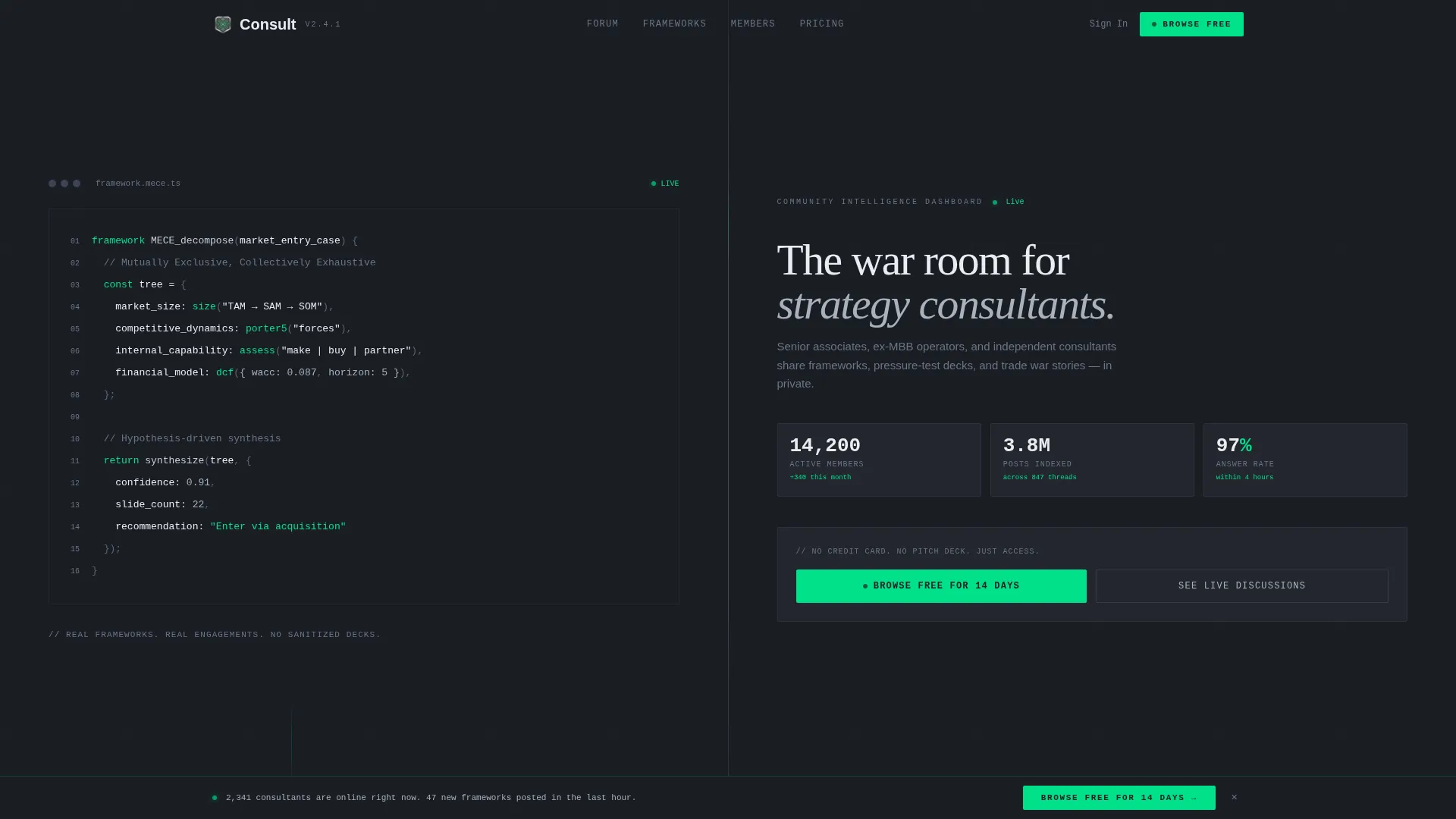
- A 50/50 split-screen header with a code-snippet left panel and a live community stat dashboard on the right
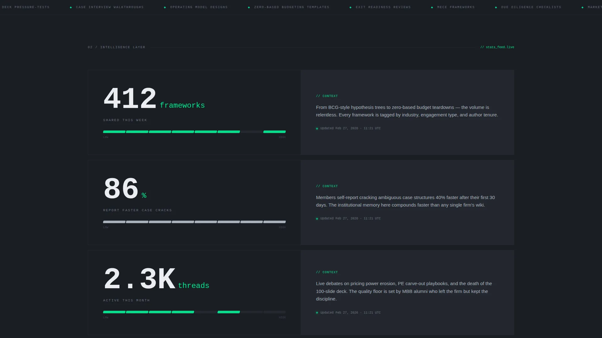
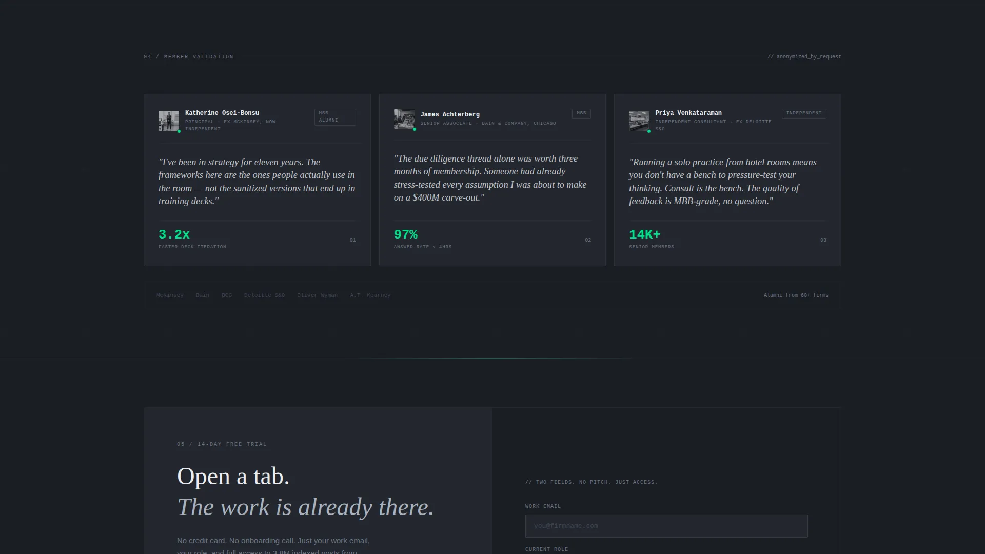
- Stats-first scroll sections pairing large left-panel metrics with right-panel context and anonymized testimonial snippets
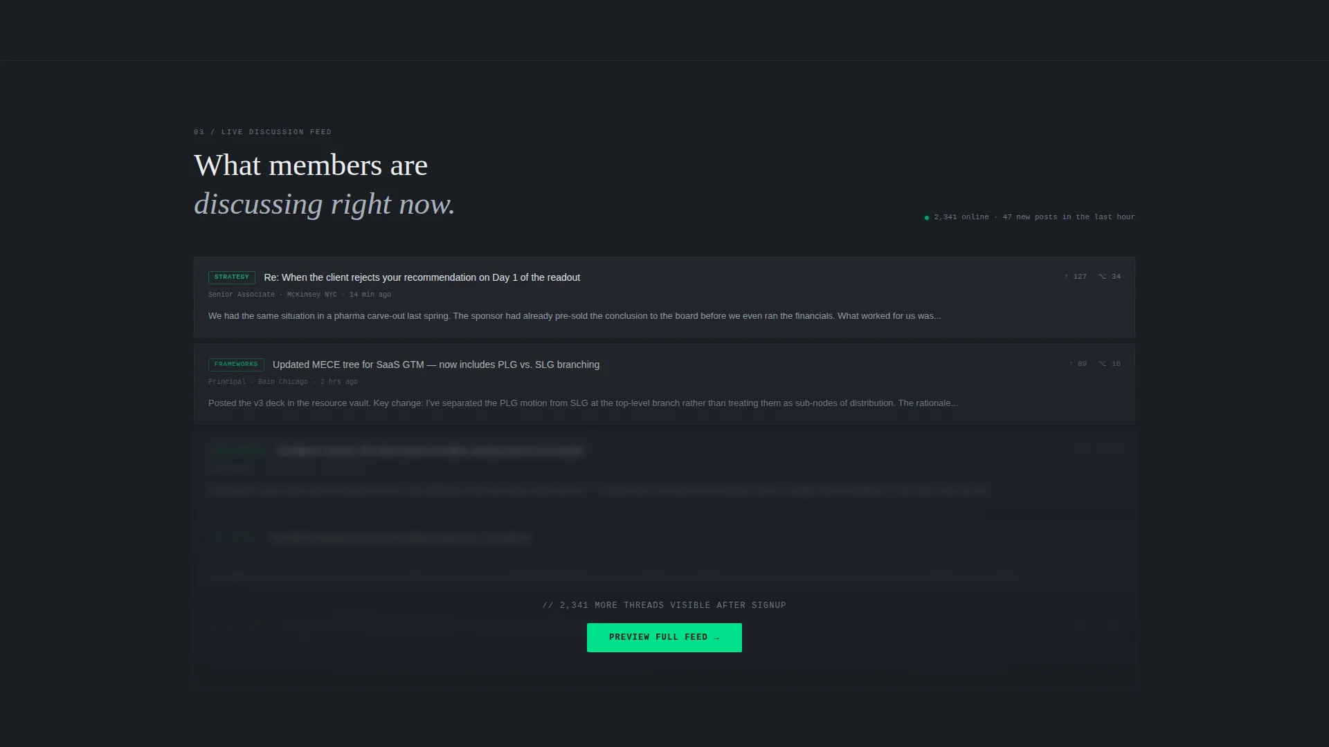
- A persistent bottom bar with the primary call to action after the second scroll, plus a blurred preview feed that sharpens on signup
Feature list
This template is built around five deliberate design and layout decisions. Each one serves the conversion goal without adding unnecessary complexity.
Split-Screen Code Snippet Header
The header divides into two equal panels. The left panel displays a live-styled monospaced code block formatted as a consulting framework, such as a MECE (Mutually Exclusive, Collectively Exhaustive) tree, a market-sizing formula, or a due diligence checklist written as pseudo-code. The right panel shows community stats at display scale.
Stats-First Scroll Architecture
Each scroll section leads with a large metric on the left before any explanation appears. The right panel then delivers the context and the story behind the number. This sequence mirrors how a data-literate reader actually processes proof, building trust before asking for anything.
Live Community Stat Dashboard
The header's right panel presents three headline figures at a scale readable from across a room: 14,200 active members, 3.8 million posts indexed, and a 97 percent answer rate within four hours. These numbers replace hero imagery entirely, letting the data serve as the visual anchor.
Freemium Trial Conversion Flow
The primary call to action, "Browse Free for 14 Days," appears first in the header right panel and again as a persistent bottom bar after the second scroll. The signup form asks only for a work email and a role dropdown, keeping commitment low and friction minimal.
Blurred Preview Feed
A secondary conversion path labeled "See What Members Are Discussing Now" reveals a blurred post feed. The feed sharpens only on signup, letting the content itself close the conversion without requiring additional copy or persuasion.
Monochrome Steel Color System
The entire palette runs on four values: gunmetal base at hex #23272F, brushed aluminum at #A8B2BD, cold white at #EAECEF, and a single signal-green accent at #00E08A. Signal green is reserved strictly for live indicators and calls to action, so every green element reads as actionable.
Page sections overview
| Section | Purpose |
|---|---|
| Split-Screen Header | Pairs code-snippet framework display with live community stat dashboard |
| Stats Scroll One | Leads with frameworks-shared metric, followed by a live recent-post feed |
| Stats Scroll Two | Leads with member-outcome stat, followed by anonymized alumni testimonial snippets |
| Persistent Bottom Bar | Keeps the primary trial call to action visible after the second scroll |
| Blurred Preview Feed | Surfaces a teaser post feed that sharpens on signup to close conversion |
| Trial Signup Form | Collects work email and role dropdown only, minimizing barrier to entry |
Design & branding system
The design language is intentionally cold and information-dense. Every visual decision reinforces the feeling of a professional data terminal rather than a marketing page. There is no warmth, no decoration, and no stock photography anywhere in the layout.
- Color system: gunmetal (#23272F) base, brushed aluminum (#A8B2BD) midtones, cold white (#EAECEF) text, and signal green (#00E08A) reserved for calls to action and live indicators only
- Typography is monospaced in the code-block header panel and rendered in clean, high-contrast type throughout, supporting the Data Command theme
- Visual rhythm follows a strict left-metric, right-context split across every scroll section, creating a predictable and scannable reading pattern
Mobile & speed optimization
The split-screen layout is designed with responsive stacking in mind, so the two-panel structure reflows cleanly on smaller screens without losing the data-first hierarchy.
- Left-panel metrics retain their large display size on mobile, staying readable and impactful when the panels stack vertically
- The persistent bottom bar is designed to remain visible and tappable on mobile viewports, keeping the trial call to action accessible throughout the scroll
- The minimal form, just two fields, reduces load and interaction friction on touch devices
How this template helps you convert
The conversion strategy is built into the layout sequence, not added as an afterthought. Every structural decision reduces the gap between a visitor's first impression and their decision to sign up.
- The header delivers scale and credibility in under three seconds, using live-styled stats instead of claims, so a skeptical consultant arrives at the form already convinced the community is real and active.
- The escalating scroll moves from community size to individual outcome, matching the natural decision logic of a senior professional who needs to see both proof of scale and personal relevance before committing.
- The blurred preview feed creates genuine curiosity without overselling, and the two-field form removes every reason to delay, turning interest into a completed signup.
Other information about this template
This template sits at the intersection of consulting community forum design and a high-trust digital presence for strategy professionals. It is well-suited for forum founders, community platform builders, and consulting firms establishing a member-facing landing page.
- The template style is a 50/50 split screen, a layout that reinforces the left-data, right-context information structure throughout the entire page
- The theme is Data Command, and the creative direction is Stats-First Impact, meaning every scroll section is organized around a hard number before any narrative copy appears
- The header concept is a Code Snippet, which gives the page an immediately recognizable signal to technical and analytical professionals that this is not a generic marketing page
- The freemium and trial conversion direction means the page is optimized for low-barrier entry, not for hard-sell or high-ticket direct close
Theme
Data Command
Creative direction
Stats-First Impact
Color system
Monochrome Steel
Style
Split Screen (50/50)
Direction
Freemium/Trial
Page Sections
Split-screen Code Snippet Header
Stats-first Scroll Sections
Live Community Stat Dashboard
Freemium Trial Call to Action and Persistent Bar
Blurred Preview Feed
Monochrome Steel Color System
Related questions
Who is the target audience for this landing page template?
Can I customize the community stats shown in the header dashboard?
What does the signup form collect?
How does the blurred preview feed support conversion?
Is this template suitable for a paid membership community?



