Specialist Consulting Digital Presence Provider Directory Website Template
Consult is a plug-and-play social media template landing page built for independent consultants who need a polished digital presence without the design overhead. The split-screen layout pairs a code-snippet header with a rendered LinkedIn carousel mockup, while a searchable directory grid, live download counter, and a free preview path work together to move visitors toward the template vault download.
by Rocket studio
Quick summary
Consult is a single-page, split-screen template landing page designed for solo consultants and boutique firms ready to upgrade their social media presence. It packages a full library of consulting social media templates inside a high-energy, directory-style layout. The acid-digital color system keeps the page impossible to scroll past, and every section builds momentum toward one clear action: downloading the template vault.
Who this template is for
This landing page is built for consultants who produce strong strategic thinking but struggle to present it consistently across social channels. It speaks directly to people who know their content deserves a better stage.
- Independent management consultants posting LinkedIn carousels between client calls
- Freelance strategy advisors who want the visual credibility of a full agency
- Boutique firm founders whose frameworks are sharp but whose Instagram grid needs work
What problem this template solves
Most consultants lose potential clients not because their thinking is weak, but because their social content looks unfinished. The gap between brilliant ideas and a polished feed costs real opportunities.
- There is no time to build designs from scratch before every post
- Inconsistent visual branding makes solo consultants look less established than they are
- Convincing visitors to download a template product requires trust, and generic pages do not build it
What you get with this template
You get a complete, ready-to-launch landing page that presents a consulting social media template library with clarity and visual confidence. Every section is pre-built and structured around a single download goal.
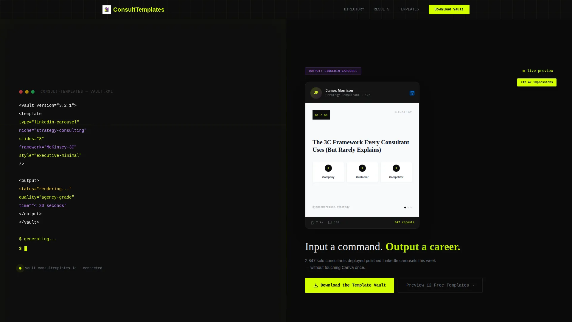
- A split-screen header pairing a terminal code snippet with a polished LinkedIn carousel mockup
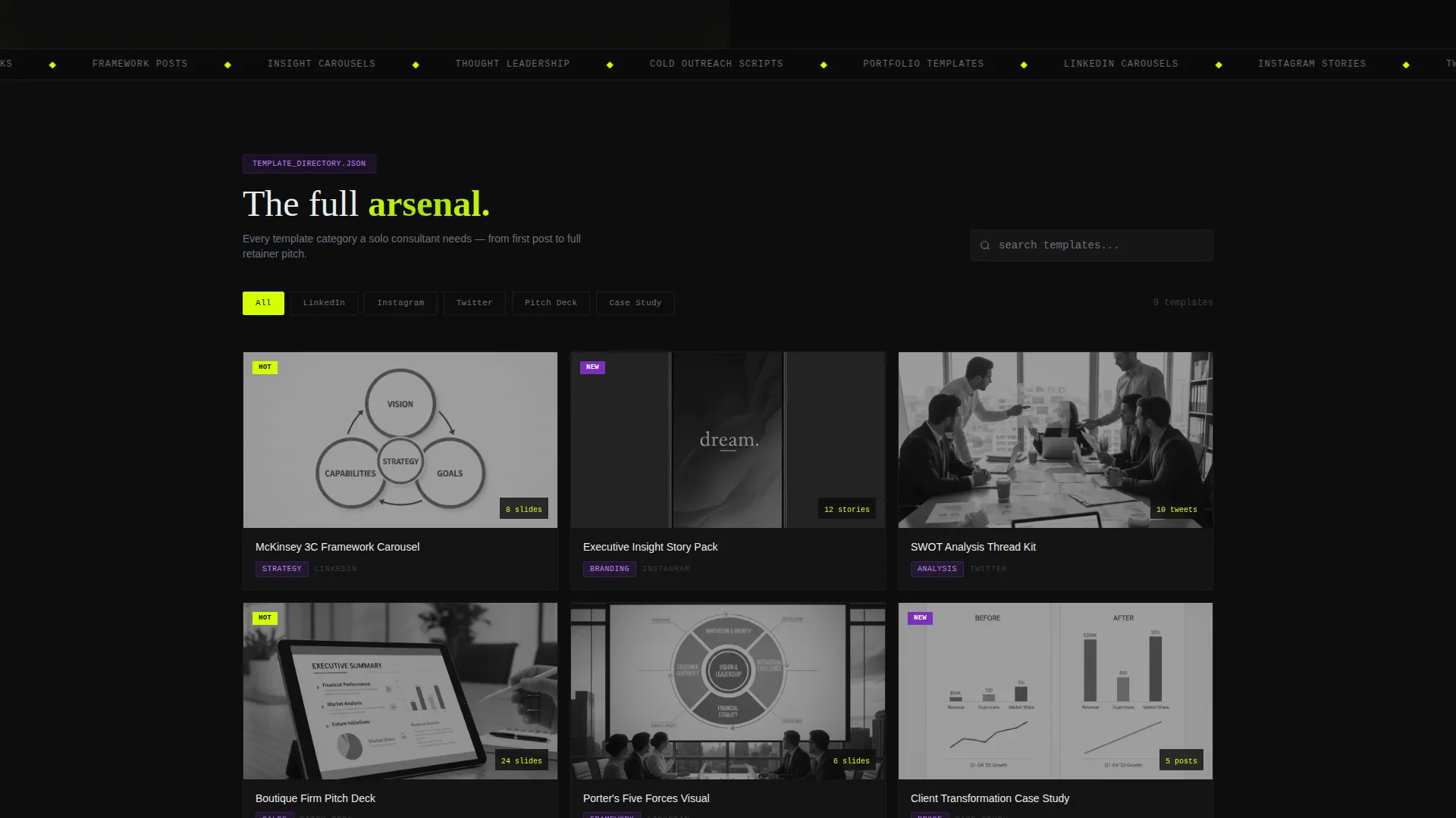
- A searchable directory grid covering template categories such as LinkedIn posts, Instagram stories, Twitter threads, and pitch deck slides
- A sticky download call-to-action bar, a platform selector flow, and a no-signup free preview path for 12 templates
Feature list
This landing page ships with a focused set of components that work together to present the template library and earn the download tap.
Split-Screen Code-to-Output Header
The header divides the viewport equally. The left panel shows a monospaced terminal snippet with syntax-highlighted tags in chartreuse and violet, ending on a blinking cursor that reads "generating...". The right panel reveals the rendered result: a polished LinkedIn carousel mockup with consultant-grade typography and a framework diagram.
Searchable Directory Grid
Past the header, a staggered-animation grid fans open to display template categories. Each row reveals faster than the last, creating genuine scroll momentum. Visitors can explore categories without leaving the page.
Live Social Proof Counter
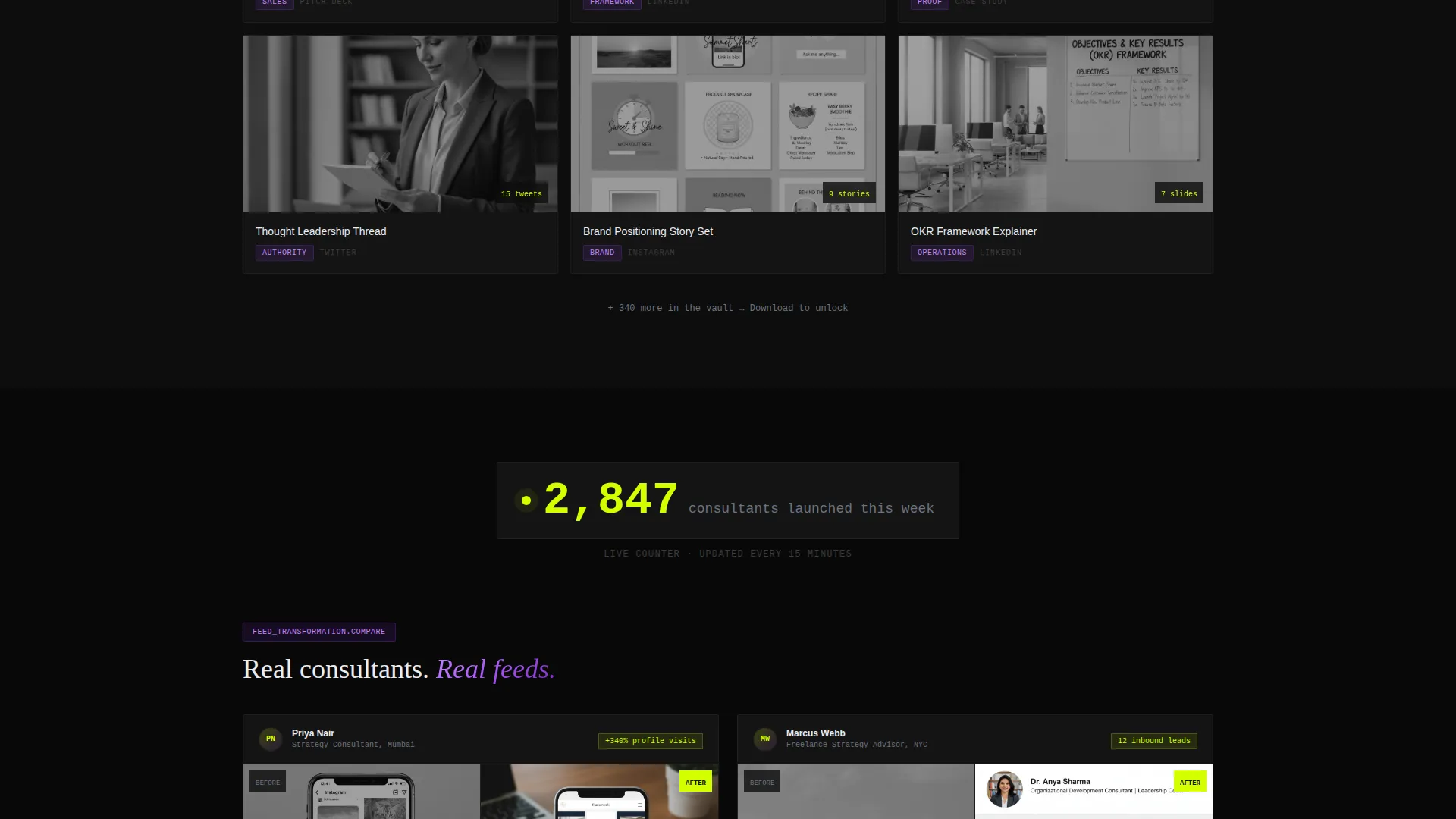
A pulsing counter midway through the page displays real-time download activity, showing how many consultants launched that week. It reinforces demand and reduces hesitation before the download decision.
Before-and-After Feed Transformation
A second split-screen section shows real mockups of a consultant's social feed before and after using the templates. The visual contrast does the persuasion work before the visitor reaches the call-to-action.
Platform Selector and Download Flow
Tapping the primary call-to-action opens a platform selector for iOS, Android, or Desktop. A single email field and a consultant-type toggle (solo, boutique firm, or agency) keep the flow short and specific.
Free 12-Template Preview Path
A secondary path lets visitors browse 12 free templates in an in-browser carousel with no signup required. It builds confidence in the product before committing to the full download.
Page sections overview
| Section | Purpose |
|---|---|
| Split-screen header | Show code-to-output transformation and set the product tone |
| Directory grid | Let visitors explore template categories with scroll momentum |
| Live counter | Reinforce demand with a real-time consultant download pulse |
| Before-and-after pair | Demonstrate feed transformation using real social mockups |
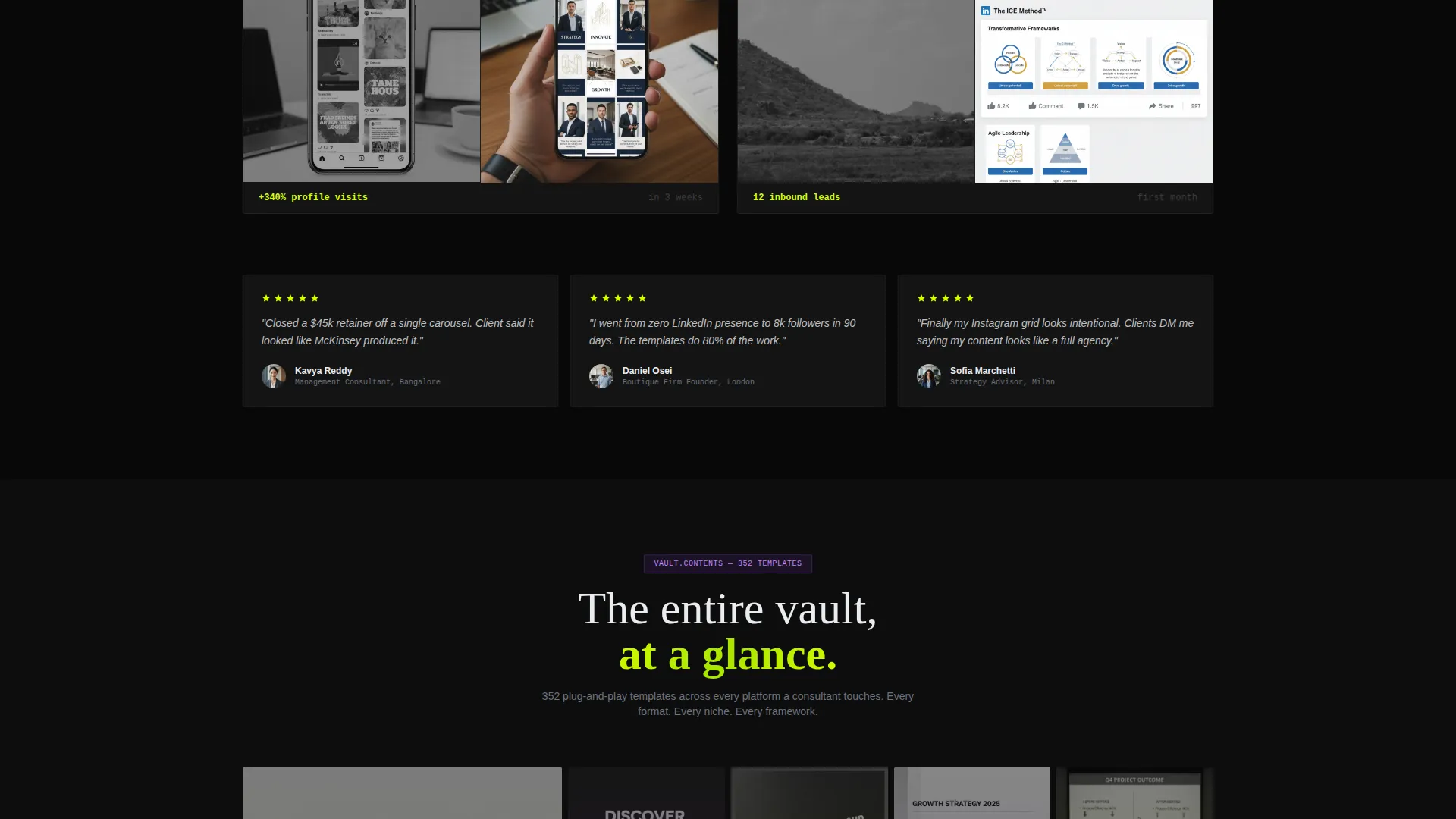
| Full-screen mosaic | Reveal the total template volume with a slow zoom-out view |
| Primary download call to action | Drive the app download with a platform selector and email field |
| Sticky bottom bar | Keep the download action visible after the directory section |
| Free preview path | Offer 12 templates in-browser so visitors build trust first |
Design & branding system
The visual identity uses an Acid Digital color system that feels like a neon sign reflecting off wet pavement at night. Every color has a specific job, and nothing competes for attention without purpose.
- Electric chartreuse (#D4FF00) drives calls-to-action, hover states, and syntax highlights so key actions are impossible to miss
- Deep terminal black (#0D0D0D) dominates the background, creating an IDE dark-mode atmosphere that grounds the layout
- Synthetic violet (#7B2FBE) marks category tags and section dividers, while interface white (#EAECF0) keeps template preview cards readable
Mobile & speed optimization
The layout is built with the mobile consultant in mind. Someone checking their phone between meetings should be able to tap through the page and reach the download flow without friction.
- The sticky bottom bar keeps the download call-to-action reachable on any screen size after the directory section passes
- The free preview carousel works inside the browser, so visitors on mobile can assess template quality without installing anything first
How this template helps you convert
Every design choice in this landing page is oriented around a single measurable outcome: getting the right consultant to tap "Download the Template Vault."
- The split-screen header gives the visitor an immediate mental image of the product's value by showing raw input transforming into polished output before they scroll at all.
- The live counter and before-and-after mockups stack social proof and visual evidence together at the midpoint, addressing hesitation right before the full-screen mosaic makes the scale of the library clear.
- The secondary free-preview path removes the trust barrier entirely by letting visitors experience 12 templates in-browser at no cost, so the final download ask feels like a logical next step rather than a leap of faith.
Other information about this template
This template is categorized under Technology and sits within the Consulting Digital Presence subcategory, with a niche focus on consulting social media templates. It is suited for digital-native audiences who are comfortable with a bold, high-contrast aesthetic.
- The Directory and Discovery theme organizes the template library in a format that feels familiar to anyone who browses product marketplaces or app stores
- The Launch Energy creative direction shapes the scroll pacing so each new section feels like a product feature being unveiled on stage
- The template style is Split Screen (50/50), making the code-snippet header concept a core structural element rather than a decorative touch
- The landing page direction targets an app download conversion, distinguishing this layout from awareness-only or lead-capture page formats
Theme
Directory & Discovery
Creative direction
Launch Energy
Color system
Acid Digital
Style
Split Screen (50/50)
Direction
App Download
Page Sections
Split-screen Code-to-output Header
Searchable Directory Grid
Live Download Counter
Before-and-after Feed Mockups
Platform Selector and Download Flow
No-signup Free Preview Path
Related questions
Who is this landing page template built for?
What template categories does the directory grid include?
Can visitors try the templates before downloading?
What does the download flow look like?
Does the split-screen layout work on mobile?



