Containerization Consulting Landing Page Template
Containerize is a dark-themed, dashboard-style landing page template built for containerization consulting teams. It features an animated metric header, a sticky twelve-row comparison matrix, interactive deployment architecture diagrams, and a three-step progressive inquiry form. The design channels a server-rack aesthetic, purpose-built to convert CTOs, platform teams, and DevOps leads into qualified migration conversations.
by Rocket studio
Quick summary
Containerize is a single-page template designed for infrastructure consulting teams that migrate monolithic systems into orchestrated container fleets. It leads with live-style metric counters, anchors trust through a competitive comparison matrix, and closes with a focused lead-capture form. Every section is built to move cautious technical buyers from skepticism to action.
Who this template is for
This template is built for infrastructure engineering firms and containerization consultants who need to win technical buyers quickly. It speaks directly to the decision-makers who feel the pain of manual deployments and config drift.
- CTOs at Series B startups losing engineer-hours to unreliable, manual deploy processes
- Platform teams at mid-market software-as-a-service companies dealing with configuration drift across environments
- DevOps leads who have inherited legacy stacks and need a credible partner to help them modernize safely
What problem this template solves
Technical buyers are skeptical. They have been burned by vendors who overpromise and under-deliver on migrations. A generic consulting page does not give them the evidence they need to trust a new team with their infrastructure.
- There is no side-by-side proof that the service is faster and more capable than going it alone
- Prospective clients cannot quickly see what a migration engagement actually looks like in practice
- There is no low-commitment conversion path for buyers who want to evaluate before they talk to sales
What you get with this template
You get a complete, production-ready landing page layout with every section pre-built and ready to customize. The template replaces weeks of design and copywriting work with a focused, conversion-oriented structure.
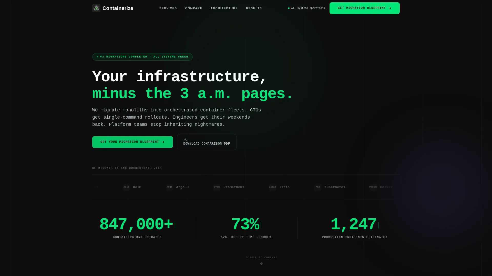
- An animated header with a logo bar, headline, and three live-style metric counters
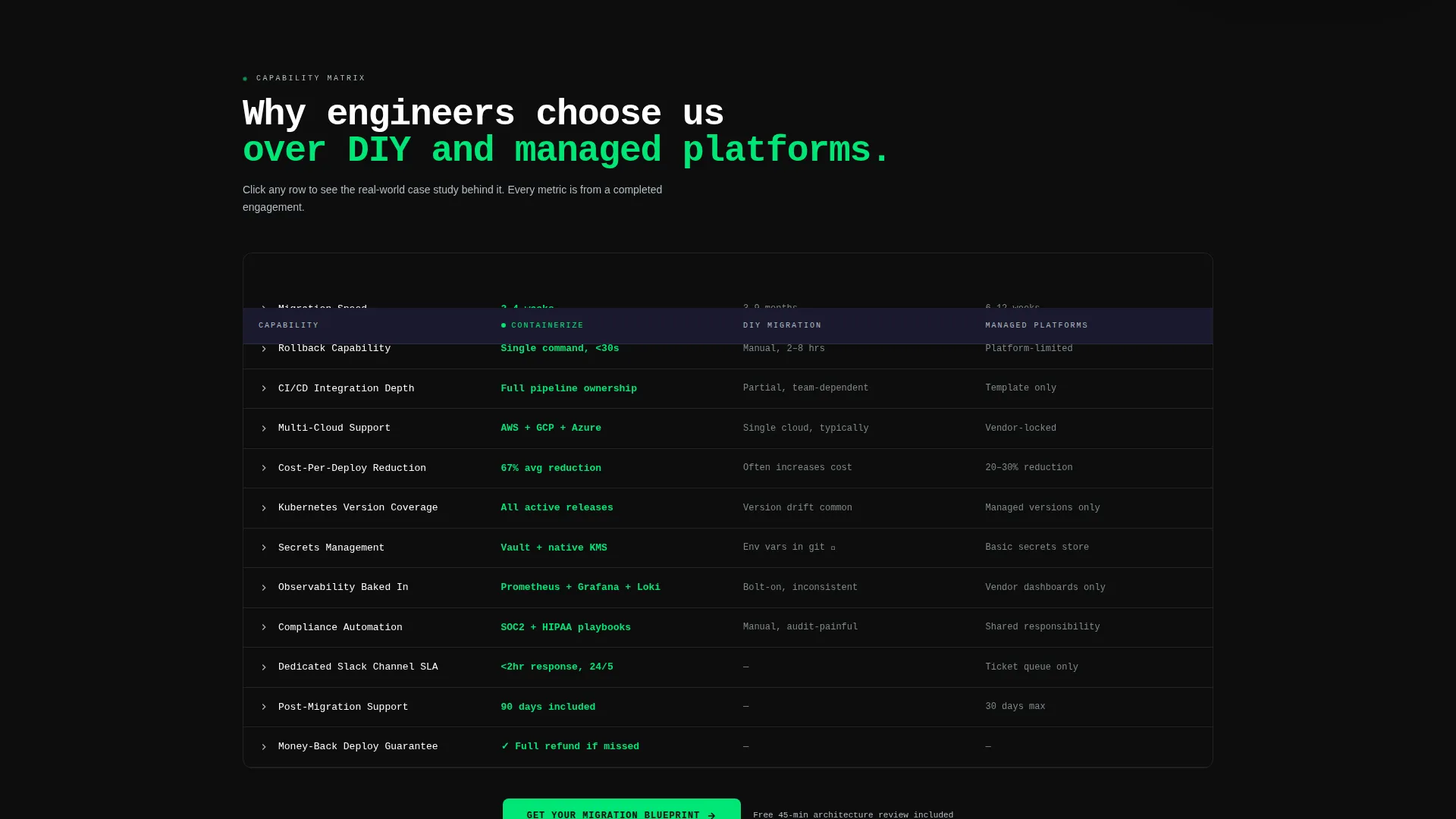
- A sticky twelve-row comparison matrix with expandable case-study snippets per row
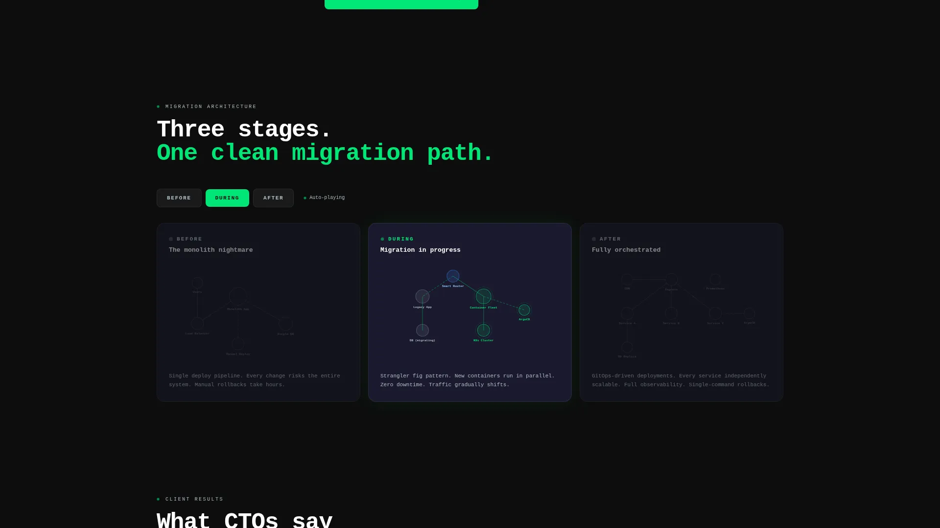
- Three interactive deployment architecture diagrams rendered as sequential node graphs
- A three-step progressive inquiry form and a secondary email-gated PDF download path
Feature list
This template is built around a clear set of functional components, each designed to address a specific moment in the technical buyer's decision process.
Animated Metric Counter Header
Three counters tick upward in a mission-control style, displaying containers orchestrated, deployment time reduced, and incidents eliminated. They establish credibility in the first five seconds without requiring the visitor to read a paragraph.
Sticky Competitive Comparison Matrix
A twelve-row grid pins the consulting service against do-it-yourself migration and competing managed platforms. Green checkmarks and quantified metrics fill the service column, while gray values represent the alternatives. Each row expands on click to reveal a short case-study snippet.
Interactive Deployment Architecture Diagrams
Three node-graph diagrams illustrate the before, during, and after states of a container migration. Nodes light up sequentially to guide the reader through the transformation story in a visual, low-friction way.
Three-Step Progressive Lead Form
The primary call-to-action opens a staged form. Step one captures current stack type via a dropdown. Step two collects team size and deploy frequency. Step three asks for work email and a free-text field labeled "What broke last?" reducing friction while gathering high-quality qualification data.
Email-Gated PDF Download Path
A secondary conversion path offers the full comparison matrix as a downloadable, branded asset. It is email-gated and designed to circulate in engineering team Slack channels and standups, extending the template's reach beyond the original visitor.
Logo Bar with Partner Badges
A horizontal scrolling strip displays client and partner tool logos rendered in monochrome titanium against a carbon black background. It signals credibility and ecosystem familiarity to technical audiences without cluttering the layout.
Page sections overview
| Section | Purpose |
|---|---|
| Headline and Logo Bar | Establishes credibility and frames the core service promise |
| Metric Counter Dashboard | Shows live-style impact numbers to build immediate trust |
| Sticky Comparison Matrix | Differentiates the service against DIY and competing platforms |
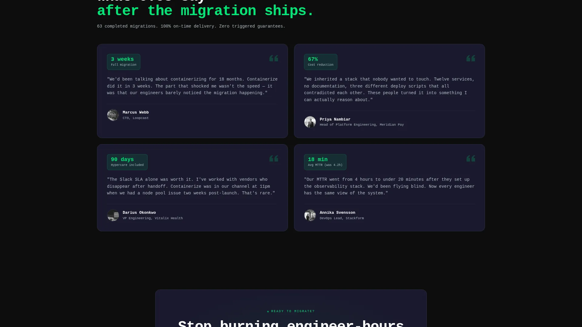
| Expandable Case Study Rows | Adds proof at the exact moment a visitor questions a claim |
| Deployment Architecture Diagrams | Visualizes the migration journey in three sequential stages |
| Primary call to action Block | Drives inquiries through the progressive three-step form |
| PDF Download Path | Captures leads not yet ready for a sales conversation |
Design & branding system
The visual identity is built on a Carbon Fiber color system that feels like the inside of a server rack at 2 a.m. Every color choice has a functional role, and nothing is decorative.
- Deep carbon black (#0D0D0D) dominates backgrounds; woven graphite (#1A1A2E) lifts cards to create depth without breaking monochrome discipline
- Status-green (#00E676) pulses on call-to-action buttons, hover states, and live metric counters to draw the eye to every conversion point
- Cool titanium gray (#B0BEC5) handles secondary text, grid lines, and table borders, keeping the data-dense layout readable and structured
- All headings use a monospaced typeface that reinforces the terminal-window aesthetic central to the Startup Velocity theme
Mobile & speed optimization
The layout is structured to remain functional and readable across device sizes. The data-dense comparison matrix and node graphs are designed to adapt without losing their core utility.
- The sticky comparison grid maintains its pinned behavior on smaller viewports so mobile visitors can still scan the full twelve-row matrix
- Metric counters and call to action buttons are sized and spaced for thumb-friendly interaction on touch devices
- The progressive form breaks into clear, one-question-at-a-time steps that feel natural on mobile without scrolling fatigue
How this template helps you convert
The template is built around two conversion paths that serve different levels of buyer readiness. Every section is sequenced to move hesitant technical buyers forward.
- The sticky "Get Your Migration Blueprint" call-to-action appears in the navigation and again after the comparison matrix, catching visitors at the two highest-intent moments on the page.
- The email-gated comparison PDF gives undecided visitors a reason to share their contact without committing to a sales call, creating a second pipeline of warm, educating leads.
Other information about this template
This template is part of a dashboard and data grid template style category, built around a Feature Matrix creative direction. It is suited for teams who want a Comparison/Versus landing page that does the selling through structured evidence rather than narrative copy alone.
- The template theme is Startup Velocity, designed to communicate speed, technical precision, and engineering credibility to a knowledgeable audience
- The Logo Bar header concept is pre-configured to display tool and platform partner badges in a scrolling strip, adaptable to any consulting team's actual toolchain
- The Carbon Fiber color system is applied consistently across all components, making the template straightforward to re-brand by swapping four hex values
- This template works well for containerization consulting services positioning against both in-house DIY approaches and fully managed platform alternatives
Theme
Startup Velocity
Creative direction
Feature Matrix
Color system
Carbon Fiber
Style
Dashboard/Data Grid
Direction
Comparison/Versus
Page Sections
Animated Metric Counter Header
Sticky Competitive Comparison Matrix
Interactive Deployment Architecture Diagrams
Three-step Progressive Lead Form
Email-gated PDF Download Path
Scrolling Logo Bar with Partner Badges
Related questions
Can I customize the twelve-row comparison matrix with my own service tiers?
How does the three-step progressive form work?
Is the PDF download path connected to a specific email platform?
Who is this template best suited for?
Can the metric counters display real live data?



