Secure Charitable Giving Platform Landing Page Template
Tithe is a scroll-reveal landing page template built for nonprofit finance teams who are done losing funds to retail-designed payment processors. It opens with live fee metrics, drops visitors straight into an interactive savings calculator, and walks through side-by-side competitor comparisons. Every section earns attention. The result is a high-contrast, data-forward page that makes transparent payments feel inevitable.
by Rocket studio
Quick summary
Tithe is a single-page landing page template designed for nonprofit payment processing platforms. It surfaces hidden fees immediately, guides visitors through an interactive savings calculator, and builds toward a low-friction sign-up form. The layout uses a terminal-fintech visual identity to make every donation dollar and processing cost feel impossible to ignore.
Who this template is for
This template is built for fintech and nonprofit software teams that need to convert skeptical finance decision-makers. If your audience reviews fee statements at midnight or compares vendors across spreadsheets, this page speaks directly to them.
- Operations directors and finance committees at mid-size nonprofits managing $100K to $2M in annual donation volume
- Executive directors at churches, mutual aid networks, and advocacy organizations watching processing fees eat into recurring gifts
- Product and marketing teams ready to build a Comparison/Versus landing page that skips fluff and leads with math
What problem this template solves
Most nonprofit payment processing pages bury their fees. They rely on stock photography of smiling volunteers and vague claims about mission alignment. Meanwhile, organizations are losing thousands of dollars per year on transactions their current processor never bothered to itemize. This landing page template fixes that.
- Finance teams cannot easily compare what they pay now versus what they could save, so they stay with familiar vendors by default
- Donation forms buried below the fold and cluttered sign-up flows add friction that kills new donations before they begin
- Without a clear, structured layout, it is hard to communicate both transparent pricing and strong security credentials on a single page
What you get with this template
You get a fully structured, scroll-reveal landing page ready to customize and build on. Every section is pre-designed and purposeful. You do not need to start from scratch.
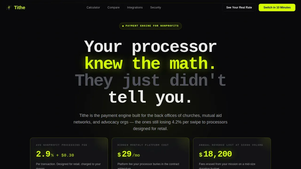
- A Dark Glass Panels hero section with three live-metric cards showing real processing cost data, designed to stop the scroll immediately
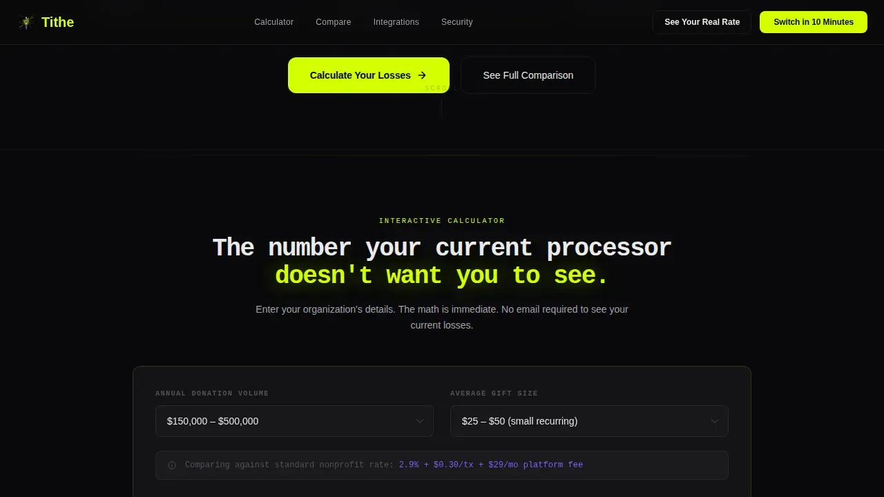
- An interactive savings calculator placed above the fold so donors and finance teams can see their real numbers before any persuasion copy appears
- A side-by-side competitor comparison table, a donor CRM integrations grid, a security and compliance vault section, and a minimal three-field sign-up form
Feature list
This template ships with six core feature areas. Each one is designed to support a specific step in the conversion journey for nonprofit payment processing clients.
Live Fee Metric Hero Cards
Three glassmorphism panels float over a void-black background. Each card displays a live-updating metric: average nonprofit processing fee, hidden monthly platform cost, and estimated annual revenue lost on a $500K donation volume. Chartreuse pulse borders activate on load to draw the eye immediately.
Interactive Savings Calculator
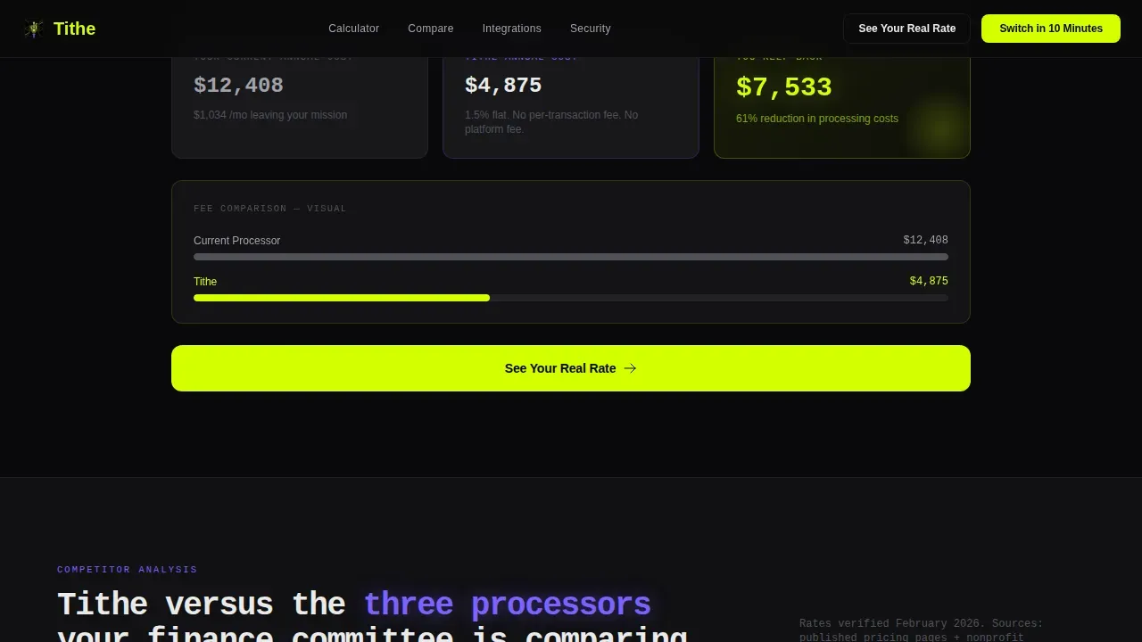
The calculator is the first full section after the hero. Visitors enter their annual donation volume, current processor rate, and average gift size. The page returns a real-time comparison showing current annual cost versus platform cost, with the savings figure rendered in oversized chartreuse type that animates upward like a ticker. This is important because it does the convincing before a single call to action appears.
Competitor Comparison Table
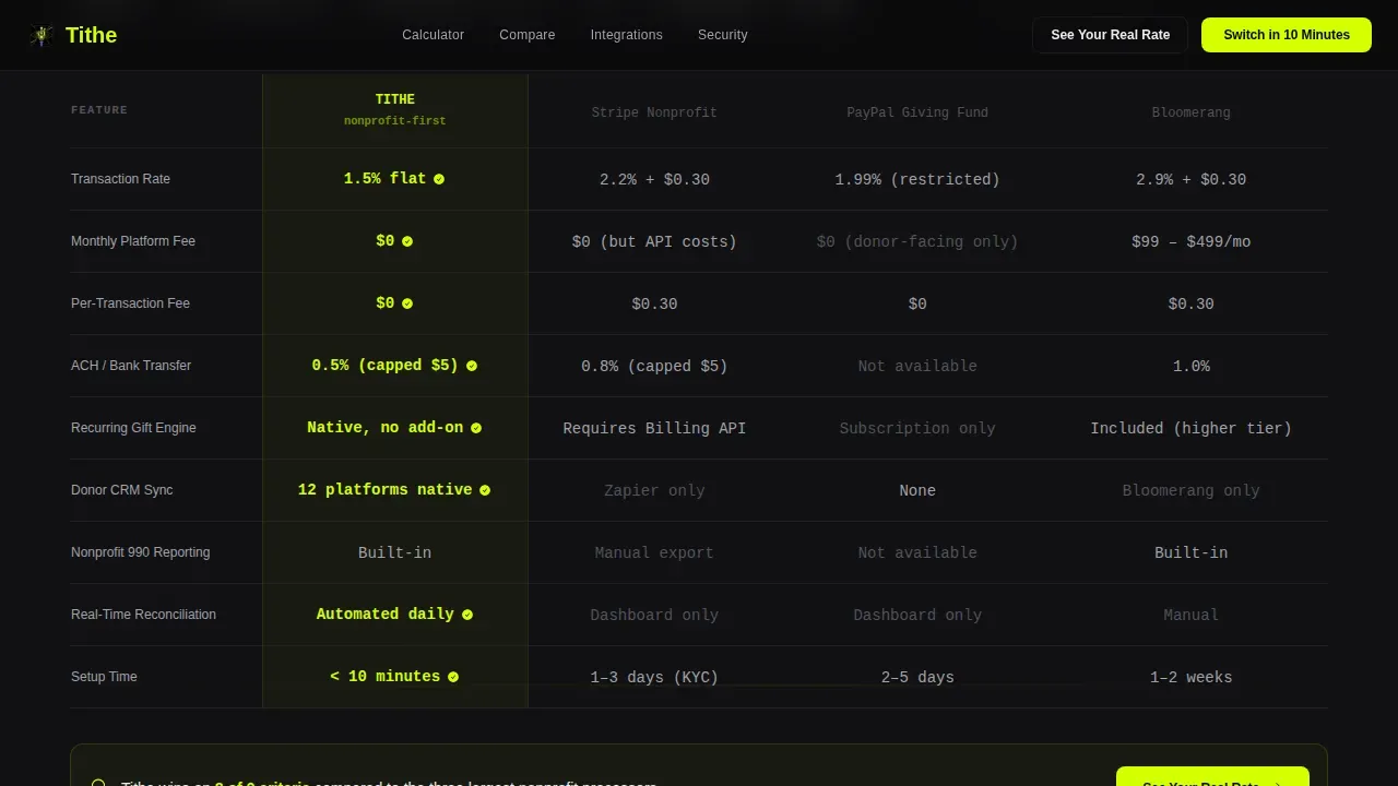
A structured, violet-highlighted table places this platform's fee structure beside competing payment processing options. Each row is scannable and easy to review. The layout makes the cost difference visible without requiring the reader to do extra math, making it an important trust-building device for skeptical finance teams.
Donor CRM Integrations Grid
A dedicated section displays compatibility with donor management platforms. The grid helps operations teams decide quickly whether the platform fits their existing stack, reducing the number of pre-sale questions and streamlining the evaluation process.
Security and Compliance Vault Section
This section unfolds progressively on scroll to reveal compliance credentials including PCI DSS (Payment Card Industry Data Security Standard), SOC 2 (System and Organization Controls 2), ACH (Automated Clearing House) support, and bank-level encryption. Security and compliance badges are placed prominently to protect donor trust and assure finance committees that donor data is safe.
Three-Field Progressive Sign-Up Form
The form collects only three fields: organization name, annual donation volume via dropdown, and work email. No phone number, no meeting booking. Simplified donation forms reduce abandonment. The page promises an instant custom rate card delivered to the inbox after submission, keeping the experience frictionless.
Page sections overview
| Section | Purpose |
|---|---|
| Dark Glass Hero | Display live fee metrics via three glassmorphism cards |
| Savings Calculator | Let visitors calculate and see their real processing cost savings |
| Competitor Comparison | Compare fee structures side-by-side with violet-highlighted rows |
| CRM Integrations Grid | Show donor platform compatibility to reduce pre-sale friction |
| Security Vault | Reveal compliance credentials progressively on scroll |
| Sign-Up Form | Collect three fields and deliver an instant custom rate card |
| Footer | Single-row linear footer with essential links |
Design & branding system
The visual identity channels Startup Velocity energy through an Acid Digital color system. Every color choice is functional. Nothing is decorative without purpose.
- Void black (#09090B) dominates all backgrounds, chartreuse (#D4FF00) owns every interactive element and savings number, synthetic violet (#7B61FF) marks comparison differentiators, and interface white (#EAEAEA) handles body text on dark surfaces
- JetBrains Mono is used for all numerical and data-driven elements; DM Sans handles all body copy, keeping the page readable without losing its terminal-fintech character
- The branding system is built to customize easily: swap organization colors, update copy, and add your own logo without rebuilding the layout from scratch
Mobile & speed optimization
The template is desktop-first, designed for operations directors working on workstations. It is also fully responsive to tablet viewports. Mobile-friendly pages can yield significantly more donations compared to non-responsive designs, so responsive behavior is built into the layout.
- Scroll-reveal animations use staggered Intersection Observer triggers, so each section loads as the user reaches it rather than all at once
- Server Components handle static sections like the hero cards and comparison table; Client Components are scoped to the interactive calculator and animation layers
- The donation form is kept minimal and above the fold where it matters most, reducing load weight and keeping the focus on conversion
How this template helps you convert
This landing page is engineered as a Comparison/Versus conversion engine. It does not ask for trust upfront. It earns it through data, then makes the next step easy.
- The savings calculator generates a real, personalized number for each visitor before any persuasion copy appears, making the value proposition concrete and immediate
- The primary call-to-action, "See Your Real Rate," appears first inside the calculator output and repeats after each competitor comparison row, so donors and finance teams always have a clear next step
- The sticky secondary button, "Switch in 10 Minutes," stays visible throughout the scroll, providing convenience and a low-commitment entry point for teams ready to act
Other information about this template
This template is a recommended starting point for any nonprofit software or fintech team that wants to build a high-converting payment processing landing page without starting from scratch. It is particularly well-suited for teams whose clients need to raise funds efficiently and process tithes, one-time gifts, and recurring donations through a single, transparent platform.
- The template is easy to embed into an existing website or deploy as a standalone page, and you can add or share the URL across fundraising campaigns and event promotions
- Nonprofit organizations can use the included layout to streamline their offerings and communicate mission impact clearly, with options to customize copy, branding, and form fields
- The page is designed to support community fundraising, sponsor acknowledgment, and convenient giving by providing a place where supporters can contribute without confusion
- Platforms like Stripe and PayPal are referenced in the competitor comparison section of this template, making it relevant for teams whose audience is already familiar with those standard processing vendors
- The Tithe transparent nonprofit payment processing landing page template is recommended for teams that want to generate trust, protect donor data, and convert new donations at scale
Theme
Startup Velocity
Creative direction
Calculator/Tool First
Color system
Acid Digital
Style
Scroll Reveal (Progressive)
Direction
Comparison/Versus
Page Sections
Live Fee Metric Hero Cards
Interactive Savings Calculator
Competitor Comparison Table
Donor CRM Integrations Grid
Security and Compliance Vault Section
Three-field Progressive Sign-up Form
Related questions
Can I customize this template to match my organization's branding?
Does the template include the interactive savings calculator as a working component?
How does this landing page handle security messaging?
Is this template suitable for one-time gift campaigns as well as recurring donations?
What makes this different from a standard nonprofit donation page template?



