Air Traffic Control Training Landing Page
Controlscope is a dark-themed, modular landing page built for air traffic control training academies. It combines a qualifying multi-step header form, people-forward card grids, and a pinned event registration call to action. The design speaks directly to civil aviation authorities, airline HR teams, and military-to-civilian controller candidates seeking structured, credible training pathways.
by Rocket studio
Quick summary
Controlscope is a single-page template built for air traffic control training programs. It opens with a multi-step qualifying form, flows through a roster of instructors and graduates on modular flip cards, and closes with a friction-reduced cohort registration. The dark radar palette and team-first creative direction communicate authority and community at once.
Who this template is for
This template is designed for organizations that train air traffic controllers at a professional level. It speaks to buyers who need more than a course listing page.
- Civil aviation authorities commissioning ab-initio training programs
- Airline human resources directors upskilling transition candidates
- Military controllers crossing over to civilian ratings who need a credible, structured program showcase
What problem this template solves
Recruiting qualified controller candidates is competitive. A generic course catalog page fails to communicate the rigor, community, and real outcomes that serious candidates and institutional buyers expect to see.
- Candidates cannot self-qualify their training path without guidance, causing drop-off before registration
- Institutional buyers need visible proof of instructor credentials and program structure before committing budget
- High-friction multi-field forms lose candidates who are still in early evaluation mode
What you get with this template
The template delivers a complete, section-led landing page flow. Every component is built around one goal: move qualified candidates from first impression to cohort reservation.
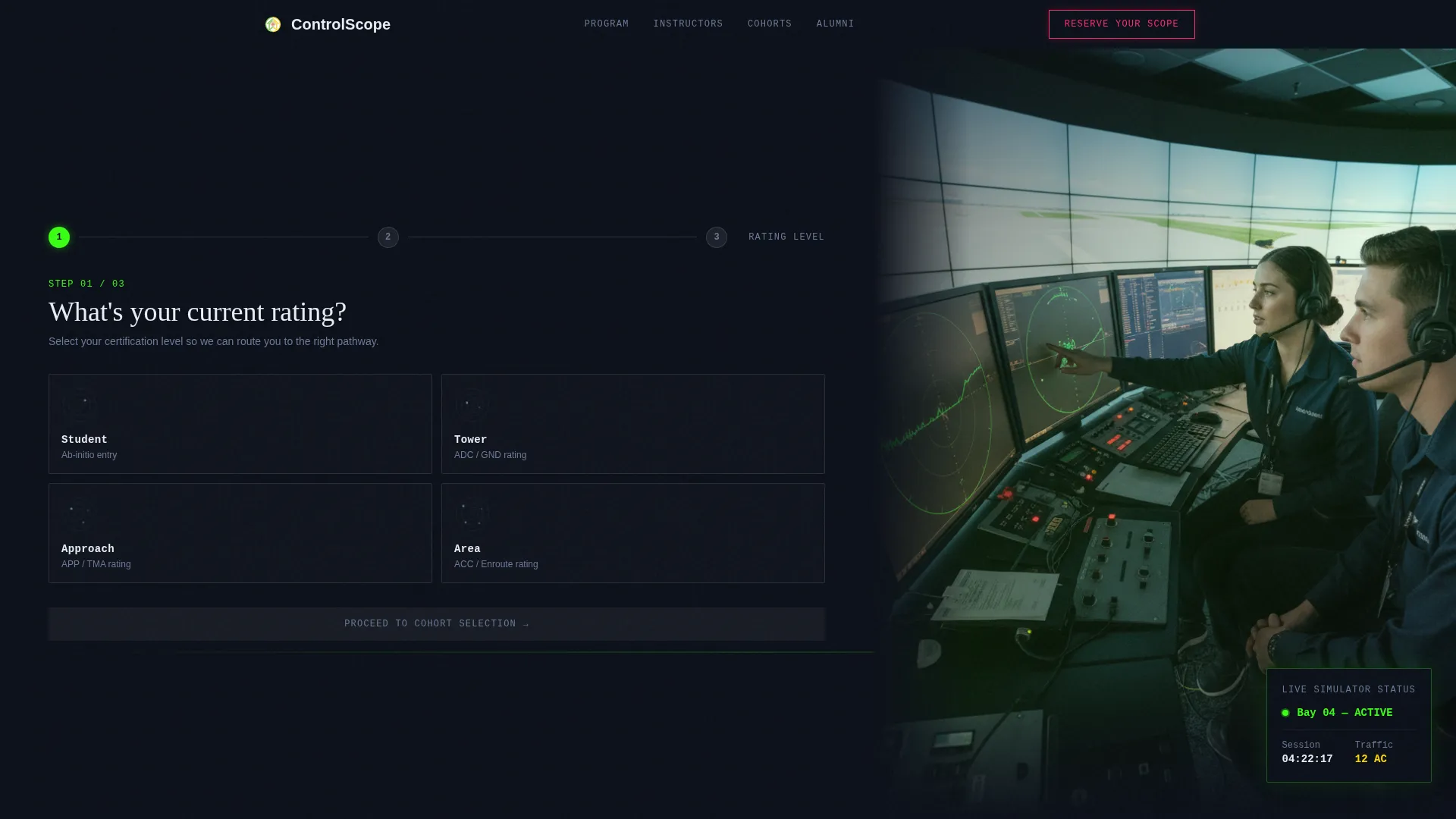
- A multi-step header form that qualifies rating level and preferred cohort date before collecting contact details
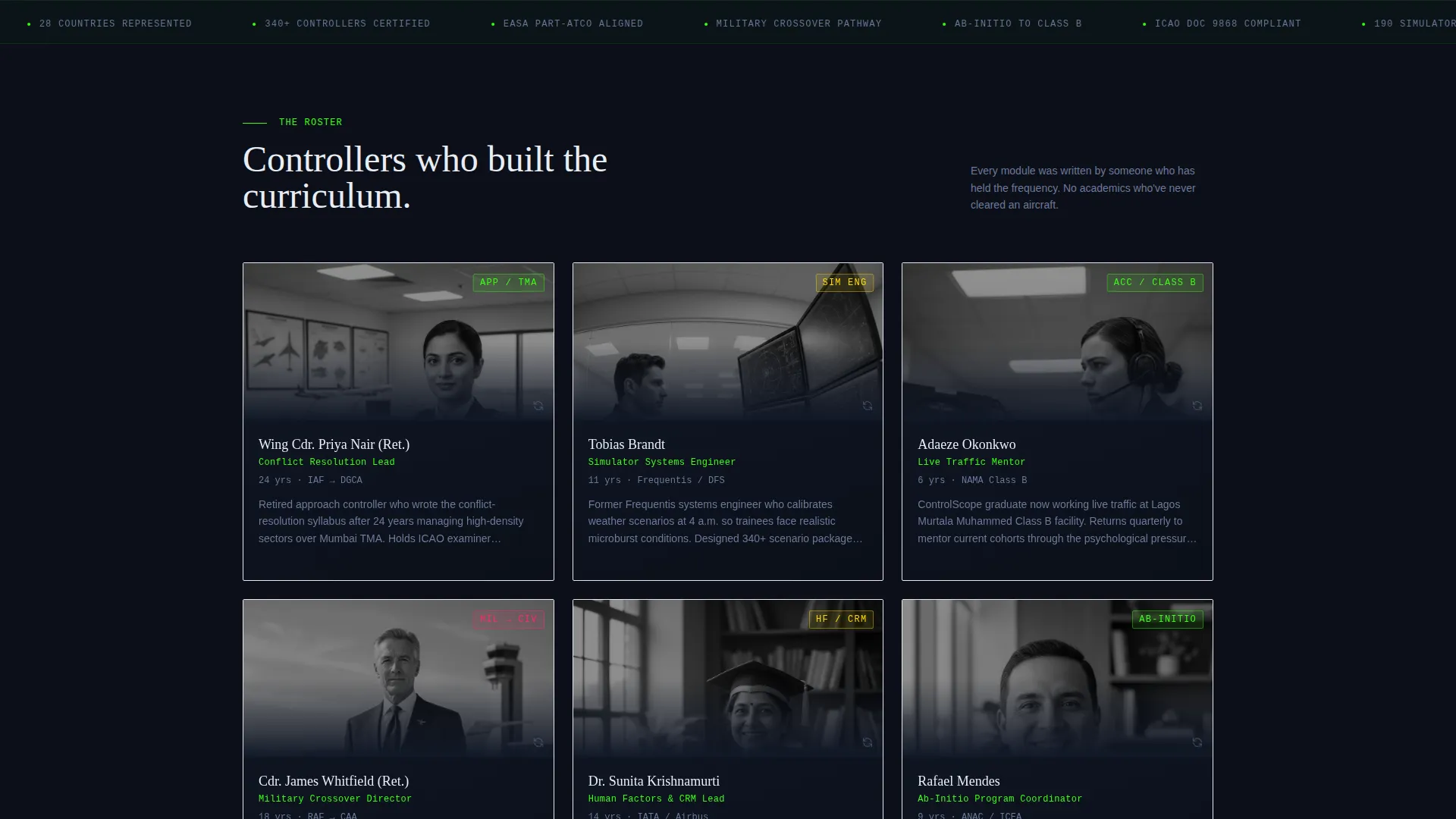
- A modular card grid section where each card introduces a real instructor, technician, or graduate with a flip-on-hover quote and single stat
- A pinned "Reserve Your Scope" call-to-action button and a gated syllabus download path for secondary lead capture
Feature list
This section describes the core functional and design components included in the Controlscope template.
Multi-Step Qualifying Header Form
The header form runs across three focused steps. Step one presents four selectable rating cards: Student, Tower, Approach, and Area. Step two shows a visual calendar with three highlighted cohort windows. Step three collects name and email. The form occupies sixty percent of the viewport width, with a real simulator photograph filling the remaining forty percent.
Modular Instructor and Alumni Card Grid
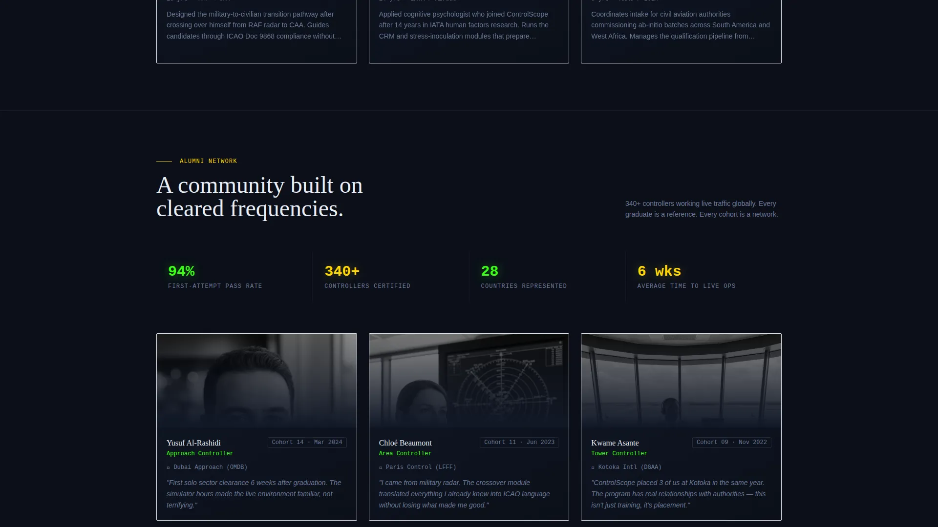
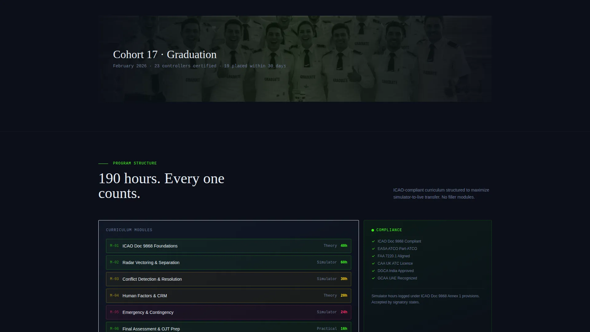
Each card in the grid introduces one person: name, role, and face. On hover, the card flips to reveal a quote and a single key stat such as hours instructed, scenarios designed, or students passed. The rhythm moves from individual portraits to group cohort shots and graduation imagery, building a sense of community progressively.
Pinned Event Registration Call to Action
After the header form is dismissed, a sticky "Reserve Your Scope" button stays anchored at the bottom of the viewport. It appears in conflict-alert magenta and remains visible throughout the scroll, ensuring the primary conversion action is never out of reach.
Gated Syllabus Download Path
A secondary conversion path labeled "Download the Syllabus" gates a detailed program PDF behind an email capture form. This gives visitors who are not yet ready to register a lower-commitment next step while still capturing their contact information.
Reduced-Friction Final Registration Card
By the time a visitor reaches the cohort detail cards at the bottom of the page, their rating level and preferred dates are already captured from the header form. The final registration card asks only for employer name and billing contact, collapsing the remaining friction to a single action.
Dopamine Pop Dark Color System
The palette is built around deep radar-screen black, electric surveillance green, high-visibility taxiway yellow, and conflict-alert magenta. Greens and yellows appear on card borders, progress indicators, and hover states. Magenta is reserved exclusively for calls to action and urgency indicators.
Page sections overview
| Section | Purpose |
|---|---|
| Multi-Step Header Form | Qualifies rating level, cohort date, and contact details upfront |
| Simulator Photo Panel | Anchors credibility with real equipment and real people imagery |
| Instructor Card Grid | Introduces program team through modular flip cards with stats |
| Cohort Detail Cards | Presents upcoming training windows with registration context |
| Alumni and Community Section | Builds trust through graduate outcomes and group imagery |
| Gated Syllabus Download | Captures secondary leads via PDF email gate |
| Pinned Registration call to action | Keeps the primary conversion action visible throughout scroll |
Design & branding system
The visual identity follows a Corporate Precision theme executed through a Dopamine Pop color system. The result feels like a tower cab at dusk: instruments alive, edges sharp, every element earning its place on screen.
- Color palette: deep radar-screen black (#0B0F19) for backgrounds, electric surveillance green (#39FF14) for card borders and hover states, high-visibility taxiway yellow (#FFD600) for progress indicators, and conflict-alert magenta (#FF2D6B) reserved for calls to action
- Card borders, hover state highlights, and progress step indicators all use the green and yellow palette to create a live-scope blip rhythm as users interact with the page
- The right-side simulator photograph uses real equipment and authentic green-glow lighting, reinforcing the dark register of the overall palette without relying on stock imagery
Mobile & speed optimization
The modular card grid layout is structured to reflow cleanly across screen sizes. The multi-step form is built in focused single-column steps, which work naturally on smaller viewports without requiring horizontal scrolling.
- Card grid columns collapse to a single-column stack on mobile, keeping instructor and alumni content readable at any screen width
- The pinned registration button remains anchored at the bottom of the viewport on mobile, preserving the primary conversion path regardless of device
- The multi-step form structure reduces the number of fields visible at once, keeping each step lightweight and easy to complete on touch devices
How this template helps you convert
The entire page flow is built as a qualification and conversion funnel. Each section moves the visitor one step closer to committing, without ever feeling like a hard sell.
- The multi-step header form qualifies candidates early, segmenting by rating level and preferred cohort window before contact details are collected, so the final registration step feels like a natural continuation rather than a cold form
- The instructor and alumni card grid builds trust progressively through real faces, real stats, and real quotes, giving institutional buyers the credibility evidence they need before approving program spend
- The pinned call-to-action button and gated syllabus download create two parallel conversion paths for visitors at different stages of decision, capturing both ready-to-register candidates and early-stage evaluators in the same scroll
Other information about this template
This template is part of a niche-specific design system built for aviation and maritime training schools operating in highly regulated, credential-driven environments. It is well suited for programs that follow structured frameworks such as those outlined by the International Civil Aviation Organization (ICAO).
- The card grid layout is modular, meaning individual instructor, cohort, or alumni cards can be added, removed, or reordered without rebuilding the page structure
- The creative direction is Team and People, meaning the visual and copy hierarchy centers on the humans behind the program rather than course specifications alone
- The template style is Card Grid (Modular), and the landing page direction is Event Registration, making it purpose-built for cohort-based enrollment cycles
Theme
Corporate Precision
Creative direction
Team & People
Color system
Dopamine Pop
Style
Card Grid (Modular)
Direction
Event Registration
Page Sections
Multi-step Qualifying Header Form
Modular Instructor and Alumni Card Grid
Pinned Event Registration Button
Gated Syllabus Download Path
Reduced-friction Final Registration Card
Dopamine Pop Dark Visual System
Related questions
Who is this template designed for?
Can I present multiple upcoming cohorts on this template?
How does the multi-step form help reduce candidate drop-off?
What does the final registration card ask for?
Is there a way to capture leads who are not ready to register yet?



