Customer Advisory Board Landing Page Template
Convene is a split-screen landing page template built for customer advisory board platforms. It pairs a live-metric stats wall with a feature matrix layout to move VP-level buyers from curiosity to download. Void black backgrounds, chartreuse counters, and parallax-driven feature rows make the case row by row, converting scattered executive feedback into a compelling product story.
by Rocket studio
Quick summary
Convene is a single-page, split-screen landing page template designed for customer advisory board platforms. It opens with an animated metrics wall, then walks visitors through a scrolling feature matrix that pairs each capability with a measurable outcome. Every section builds the case for app download, using motion, color, and quantified results to earn the click.
Who this template is for
This template is built for B2B software teams that run structured advisory programs and need a polished, high-converting page to recruit and onboard members. It speaks the language of data-driven product and customer success leaders.
- VP-level customer success leaders at B2B software-as-a-service companies who manage advisory boards today using spreadsheets and calendar invites
- Product chiefs at enterprise software firms who need executive feedback structured and piped into roadmap decisions
- Customer experience directors at large organizations who want a credible digital front door for their advisory programs
What problem this template solves
Advisory board programs are often invisible. There is no dedicated page that communicates their value, drives member sign-ups, or proves ROI to executive sponsors. Teams end up stitching together slide decks and email threads instead of pointing stakeholders to a single, confident source of truth.
- Scattered executive feedback never reaches a structured format that product teams can act on quickly
- No single page exists to convert potential advisory members or enterprise buyers into app downloads or onboarding calls
- The program looks informal, reducing trust from VP-level and C-suite participants who expect a polished experience
What you get with this template
You get a fully designed split-screen landing page with dark-mode visual identity, animated metric counters, and a scrolling feature matrix. Every layout decision is made to move visitors toward a clear action without requiring extra design work.
- A stats and metrics header wall with eased counter animations showing participation rate, insights captured, and decision speed benchmarks
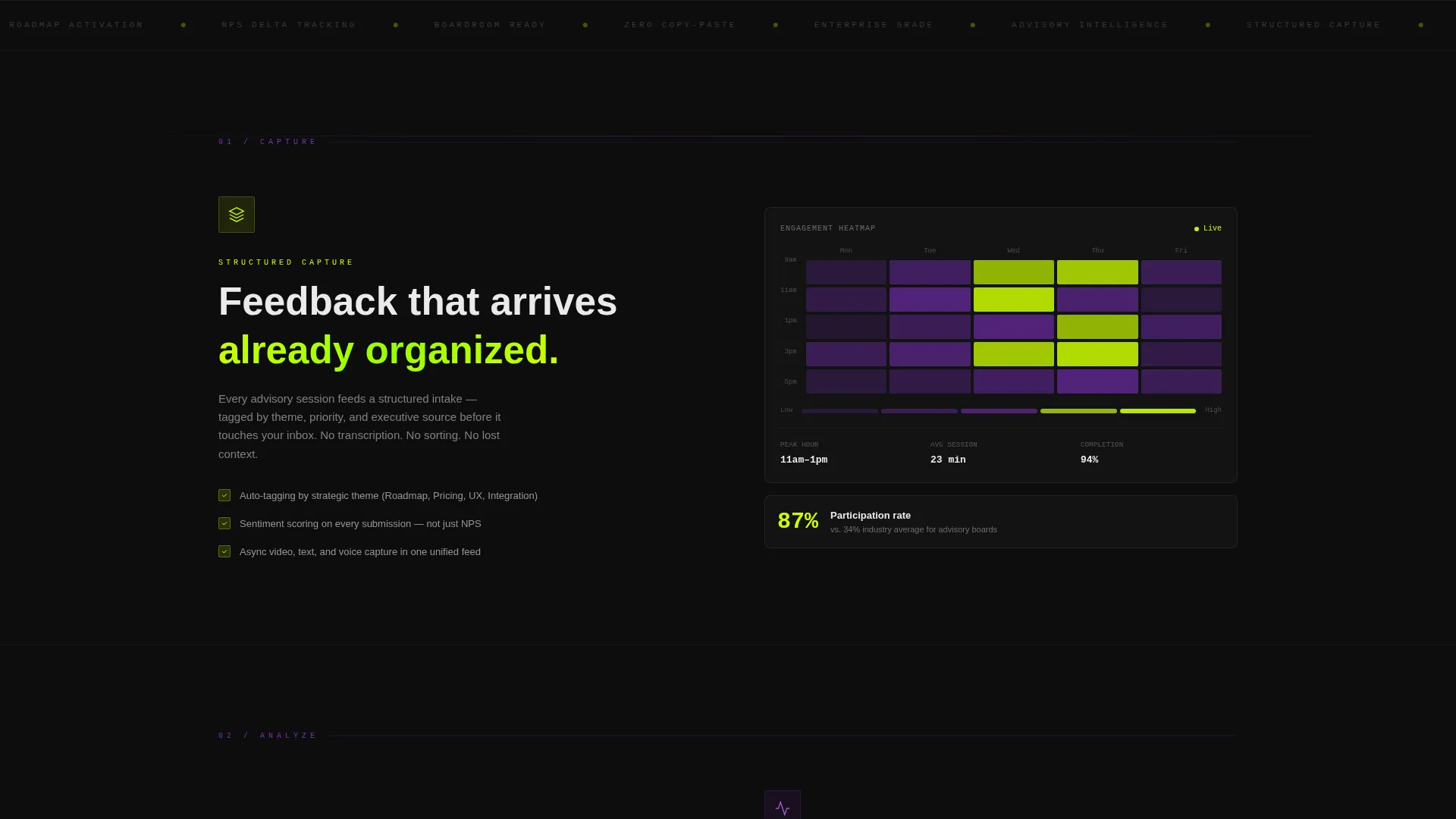
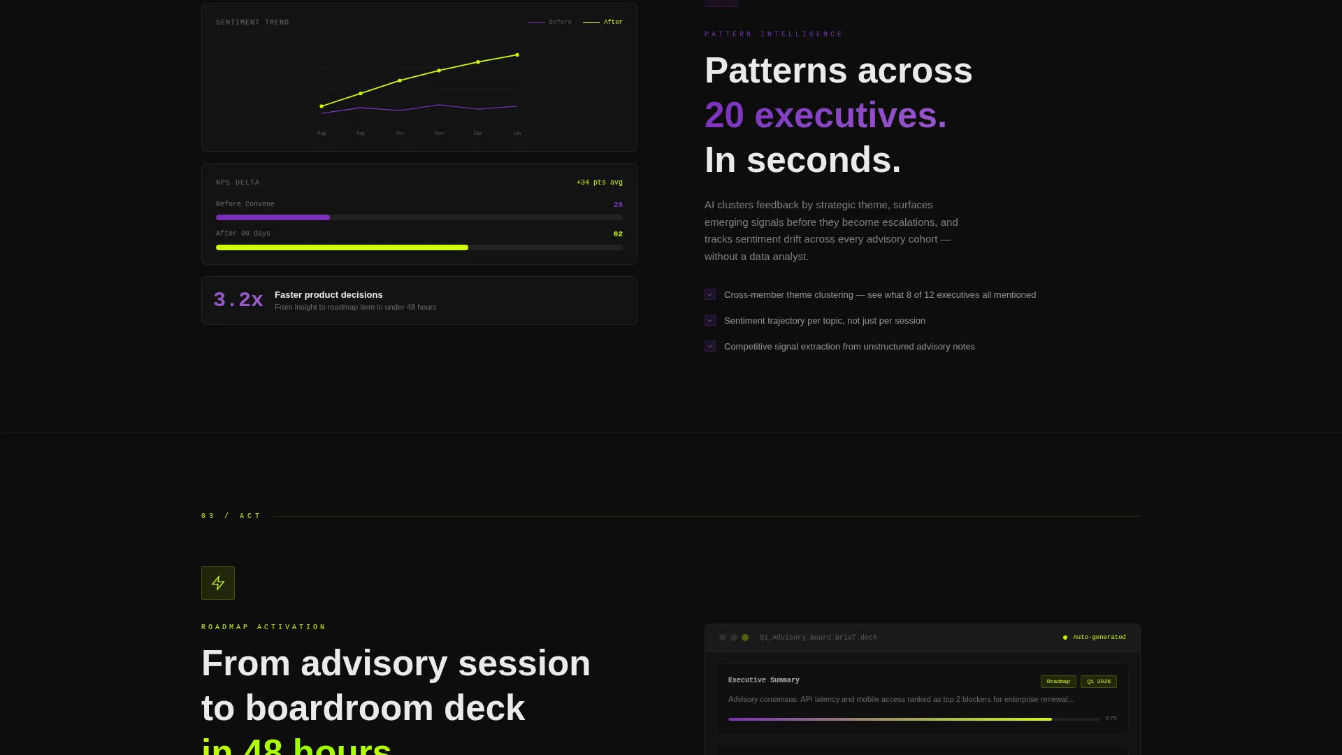
- A feature matrix with left-side capability columns paired with right-side micro-dashboards showing engagement heatmaps, sentiment trend lines, and NPS delta visuals
- Dual call-to-action paths: a primary app download button with OS detection routing and a QR code for desktop visitors, plus a secondary "Book a Board Setup Call" path for enterprise buyers
Feature list
This template is built around seven quantified outcome rows and two conversion paths. Each component below is directly included in the template design.
Animated Stats and Metrics Wall
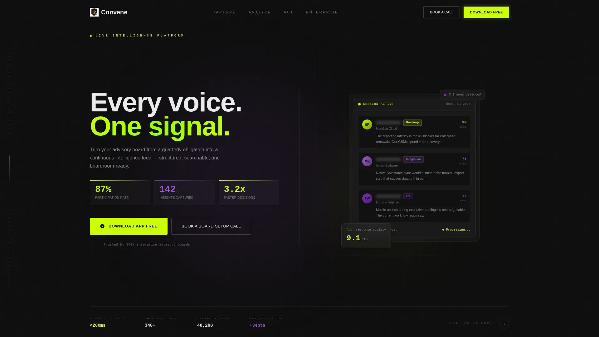
The header spans the full viewport in a 50/50 split. The left panel displays a real-time-styled dashboard with advisory engagement numbers: 87 percent participation rate, 142 insights captured, and 3.2x faster product decisions. Counters tick upward with eased animations to make the data feel live.
Device Mockup Panel
The right side of the header shows phone and tablet mockups running the advisory session interface. A member's face sits behind a frosted-glass card displaying submitted feedback tagged by theme. No stock photography is used anywhere on the page.
Scrolling Feature Matrix Layout
Past the header, the page splits into capability rows. Each row places a feature name, icon animation, and one explanatory sentence on the left. The right side shows a micro-dashboard proving the feature works, including engagement heatmaps, sentiment trend lines, and NPS delta views.
Parallax and Draw Animations
Cards slide in on parallax offsets as the visitor scrolls. Charts draw themselves into view. The chartreuse accent pulses gently on interactive elements, creating a heartbeat-monitor rhythm that keeps the page feeling alive without becoming distracting.
Sticky Mobile call to action Bar
On mobile, the primary call-to-action is anchored in a sticky bottom bar so it is always visible. On desktop, the same call to action repeats at the header and after every third feature row, ensuring no visitor has to scroll back to convert.
OS-Detecting Download Button
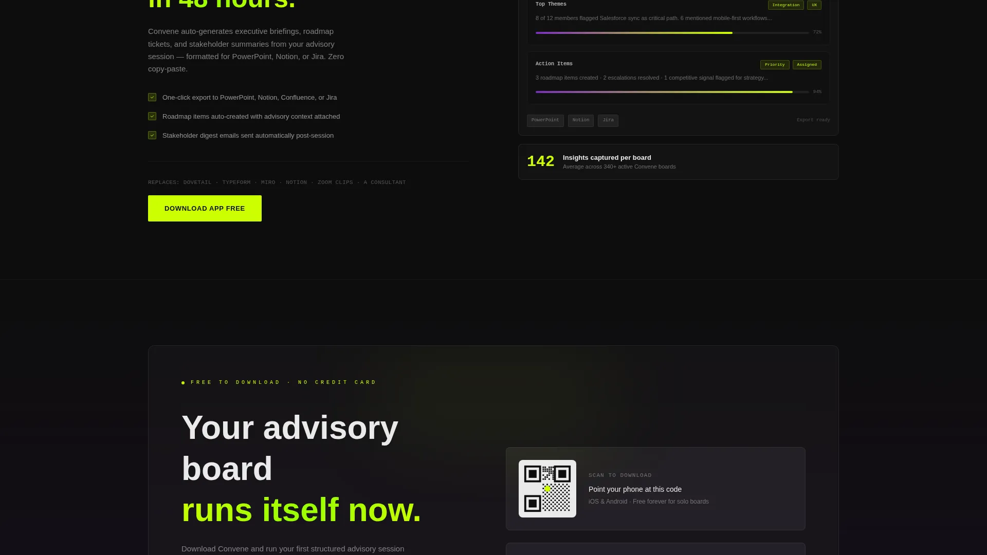
The primary call-to-action reads "Download the App Free." When tapped on a mobile device, it detects the operating system and routes directly to the App Store or Google Play. On desktop, a QR code appears so visitors can point their phone at the screen immediately.
Page sections overview
| Section | Purpose |
|---|---|
| Metrics Header Wall | Opens with live-counter stats and a device mockup to establish instant credibility |
| Feature Row: Capture | Introduces the data-capture capability with an icon animation and a supporting micro-dashboard |
| Feature Row: Analyze | Shows sentiment analysis and engagement heatmap visuals paired with outcome metrics |
| Feature Row: Act | Presents roadmap and boardroom output proof, completing the capture-to-action narrative |
| Repeat call to action Block | Re-anchors the app download call-to-action after the third feature row on desktop |
| Final Conversion Section | Closes with the primary download call to action, QR code, and secondary enterprise booking path |
Design & branding system
The visual identity uses the Acid Digital color system on a Dynamic Motion theme. Every color has a defined role, and nothing is decorative without purpose.
- Void black (#0D0D0D) dominates all backgrounds, giving the page the feel of a near-future ops center terminal
- Electric chartreuse (#CCFF00) fires on call-to-action buttons, hover states, and live metric counters; synthetic violet (#7B2FBE) marks section transitions and graph accents
- Interface white (#EAEAEA) handles all body text and card surfaces, keeping typography readable against the dark backgrounds
Mobile & speed optimization
The template is built for mobile-first conversion. The sticky call to action bar and OS-detecting button ensure that a visitor on any device can act without friction.
- Sticky bottom bar on mobile keeps the primary download call-to-action in view at all times during scroll
- Device mockups in the header are sized and positioned to render clearly on both phone and tablet viewports
- The QR code on desktop bridges the gap between screen and phone, removing the need for a visitor to type or search
How this template helps you convert
Every design decision in Convene is built to reduce hesitation and move visitors toward the app download or enterprise booking call.
- The metrics wall leads with proof. Visitors see 87 percent participation rate and 3.2x faster decisions before they read a single marketing claim, which builds trust from the first scroll.
- The feature matrix earns each click row by row. By the time a visitor reaches the final call-to-action, they have seen seven quantified outcomes and no unsupported assertions, making the decision to download feel logical rather than risky.
Other information about this template
This template sits at the intersection of the Documentation and Support category with a Community and Forum subcategory, specifically targeting the customer advisory board niche. It is designed as a single landing page rather than a multi-page website, which keeps the conversion path focused and direct.
- The template style is Split Screen (50/50), and the creative direction follows a Feature Matrix structure that escalates in complexity from capture to analyze to act
- The header concept is a Stats and Metrics wall, and the landing page direction is App Download, making this template a strong fit for mobile-first go-to-market launches
- The Acid Digital color system and Dynamic Motion theme together create a visual language that feels credible to VP-level and enterprise buyers without relying on stock imagery or generic design patterns
Theme
Dynamic Motion
Creative direction
Feature Matrix
Color system
Acid Digital
Style
Split Screen (50/50)
Direction
App Download
Page Sections
Animated Metrics Header Wall
Device Mockup with Frosted-glass Feedback Card
Capability-outcome Feature Matrix
Parallax Scroll and Draw Animations
Os-detecting App Download Call to Action
Dual Conversion Path Design
Related questions
Who is this template designed for?
Can I update the feature matrix rows with my own platform messaging?
How many call-to-action placements are included in the template?
Does the template work for a pre-launch advisory platform?
What visual style does this template use?



