Reinforcement Learning Platform Landing Page Template
Converge is a scroll-reveal landing page template built for reinforcement learning platforms. It opens with live-styled metric panels, moves through benchmark grids and animated reward curves, and closes with a clear call to action. The design channels a terminal-at-midnight aesthetic, monochrome steel tones with a single electric accent reserved for signals that mean something is working.
by Rocket studio
Quick summary
Converge is a single-page, scroll-reveal landing page template designed for reinforcement learning platforms. It leads with numbers, earns credibility through data visualizations, and routes engineers directly to a signup flow. The visual language mirrors a successful training run, dark, precise, and lit only where it counts.
Who this template is for
This template was built for technical teams who need to communicate the performance of their reinforcement learning platform without resorting to marketing fluff. It speaks the language of the people who will read it.
- Machine learning engineers who debug sparse reward functions and need a page that respects their time
- Robotics teams working on sim-to-real transfer who want to show benchmark results clearly
- Quantitative researchers and platform founders who need to attract early adopters with hard evidence
What problem this template solves
Most landing pages for technical platforms rely on abstract claims that fail to persuade engineers. Visitors leave before they ever see proof of value. Converge flips that pattern by leading with evidence first.
- Generic hero sections delay the numbers that engineers actually care about
- Vague copy around "intelligent agents" or "scalable infrastructure" builds no real trust
- A missing or cluttered call-to-action flow causes drop-off before signup
What you get with this template
You get a complete, single-page scroll-reveal layout built around the specific visual rhythm of a reinforcement learning product. Every section is purposeful and sequenced to build confidence before asking for a click.
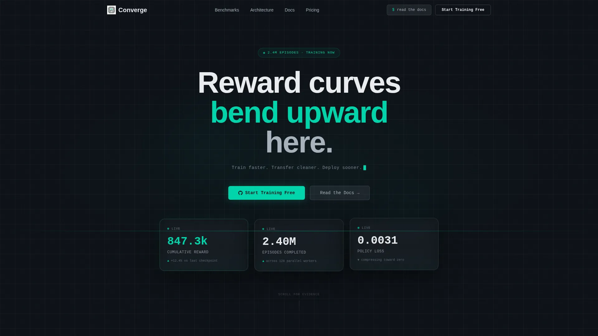
- Dark glass panel header with three live-styled metric cards showing cumulative reward, episode count, and policy loss
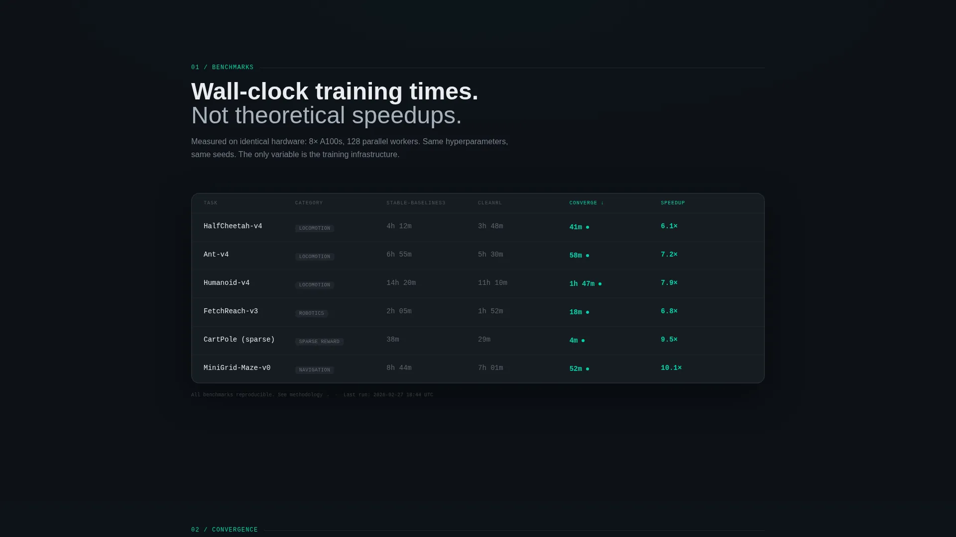
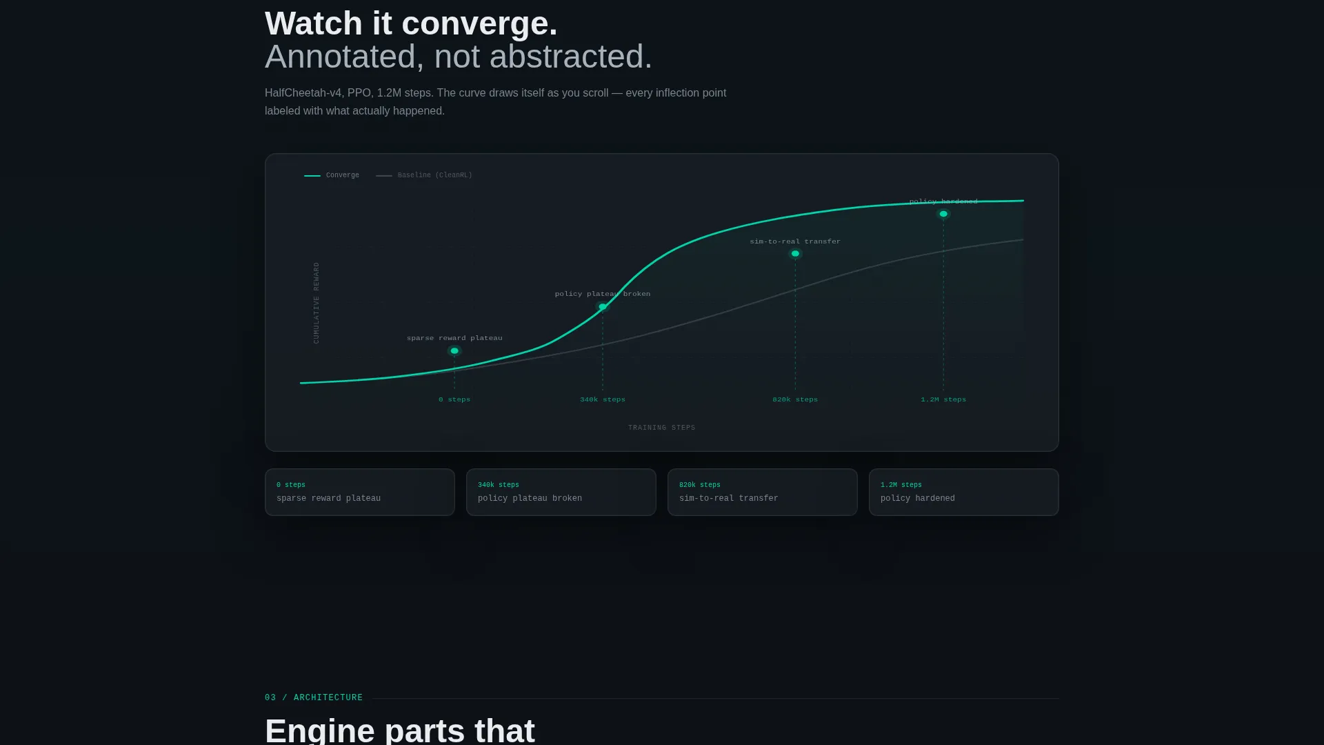
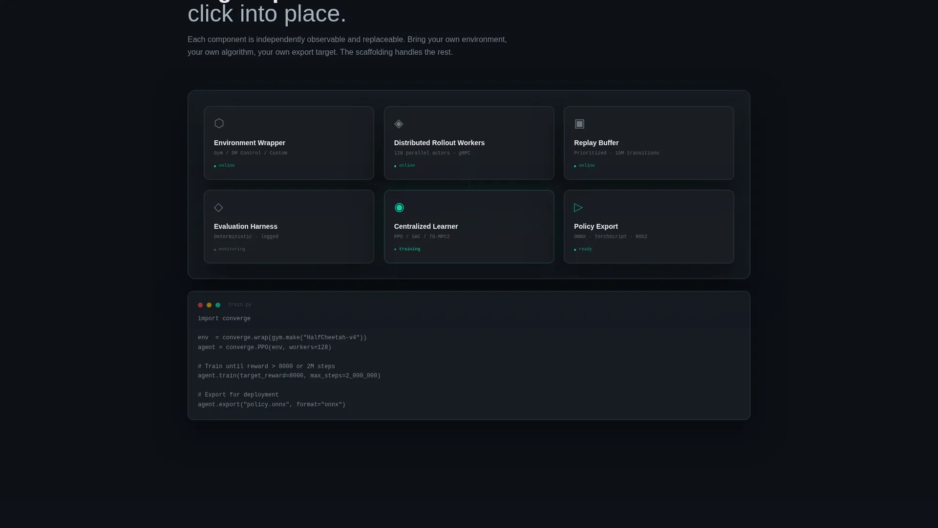
- A benchmark comparison grid, an animated reward curve section, and a step-by-step architecture diagram
- Two call-to-action states: a ghost button in the header and a solid accent block after the benchmark section, plus a secondary "Read the Docs" button in chrome gray
Feature list
This template was designed with a clear set of functional and visual components drawn directly from the brief.
Live-Styled Metric Header
Three translucent frosted-glass cards float against a near-black void. Each card displays a key training metric: cumulative reward climbing, episode count ticking past 2.4 million, and policy loss compressing toward zero. The panels carry subtle depth-of-field blur and surface reflections.
Scroll-Reveal Section Sequence
Each content block enters the viewport progressively as the user scrolls. The benchmark grid fades up row by row, the reward curve draws itself across the screen, and the architecture diagram assembles component by component.
Benchmark Comparison Grid
A structured grid shows wall-clock training times against baseline platforms. The platform column is highlighted in the electric accent color on each row, making the performance advantage immediately visible without explanation.
Animated Reward Curve
An SVG-style reward curve draws itself across the full viewport width. Plain-language callouts appear at key inflection points, such as "policy plateau broken at 340k steps," making the visualization readable to both technical and non-technical viewers.
Architecture Diagram Assembly
The environment wrapper, replay buffer, and distributed rollout workers each click into place sequentially. This section shows platform architecture as a living diagram rather than a static image.
Dual Call-to-Action System
The primary call to action, "Start Training Free," appears as a ghost button in the header and transitions to a solid electric-accent block after the benchmark section. A secondary "Read the Docs" button sits beside it in chrome gray for engineers who need to inspect before committing.
Page sections overview
| Section | Purpose |
|---|---|
| Dark Glass Header | Display live-styled training metrics and first call-to-action ghost button |
| Tagline Block | Deliver the single-line positioning statement in monospaced type |
| Benchmark Grid | Show wall-clock training comparisons against baselines row by row |
| Reward Curve | Animate the reward signal trajectory with annotated plain-language callouts |
| Architecture Diagram | Assemble platform components visually to show infrastructure depth |
| Solid call to action Block | Convert on earned credibility with the primary and secondary action buttons |
Design & branding system
The visual identity is built on a Monochrome Steel palette that reads like a terminal window at midnight. Color is used with strict intent: the single electric accent appears only where something is working.
- Core palette: deep gunmetal (#1B1F23), brushed chrome (#A8B2BD), cold white (#EAECEF), and electric accent (#00D4AA) reserved for positive metrics and active states
- Typography uses monospaced type for the hero tagline, reinforcing the terminal and developer-tool aesthetic throughout
- Background void is near-black (#0D1117), keeping focus on data panels and metric callouts rather than decorative elements
Mobile & speed optimization
The template is structured for clean rendering across screen sizes, with layout decisions that keep the data-heavy sections legible on smaller viewports.
- Scroll-reveal animations are sequenced to perform smoothly as sections enter the viewport one at a time
- The metric header panels and benchmark grid are designed to stack gracefully on narrower screens without losing visual hierarchy
- Call-to-action buttons are sized and spaced for comfortable interaction on both desktop and mobile displays
How this template helps you convert
Converge is built around a specific persuasion sequence: show results first, explain infrastructure second, ask for the click last. Every section earns the next one.
- The benchmark grid and animated reward curve present hard performance evidence before any copy asks for intent, so engineers arrive at the call to action already convinced
- The dual call-to-action system serves two distinct engineer mindsets: those ready to start and those who need documentation first, reducing drop-off from both groups
Other information about this template
This template is part of a broader set of high-performance landing page templates built for technical SaaS and AI platform use cases. A few additional details worth knowing before you customize it.
- The Startup Velocity theme means the layout moves fast and wastes nothing. Every scroll step is a data point, not a pause
- The Stats-First Impact creative direction means no introductory philosophy section appears before the numbers
- The Click-Through landing page direction means there is no form on the page. The single action routes to a signup flow with GitHub OAuth as described in the brief
- The template style is Scroll Reveal (Progressive), meaning each section enters the viewport in a timed sequence rather than loading all at once
- The color system is Monochrome Steel, and the electric accent (#00D4AA) is used exclusively for positive metrics, active states, and reward signals throughout the layout
Theme
Startup Velocity
Creative direction
Stats-First Impact
Color system
Monochrome Steel
Style
Scroll Reveal (Progressive)
Direction
Click-Through
Page Sections
Live-styled Metric Header Panels
Row-by-row Benchmark Grid
Animated Reward Curve Visualization
Step-by-step Architecture Diagram
Dual Call-to-action System
Scroll-reveal Progressive Layout
Related questions
Who is this landing page template designed for?
Does this template include a contact form or lead capture form?
Can I update the metric values shown in the header panels?
How many calls to action does this template include?
What makes this template visually different from a standard SaaS landing page?



