Local Advanced Tech & AI Platforms Comparison Website Template
Converse is a high-converting comparison table landing page built for conversational commerce platforms. It opens with a live stats wall, moves through a side-by-side before-and-after table, and drives app installs with a single-field download flow. The design uses deep terminal black and electric indigo to create a data command aesthetic that feels urgent, precise, and impossible to ignore.
by Rocket studio
Quick summary
Converse is a single-page, comparison-table landing page template built for a conversational commerce platform. It opens with animated live metrics, escalates through a bold before-and-after comparison table, and closes with a frictionless app install flow. The visual identity runs on deep terminal black and charged indigo, giving every section the charged energy of a live mission control screen.
Who this template is for
This template is built for teams who sell through chat and need a landing page that matches the speed of their product. It speaks directly to operators who measure success in recovered carts, not bounce rates.
- Direct-to-consumer brand operators dealing with abandoned carts and fragmented support tools
- E-commerce managers who want one unified inbox instead of five disconnected platforms
- Growth leads at mid-market retailers who know slow reply times are costing them revenue
What problem this template solves
Most landing pages for commerce tools explain features in long paragraphs. Visitors skim, lose interest, and leave before they understand the cost of not switching. This template reverses that pattern by making the cost of inaction visible in every row of the comparison table.
- Abandoned cart anxiety is addressed immediately through live-counting metrics in the header
- Tool fragmentation confusion is resolved by showing a unified workflow versus scattered alternatives
- Slow conversion paths are replaced by a one-field install flow that removes signup friction entirely
What you get with this template
You get a fully structured, single-page layout designed to earn the install tap. Every section flows into the next with escalating energy, from raw performance data at the top to a locked-in call to action at the bottom.
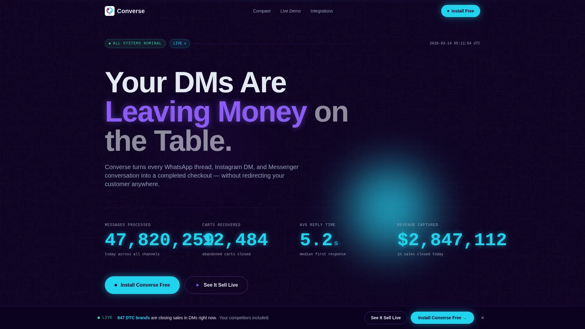
- A full-viewport stats wall header with animated counters for messages processed, carts recovered, reply time, and revenue captured
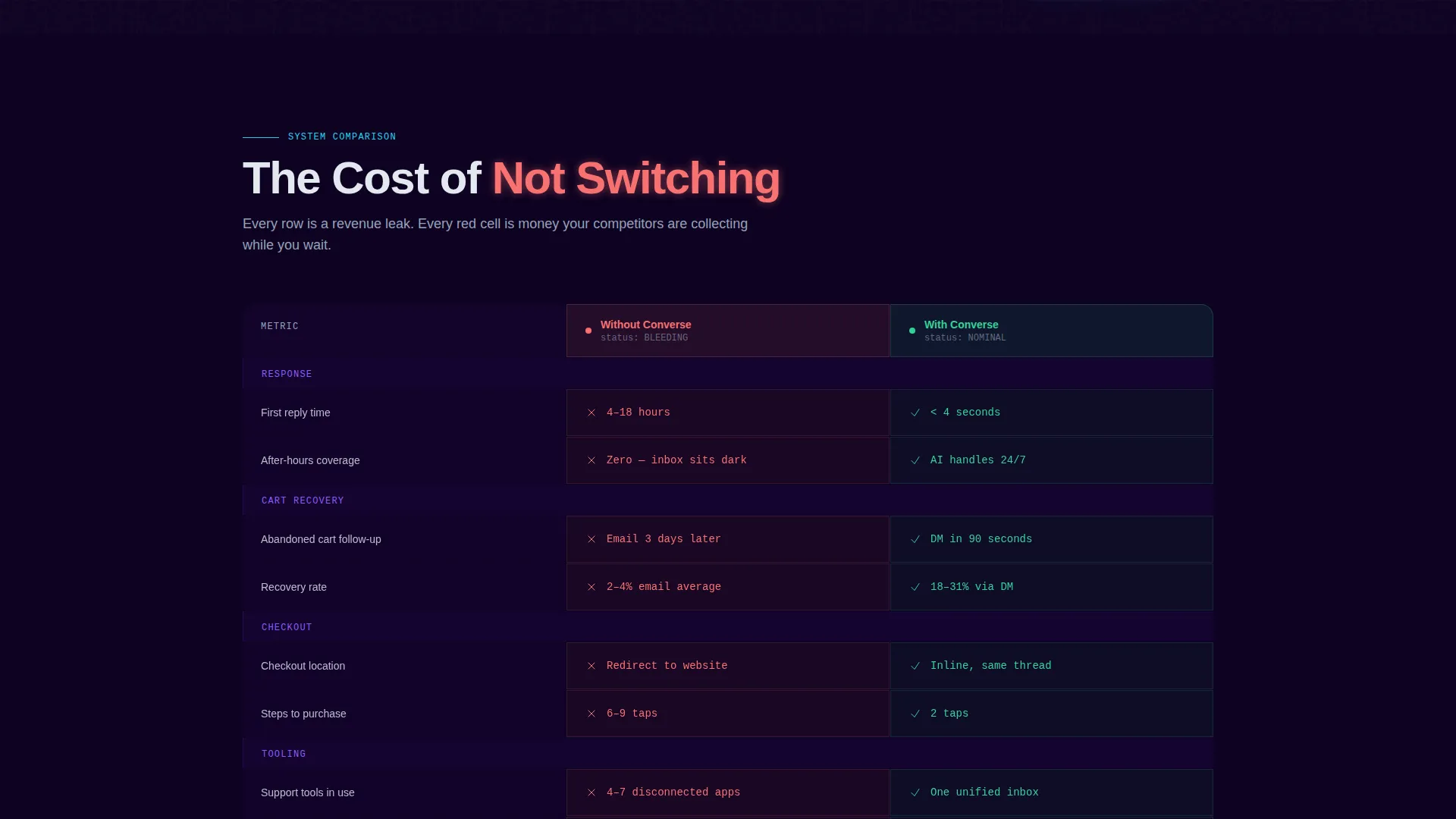
- A side-by-side comparison table with red-highlighted manual workflow rows on the left and green automated flow rows on the right
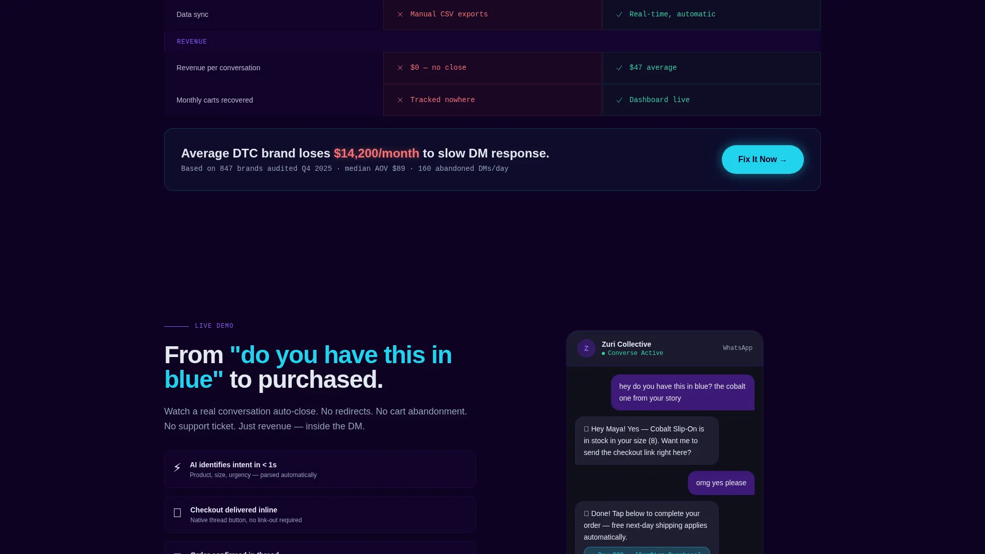
- A live chat simulation section that auto-plays a customer conversation from first message to completed purchase
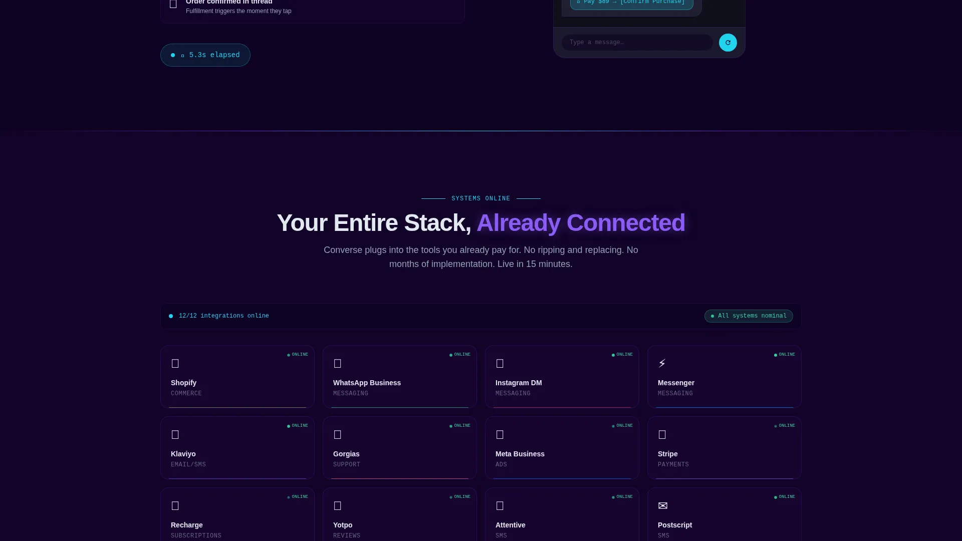
- An integration logo grid that pulses on like systems coming online
- A fixed bottom bar with a primary cyan-glowed install button and a secondary demo video link
- A one-field download flow using only a phone number to send an SMS install link
Feature list
This template packs purpose-built components into a tight, fast-scrolling layout. Every element earns its place by moving the visitor closer to the install tap.
Animated Stats Wall Header
The header fills the full viewport with live-counting numbers rendered in reactive cyan. Metrics for messages processed, carts recovered, average reply time, and revenue captured tick upward in real time. A single headline in plasma violet anchors the data and sets the stakes immediately.
Side-by-Side Comparison Table
The comparison table places the cost of inaction directly beside the benefit of switching. Each row animates in like a system check completing. Red-highlighted cells show manual, scattered workflows; green cells show automated, unified results.
Live Chat Simulation Block
A scripted conversation auto-plays from an opening product question to a completed purchase in eleven seconds. This section demonstrates platform velocity without explaining it, showing visitors exactly how fast a chat-to-checkout flow can move.
Integration Logo Grid
A grid of integration logos pulses onto the screen in sequence, evoking systems coming online. This section communicates platform connectivity at a glance, without requiring the visitor to read a list.
Fixed Install call to action Bar
After the comparison table scrolls into view, a bottom bar locks into place with the primary install button glowing in reactive cyan. The bar stays visible through the rest of the scroll, keeping the conversion path open at all times.
Frictionless One-Field Download Flow
The install flow asks for one input: a phone number. The visitor selects their platform using an iOS/Android toggle and receives an SMS install link. No account creation is required until after the app is installed.
Page sections overview
| Section | Purpose |
|---|---|
| Stats Wall Header | Opens with live-counting performance metrics to establish immediate urgency |
| Comparison Table | Shows before-and-after workflows side by side to make switching costs visible |
| Chat Simulation Block | Auto-plays a chat-to-checkout sequence to demonstrate platform speed |
| Integration Logo Grid | Pulses integration logos on screen to signal platform connectivity |
| Install call to action Bar | Fixed bottom bar keeps the primary download action visible throughout the scroll |
| SMS Download Flow | One-field form sends an install link directly to the visitor's phone |
Design & branding system
The visual identity follows a Data Command theme. Every color choice is deliberate: backgrounds stay dark to make lit elements snap forward, and cyan is reserved exclusively for live data and interactive moments so nothing dilutes its urgency.
- Color palette runs from deep terminal black (#0D0221) through charged indigo (#5B21B6) and hot plasma violet (#8B5CF6) to reactive cyan (#22D3EE) for metrics and call-to-action pulses
- Text renders in cool white (#E2E8F0) against dark backgrounds in the #0D0221-to-#1A0536 range for high contrast without harshness
- Interactive elements and live data points spark with cyan or violet to draw attention the way a notification does on a dark screen
Mobile & speed optimization
The template is built to perform on the devices where conversational commerce actually happens. Visitors arriving from WhatsApp, Instagram, or Messenger links will most likely be on a phone, and the layout accounts for that.
- The fixed install bar and one-field download flow are thumb-friendly by design, reducing tap friction on small screens
- The comparison table is structured to remain readable when stacked vertically on mobile viewports
- Animated counter and simulation elements are scoped to keep the scroll fast and avoid layout blocking on lower-powered devices
How this template helps you convert
The page is structured as a conviction-building sequence. Each section increases the visitor's sense of urgency and removes one more reason to delay the install.
- The stats wall opens with real performance numbers, establishing that the platform is already working for other brands and setting a tone of forward momentum from the first second of the visit
- The comparison table turns hesitation into action by making the gap between the current state and the improved state impossible to ignore, using color and animation to reinforce the contrast
- The one-field SMS install flow removes every traditional signup barrier, letting the visitor move from intent to install in a single step without creating an account
Other information about this template
This template is categorized under Technology and Advanced Tech and Artificial Intelligence Platforms, specifically built for the conversational commerce platform niche. It is designed as a single landing page with a clear app download objective.
- The template style is a comparison table layout, which is particularly effective for platforms competing against fragmented toolsets
- The creative direction is Launch Energy: the scroll is paced like a countdown sequence, with each section escalating rather than repeating the same pitch
- The header concept is a Stats and Metrics wall, which replaces lifestyle photography with raw performance data to match the expectations of data-driven operators
- The Electric Indigo color system is theme-specific and gives the page a distinctive identity within the technology and commerce software category
- The Data Command theme positions the platform as infrastructure, not just a feature add-on, which aligns with how mid-market retailers and direct-to-consumer operators evaluate tools
Theme
Data Command
Creative direction
Launch Energy
Color system
Electric Indigo
Style
Comparison Table
Direction
App Download
Page Sections
Animated Live Stats Wall
Before-and-after Comparison Table
Live Chat-to-checkout Simulation
Pulsing Integration Logo Grid
Fixed Bottom Install Bar
One-field SMS Download Flow
Related questions
Who is this landing page template designed for?
What makes the comparison table section effective?
Does the download flow require visitors to create an account?
What is the primary call to action on this landing page?
Can the integration logo grid be customized for different platforms?



