Coordinate - Powerful Wedding Landing Page Template
Coordinate is a bold brutalist landing page template built for an AI-powered wedding scheduling assistant. It leads with a live dashboard preview, escalates trust through stats-first metric cards, and closes with a focused lead-capture form. Designed for type-A couples, professional planners, and venue coordinators who need proof before they commit.
by Rocket studio
Quick summary
Coordinate is a single-page, card-grid landing page template for a wedding AI scheduling assistant. It opens with a full-viewport dashboard preview showing a real Gantt-style timeline, then builds credibility through oversized efficiency metrics and real-world conflict-resolution data. The page ends with a streamlined lead form that captures wedding date, guest count, and email in three fast steps.
Who this template is for
This template is built for teams and individuals who need a no-nonsense, high-proof landing page to present a wedding scheduling tool. It speaks directly to users whose current process is too slow, too manual, or too fragile to handle complex event logistics.
- Type-A couples managing guest lists of 200 or more from their phones
- Professional wedding planners juggling several Saturday weddings at once
- Venue coordinators who must keep every florist, caterer, and DJ on the same schedule
What problem this template solves
Wedding logistics break down when vendors, timelines, and guest data live in separate places. The old way, spreadsheets and email threads, creates double-bookings, missed conflicts, and last-minute panic. This template solves the visibility problem by making the product's core value impossible to miss.
- Vendors get double-booked because no single source of truth exists
- Planners waste hours reconciling overlapping ceremony and vendor schedules
- Coordinators have no fast way to show clients what a conflict-free day actually looks like
What you get with this template
You get a complete, production-ready landing page layout that front-loads proof and earns the form submission before a visitor ever scrolls to it. Every section is purposeful and ordered to build conviction from the first pixel to the final call to action.
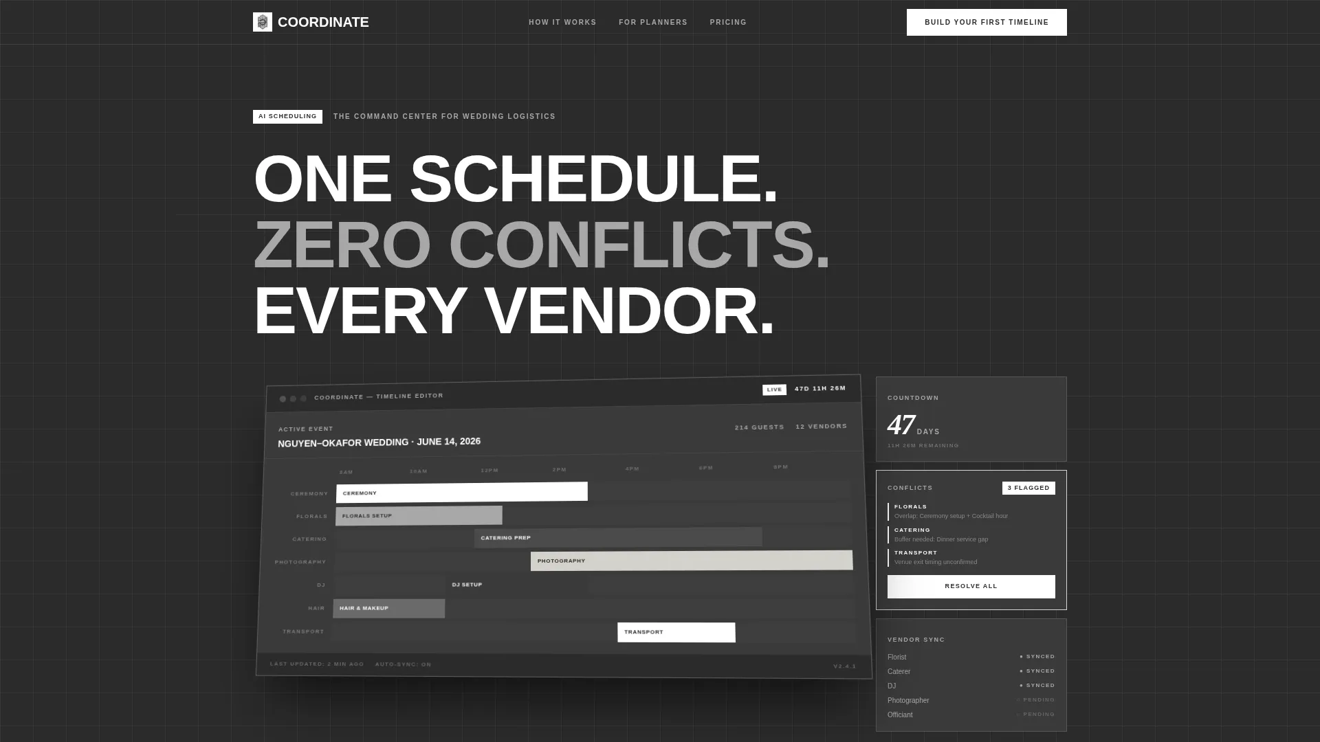
- A full-viewport dashboard hero with an isometric interface screenshot and live-countdown display
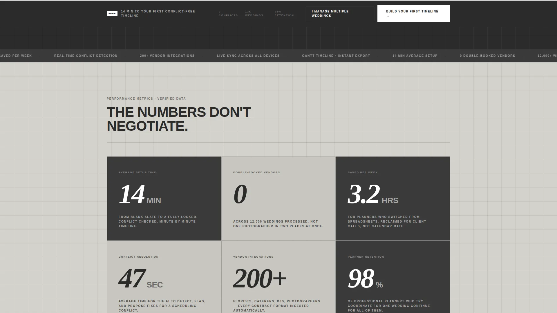
- A modular card grid with oversized stat callouts such as "14 min," "0 double-booked vendors," and "3.2 hrs saved"
- A dual-path lead form supporting both individual couples and multi-wedding business planners
Feature list
This template packs several carefully designed components that work together to convert skeptical, detail-oriented visitors into leads.
Full-Viewport Dashboard Hero
The header fills the entire screen with a high-fidelity scheduling interface screenshot. It shows the "Nguyen-Okafor Wedding, June 14" timeline, color-coded vendor blocks in a Gantt-style layout, a sidebar flagging three unresolved conflicts, and a live countdown reading "47 days, 11 hours." The dashboard is rendered at a slight isometric tilt with a drop shadow that lifts it off the concrete background.
Stats-First Metric Card Grid
Below the fold, uniform brutalist cards snap into a rigid grid. Each card leads with a single oversized number before any explanation. The sequence escalates from efficiency stats to real user data to planner testimonials, making the case feel like a factory spec sheet rather than a sales pitch.
Dual-Path Lead Capture Form
The primary form collects three fields in sequence: wedding date, estimated guest count, and email address. A secondary path labeled "I Manage Multiple Weddings" swaps to a business-tier intake asking for average weddings per month and current scheduling tool. Both paths are built into the same fixed bottom bar.
Fixed Bottom call to action Bar
After the third card row, a fixed bar anchors to the bottom of the viewport and stays visible as the visitor scrolls. The primary call to action reads "Build Your First Timeline" in signal white on charcoal. This persistent element ensures the conversion entry point is always one click away.
Conflict-Resolution Evidence Cards
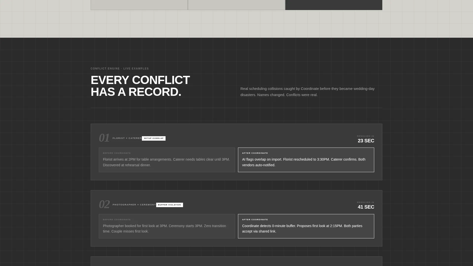
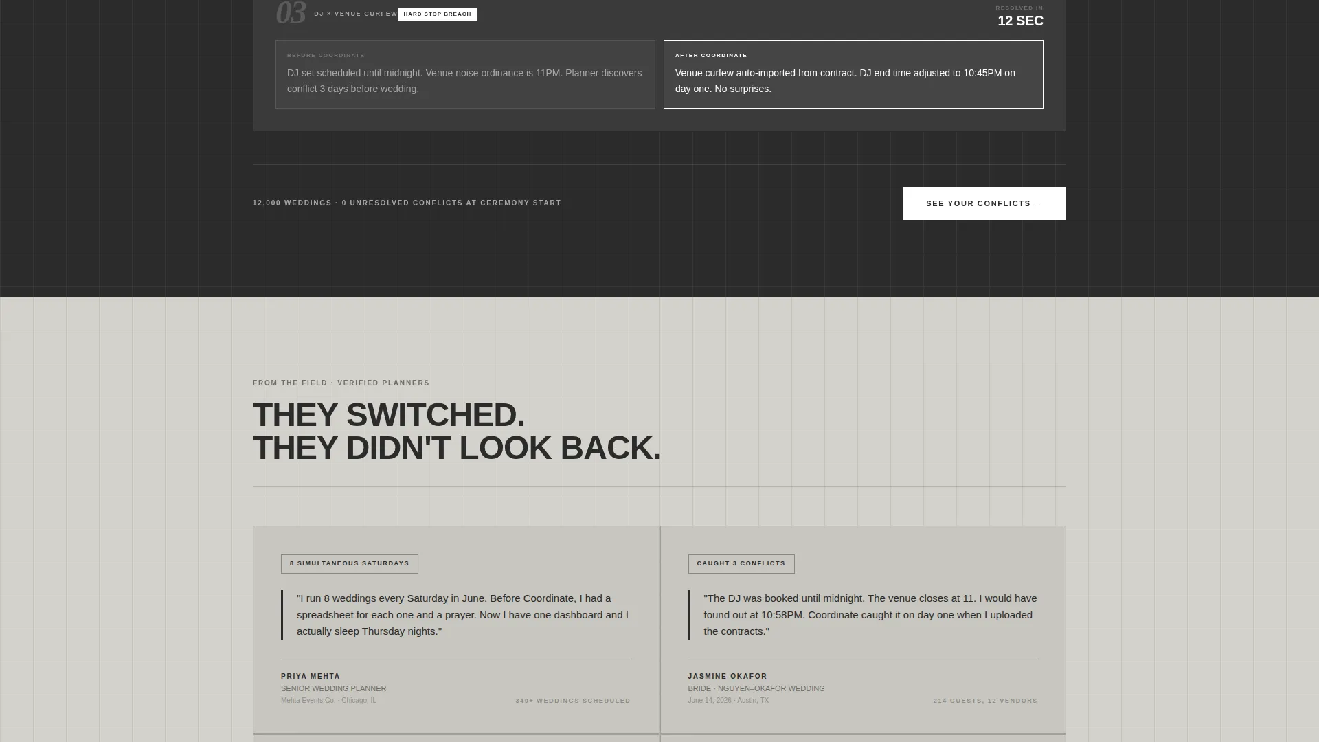
Mid-page cards present real conflict-resolution examples alongside user data. These cards bridge the gap between raw efficiency numbers and lived planner experience, showing specifically how the tool handles overlapping vendor windows and tight ceremony transitions.
Planner Testimonial Cards
The final card rows surface testimonials from planners who switched from manual scheduling tools. Each testimonial is framed within the same sharp-cornered brutalist card format, keeping visual consistency while adding social proof at the moment the visitor is closest to converting.
Page sections overview
| Section | Purpose |
|---|---|
| Dashboard Hero Header | Establish credibility with a live scheduling interface screenshot |
| Efficiency Metric Cards | Lead with hard numbers to prove time savings instantly |
| User Data Cards | Show real conflict-resolution examples from actual weddings |
| Planner Testimonial Cards | Add social proof from planners who left manual tools |
| Fixed call to action Bar | Keep the lead form visible and accessible throughout the scroll |
| Dual-Path Lead Form | Capture individual and multi-wedding planner leads separately |
Design & branding system
The visual identity follows a Bold Brutalist theme with a Monochrome Steel color system. Every surface is functional and undecorated, echoing the precision of a professional kitchen counter or an industrial planning room.
- Colors: industrial charcoal (#2B2B2B), cold-rolled silver (#A8A8A8), exposed concrete (#D4D2CC), and signal white (#FFFFFF) reserved for call to action buttons and active-state borders
- Typography is oversized, uppercase, and unapologetic, with no script fonts and no lifestyle photography anywhere on the page
- Cards use sharp-cornered containers with zero border-radius, and backgrounds alternate between charcoal and concrete to create visual rhythm without decoration
Mobile & speed optimization
The card grid layout is built on a modular system that adapts cleanly to smaller screens. Rigid proportions and a limited color palette help the page render efficiently without complex graphic dependencies.
- Uniform card sizing and a strict grid snap structure make reflow predictable on any screen width
- The fixed bottom call to action bar is designed to remain usable and visible on mobile viewports without obscuring content
- Typography scales from oversized desktop display down to readable mobile sizes while preserving the uppercase, high-contrast style
How this template helps you convert
This template is engineered around a single idea: earn the click before you ask for it. Every layout decision is sequenced to reduce friction and increase confidence in the product.
- The dashboard hero removes abstraction immediately. Visitors see a real, working-looking interface in the first second, not a headline and a stock photo.
- The stats-first card grid delivers proof in a format that is hard to ignore. Numbers like "0 double-booked vendors across 12,000 weddings" land before any feature copy appears.
- The fixed call to action bar and dual-path form meet the visitor exactly where they are, whether they are a solo couple or a multi-event planning business, with a form sized to their specific need.
Other information about this template
This template is categorized under Technology and the AI for Wedding subcategory, making it suited for teams building in the wedding technology space. A few additional points worth noting for anyone evaluating this template for their project:
- The template style is Card Grid (Modular), which means individual card sections can be reordered or removed without breaking the overall layout flow
- The header concept is a Dashboard Preview, a deliberately product-forward approach that works especially well for software and tool-based offerings
- The creative direction, Stats-First Impact, is a deliberate departure from the warm, lifestyle-heavy aesthetic typical of wedding industry marketing
- The landing page direction is Lead Generation, so every section is ordered to support a single measurable outcome: capturing a qualified lead through the bottom-bar form
- The Bold Brutalist theme and Monochrome Steel palette are intentional signals to a data-driven audience that this product is built for performance, not sentimentality
Theme
Bold Brutalist
Creative direction
Stats-First Impact
Color system
Monochrome Steel
Style
Card Grid (Modular)
Direction
Lead Generation
Page Sections
Full-viewport Dashboard Hero
Stats-first Metric Card Grid
Dual-path Lead Capture Form
Fixed Bottom Call to Action Bar
Conflict-resolution Evidence Cards
Planner Testimonial Card Row
Related questions
Who is this landing page template designed for?
Does this template include both individual and business-tier lead paths?
Can I use this template for a single product or service, not a full software platform?
Can I change the color palette or typography to match a different brand?
Is this template suitable for a product that is still in early access or beta?



