Coordinate - Seamless Wedding Landing Page Template
Coordinate is a single-page wedding staff scheduling landing page built for planners, catering directors, and day-of coordinators. It pairs a live interactive timeline preview with a structured feature comparison table, letting visitors drag staff tokens, spot conflict alerts, and move straight to a free-trial signup. No forms on the page, just one clear call to action.
by Rocket studio
Quick summary
Coordinate is a wedding staff scheduling landing page that shows the product in action before asking for a click. Visitors interact with a live mini-timeline in the header, then scroll through a tier-by-tier comparison table that proves the free plan already handles a full Saturday. The page ends with a single coral button routing to signup.
Who this template is for
This template is built for teams that manage people, not just playlists. If your Saturday involves fifteen vendors and a color-coded binder, this page was designed with you in mind.
- Wedding planners coordinating multiple vendors across one venue
- Catering directors staffing two or three receptions on the same day
- Day-of coordinators currently running schedules from highlighted spreadsheets
What problem this template solves
Managing wedding-day staff on paper means someone always shows up at the wrong time. The template addresses the gap between a messy vendor list and a clean, minute-by-minute schedule that everyone can follow.
- Double-booked staff slots that only surface on the wedding day itself
- No clear way to show visitors what the scheduling tool actually does before they sign up
- Comparison pages that feel flat and static, failing to build trust before the click
What you get with this template
You get a fully structured, single-page layout that combines live product interaction with a systematic feature reveal. Every section is purposeful and moves the visitor closer to the free-trial button.
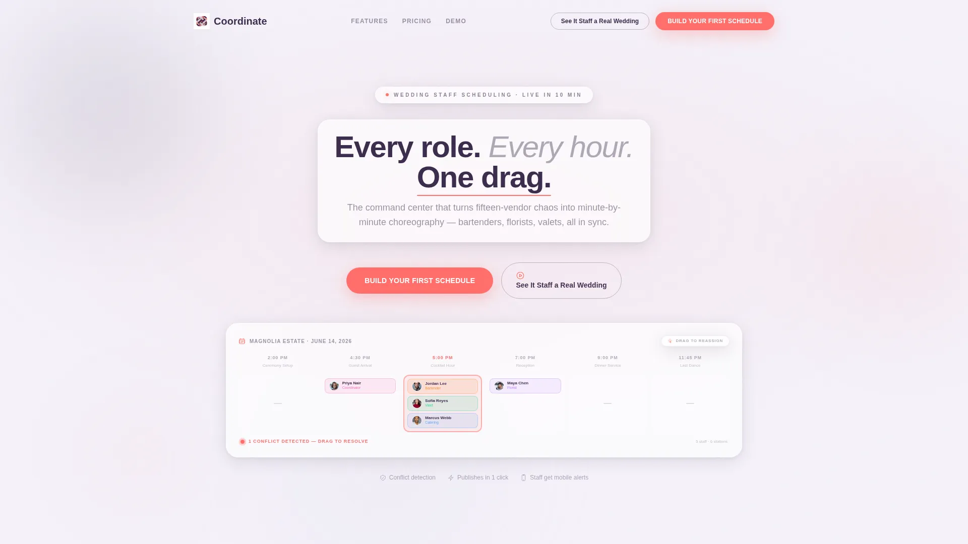
- An interactive header where staff avatars animate along a real wedding-day timeline
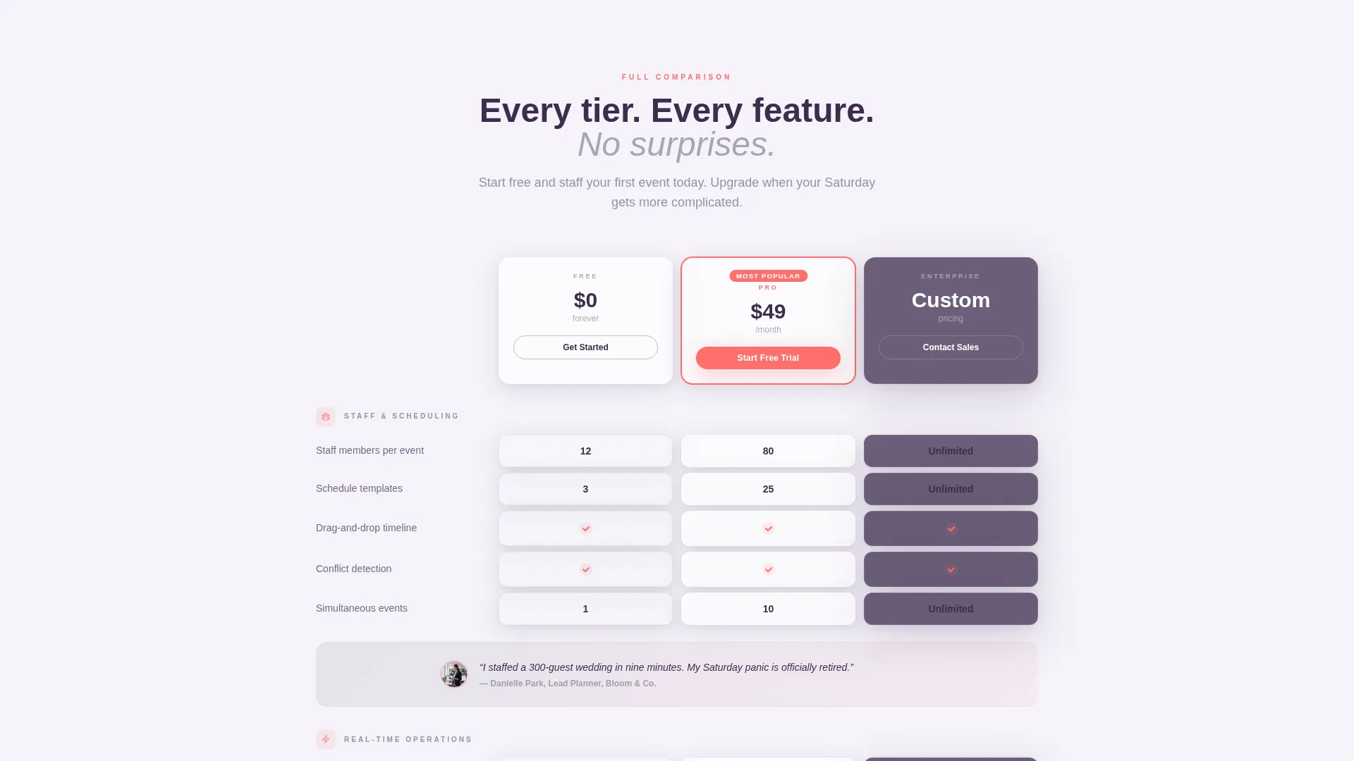
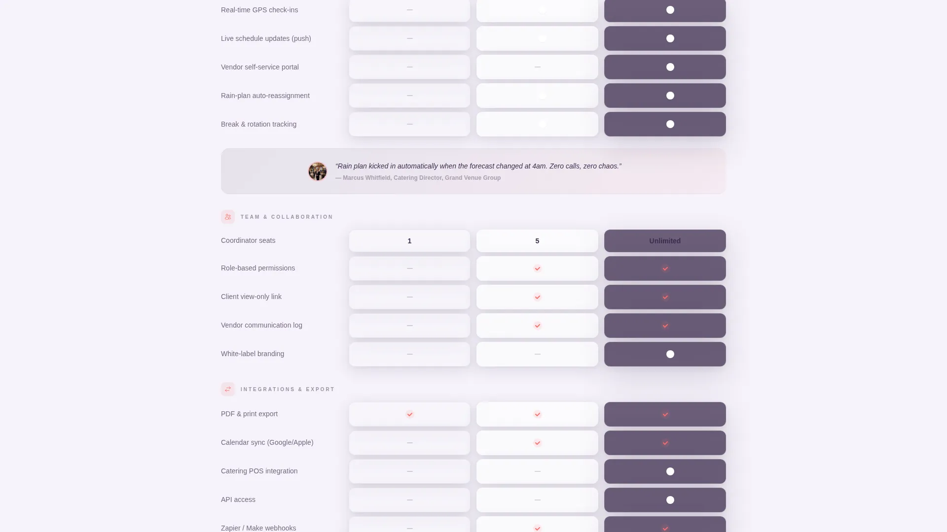
- A scrollable comparison table covering Free, Pro, and Enterprise tiers with micro-animated feature cells
- Three strategically placed call-to-action buttons and one secondary demo video trigger, all with zero form fields on the page
Feature list
This template ships with a focused set of components, each designed to earn trust and reduce hesitation before the signup click.
Interactive Timeline Header
The header renders a functioning mini-version of the scheduling interface directly in the viewport. Animated staff avatars glide from ceremony setup to last dance, and visitors can drag a bartender token to trigger a coral conflict-detection pulse. The headline hovers on a frosted glass card with a parallax shift tied to cursor movement.
Animated Comparison Table
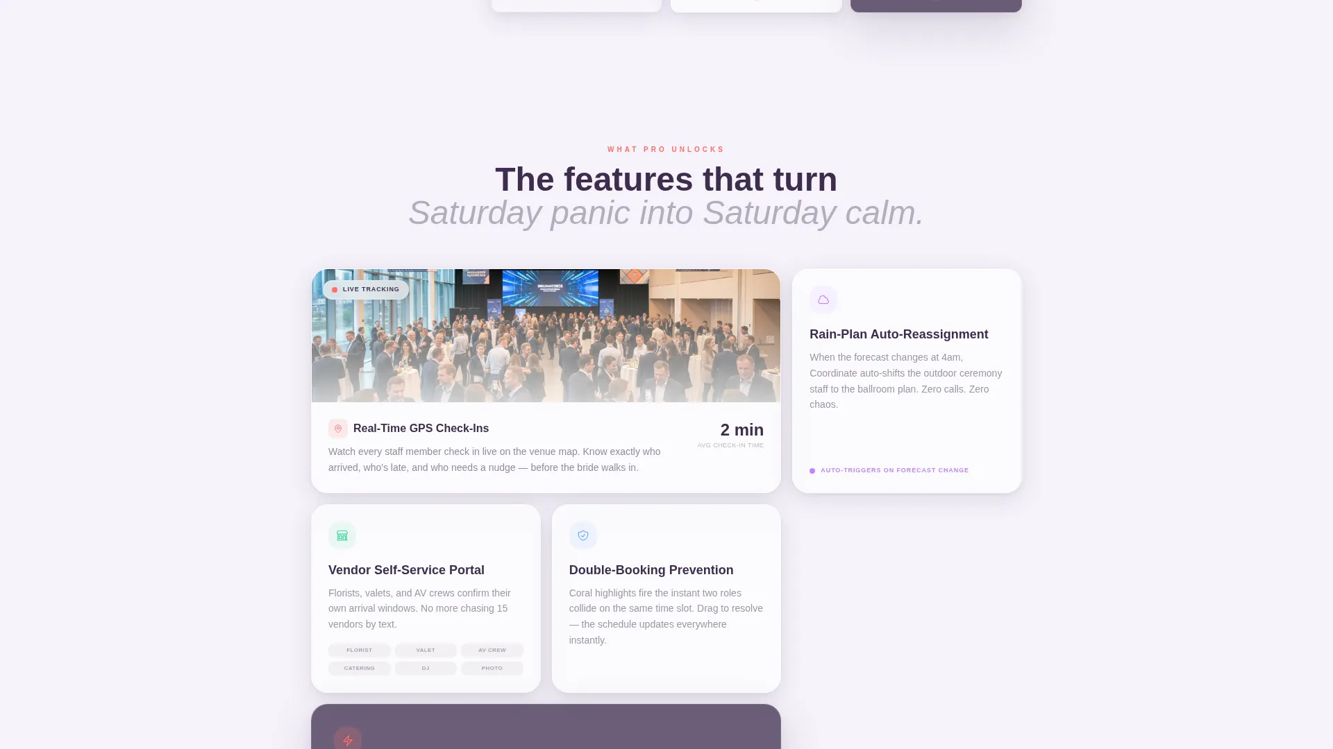
The feature matrix reveals capability rows as the visitor scrolls, using spring-eased motion to slide frosted-glass column cards into frame. Each cell contains a micro-animation, a self-drawing checkmark, a counting number, or a flipping toggle, so the table feels active rather than printed. Tiers escalate from basic staff count limits to rain-plan auto-reassignment and vendor self-service portals.
Testimonial Strip
A single inline testimonial appears between comparison rows, quoting a named planner on exactly how fast she staffed a 300-guest event. It breaks the data rhythm without interrupting the scroll, adding a human proof point at the moment visitors weigh the decisive features.
Frictionless call to action System
The primary call-to-action button, labeled "Build Your First Schedule," appears three times: in the header, floating fixed at the base of the comparison table, and once more in the final section. No form fields appear anywhere on the page. Every primary button routes directly to the onboarding flow.
Demo Video Modal
A secondary ghost-button labeled "See It Staff a Real Wedding" opens a 90-second demo video inside a glassmorphic modal overlay. It gives hesitant visitors a low-commitment way to see the full product experience without leaving the page.
Glassmorphic Card System
Every card, panel, and modal uses frosted translucent layering, soft drop shadows, and glassy borders. Coral accent pulses appear only on interactive elements and calls to action, so the eye always knows where to go next. The background layers blurred gradient panels over an animated mesh for visual depth.
Page sections overview
| Section | Purpose |
|---|---|
| Interactive Timeline Header | Shows the scheduling interface live and sets the headline |
| Comparison Table Matrix | Reveals tier-by-tier feature differences with scroll animation |
| Inline Testimonial Strip | Adds a named social proof point mid-scroll |
| Fixed call to action Bar | Keeps the primary signup button accessible during table scroll |
| Final call to action Section | Closes the page with a third signup prompt and demo trigger |
Design & branding system
The visual identity follows a Dynamic Motion theme built on a Glassmorphic color system. The palette is inspired by warm candlelight diffusing through a frosted champagne flute.
- Core colors: frosted translucent white at 40% opacity, soft lavender-gray (#D6D3E0), and deep plum (#3D2C4E) for primary text and anchor surfaces
- Accent color: living coral (#FF6F6B) reserved for interactive elements, call to action buttons, and conflict-detection highlights
- Backgrounds layer blurred gradient panels over a subtle animated mesh, with cards floating on glassy borders and soft drop shadows
Mobile & speed optimization
The template is built with a responsive layout that adapts the comparison table and interactive header for smaller screens. The glassmorphic layers and motion effects are structured to degrade gracefully on devices where heavy animation is less suitable.
- The comparison table reflows to a vertically stacked card format on narrow viewports
- Animated mesh backgrounds and parallax effects are contained to preserve layout stability across screen sizes
How this template helps you convert
Every design and copy decision on this page reduces the distance between a first visit and a free-trial click.
- The interactive header lets visitors touch the product immediately, replacing a static screenshot with a live drag-and-drop moment that builds confidence before they read a single feature row.
- The comparison table is structured to escalate from obvious features to decisive ones, so visitors who scroll to the bottom have already convinced themselves the tool solves their problem before they reach the final call to action button.
Other information about this template
This template is part of a focused set of wedding software landing page designs built for the scheduling and coordination niche. It is suited to teams comparing it against general-purpose event staffing tools or spreadsheet-based workflows.
- The page style is a comparison table landing page, which is well-suited to SaaS products with tiered pricing or feature sets
- The Dynamic Motion theme and Glassmorphic color system give it a product-forward look that stands out from traditional wedding industry aesthetics
- It is designed as a click-through landing page, meaning all conversion action happens after the page rather than on it, keeping the on-page experience clean and low-pressure
- The template works for any wedding staff scheduling platform looking to communicate tier value clearly and let the product speak before asking for a commitment
Theme
Dynamic Motion
Creative direction
Feature Matrix
Color system
Glassmorphic
Style
Comparison Table
Direction
Click-Through
Page Sections
Interactive Timeline Header
Animated Comparison Table
Frictionless Call to Action Button System
Demo Video Modal
Inline Testimonial Strip
Glassmorphic Card System
Related questions
Does this template include actual scheduling functionality?
Can I customize the tier names and feature rows in the comparison table?
Do visitors need to fill out a form to start the free trial?
What types of businesses fit this template best?
Is the demo video included in the template?



