Healthcare Software Complete Cost Calculator Website Template
Copay is a glassmorphic healthcare subscription management landing page template built for clarity and immediate action. It opens with a live subscription calculator pre-loaded with real healthcare line items, surfaces duplicate charges and FSA savings automatically, and guides visitors into a free account creation flow, all without a single form field on the page.
by Rocket studio
Quick summary
Copay is a single-page, card grid landing page template for a healthcare subscription management platform. It leads with a working subscription calculator, layers insight cards below it, and closes with a full-width call-to-action bar. The design uses a Tech Glass visual identity, deep navy, frosted glass cards, and teal data highlights, to make a complex financial picture feel precise and approachable.
Who this template is for
This template is built for teams and founders launching a healthcare subscription tracking or benefits management product. It speaks directly to users who carry real billing complexity in their daily lives.
- HR benefits coordinators managing large employee plan portfolios
- Chronic-care patients tracking multiple overlapping healthcare subscriptions
- Family caregivers who discovered duplicate or redundant coverage for a dependent
What problem this template solves
Recurring healthcare bills pile up quietly. People sign up for services at different moments of need, and the total committed spend becomes invisible. This template creates a page that makes that problem visible the instant a visitor arrives.
- No single view shows all recurring healthcare costs in one place
- Duplicate services and FSA-eligible out-of-pocket charges go undetected
- Visitors have no reason to trust a tool they cannot try before signing up
What you get with this template
You get a fully structured, modular card grid landing page ready to present a healthcare subscription management product. Every section is designed to deepen the visitor's trust through demonstrated utility rather than marketing claims.
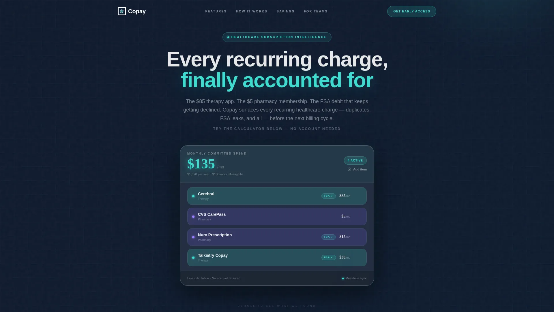
- An interactive subscription calculator in the header, pre-loaded with sample healthcare line items
- Three card rows covering auto-detected insights, a process walkthrough, and social proof savings
- A click-through conversion path with two call-to-action touchpoints and no on-page form fields
Feature list
This template is built around one principle: let the product prove itself before asking for anything.
Live Subscription Calculator
The header contains a functioning subscription calculator pre-populated with sample healthcare line items such as a monthly teletherapy service at $85, a pharmacy membership at $5, a prescription delivery service at $15 per month, and a specialist copay at $30. Visitors can delete items, add their own, and watch the total committed monthly spend recalculate in real time.
Auto-Detected Insight Cards
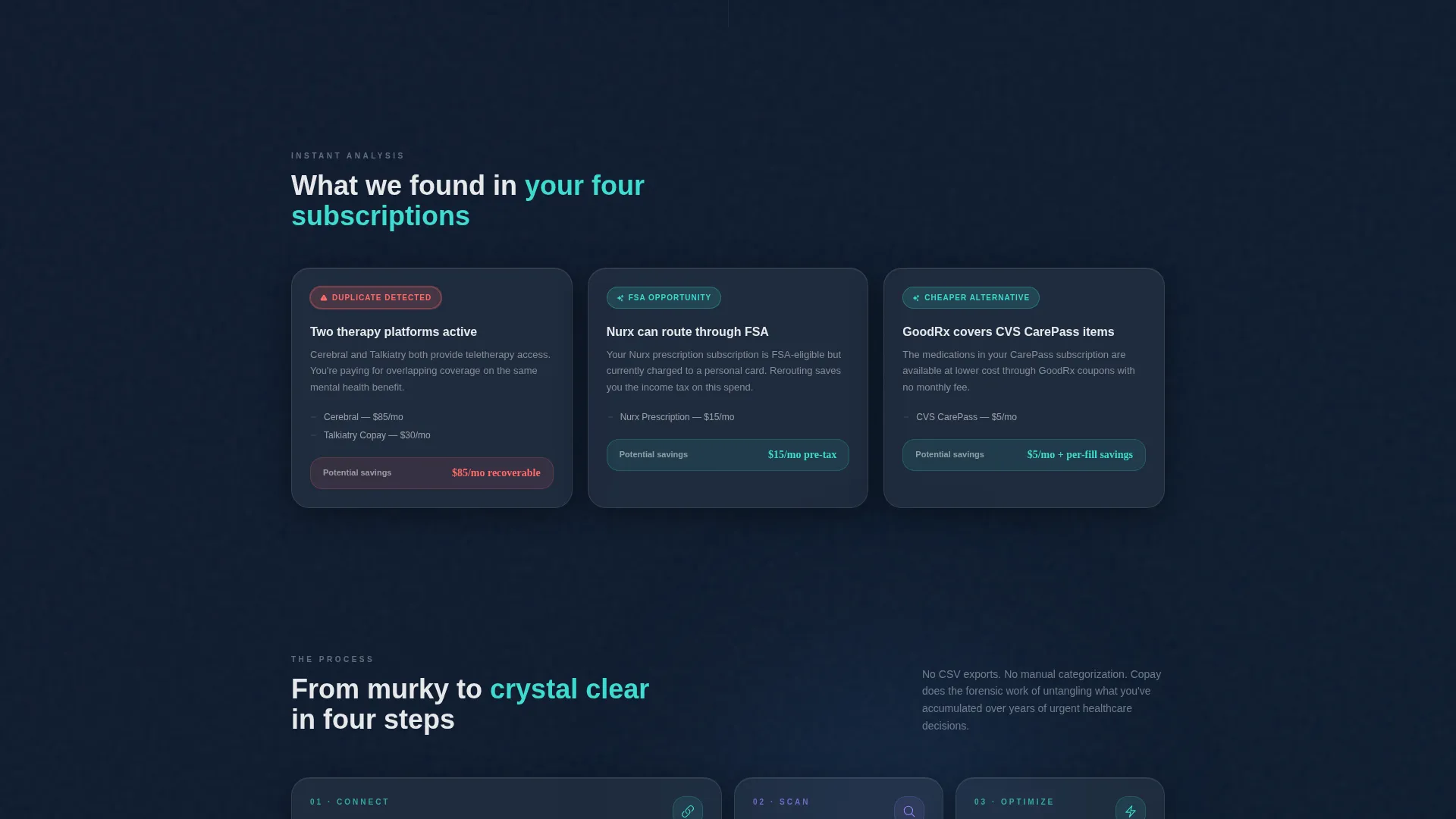
The first card row below the calculator displays "What We Found" results. Each frosted glass card shows one of three insight types: auto-detected duplicate services, FSA-eligible items being paid out-of-pocket, and subscriptions with cheaper generic alternatives. Duplicate and overspend cards carry a soft coral warning badge; savings opportunities carry a teal badge.
Process Walkthrough Cards
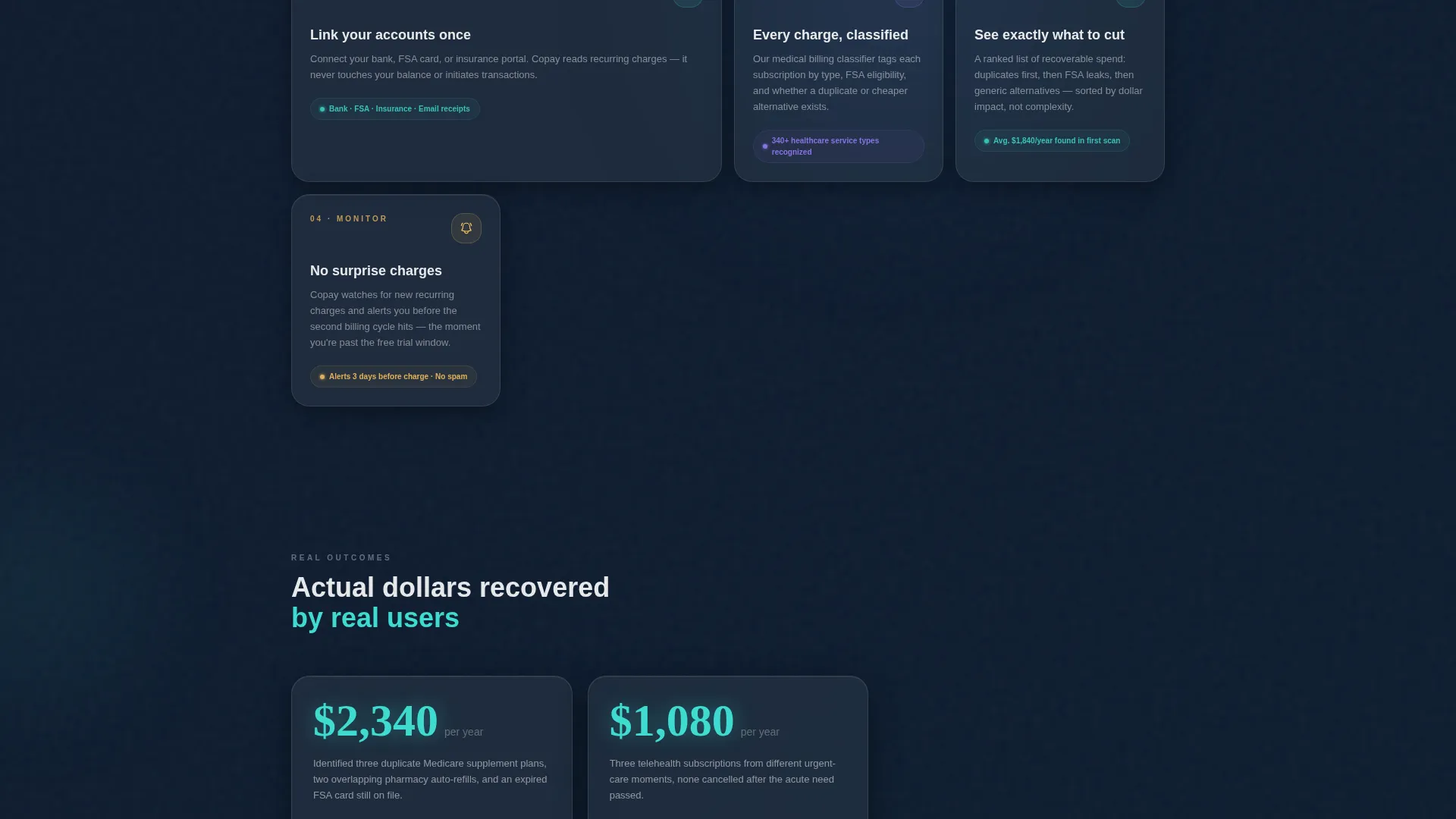
The "How It Works" row presents four sequential process cards, Connect, Scan, Optimize, Monitor. Each card triggers a micro-animation on scroll entry, making the workflow feel intuitive and digestible without requiring any explanatory text block.
Social Proof Savings Tiles
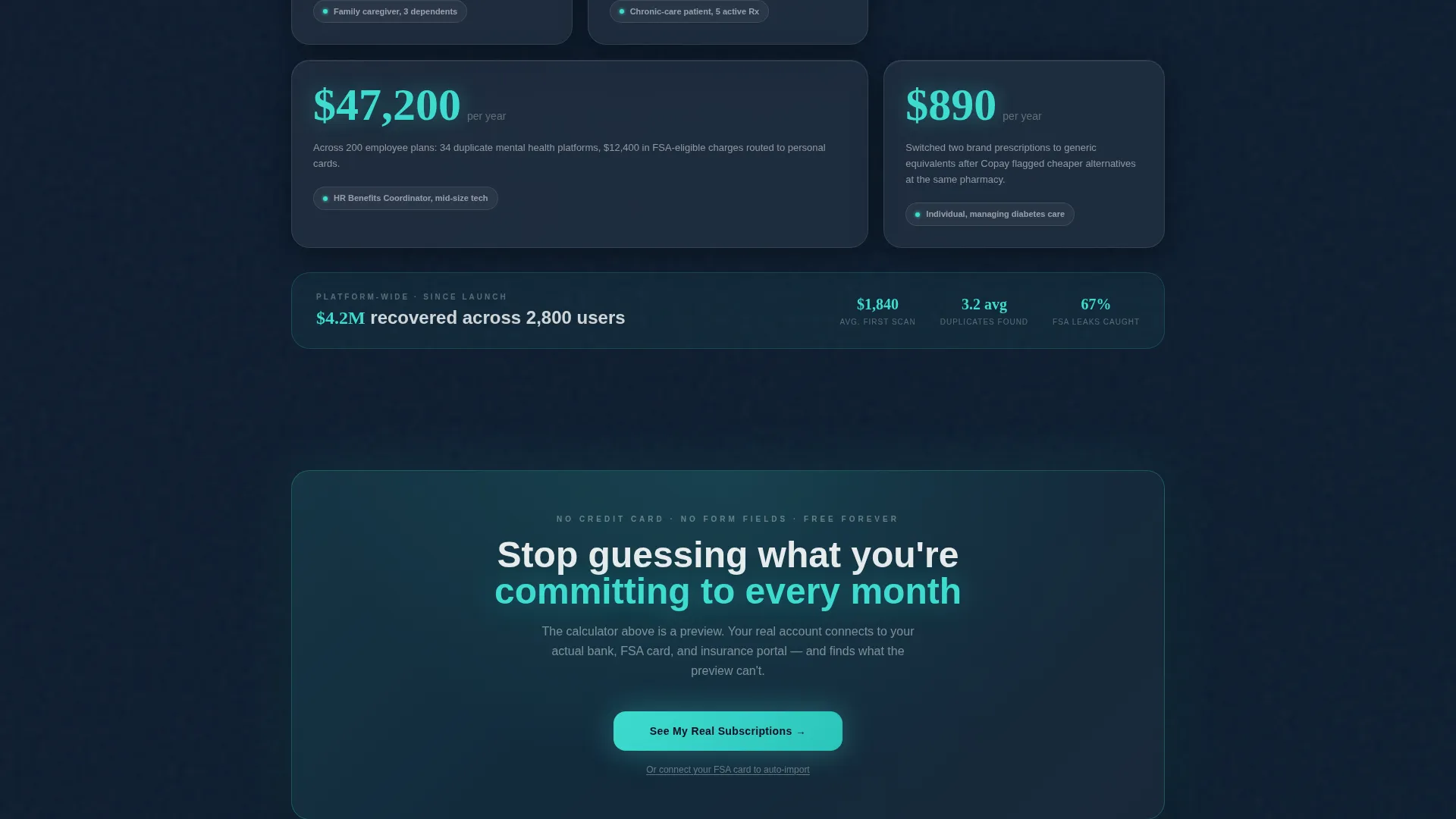
The final card row shows real dollar amounts saved, rendered as large teal numerals on glass tiles. Each tile pairs the figure with an anonymized user description, such as a family caregiver managing three dependents who saved $2,340 per year, grounding the promise in specific, believable outcomes.
Session-Carry Click-Through Flow
The primary call-to-action button appears pinned below the calculator after the visitor interacts with at least two items. A second full-width glass call-to-action bar appears after the savings proof section. Neither touchpoint includes a form field. The click carries the visitor's calculator session data forward so the sign-up page feels like a continuation.
Frosted Glass Card Grid Layout
Every card surface uses a frosted translucent white at 12% opacity over the deep surgical navy base. Cards float with blurred backdrop shadows and 1px white-opacity border strokes. Teal underglow appears beneath interactive elements, and the coral warning accent pulses only when a duplicate or overspend is detected.
Page sections overview
| Section | Purpose |
|---|---|
| Interactive Calculator Header | Let visitors explore real healthcare subscription costs immediately |
| What We Found Cards | Surface duplicate charges, FSA gaps, and cheaper alternatives |
| How It Works Cards | Walk through the Connect, Scan, Optimize, Monitor process |
| Social Proof Tiles | Show anonymized savings figures to build credibility |
| Primary call to action Button | Prompt interaction-qualified visitors to start their free account |
| Full-Width call to action Bar | Recapture intent after the savings proof section |
| Secondary Text Link | Offer a faster FSA card import path for power users |
Design & branding system
The visual identity follows a Tech Glass theme built on a Glassmorphic color system. The palette feels like looking through the glass partition of a modern pharmacy, precise and backlit, but softened at every edge.
- Base layer: deep surgical navy (#0B1120); card surfaces: frosted white at 12% opacity with 1px white-opacity border strokes and blurred backdrop shadows
- Active states and data highlights: cool clinical teal (#3EDBD0) with underglow beneath interactive elements
- Warning accent: soft coral (#FF6B6B) that pulses only when a duplicate charge or overspend is detected
Mobile & speed optimization
The modular card grid structure adapts naturally to smaller screens. Each card is a self-contained unit, so the layout reflows without breaking the visual hierarchy or the calculator interaction.
- Card grid columns collapse gracefully on narrow viewports, keeping each insight card fully readable
- Micro-animations are scroll-triggered, so they load progressively rather than all at once on page entry
- The pinned call-to-action button stays accessible on mobile after the calculator interaction threshold is met
How this template helps you convert
This template is built as a click-through landing page. Every design and content decision pushes the visitor toward one action: clicking through to create a free account.
- The interactive calculator creates personal investment before any marketing copy appears, making the visitor feel the product working rather than reading about it.
- The insight card rows layer specific, dollar-denominated proof onto the experience the visitor just had, reinforcing trust with each scroll step.
- The session-carry call to action removes the friction of starting over, so the sign-up page feels like the natural next step rather than a separate ask.
Other information about this template
This template is part of a matched intersection set combining a Tech Glass theme, Glassmorphic color system, Calculator/Tool First creative direction, Card Grid modular template style, Interactive Preview header concept, and a Click-Through landing page direction. It is purpose-built for the healthcare subscription management niche within the broader healthcare software category.
- The template style is Card Grid (Modular), meaning individual sections can be reorganized or expanded without redesigning the full layout
- The intersection match score for this template's category, theme, and niche alignment is 13, indicating a high-specificity fit for healthcare software products
- No form fields appear on this page; the entire conversion path is a single click that carries session context forward to the next page
Theme
Tech Glass
Creative direction
Calculator/Tool First
Color system
Glassmorphic
Style
Card Grid (Modular)
Direction
Click-Through
Page Sections
Live Subscription Calculator
Auto-detected Insight Cards
Process Walkthrough Cards
Social Proof Savings Tiles
Session-carry Click-through Call to Action
Related questions
Can I change the sample line items in the calculator?
Does the template include the sign-up page after the click-through?
Can I update the coral and teal accent colors to fit my brand?
Is the card grid layout easy to extend with new rows?
What does 'session-carry' mean for the call-to-action button?



