Nonprofit Organization Reviews Website Template
Beacon is a hub-and-spoke landing page template built for nonprofit organizations that need one clear digital home for their operations. It features a live-feel dashboard preview header, five anchor-nav spokes covering donors, volunteers, grants, and reports, and a focused app-download call to action. The Slate and Sky color system gives it a sharp, trustworthy look.
by Rocket studio
Quick summary
Beacon is a single-page, anchor-nav landing page template designed for nonprofit management apps. It opens with an animated dashboard preview that makes the product feel real before a visitor reads a single word. Five dedicated spec sheet spokes answer every operational question in sequence, building confidence through accumulation rather than persuasion.
Who this template is for
This template is built for teams behind nonprofit management apps that need a focused, high-trust landing page to earn app downloads. It speaks directly to the daily realities of the people those apps serve.
- Executive directors managing donors, volunteers, and grant deadlines across too many browser tabs at once
- Development coordinators who reconcile donation records manually and need a clear case for switching to a smarter tool
- Volunteer managers who want a product page that mirrors the organized, dependable experience their app promises
What problem this template solves
Most nonprofit software landing pages either oversell with vague promises or underwhelm with technical spec lists that feel cold. Neither approach earns trust from mission-driven teams who are skeptical of new tools.
- Visitors arrive with a long mental checklist of "but does it do..." objections before they ever consider downloading
- The page has no natural structure to answer donor questions, volunteer questions, and grant questions in the same visit
- Without a strong visual proof point up front, app download pages lose visitors before they reach the call to action
What you get with this template
You get a complete, ready-to-customize single-page layout structured around five operational spokes. Every section is purposeful and ordered to move a cautious nonprofit professional toward the download button.
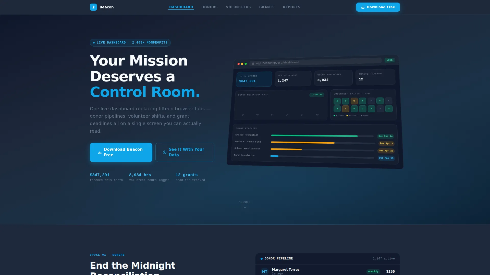
- An animated browser-frame dashboard preview in the header, complete with a live donation notification loop, a donor retention graph, a volunteer shift calendar, and a grant deadline tracker
- Five anchor-navigated spec sheet sections covering Dashboard, Donors, Volunteers, Grants, and Reports, each with an icon-and-metric capability grid
- A persistent mobile bottom bar, a header call to action, and a final-section app download prompt, all pointing to a single platform-selection step with no extra form fields
Feature list
This template delivers focused, prompt-backed capabilities across layout, interactivity, and conversion design.
Animated Dashboard Preview Header
The header displays a browser-frame mockup at a slight isometric tilt. It shows real-feeling nonprofit data: a donor retention graph, a volunteer shift calendar with filled slots, a grant deadline tracker with color-coded status pills, and a raised-funds counter reading $847,291. A looping animation slides in a recurring donation notification to make the product feel live and credible from the first second.
Hub-and-Spoke Anchor Navigation
A pinned top rail carries five labeled spokes: Dashboard, Donors, Volunteers, Grants, and Reports. Clicking any spoke scrolls directly to its dedicated section. This structure lets visitors self-navigate to their biggest concern without scrolling through irrelevant content first.
Spec Sheet Capability Grids
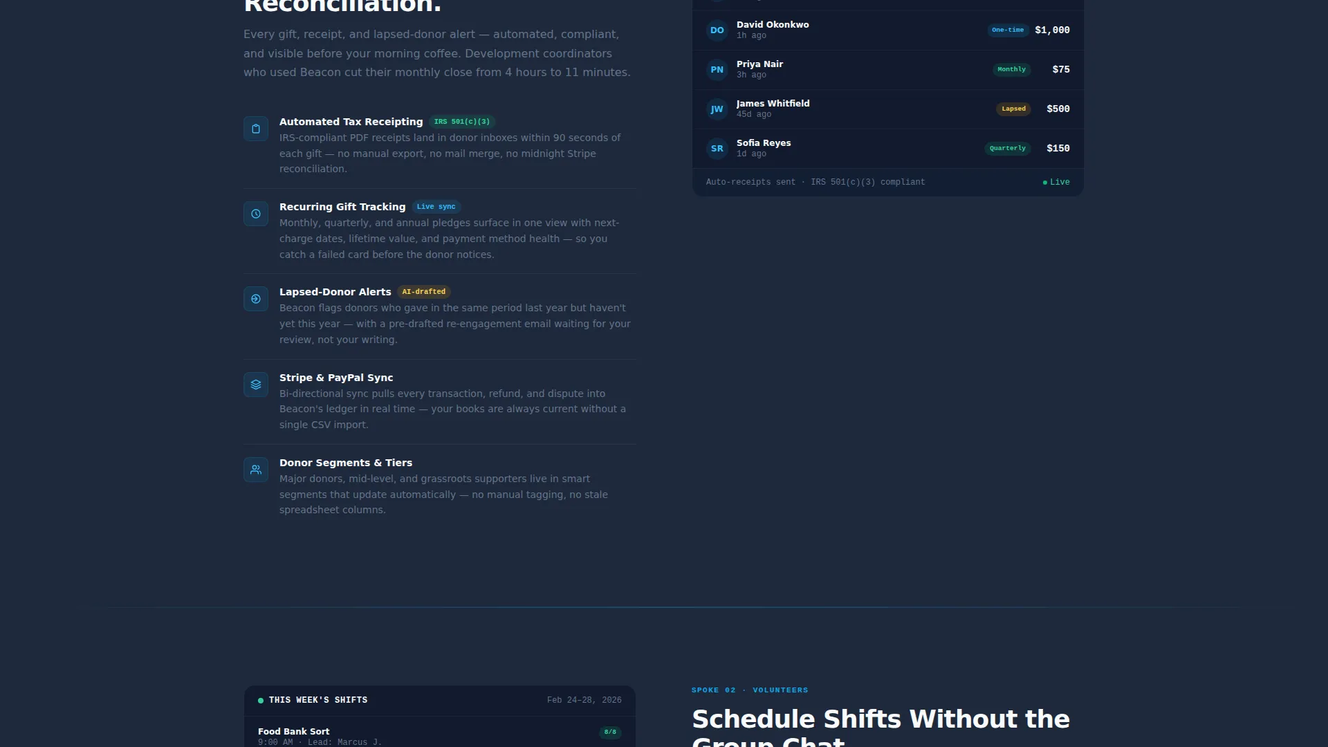
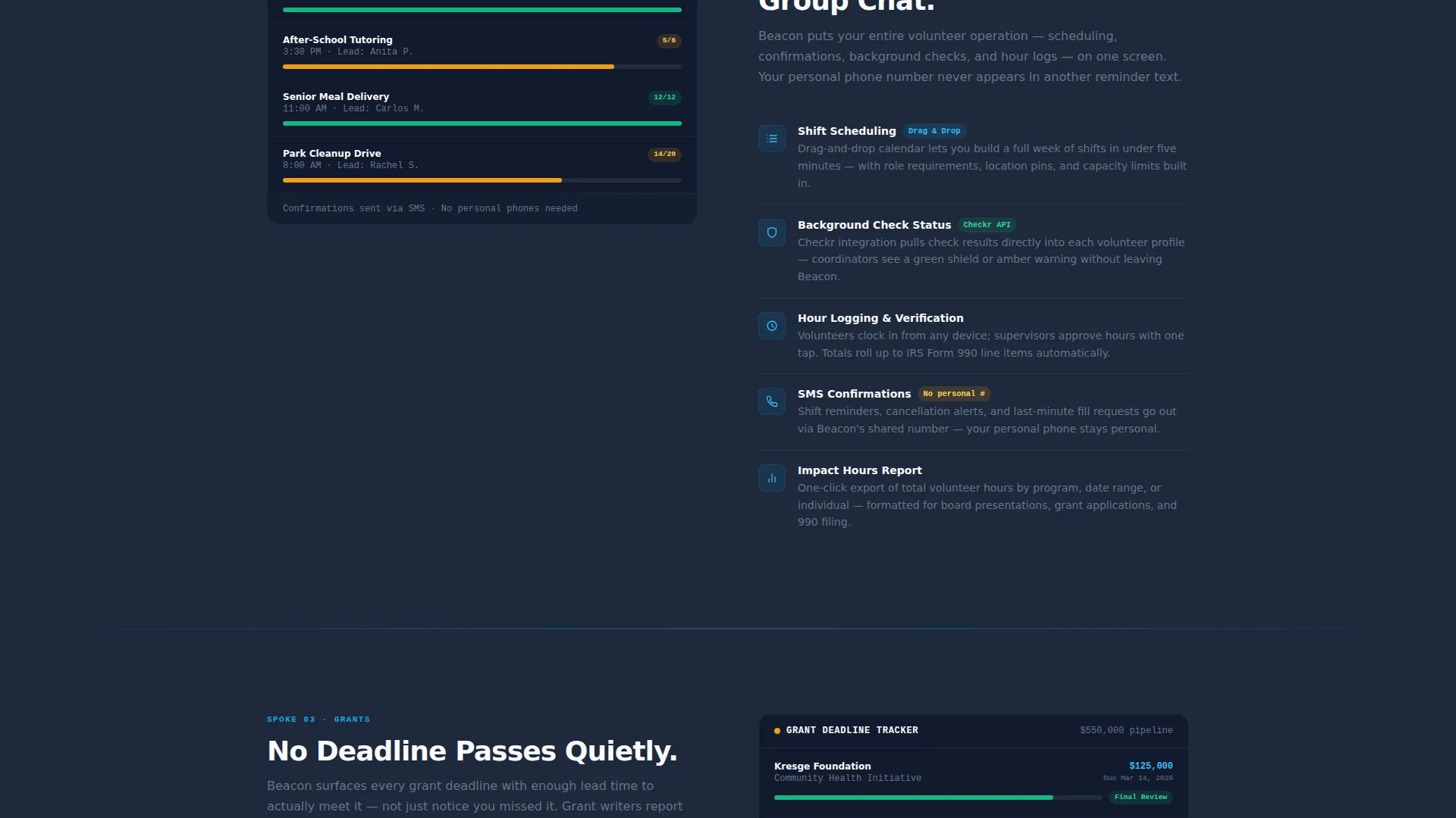
Each spoke section opens with a feature name in sky blue, a one-line promise, and a tight capability grid. Each row in the grid pairs an icon with a metric name and one clarifying sentence. Donors covers automated receipting, recurring gift tracking, and lapsed-donor alerts. Volunteers covers shift scheduling, hour logging, and background-check status.
Dual Call-to-Action System
The primary call to action, "Download Beacon Free," appears in three places: the header, a persistent bottom bar on mobile, and the final anchor section. A secondary call to action, "See It With Your Data," links to a live demo environment. Platform selection (iOS, Android, or Desktop) is the only input required.
Slate and Sky Color Progression
The page uses a deliberate color scroll: deep operational slate at the top, mid-tone graphite for secondary panels, and open-sky blue intensifying as the visitor scrolls deeper into features. Cloud white card surfaces float throughout for readability and breathing room. The palette shift reinforces a sense of moving from complexity toward clarity.
Startup Velocity Visual Theme
The overall design language channels energy and forward momentum without feeling frivolous. Typography is sharp and confident. Section transitions feel purposeful. The spec sheet creative direction keeps every pixel accountable to a real product capability, building an overwhelming case through accumulation.
Page sections overview
| Section | Purpose |
|---|---|
| Dashboard Preview Header | Establishes product credibility with an animated live-data mockup |
| Anchor Navigation Rail | Lets visitors jump directly to their priority spoke |
| Dashboard Spoke | Introduces the core unified view and its key metrics |
| Donors Spoke | Details receipting, recurring gifts, and lapsed-donor alerts |
| Volunteers Spoke | Covers shift scheduling, hour logging, and check-in status |
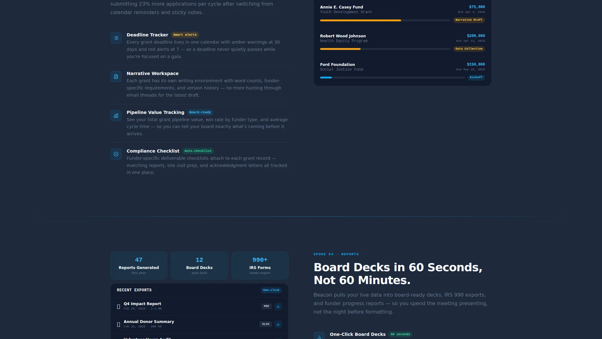
| Grants Spoke | Shows deadline tracking with amber and green status indicators |
| Reports Spoke | Presents reporting capabilities in a scannable grid format |
| App Download Section | Anchors the primary call to action with platform selection |
Design & branding system
The Slate and Sky system is built to feel like a command center at dawn: grounded, clear, and optimistic. Every color has a defined role so the page never feels arbitrary.
- Primary backgrounds use deep operational slate (#1E293B), secondary panels use mid-tone graphite (#475569), interactive elements and data highlights use open-sky blue (#0EA5E9), and card surfaces use cloud white (#F8FAFC)
- Sky blue intensifies progressively as the visitor scrolls from the header into the feature spokes, reinforcing the product's promise of moving from chaos to clarity
- The overall aesthetic references a weather app at dawn: dark ground giving way to an optimistic, widening sky
Mobile & speed optimization
On mobile, the template prioritizes the download goal with a layout that surfaces the call to action without requiring a full page scroll.
- A persistent bottom bar keeps the "Download Beacon Free" button visible at all times on mobile screens
- The anchor navigation simplifies to a compact, tappable format so spoke sections remain accessible on smaller viewports
- Card surfaces and breathing room are preserved at mobile sizes so the spec sheet grids stay readable without horizontal scrolling
How this template helps you convert
The conversion strategy is built on proof before persuasion. The page earns the download by front-loading credibility and then systematically removing doubt.
- The animated dashboard preview in the header acts as immediate visual proof that the product is real and capable, reducing skepticism before the visitor reads the first feature claim
- The five spec sheet spokes answer operational objections in sequence, so by the time a visitor reaches the final section, the download feels like a logical next step rather than a leap of faith
Other information about this template
This template is categorized under nonprofit organization website templates in the Technology category, making it well suited for teams building or relaunching a digital presence for a nonprofit management product.
- The template style is hub and spoke with anchor navigation, a format that suits products with multiple distinct feature areas that need to address different buyer personas in one visit
- The header concept is a dashboard preview, a widely recognized pattern in software landing pages for building immediate trust through visual demonstration
- The creative direction follows a spec sheet approach, which works particularly well for technical or operational tools where the buyer needs evidence over emotion
- The app download landing page direction means the entire page is optimized toward a single, low-friction action with no lengthy form fields standing between interest and install
- The Startup Velocity theme keeps the page feeling modern and capable without losing the earnest tone appropriate for mission-driven nonprofit audiences
Theme
Startup Velocity
Creative direction
Spec Sheet
Color system
Slate & Sky
Style
Hub & Spoke (Anchor Nav)
Direction
App Download
Page Sections
Animated Dashboard Preview Header
Hub-and-spoke Anchor Navigation
Spec Sheet Capability Grids
Dual Call-to-action System
Slate and Sky Color Progression
Related questions
Can I customize the dashboard preview numbers and data in the header?
Does the template include all five spoke sections out of the box?
Is the donation notification animation included in the template?
What is the only input required from a visitor before downloading?
Who is this landing page template best suited for?



