AI-Powered CMS Landing Page Template
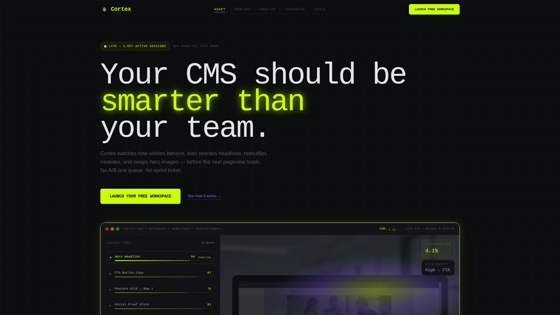
Cortex is an AI-powered content management system landing page template built for growth teams who need more than static pages. It features a hub-and-spoke anchor navigation, a live dashboard header with animated metrics, and a freemium trial conversion flow. The design runs on a Data Command color system: void black, electric chartreuse, and synthetic violet.
by Rocket studio
Quick summary
Cortex is a single-page, hub-and-spoke landing page template for an AI-powered content management system. It opens with a full-width product screenshot, guides visitors through five anchor-linked spoke sections, and closes with a frictionless free workspace signup. The visual identity is built on a Data Command aesthetic with void black backgrounds, electric chartreuse interactives, and synthetic violet accents.
Who this template is for
This template is built for teams who manage content at scale and need a landing page that matches the sophistication of their product. It speaks directly to operators who move fast and expect their tools to keep up.
- Growth-team leads at mid-stage SaaS companies running many landing pages at once
- E-commerce directors who have outgrown their current native content management system
- Agency operators managing multiple client sites who need one unified dashboard view
What problem this template solves
Static landing pages cannot demonstrate a dynamic, behavior-responsive product. Visitors who land on a flat page for an intelligent content management system feel the gap between what they read and what they might experience. This template closes that gap.
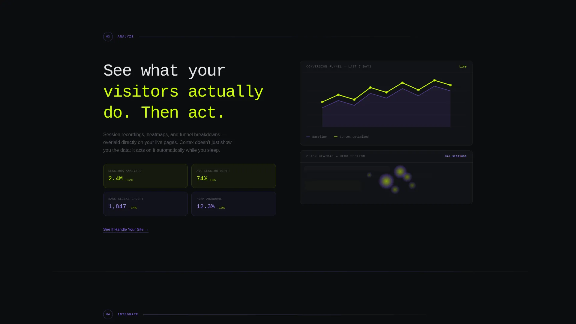
- It mirrors the product's intelligence through animated data, live metric counters, and heatmap visuals
- It removes friction from the signup path with a single email field and instant account creation
- It gives skeptical visitors a sandbox interaction point before they ever commit to a workspace
What you get with this template
You get a fully structured, single-page layout with five spoke sections, an anchor navigation rail, and two conversion paths. Every section is designed to build confidence and move visitors toward a free workspace signup.
- A full-width product screenshot header with a looping animated metric counter
- Five anchor-linked spoke sections covering AI content adaptation, publishing, analytics, integrations, and scaling
- A persistent floating call-to-action button and a live sandbox link beneath each spoke section
Feature list
This template includes purpose-built components that communicate the intelligence and speed of an AI-powered content management system.
Animated Product Screenshot Header
The header displays the Cortex dashboard mid-action, showing a live module swap on a retail landing page. A looping animation pulses a conversion rate counter from 3.2% to 4.1%, giving the screenshot a heartbeat and making the page feel alive on first load.
Hub-and-Spoke Anchor Navigation
A horizontal anchor navigation rail pins to the top of the page with five nodes: Adapt, Publish, Analyze, Integrate, and Scale. Clicking any node rockets the viewport to that spoke section instantly, while natural scrolling builds momentum through each section in sequence.
Kinetic Section Transitions
Each spoke section fires with a brief blackout flash that mimics a system boot sequence. This transition resets visitor attention between sections and compresses perceived scroll time, making the page feel faster and more purposeful than a standard layout.
Dual Conversion Flow
The primary call-to-action reads "Launch Your Free Workspace" and appears first in the header, then again as a persistent floating button after the second spoke. The secondary path beneath each spoke offers a "See It Handle Your Site" sandbox link for visitors who need proof before committing.
Live Sandbox Entry Point
The sandbox lets visitors paste their own URL and watch the system analyze and score their site in real time. This interaction acts as the closing moment of the conversion flow, making the free workspace feel like the obvious next step rather than a risk.
Integration Grid Section
The Integrate spoke visualizes connection nodes snapping into place as a visual grid. This section communicates broad platform compatibility through its layout without requiring visitors to read through a long list of technical documentation.
Page sections overview
| Section | Purpose |
|---|---|
| Header with screenshot | Opens with live dashboard visual and animated metric counter |
| Anchor nav rail | Pins five spoke nodes to top for fast section access |
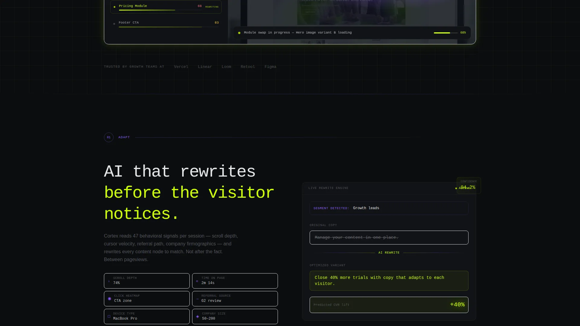
| Adapt spoke | Shows AI content engine rewriting copy in real time |
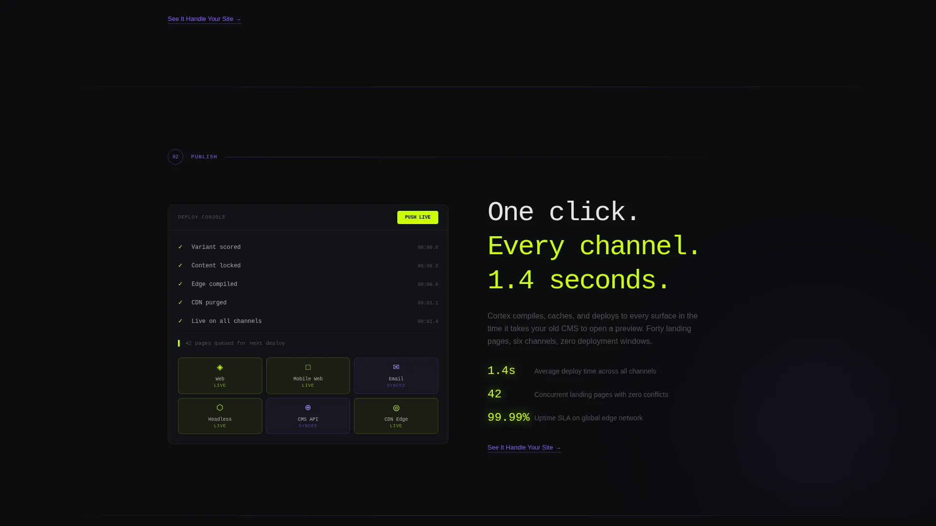
| Publish spoke | Demonstrates one-click multi-channel publishing capability |
| Analyze spoke | Overlays live session recordings with analytics layer |
| Integrate spoke | Displays integration grid with connection nodes snapping in |
| Scale spoke | Visualizes infrastructure scaling like server cell division |
| Floating call to action button | Persists after second spoke as a constant conversion trigger |
| Sandbox entry point | Lets visitors analyze their own URL before signing up |
Design & branding system
The visual identity follows a Data Command theme executed through the Acid Digital color system. Every design decision is built to feel like a live terminal rather than a marketing brochure.
- Void black (#0B0D0F) covers all background panels, creating depth rather than empty space
- Electric chartreuse (#CAFF04) drives every interactive element, button, toggle state, and live-data numeral
- Synthetic violet (#8B5CF6) traces connective tissue: navigation underlines, tooltip borders, graph lines, and spoke radiators
- Interface white (#E4E4E7) handles all body text and labels for clean legibility against the dark field
- The headline uses oversized monospace type to anchor the Data Command visual language
Mobile & speed optimization
The template is structured for responsive display across screen sizes, ensuring the anchor navigation, spoke sections, and conversion elements remain functional and visually coherent on smaller viewports.
- The anchor nav rail and floating call-to-action button are designed to adapt to mobile screen widths without losing their pinned behavior
- Section transitions and animation pulses are contained within the layout so they do not disrupt the scroll experience on touch devices
How this template helps you convert
Every structural and visual decision in this template is aimed at moving a skeptical, technically sophisticated visitor toward a free workspace signup with as little friction as possible.
- The animated metric counter in the header demonstrates product value before the visitor reads a single headline, creating immediate curiosity and context
- The dual conversion path gives two types of visitors what they need: the confident visitor clicks "Launch Your Free Workspace" early, while the skeptical visitor reaches the sandbox and converts after seeing their own site analyzed
Other information about this template
This template is categorized under Technology and sits at the intersection of AI-powered enterprise software and the AI-powered content management system niche. It is designed as a hub-and-spoke anchor navigation landing page, using the Launch Energy creative direction to drive scroll momentum through the page.
- The template follows the Freemium/Trial landing-page direction, prioritizing zero-friction entry over demo booking or sales qualification flows
- The Data Command theme and Acid Digital color system give the page a distinct visual personality suited to technical and growth-focused audiences
- The header concept is a Product Screenshot, grounding visitor trust in real interface chrome rather than illustrated mockups or abstract visuals
- Template style is Hub and Spoke with Anchor Nav, making it well suited for products with multiple distinct feature areas that each deserve focused attention
Theme
Data Command
Creative direction
Launch Energy
Color system
Acid Digital
Style
Hub & Spoke (Anchor Nav)
Direction
Freemium/Trial
Page Sections
Animated Product Screenshot Header
Hub-and-spoke Anchor Navigation
Kinetic Section Transitions
Dual Conversion Flow
Live Sandbox Entry Point
Integration Grid Visualization
Related questions
Who is this landing page template designed for?
Does the signup flow require a credit card?
What are the five anchor navigation sections?
Can visitors try the product before creating a workspace?
Is the color system adjustable for different brand identities?



