No-Code Enterprise Software Specialist Professional Website Template
Courseforge is a bento grid landing page template built for no-code learning management system platforms. It uses a Data Command visual theme with an Acid Digital color palette to simulate a live analytics cockpit. The design targets solo course creators, HR teams, and coaching businesses, and drives freemium sign-ups with a minimal two-field form and a demo dashboard path.
by Rocket studio
Quick summary
Courseforge is a single-page bento grid template designed for no-code learning management system platforms. It opens with a live-data-style metrics dashboard and unfolds into an expanding feature matrix. The design earns trust through visible output, real numbers, real artifacts, and converts visitors with a frictionless two-field sign-up.
Who this template is for
This template is built for teams and individuals who need to sell or present a no-code learning management system without a heavy development lift. The visual language speaks directly to people who value clarity, speed, and measurable results.
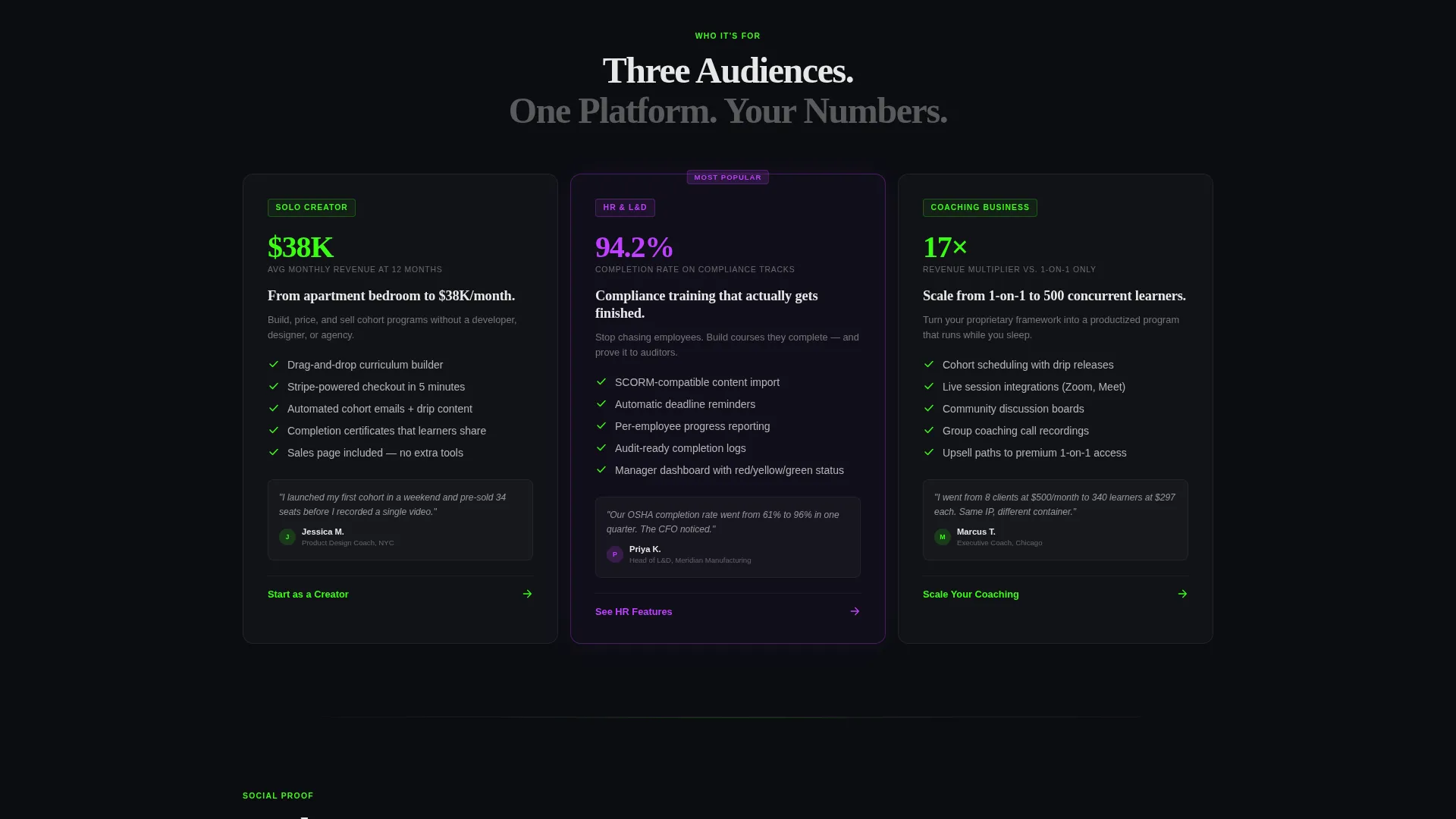
- Solo course creators selling cohort-based programs who need a launch-ready page fast
- HR leads at mid-size companies building compliance training with real completion metrics
- Coaching businesses moving from one-on-one sessions to hundreds of concurrent learners
What problem this template solves
Most landing pages for learning platforms undersell the product. They rely on generic stock photography and vague benefit statements that do not show the visitor what success actually looks like. Courseforge fixes that by replacing illustrations with data.
- Visitors leave before signing up because they cannot picture using the platform
- Founders spend weeks building a custom page instead of building their course catalog
- Generic templates fail to communicate the power of a drag-and-drop learning management system
What you get with this template
You get a complete, conversion-focused bento grid landing page that communicates platform capability through live-style data tiles, an expanding feature matrix, and a frictionless sign-up flow. Every section is purposeful and ready to customize.
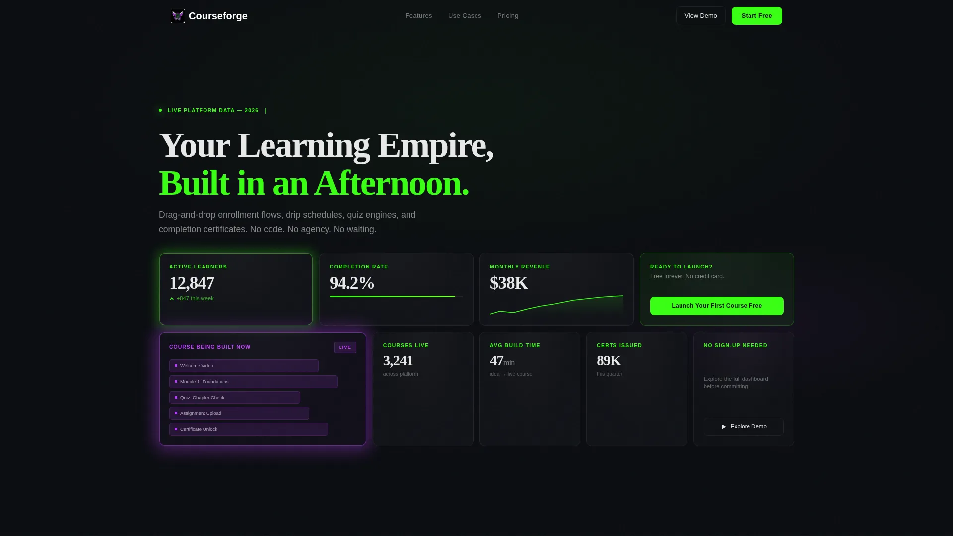
- A Stats/Metrics header dashboard with oversized numbers, sparklines, and a real-time course-building tile
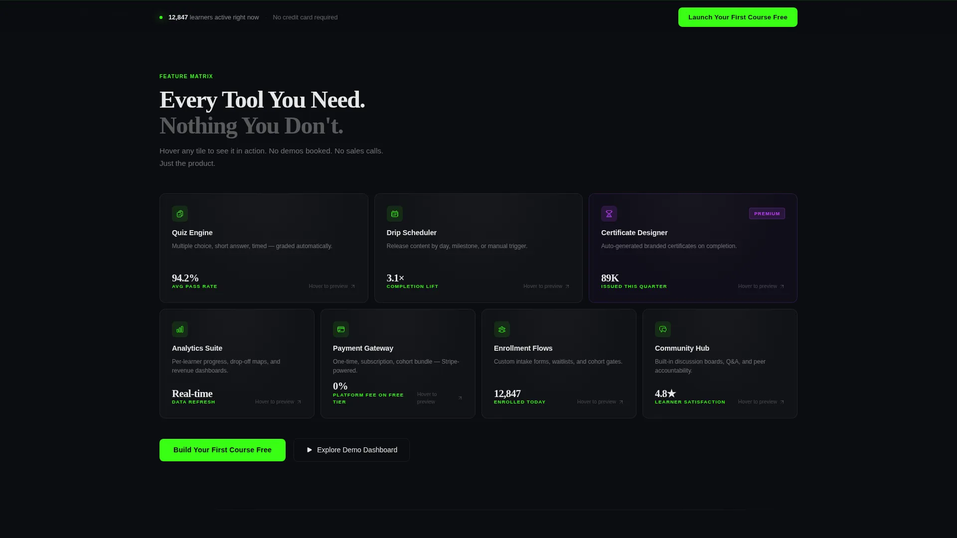
- An expanding Feature Matrix section where each bento tile represents a discrete platform capability with hover-reveal micro-demos
- A sticky bottom call-to-action bar and a secondary demo-access path that requires zero form completion
Feature list
This template delivers a focused set of design and structural features, each grounded in the Courseforge brief.
Live Stats Dashboard Header
The header is styled as a frozen mid-session analytics dashboard. Tiles display oversized metrics such as active learner counts, completion rates, and monthly revenue figures, alongside a small sparkline. One tile pulses with an electric violet glow to suggest a course being built in real time.
Expanding Bento Feature Matrix
Below the header, the grid starts in a tight two-by-two layout and breaks wider as the visitor scrolls. Each tile maps to a specific platform capability, quiz builder, drip scheduler, certificate designer, payment gateway, or analytics suite. Hovering a tile flips it to reveal a micro-demo or supporting metric.
Freemium Conversion Flow
The primary call to action, "Launch Your First Course Free," appears first as a native-looking tile inside the header grid. It then reappears in a slim fixed bar after the second scroll. The sign-up asks only for an email address and a single text field: "What will you teach?"
Demo Dashboard Secondary Path
Visitors who are not ready to sign up can choose "Explore the Demo Dashboard" without filling in any form. This no-commitment path builds confidence by letting people experience the platform's output before they decide to create an account.
Data Command Visual System
The Acid Digital color palette uses void black (#0B0D11) for all backgrounds, terminal green (#39FF14) for live data points and primary actions, electric violet (#BF40FF) for premium feature indicators and hover states, and phosphor white (#E8E8E8) for body text. The result is a high-contrast, synthetic aesthetic that communicates precision.
Artifact-First Content Strategy
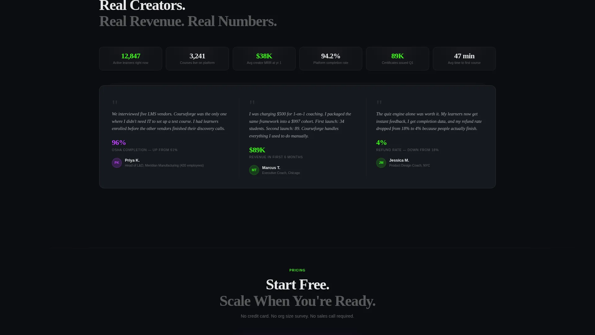
The page shows the actual outputs the platform produces rather than promising features in abstract terms. Enrollment flows, completion certificates, quiz results, and revenue numbers are displayed as finished artifacts, making the value immediately tangible.
Page sections overview
| Section | Purpose |
|---|---|
| Stats Dashboard Header | Opens with live-style metrics to set platform credibility |
| Primary call to action Tile | Embeds the sign-up action natively inside the header grid |
| Feature Matrix Grid | Reveals platform capabilities tile by tile as the visitor scrolls |
| Hover Micro-Demos | Flips each feature tile to show a metric or mini interaction |
| Secondary Demo Path | Offers a form-free route to explore the platform dashboard |
| Sticky call to action Bar | Keeps the primary call to action visible after the second scroll |
Design & branding system
The template uses a Data Command theme expressed through the Acid Digital color system. Every visual decision reinforces the idea of a high-performance operations interface, not a friendly consumer product.
- Void black (#0B0D11) floods every background tile; terminal green (#39FF14) marks live data and primary actions; electric violet (#BF40FF) signals premium features and hover states; phosphor white (#E8E8E8) keeps body text crisp
- Typography is oversized for key metrics, with labels rendered in terminal green against void black for maximum contrast
- No stock photography and no illustration; trust is communicated entirely through data and visible platform artifacts
Mobile & speed optimization
The bento grid layout is structured to reflow cleanly across screen sizes. Tile-based grids adapt naturally to narrower viewports, and the sticky call-to-action bar remains functional on mobile without obscuring content.
- Bento tiles stack and resize predictably on smaller screens, preserving the cockpit aesthetic at every breakpoint
- The two-field sign-up form is minimal by design, keeping the mobile conversion path fast and distraction-free
How this template helps you convert
Every structural decision in this template is oriented toward lowering the barrier to a first action. The page does not ask visitors to imagine the product; it shows them the product's output.
- The header dashboard makes the visitor picture their own metrics in those tiles, creating an emotional connection before any feature is explained
- The expanding feature matrix answers objections progressively, so the visitor feels informed rather than overwhelmed by the time they reach the call to action
- The two-field sign-up and the form-free demo path give every visitor a comfortable next step, whether they are ready to commit or still exploring
Other information about this template
This template is built specifically for the no-code learning management system space and carries design decisions that reflect that niche. A few additional details are worth noting.
- The template style is Bento Grid, making it well-suited for platforms that want to present multiple capabilities without a long, linear scroll
- The header concept is Stats/Metrics, which means the opening impression is built on data credibility rather than brand narrative
- The freemium and trial conversion direction means the page is optimized for low-friction first actions, not high-ticket direct sales
- The creative direction is Feature Matrix, so the mid-page content is structured to reveal complexity gradually rather than front-loading every capability
- The intersection of the Technology category, No-Code Enterprise Software subcategory, and No-Code LMS niche makes this template a strong fit for platforms competing in the broader no-code tools market
Theme
Data Command
Creative direction
Feature Matrix
Color system
Acid Digital
Style
Bento Grid
Direction
Freemium/Trial
Page Sections
Live Stats Dashboard Header
Expanding Bento Feature Matrix
Freemium Sign-up Flow
Form-free Demo Path
Acid Digital Color System
Artifact-first Page Structure
Related questions
Who is the Courseforge template designed for?
Do I need to write code to use this template?
Can I change the metrics shown in the header dashboard?
What makes this landing page different from a standard SaaS template?
Is the demo dashboard path included in the template?



