Advanced Dental Software Professional Website Template
Covenant is a dental contract management landing page template built for platforms that track, negotiate, and enforce provider agreements. With a split-screen layout, a Problem→Solution narrative arc, and a Midnight Blue visual identity, it converts overwhelmed practice managers and DSO operations directors into qualified leads through a focused, three-field audit form.
by Rocket studio
Quick summary
Covenant is a single-page, split-screen landing page template for a dental contract management platform. It moves visitors through a Problem→Solution arc, naming the real cost of missed renewals and fee schedule erosion before presenting a clear path forward. The design feels clinical and controlled, built to earn trust from busy dental operations professionals.
Who this template is for
This template is built for dental software platforms that help practices and dental service organizations (DSOs) take control of their provider agreements. It speaks directly to the people managing those agreements day to day.
- Practice managers tracking dozens of renewal dates across payer contracts and network agreements
- Associate dentists who need visibility into their own reimbursement rates and non-compete clauses
- DSO operations directors managing hundreds of contracts across multiple locations
What problem this template solves
Dental practices lose money silently. Renewal windows close unnoticed, fee schedules erode between renegotiations, and non-compete conflicts surface at the worst possible moment. A generic website template cannot communicate that level of operational urgency. Covenant is designed specifically to name those failures and quantify their cost before asking for a single click.
- Missed renewal windows and fee schedule erosion go unaddressed because no single view exists
- Multi-location contract portfolios outgrow spreadsheets fast, creating blind spots across a DSO network
- Visitors arrive skeptical; the template earns the form submission by making the cost of inaction visible first
What you get with this template
Covenant delivers a fully structured, conversion-focused landing page layout. Every section is purpose-built to move a dental operations professional from recognition to action. The visual design and content flow work together so the platform's value is felt, not just stated.
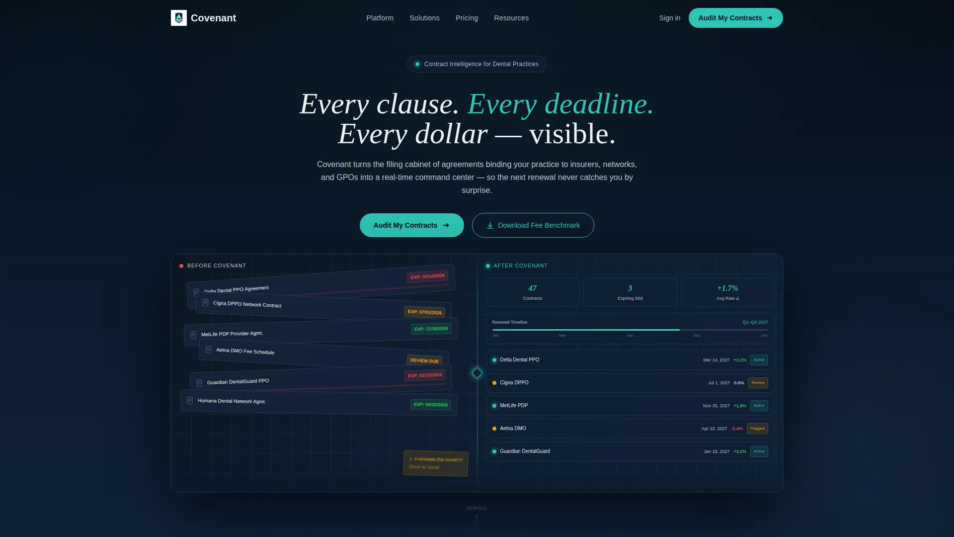
- A split-screen (50/50) header with Dark Glass Panels showing the before-and-after contrast of chaotic versus organized contracts
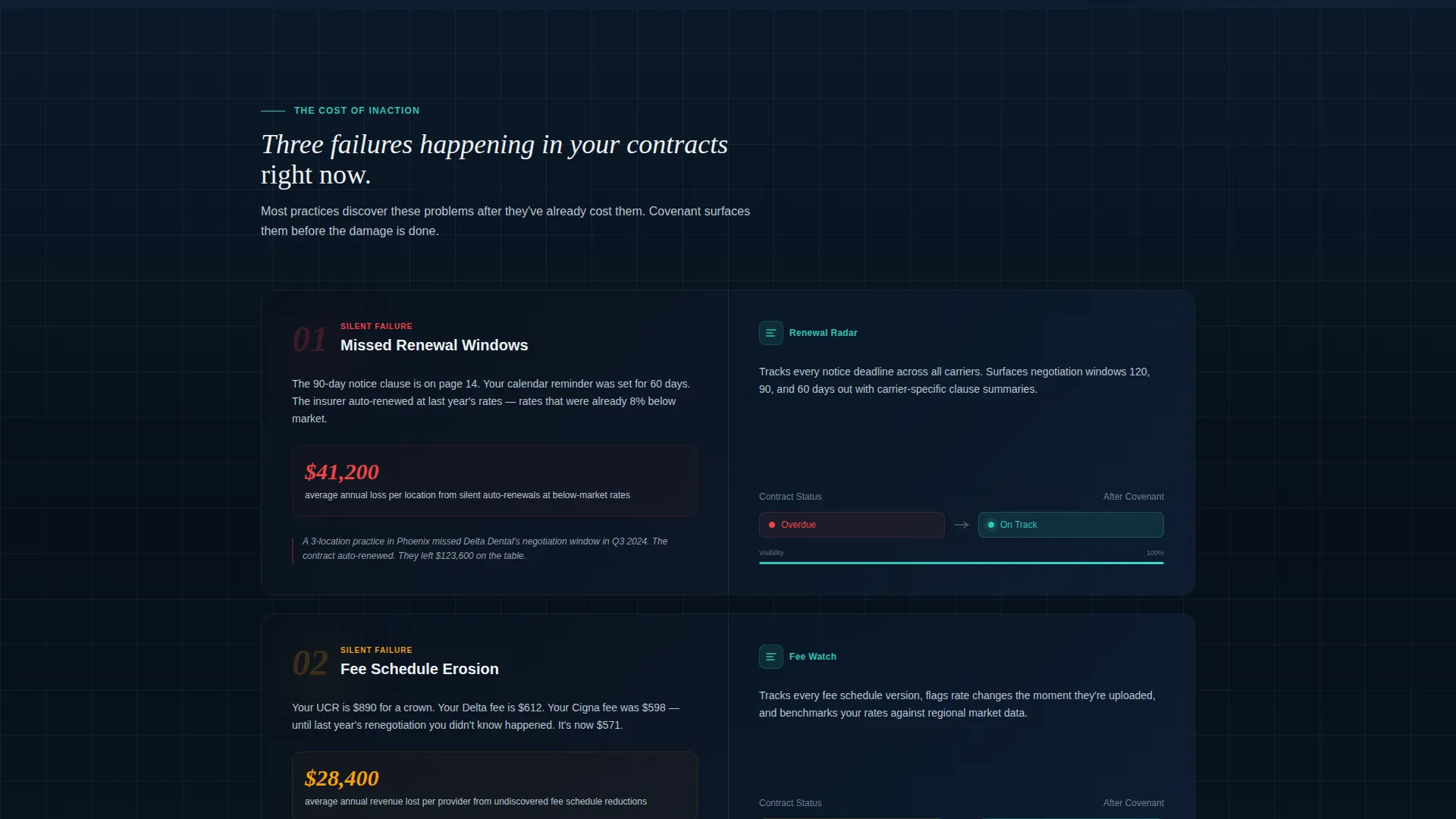
- A scrollable Problem→Solution arc with three named failure modes and corresponding platform modules
- Two lead capture paths: a primary "Audit My Contracts" form and a secondary gated download for fee schedule benchmarks
Feature list
This template includes the following built-in layout features and design components.
Split-Screen Header with Dark Glass Panels
The header divides the screen into two frosted-glass panels set against a deep midnight navy background. The left panel shows overlapping PDFs with red and amber expiration highlights. The right panel resolves those same contracts into a clean dashboard with green status chips and a timeline bar. A light-refraction line runs down the center seam, and the headline fades in over the divide.
Problem→Solution Narrative Arc
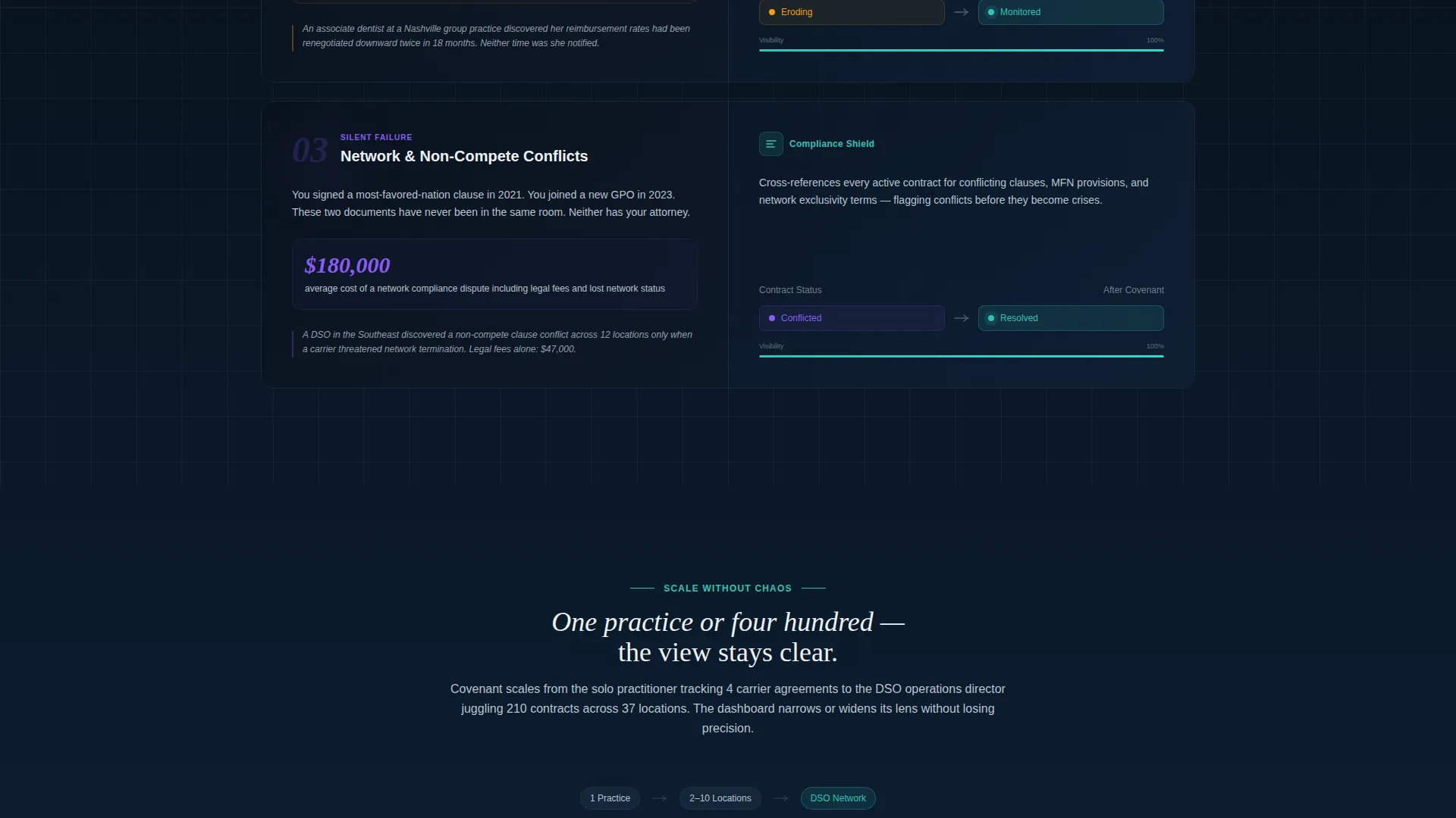
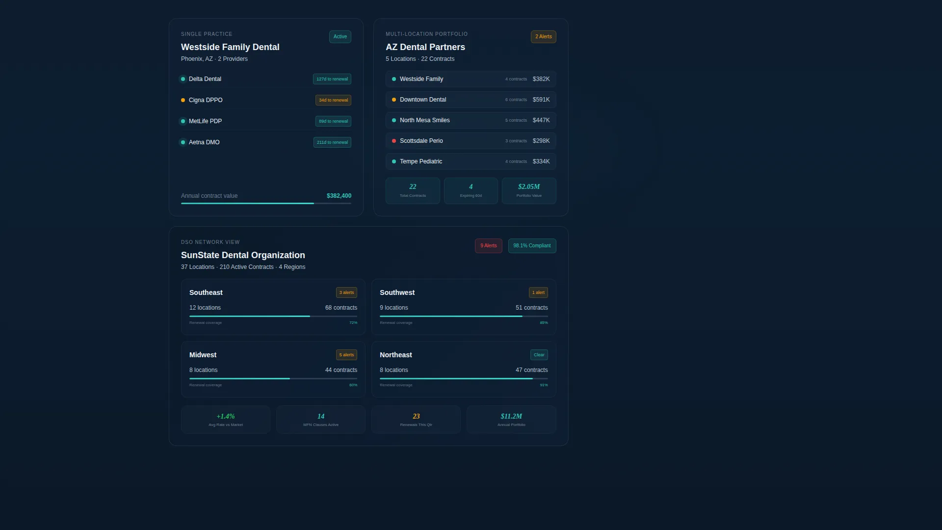
Each scroll section pairs a named failure mode with its platform module. Dollar-loss figures appear on the left to anchor the stakes. The corresponding solution appears on the right. The lens widens progressively, from a single contract view, to a multi-location portfolio, to a full DSO network perspective.
Micro-Interaction Scroll Rewards
As visitors scroll, contracts slide into place and status lights flip from red to teal. These micro-interactions reinforce the feeling of control being restored and keep engagement high through the full page length.
Primary Lead Capture Form
The "Audit My Contracts" call to action anchors to a three-field form: number of practice locations, current contract count via a dropdown (1 to 10, 11 to 50, 51 to 200, or 200+), and work email. The form appears after the visitor has already seen the cost of inaction quantified in each prior section.
Gated Secondary Download Path
Visitors who are not ready to request an audit can access a "Download the Fee Schedule Benchmark" resource by entering their email only. This secondary path captures leads at an earlier stage of consideration without interrupting the primary conversion flow.
Contract Status Badge System
Teal alert badges and color-coded status chips communicate contract health at a glance throughout the page. This visual language mirrors the platform's own interface, building familiarity and confidence before the visitor ever logs in.
Page sections overview
| Section | Purpose |
|---|---|
| Split-Screen Header | Visualize before-and-after contract clarity |
| Problem Arc Row | Name missed renewal window costs |
| Fee Schedule Section | Quantify reimbursement erosion risk |
| Non-Compete Section | Surface contract conflict consequences |
| Multi-Location View | Expand stakes to portfolio scale |
| DSO Network View | Show full enterprise contract scope |
| Primary call to action Form | Capture audit-ready lead information |
| Secondary Download | Gate benchmark for early-stage visitors |
Design & branding system
The Midnight Blue color system creates the atmosphere of a command center back office, calm, focused, and ready. Every color choice carries a functional signal that reinforces the platform's promise of order and control.
- Deep navy (#0B1929) dominates backgrounds and panels; polished steel (#3A4F6A) carries secondary text and dividers; clinical ceramic white (#EDF1F5) opens breathing room in content blocks
- Alert teal (#2EC4B6) pulses on buttons, toggle states, and contract-status badges to signal action and healthy contract status
- The frosted Dark Glass Panel header treatment and light-refraction center seam establish a refined, instrument-grade visual identity
Mobile & speed optimization
The split-screen layout is structured to adapt cleanly as screen width changes. Stacked mobile sections preserve the Problem→Solution narrative even when the side-by-side view collapses.
- The 50/50 split reflows to a single-column stacked layout on smaller screens, keeping section order and context intact
- Status badges, timeline bars, and form fields are sized for touch interaction on mobile devices
- Micro-interaction elements are designed to stay performant without interrupting the scroll experience on mobile
How this template helps you convert
Covenant is built around a single conversion principle: earn the click before you ask for it. Every section adds a specific reason to act before the form ever appears.
- The Problem→Solution arc uses real dollar-loss figures in each section, so visitors calculate the cost of inaction on their own terms before reaching the call to action.
- The two-path lead capture system meets visitors wherever they are, either ready to request an audit or still evaluating, and collects a qualified contact either way.
Other information about this template
Covenant sits at the intersection of dental software and contract operations technology. It is designed for platforms serving the full spectrum of dental practice structures, from solo practitioners to large DSO networks.
- The template style is Split Screen (50/50), theme is Directory and Discovery, and the creative direction follows a Problem→Solution Arc
- The header concept is Dark Glass Panels with a Midnight Blue color system, making it visually distinct from generic healthcare SaaS templates
- The lead generation direction is optimized for capturing segmented intent: the three-field form qualifies leads by practice size and contract volume before a single conversation begins
- This template is categorized under Technology, Dental Software, and Dental Contract Management, making it relevant for platforms operating in the provider agreement and dental network management space
Theme
Directory & Discovery
Creative direction
Problem→Solution Arc
Color system
Midnight Blue
Style
Split Screen (50/50)
Direction
Lead Generation
Page Sections
Split-screen Header with Dark Glass Panels
Problem→solution Narrative Arc
Micro-interaction Scroll Rewards
Primary Three-field Audit Form
Gated Benchmark Download Path
Contract Status Badge System
Related questions
Who is this landing page template designed for?
What does the split-screen header actually show?
How does the lead capture flow work?
Can this template address both single-practice and multi-location DSO use cases?
What color system does this template use?



