Coworking Digital Presence Professional Website Template
Coworkforum is a dashboard-style community landing page built for coworking operators, community managers, and freelance nomads. It combines glassmorphism header panels, a live-feed thread preview, a category grid, and a freemium sign-up flow into one focused single-page experience. The result is a command-center aesthetic that signals an active, expert community from the first scroll.
by Rocket studio
Quick summary
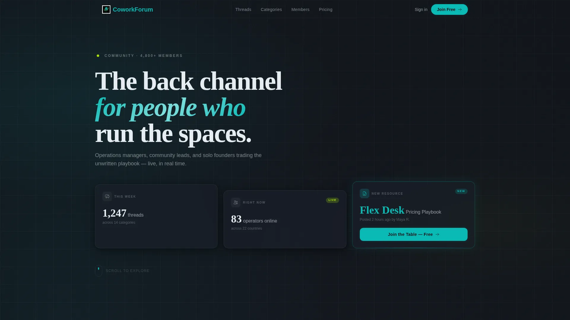
Coworkforum is a dark, data-forward community landing page template built for coworking professionals. It opens with three frosted-glass metric panels, moves through a live-feed thread preview and category grid, and closes on a freemium sign-up form. The design communicates that a real, active community is already running, and invites the visitor to join it.
Who this template is for
This template is built for the people who run coworking spaces day to day. It speaks directly to the professionals who need peer knowledge, not generic advice.
- Coworking operators managing single locations or multi-site networks who want a community hub that reflects their operational sophistication
- Community managers trying to prove membership value to landlords and stakeholders who need a credible, data-led first impression
- Freelance nomads and solo founders looking for a trusted space to ask real operational questions and get answers from experienced peers
What problem this template solves
Running a coworking space surfaces niche problems that general business forums cannot answer. Operators need a focused gathering point that feels like a professional resource, not a side project.
- No existing template combines a mission-control aesthetic with the community-specific sections operators actually need, such as pricing strategy, tech stack, and member behavior discussions
- Generic forum landing pages lack the data-driven visual language that signals activity and legitimacy to a skeptical, experienced audience
- Most freemium sign-up flows bury the value proposition; this template leads with live metrics and real thread previews so visitors understand what they are joining before they commit
What you get with this template
You get a fully designed, single-page community landing page that covers every stage of the visitor journey. From the first metric panel to the sign-up form, every section is built to reduce hesitation and communicate momentum.
- A Dark Glass Panels header with three frosted-glass metric cards, a sticky conversion bar, and a freemium registration form including role selection and an open-ended onboarding question
- A live-feed thread preview section, a five-category activity grid, and a member spotlight card that together establish social proof and community depth
- An animated counters section, progress rings, and a feature roadmap timeline that show the platform is growing and shipping value continuously
Feature list
This template ships with purpose-built sections and visual components drawn directly from the design brief. Each one serves a specific function in the visitor-to-member journey.
Dark Glass Panels Header
Three frosted-glass cards sit in a staggered grid against a pure black background. Each card displays a live forum metric. A teal edge-glow and subtle blur give the header a command-center depth without relying on photography or illustration.
Live-Feed Thread Preview
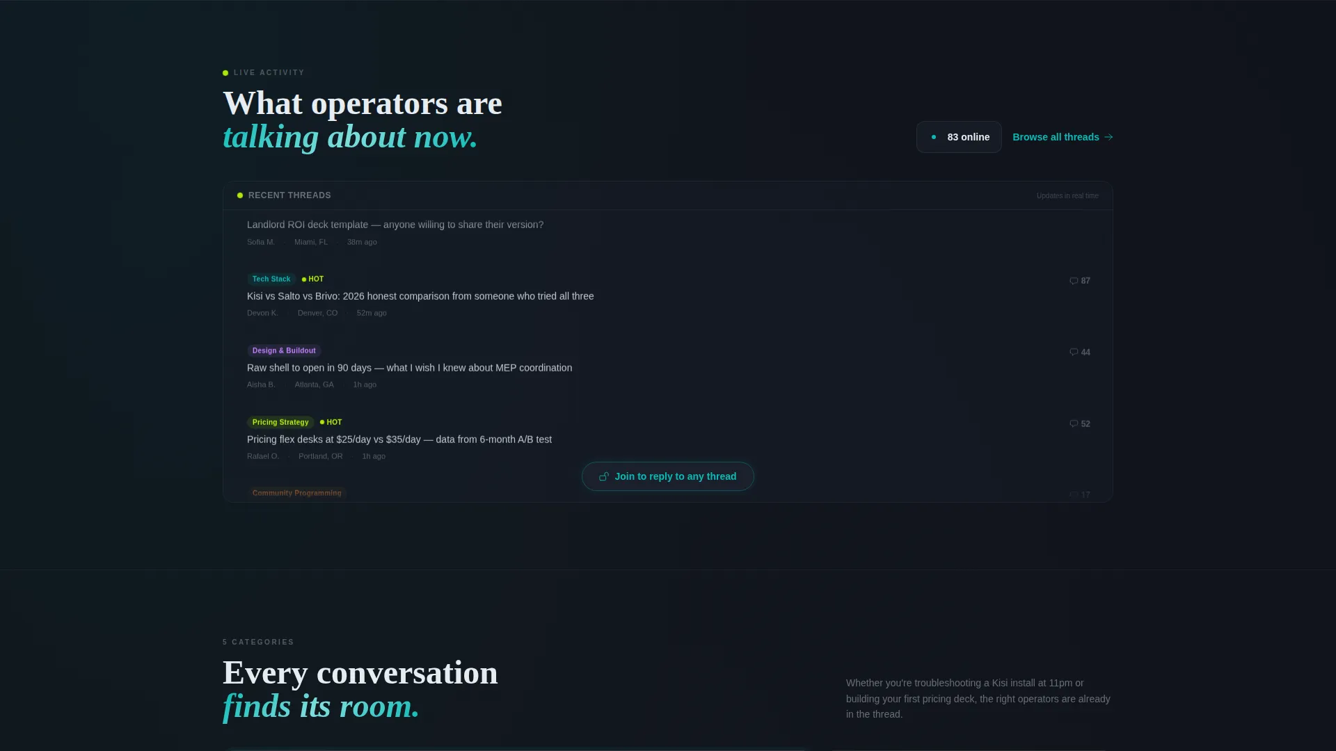
A scrolling upward feed shows actual thread titles from the community. This section communicates real activity immediately and gives a prospective member a taste of the conversations happening right now.
Category Activity Grid
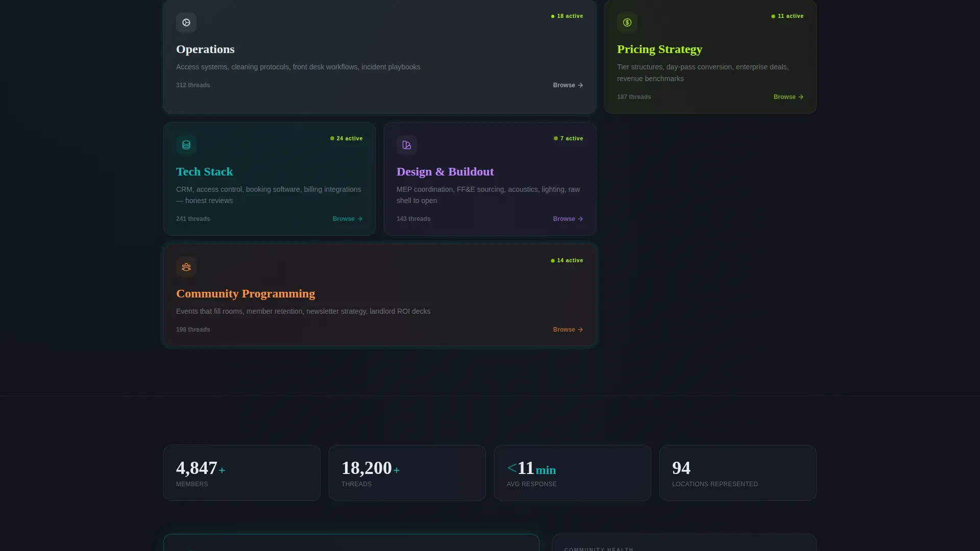
Five topic tiles cover Operations, Design and Buildout, Pricing Strategy, Community Programming, and Tech Stack. Each tile pulses faintly to indicate recent activity, helping visitors self-identify where they belong and what value they will find.
Member Spotlight Card
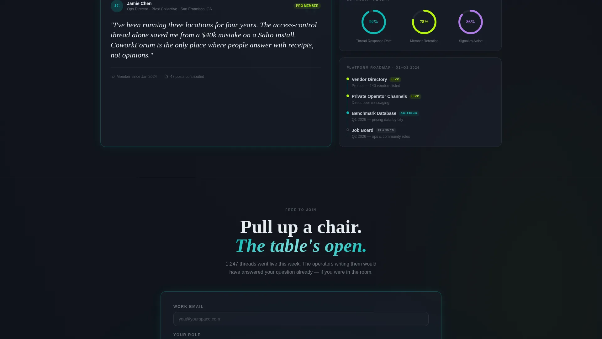
A highlighted quote from a real operator, paired with their space's city, provides human social proof. This card breaks up the data-heavy rhythm and connects the platform's metrics to real people and real results.
Animated Counters and Roadmap Timeline
Data counters and progress rings count up as the visitor scrolls. A roadmap timeline shows features shipping this quarter. Together these components reinforce that the platform is live and actively improving.
Freemium Sign-Up Form with Tier Comparison
A single-step form captures work email, role, and an optional open question. A visible but low-pressure comparison row beneath the form shows the free tier versus the Pro tier at nineteen dollars per month, letting the value of upgrading become apparent through participation rather than hard selling.
Page sections overview
| Section | Purpose |
|---|---|
| Glass Panels Header | Display live forum metrics and primary call to action |
| Live Thread Feed | Show real community activity scrolling in real time |
| Category Topic Grid | Let visitors locate relevant discussion categories instantly |
| Member Spotlight Card | Build trust through an operator quote and location |
| Animated Data Counters | Reinforce community scale with live-style number animations |
| Roadmap Timeline | Signal active platform development and upcoming features |
| Sticky Conversion Bar | Keep the sign-up call to action visible after two scroll sections |
| Freemium Sign-Up Form | Capture email and role with an optional onboarding question |
| Tier Comparison Row | Present free versus Pro access in a low-pressure format |
Design & branding system
The Teal Catalyst color system gives the template a focused, after-hours command-center feel. Every color choice has a functional role, not just a decorative one.
- Core palette: deep command-center black (#0D1117) as the base, active-node teal (#0ABAB5) on interactive surfaces and card borders, soft-grid charcoal (#1A1F2B) for floating panel backgrounds, and signal white (#E6ECF1) for typography and dividers
- Electric lime (#B5F507) appears as accent pulses on live activity indicators and notification badges, providing high-contrast contrast without competing with the primary teal
- Glassmorphism treatment on header cards, frosted blur effects, teal edge-glow on hover states, and charcoal panels floating above the black ground create depth and a sense of quiet data movement throughout the page
Mobile & speed optimization
The template is structured with mobile readability in mind. The staggered grid, card-based layout, and section-by-section scroll rhythm adapt naturally to narrower viewports.
- The card-based grid system for the header panels and category tiles reflows cleanly on smaller screens without losing the dark, layered visual hierarchy
- The sticky conversion bar and single-step sign-up form are designed to remain functional and uncluttered on mobile, keeping the primary call to action accessible at every scroll depth
- Launch Energy scroll animations are kept lightweight by design, arriving section by section as the page boots up rather than loading all at once
How this template helps you convert
Every section of this landing page is sequenced to reduce friction and increase the visitor's sense of belonging before they reach the sign-up form.
- The header's live metrics and the scrolling thread feed establish that this is a real, active community within the first few seconds of arrival, removing the biggest objection a visitor has before joining any new platform.
- The freemium model does the heavy lifting at the conversion point: the free tier is genuinely useful, with read access and five posts per month, so the ask feels low-risk, while the Pro tier comparison sits nearby for visitors who are already sold.
Other information about this template
This template is part of the Dashboard Pro theme family and uses the Teal Catalyst color system alongside a Launch Energy creative direction. These design conventions are consistent across the broader template collection for teams that want a cohesive visual language.
- The template style is classified as Dashboard and Data Grid, making it well-suited for any community or platform product that wants to lead with live data rather than static marketing copy
- The header concept, Dark Glass Panels, is a standalone design pattern that can be adapted for other data-forward landing pages within the same theme family
- The freemium and trial landing page direction means the conversion architecture is built around low-barrier entry, with upgrade paths visible but never disruptive
Theme
Dashboard Pro
Creative direction
Launch Energy
Color system
Teal Catalyst
Style
Dashboard/Data Grid
Direction
Freemium/Trial
Page Sections
Dark Glass Panels Header
Live-feed Thread Preview
Category Activity Grid
Animated Counters and Progress Rings
Freemium Form with Tier Comparison
Sticky Conversion Bar
Related questions
What kind of community is this template designed for?
Does the template include the actual forum or community platform?
Can I change the color palette or category labels?
How does the freemium sign-up form work in this template?
Is this template suitable for a coworking space that is just starting out?



