IIT-JEE Coaching Institute Landing Page Template
Crack is a sidebar companion landing page built for IIT-JEE coaching institutes. It pairs a metrics-driven header with faculty-led content sections and gated resource downloads. The dark Dopamine Pop color system, fixed sidebar navigator, and diagnostic test shortcut work together to give serious aspirants a high-trust, high-value first impression before they ever hit a sign-up form.
by Rocket studio
Quick summary
Crack is a precision-built sidebar companion landing page for IIT-JEE coaching institutes. It opens with a live-feeling stats wall, guides visitors through faculty-led subject sections, and closes with a resource-gated conversion form. The design runs on a dark Corporate Precision visual system that feels purpose-built for students who study at 2 AM.
Who this template is for
This template is built for IIT-JEE coaching institutes that want to convert serious aspirants rather than casual browsers. It suits programs serving Class 11 and Class 12 students, as well as droppers targeting a specific rank in the Joint Entrance Examination Advanced (JEE Advanced) or JEE Main. If your institute has real selection data, credible faculty, and downloadable resources to offer, this template gives those assets the right stage.
- Coaching institute owners and academic directors building a new enrollment funnel
- Marketing teams that want to replace generic brochure pages with proof-led content
- Faculty-forward programs ready to let teachers and their results do the selling
What problem this template solves
Most coaching institute pages either overwhelm visitors with course lists or underwhelm them with vague claims. Neither builds trust with a student who has one shot and two years of savings on the line. This template solves the credibility gap by making proof the centerpiece of every section.
- Generic hero banners and stock photos that fail to signal academic seriousness
- Conversion forms placed before the visitor has received any real academic value
- Faculty pages that list qualifications without showing actual teaching evidence or student outcomes
What you get with this template
You get a fully structured, single-page layout built around three conversion layers: a stats wall that earns attention, faculty sections that build trust, and a gated download that captures leads. Every section is designed to feel like useful academic content, not a sales pitch.
- A fixed sidebar with a module navigator, diagnostic quiz shortcut, and a contextual faculty avatar stack
- Faculty profile sections embedding downloadable resources such as formula sheets, PYQ problem sets, and chapter-wise weightage PDFs
- A primary call to action gating the full Previous Year Question (PYQ) bank behind a lean four-field form, plus a secondary ungated diagnostic test path
Feature list
A brief description of each built-in capability follows below.
Live-Feeling Stats Header
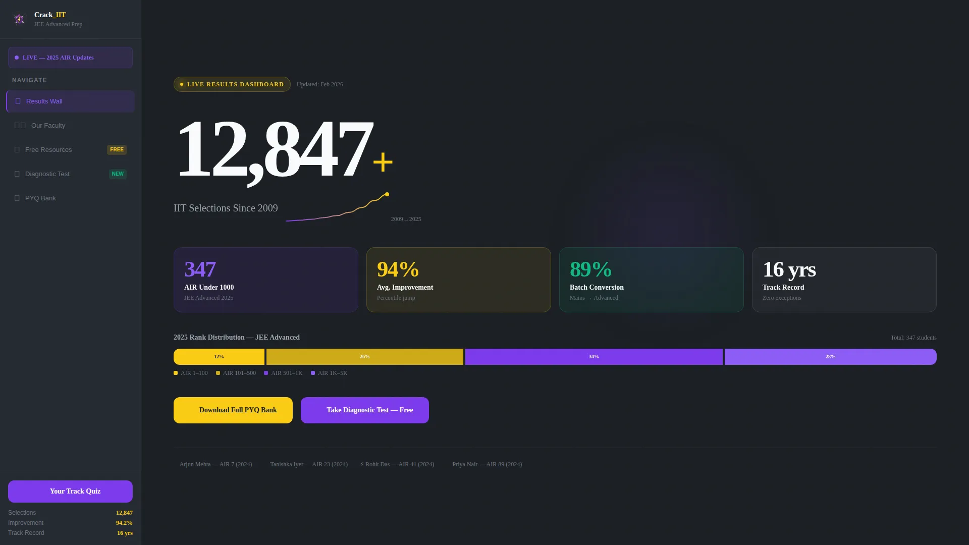
The header presents key institute metrics in oversized variable-weight type against a deep charcoal background. Total selections since 2009, an animated counter for current-year All India Rank (AIR) under-1000 seats, average improvement percentages, and a sparkline rank-distribution graph are all visible without scrolling. Reactor yellow pulses gently on the top stat, making the section read like a leaderboard at first glance.
Fixed Sidebar Navigator
The sidebar stays anchored as the visitor scrolls through the main content column. It houses a subject module navigator so students can jump directly to Physics, Chemistry, or Mathematics sections. A "Your Track" diagnostic quiz shortcut sits within reach at all times.
Contextual Faculty Avatar Stack
The sidebar's faculty avatar stack updates as the visitor scrolls into each subject section. This creates a live-companion feel where the right teacher appears alongside their own content block. It reinforces the institute's human identity without requiring a dedicated team page.
Faculty-Led Subject Sections
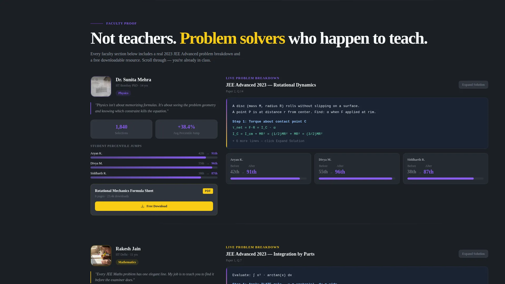
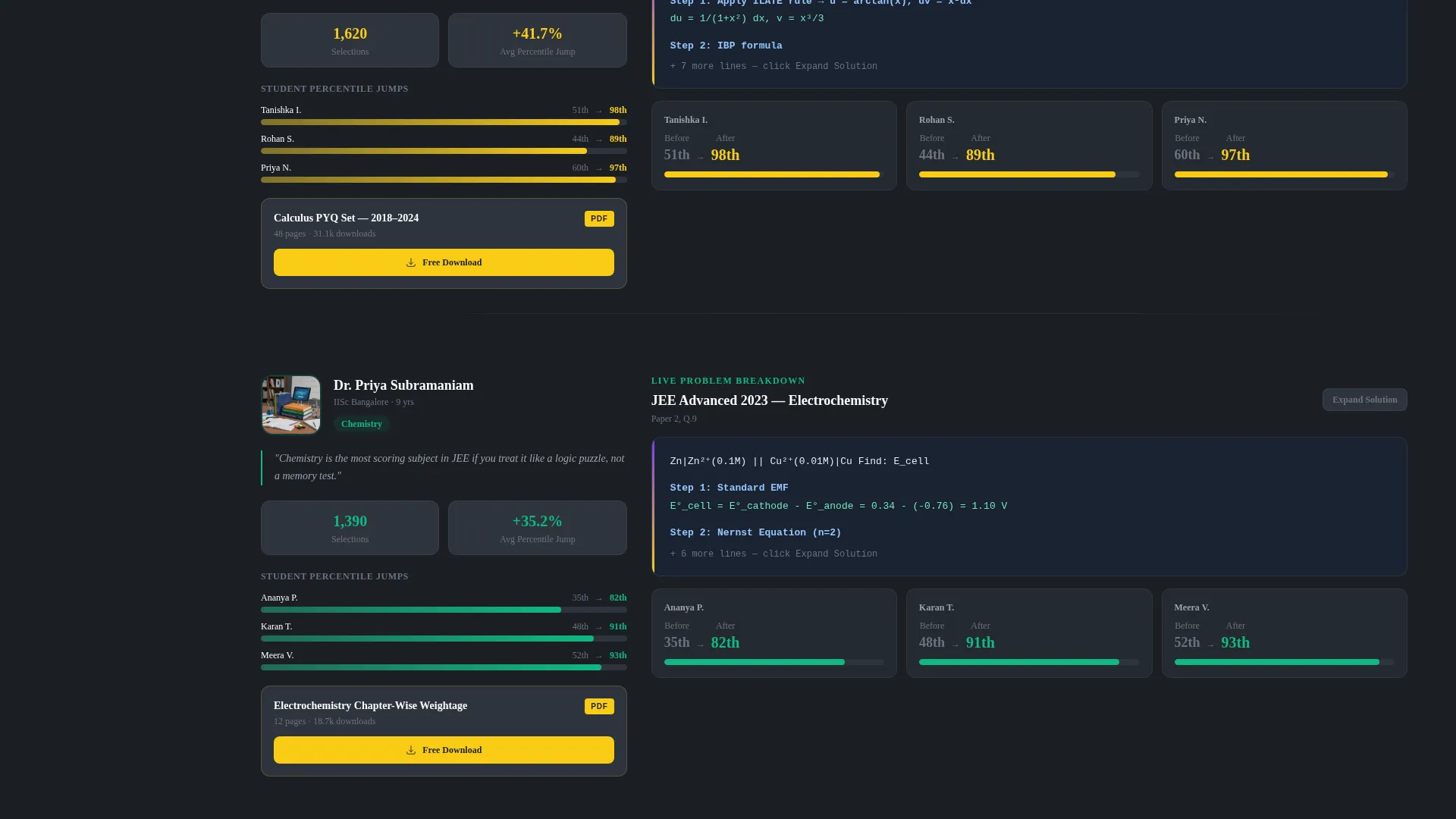
Each subject segment introduces a faculty member through their actual teaching evidence. Visitors see a whiteboard breakdown of a past JEE Advanced problem, selection statistics, and student percentile improvement data. A downloadable resource is embedded in each section so the scroll feels like being already enrolled.
Dual Conversion Path
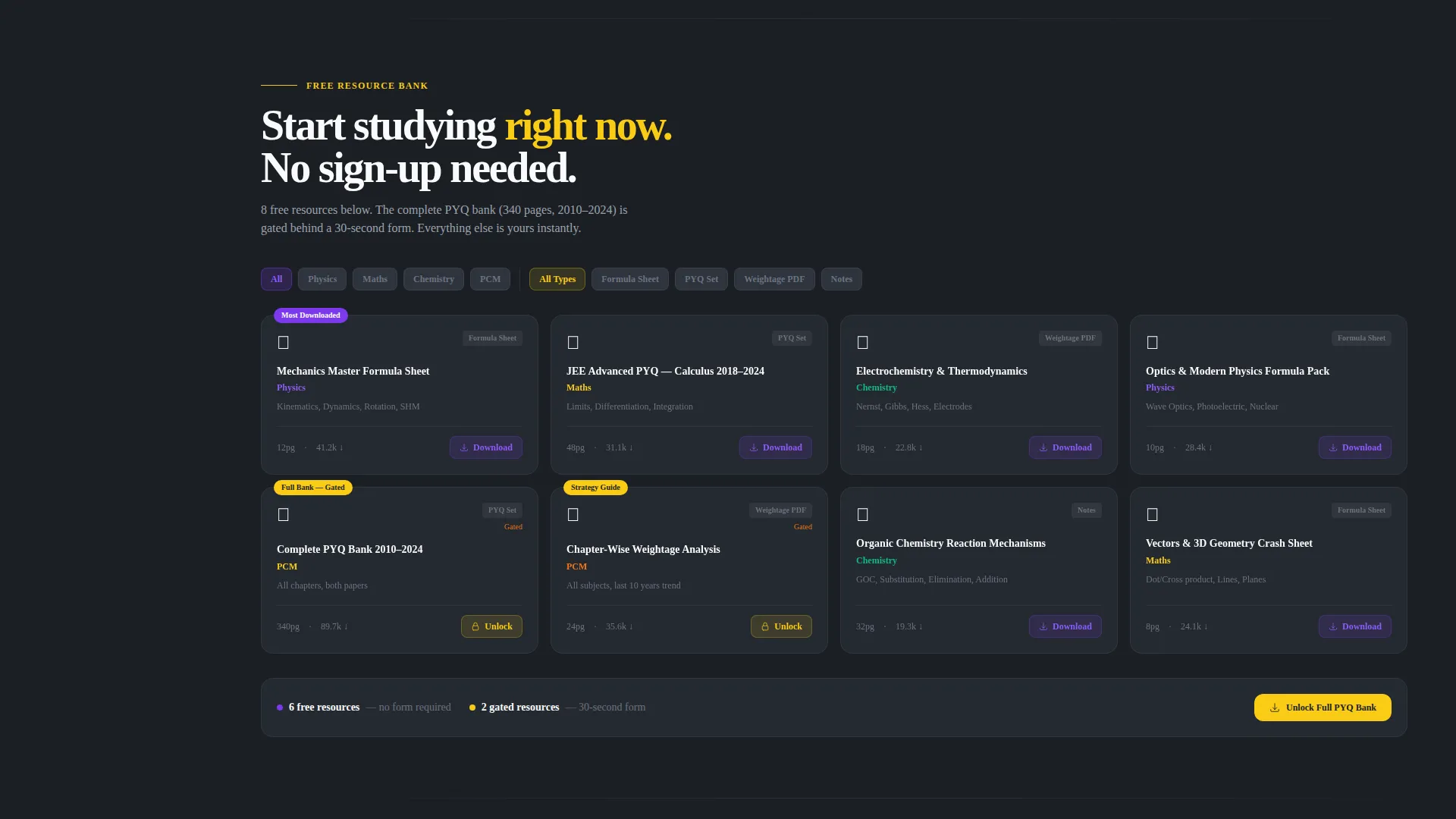
The primary conversion path gates the full PYQ bank behind a four-field form collecting name, phone number, current class, and target year. The secondary path offers an ungated diagnostic test that scores PCM (Physics, Chemistry, Mathematics) readiness and sends a personalized weak-chapter report by email. Both paths are active in the same layout without competing for attention.
Dopamine Pop Color System
The template uses a four-tone palette built for dark-mode academic contexts. Deep blackboard charcoal (#1B1F24) forms the background, serotonin violet (#7C3AED) marks active states and progress indicators, reactor yellow (#FACC15) highlights rank badges and key stats, and chalk white (#F9FAFB) keeps text and card surfaces crisp.
Page sections overview
| Section | Purpose |
|---|---|
| Stats Metrics Header | Opens with institute selection data and animated rank counters to earn immediate credibility |
| Fixed Sidebar Panel | Persists across scroll with module navigator, quiz shortcut, and contextual faculty avatars |
| Physics Faculty Section | Introduces the Physics teacher through a solved problem, stats, and a downloadable formula sheet |
| Chemistry Faculty Section | Introduces the Chemistry teacher with selection data and a chapter-wise weightage PDF |
| Mathematics Faculty Section | Introduces the Mathematics teacher with student percentile data and a PYQ problem set download |
| Primary call to action Block | Gates the full PYQ bank behind a lean four-field lead-capture form |
| Diagnostic Test Path | Offers an ungated PCM readiness quiz that emails a personalized weak-chapter report |
Design & branding system
The visual identity follows a Corporate Precision theme executed through a Dopamine Pop color system. Every color decision serves a functional purpose: charcoal recedes so content floats forward, violet signals active progress, and yellow draws the eye to the most important number on the screen at any given moment.
- Background: deep blackboard charcoal (#1B1F24) for zero eye fatigue during extended sessions
- Accent colors: serotonin violet (#7C3AED) for active states, reactor yellow (#FACC15) for highlights and rank badges
- Typography and surfaces: chalk white (#F9FAFB) for body text and card backgrounds, with oversized variable-weight type used in the stats header
Mobile & speed optimization
The sidebar companion layout is designed to adapt cleanly between screen sizes. On smaller screens, the fixed sidebar collapses into an accessible navigation layer so the main content column remains unobstructed. The template's structural choices support lean, fast-loading page behavior.
- Sidebar collapses gracefully on mobile so the content column takes full-screen priority
- Oversized stat typography scales responsively to retain visual impact on any screen width
- Downloadable resource embeds and the diagnostic test shortcut remain reachable on mobile without layout breakage
How this template helps you convert
The conversion architecture is built around the principle of earning the click before asking for anything. Visitors receive real academic value at multiple points in the scroll before they encounter a form.
- The stats header anchors credibility within seconds, so visitors arrive at faculty sections already primed to trust the institute's track record.
- Embedded downloadable resources in each faculty section create a sense of enrollment before any form appears, lowering psychological resistance to the primary call to action.
- The ungated diagnostic test offers a zero-commitment entry point for visitors who are not yet ready to share their contact details, keeping them engaged and generating a personalized email touchpoint.
Other information about this template
This template is suited to institutes that already hold measurable outcome data and want a page that reflects genuine academic rigor. It is not a generic course catalog design. The "Team and People" creative direction makes individual faculty the narrative backbone of the page, so institutes with recognized teachers will see the strongest fit. The sidebar companion template style is particularly effective for content-heavy pages where multiple subject sections need to stay navigable without forcing the visitor to scroll back to the top.
- Template style: Sidebar Companion, suited for content-rich single-page flows
- Creative direction: Team and People, placing faculty proof at the center of every section
- Header concept: Stats and Metrics wall, rendering outcomes data as the first visual experience
- Conversion direction: Content and Resource lead capture, gating the PYQ bank behind a lean form
- Theme: Corporate Precision, conveying rigor without sacrificing visual energy
Theme
Corporate Precision
Creative direction
Team & People
Color system
Dopamine Pop
Style
Sidebar Companion
Direction
Content/Resource
Page Sections
Live Stats Metrics Header
Fixed Sidebar Navigator
Contextual Faculty Avatar Stack
Faculty-led Resource Sections
Dual Conversion Architecture
Dopamine Pop Dark Color System
Related questions
What kind of institutes fit this template best?
Can the downloadable resources be replaced with my own materials?
How does the diagnostic test path work in this layout?
What fields does the primary lead capture form collect?
Is the sidebar usable on mobile devices?



