Minimalist Fashion Professional Website Template
Forge is a bold brutalist minimalist jewelry brand landing page template built for sculptural jewellery collections. It pairs a pitch-black spotlight hero with a shoppable masonry gallery, process imagery, and scroll-triggered calls to action. The design conveys weight, intention, and craft, making every product feel like an object worth owning.
by Rocket studio
Quick summary
Forge is a single-page jewellery landing page template designed for minimalist jewelry brands that treat each piece as sculpture. The landing page design leads with a spotlight hero, flows into a brutalist masonry gallery of shoppable product tiles, and closes with a confident footer call to action. Every design decision conveys the beauty of restraint.
Who this template is for
This template speaks directly to jewelry brands and designers who build collections with intention. It suits anyone creating a professional online presence for sculptural, art-adjacent jewellery that sells on visual authority alone.
- Independent jewellery makers and studio founders who want a landing page that feels as considered as their work
- Creative directors and designers building a direct-to-consumer jewelry brand website for an architecture-aware audience
- Gift-focused jewelry retailers who want visitors to feel the weight and beauty of each product before they click through
What problem this template solves
Most jewelry landing page designs either over-explain or under-impress. They rely on busy layouts, soft pastels, and lifestyle clutter that dilutes the product. A jewellery brand with a strong point of view needs a landing page that lets the work speak without decoration getting in the way.
- Generic jewelry website templates fail to convey the sculptural nature and beauty of minimalist jewellery pieces
- Shoppable gallery pages often lack the visual urgency needed to drive click-through from high-intent visitors
- Building a professional jewelry landing page from scratch wastes time that makers need for their craft
What you get with this template
This template delivers a complete, professional jewelry landing page layout, fully structured, visually sharp, and ready to customize. Every section is developed with a specific job to do, from first impression to final action.
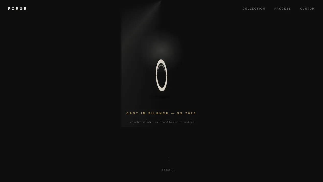
- A spotlight hero section with a rotating jewellery ring, directional light beam, and tracked-out collection name in tarnished gold text
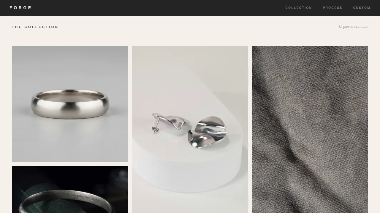
- A brutalist masonry gallery of shoppable jewellery product tiles with hover reveals showing piece name, metal type, and price
- A process interlude section, a single lifestyle break image, and a sticky "View the Collection" call to action bar that appears after scroll depth
Feature list
This template was developed around five distinct design and interaction ideas that work together to build trust, drive views, and move visitors toward purchase.
Spotlight Hero with Rotating Jewellery Ring
The hero section fills the full viewport with a pitch-black void. A single sculptural jewellery ring is suspended in a hard-edged beam of directional light. The piece rotates imperceptibly slowly, and the collection name fades in below it in tracked-out caps, the tarnished gold catching like a hallmark stamp. This landing page design creates an immediate first impression that commands attention without a single lifestyle element.
Brutalist Shoppable Masonry Gallery
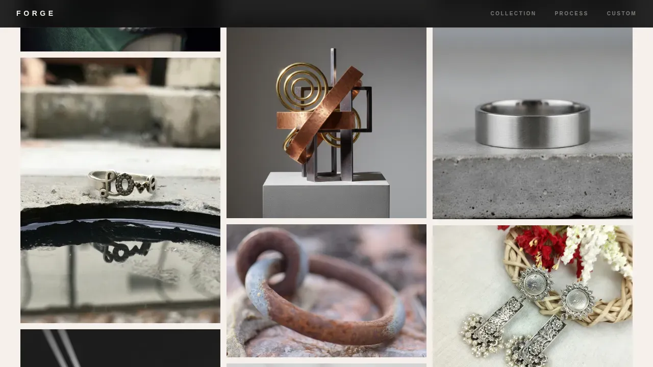
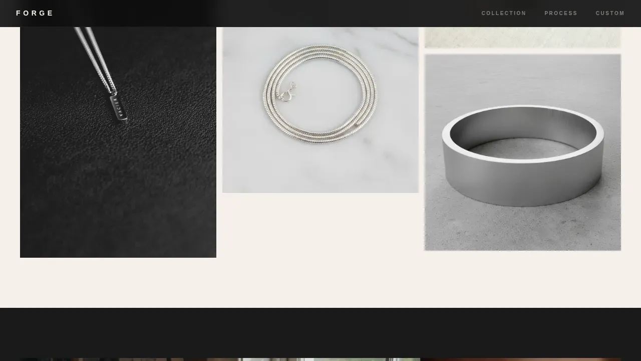
The masonry grid is deliberately uneven, some tiles towering and narrow, others wide and squat. Each jewellery product tile is shoppable. Hovering reveals the piece name, metal type, and price in tarnished gold. The grid layout forces the eye to hunt and discover rather than scan, making the experience of exploring the jewelry feel like a visit to a gallery.
Scroll-Triggered Sticky Call to Action
The primary "View the Collection" call to action appears as a sticky bottom bar only after three scroll-depths. This earns attention rather than demanding it. Calls to action presented this way convert better because visitors have already engaged with the product before being asked to act.
Process Interlude and Lifestyle Break Sections
A raw studio section shows tool marks in the metal, concrete floors, and hand-finishing detail, sharing the brand story through imagery rather than copy. Near the bottom, a single lifestyle image of a bare collarbone and chain breaks the darkness like an exhale. These two sections build trust by showing the making process and the beauty of the piece in context.
Footer with Custom Request Path
The footer follows an extreme minimal pattern with social icons, copyright, and a quiet "Request a Custom Piece" text link. This secondary path serves visitors who scrolled all the way down and still wanted more, converting a different kind of buyer without cluttering the primary landing page flow.
Page sections overview
| Section | Purpose |
|---|---|
| Spotlight Hero | First impression with rotating jewellery ring and collection name |
| Masonry Gallery | Shoppable brutalist jewellery product grid with hover reveals |
| Process Interlude | Raw studio imagery showing hand-finishing and tool marks |
| Lifestyle Break | Single collarbone image providing contrast and emotional exhale |
| Footer and call to action | Sticky action bar plus custom piece request link |
Design & branding system
The visual identity follows a Bold Brutalist theme through an Ink and Paper color system. The palette feels like a freshly printed monograph, ink sharp, paper warm. Typography uses DM Sans for body and interface text, and Fraunces for editorial display moments. Massive headlines occupy a significant portion of the screen, functioning as structural design elements rather than decorative text.
- Colors: soot black (#1A1A1A) for backgrounds and primary text, unbleached cotton (#F5F0EB) breathing between masonry tiles, graphite (#4A4A4A) for secondary text, and tarnished gold (#C4A35A) reserved exclusively for prices and calls to action
- Typography: oversized, bold sans-serif headlines favoring unrefined weight, with display moments in Fraunces that convey editorial beauty and confidence
- Grid and texture: asymmetrical grid-based layout with visible structural rhythm, high-contrast product photography, and detail close-ups showing tool marks in recycled silver and oxidized brass
Mobile & speed optimization
The landing page is designed desktop-first, with a strong mobile masonry adaptation that shifts from a multi-column grid to a two-column and then single-column layout as screen size drops. The design stays sharp and professional at every breakpoint.
- Masonry grid adapts from full brutalist desktop layout to a clean two-column mobile view, preserving the shoppable hover reveal behavior for touch interactions
- Intersection Observer drives lazy reveals so jewellery product tiles and section imagery load progressively as visitors scroll, keeping the page responsive without sacrificing visual richness
How this template helps you convert
An eye-catching landing page is crucial for a jewelry business because it serves as the first impression for potential customers. This template is built to drive click-through to individual product pages, where sizing, material options, and checkout live.
- The shoppable masonry gallery puts high-quality jewellery product images front and center, letting visitors explore pieces by visual weight and beauty before the call to action ever appears, high-resolution imagery influences 88% of shoppers, and this template makes every product tile count
- The scroll-triggered sticky bar creates urgency at exactly the right moment, presenting a bold, blocky call to action after visitors have already invested time in the jewellery landing page, signups and click-throughs increase when action is requested at peak engagement
- The "Request a Custom Piece" footer link serves a secondary audience of high-intent visitors, adding a quiet path to conversion without competing with the primary landing page flow or overwhelming the minimalist design
Other information about this template
This template fits into a broader set of ideas for professional jewellery landing page design. It works well for jewelry brands that want to launch quickly without sacrificing craft. The template is affordable relative to custom website design, and you can easily customize colors, text, and product images to match your brand's preferences in minutes.
- Unicorn Platform offers this template as part of a professionally designed library of jewelry landing page templates, including free templates that let you explore the builder before committing
- The drag-and-drop editor lets you add and customize sections, upload high-quality product images, and set your brand colors without writing code, making it easy for non-designers to build a polished jewelry website
- You can determine your own content structure, add a signup form for jewellery launch announcements and new drop alerts, and include social proof elements like material specificity and process imagery to build trust with new visitors
- Social media sharing links are supported in the footer, and the minimal design makes the landing page easy to share across social media without looking out of place
Theme
Bold Brutalist
Creative direction
Immersive Visual
Color system
Ink & Paper
Style
Masonry/Pinterest
Direction
Click-Through
Page Sections
Spotlight Hero with Rotating Ring
Brutalist Shoppable Masonry Grid
Scroll-triggered Sticky Call to Action Bar
Process Interlude and Lifestyle Section
Minimal Footer with Custom Request Link
Related questions
Can I customize the colors and typography in this template?
Does this template include a shopping cart or checkout?
Can I add a signup form for new collection drops?
Is this template suitable for a jewellery brand with a small catalog?
What kind of product photography works best with this design?



