Computer Science Flashcard Landing Page Template
Cram is a modular card-grid landing page template built for a computer science flashcard and spaced-repetition review app. It combines a persona-selector header, an interactive quiz flow, and a social-proof card grid to convert bootcamp grads, senior engineers, and professors into engaged learners. The dark IDE-inspired design makes every interactive element feel sharp and rewarding.
by Rocket studio
Quick summary
Cram is a single-page landing page template for a computer science flashcard and spaced-repetition review app. It opens with a persona selector, flows through a modular card grid packed with social proof and live demos, and closes with a quiz-driven conversion path. The design system pairs a deep dark background with electric violet and reward green to feel like focused, celebratory work.
Who this template is for
This template is built for teams launching or marketing a computer science review platform. It speaks directly to technically minded audiences who want proof before they commit.
- Bootcamp grads and self-taught developers grinding interview prep under a deadline
- Senior engineers brushing up on system design before a promotion loop or technical screen
- Computer science educators building shared flashcard decks for classroom or cohort use
What problem this template solves
Most flashcard app landing pages treat every visitor the same. They dump a hero banner and a pricing table on people who have wildly different goals. Cram solves that by letting visitors self-select before they read a single line of copy.
- Visitors land on a persona selector instead of a generic headline, so the page feels immediately relevant
- A quiz-gated gap analysis replaces vague feature lists with a personalized result the visitor actually wants
- The modular card grid mixes proof, demos, and features so the page never feels like a one-way pitch
What you get with this template
You get a fully structured, single-page landing page built around interactive conversion moments. Every layout block is modular and purpose-built for a computer science flashcard audience.
- A three-persona header with illustrated character cards, one-line challenges, and a diagnostic quiz trigger per persona
- A scrollable modular card grid blending streak heatmaps, testimonials, live review counts, and a playable sample flashcard
- A sticky bottom bar and in-grid calls to action that stay visible as users scroll deeper into the page
Feature list
This template includes purpose-designed sections and interaction patterns drawn directly from the source brief. Each one serves the computer science learner audience and the quiz-led conversion strategy.
Persona Selector Header
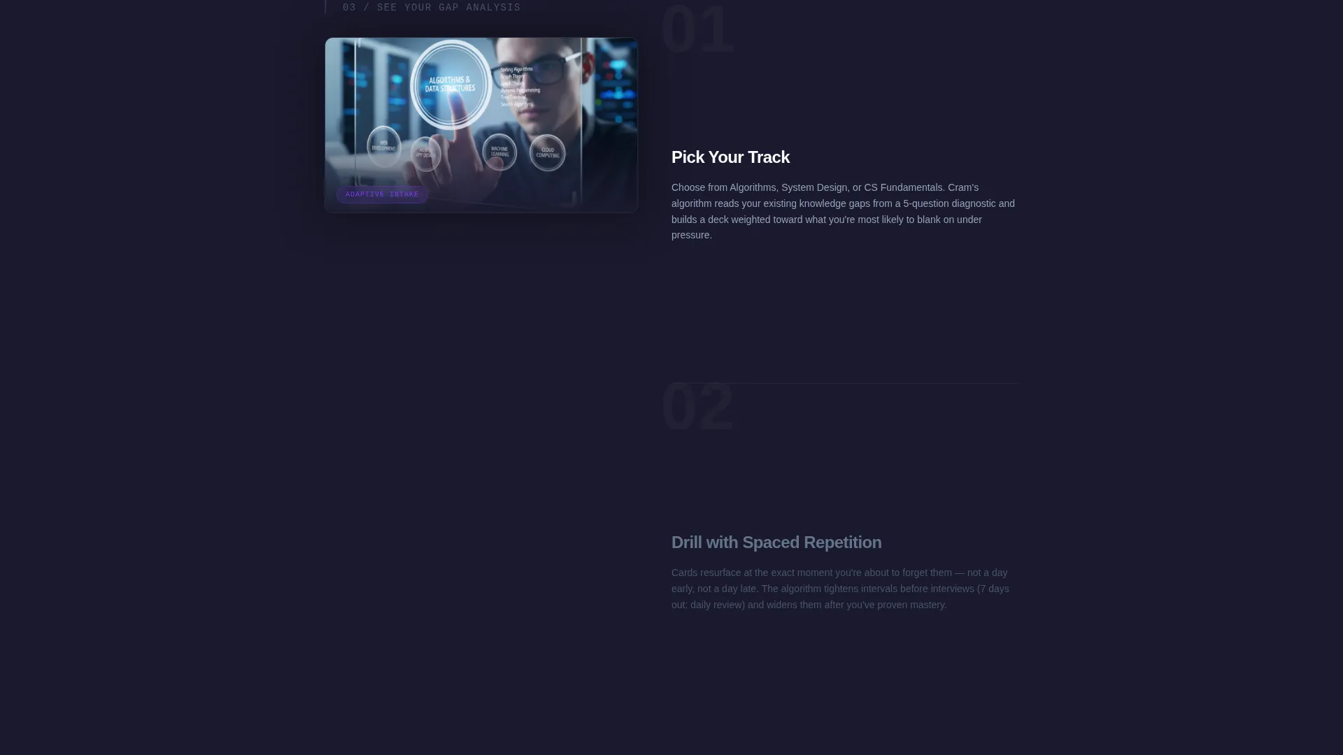
Three illustrated character cards sit side by side at the top of the page. Each card represents a real user archetype, displays a one-line challenge prompt, and triggers a five-question diagnostic quiz when clicked. Visitors self-identify before they scroll, making every subsequent section feel personally relevant.
Adaptive Quiz Conversion Flow
The primary call to action launches a ten-question adaptive quiz covering Big-O notation, recursion, trees, and system design basics. Every answer triggers an immediate card-flip response showing correct or incorrect feedback with a one-line explanation. The quiz ends with a personalized radar chart gated behind an email and a self-identified skill level.
Modular Social-Proof Card Grid
The card grid is the backbone of the page. Individual cards carry a user streak heatmap, a cohort-lead testimonial, a live global review count, and a playable flip card demo. Cards subtly rearrange on hover, mimicking the feel of shuffling a real flashcard deck.
Sticky Quiz Call to Action Bar
After two scroll depths, a sticky bottom bar appears with the primary "Find Your Weak Spots" prompt. It keeps the conversion entry point visible without interrupting the card-grid browsing experience. A secondary "Browse Free Decks" path appears on every third grid card for visitors who want to explore first.
Personalized Gap Analysis Result
At the end of the quiz, users receive a radar chart visualizing their strength across five computer science domains. This result is gated behind an email entry and skill-level selection. The gated delivery turns quiz completion into a qualified lead moment.
Dopamine Pop Design System
The page uses a structured four-color palette: deep IDE-dark background, electric violet for active states and progress rings, reward green for correct-answer moments, and crisp interface white for card faces and typography. Violet drives interactive surfaces; green appears only on success states.
Page sections overview
| Section | Purpose |
|---|---|
| Persona Selector Header | Visitor self-identifies via illustrated archetype cards |
| Diagnostic Quiz Trigger | Five-question quiz launches per selected persona |
| Modular Card Grid | Mixes proof, demos, streaks, and feature explanations |
| Playable Flip Card | Live sample flashcard visitors can interact with |
| Streak Heatmap Card | Shows a real 47-day user streak as social proof |
| Testimonial Card | Cohort-lead quote embedded inside the card grid |
| Live Review Counter | Global card-review count updated in real time |
| Sticky call to action Bar | Persistent quiz entry point after two scroll depths |
| Free Decks Path | Secondary browse option on every third grid card |
| Radar Chart Result | Personalized gap analysis gated by email and skill level |
Design & branding system
The visual identity follows a Corporate Precision theme executed through a Dopamine Pop color system. The palette is restrained until an interaction fires, then unmistakably alive.
- Deep IDE-dark background (#1A1A2E) recedes so each card floats like a terminal window
- Electric violet (#7C3AED) dominates hover states, active cards, and progress rings; reward green (#10B981) appears only on correct-answer flashes
- Crisp interface white (#F8FAFC) on card faces and body typography keeps reading effortless against the dark background
Mobile & speed optimization
The modular card grid is designed to reflow cleanly across screen sizes. Each card unit is self-contained, which makes the layout naturally adaptable without breaking the visual logic of the grid.
- Card grid columns collapse into a single-column stack on smaller screens, preserving the browse-and-flip experience
- The sticky bottom bar and persona selector header are both sized for comfortable thumb-reach interaction on mobile viewports
- Interactive elements like the flip card and quiz flow are contained within their card boundaries, keeping touch targets clear and predictable
How this template helps you convert
The conversion architecture is built around three reinforcing moments that move visitors from curiosity to commitment.
- The persona selector forces an immediate self-identification, which primes visitors to see the rest of the page as built for them specifically rather than for a generic audience.
- The ten-question adaptive quiz produces a personalized radar chart that visitors genuinely want. Gating it behind an email and skill level turns a completed quiz into a qualified, self-segmented lead.
- The secondary "Browse Free Decks" path on every third grid card gives skeptical visitors a low-commitment entry point, reducing drop-off before the primary conversion moment.
Other information about this template
This template is a strong fit for teams building or relaunching a computer science flashcard platform, an interview prep tool, or a structured spaced-repetition study app. It is equally useful for solo founders and education-focused product teams.
- The card-grid layout works well for any review app that wants to surface social proof and interactive demos together rather than in separate sections
- The quiz-gated gap analysis pattern is adaptable to other skill-based niches beyond computer science, since the radar chart result and email gate are structural components
- The template pairs naturally with spaced-repetition learning workflows because the card metaphor runs consistently from the header through to the conversion result


Theme
Corporate Precision
Creative direction
Team & People
Color system
Dopamine Pop
Style
Card Grid (Modular)
Direction
Quiz/Assessment
Page Sections
Persona Selector Header with Quiz Triggers
Ten-question Adaptive Quiz Flow
Modular Social-proof Card Grid
Gated Radar Chart Gap Analysis
Sticky Conversion Bar
Dopamine Pop Color System
Related questions
Who is this landing page template best suited for?
Can I customize the persona cards for a different audience?
How does the quiz-gated radar chart work as a lead capture tool?
What makes the card grid different from a standard features section?
Is there a secondary conversion path for visitors who are not ready to take the quiz?



