Punk Fashion Professional Website Template
Crate is a bold brutalist landing page built for a punk subscription box. It uses a masonry grid layout, a lavender-and-hot-pink color system, and a seasonal unboxing narrative to turn each monthly drop into an unmissable event. The page is designed to convert existing subscribers into higher-tier upgrades while pulling new visitors into the community.
by Rocket studio
Quick summary
Crate is a single-page brutalist landing page template built for a punk subscription box brand. It leads with a full-bleed type-over-image header, rolls into a raw masonry grid showcasing the current seasonal drop, and closes with a side-by-side upgrade table and a sticky add-on banner. Every design decision is intentional, rough, and built to convert.
Who this template is for
This template is built for subscription box brands that have a strong visual identity and an audience who values authenticity over polish. It suits operators who want to drive tier upgrades and add-on sales without a generic e-commerce feel.
- Punk, DIY, and underground culture brands running monthly subscription boxes
- Existing subscription operators looking to upsell current subscribers from a seasonal email campaign
- Creators and independent curators selling limited physical drops to a loyal niche community
What problem this template solves
Most subscription box landing pages look like every other one: clean grids, pastel hero sections, and safe copy. That sameness kills conversion for brands whose audience can spot a corporate template from a mile away. Crate is built to feel earned and specific.
- Generic templates fail to communicate scarcity or seasonal urgency in a visceral way
- Basic layouts cannot visually show the gap between subscription tiers without awkward comparison blocks
- Polished, minimal designs undercut the raw credibility that punk and DIY audiences respond to
What you get with this template
You get a complete single-page layout that is purpose-built for the punk subscription box use case. Every section is already structured for the upsell and upgrade flow described in the brief.
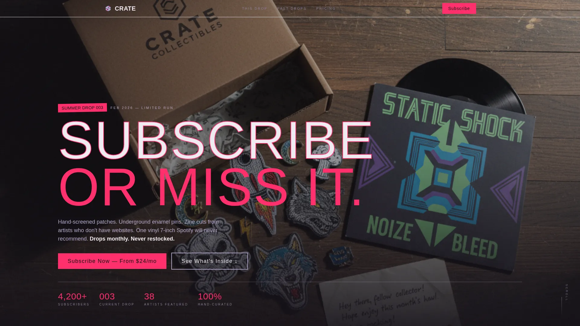
- A gritty type-over-image header with enormous condensed uppercase typography and a two-pixel hot-pink stroke
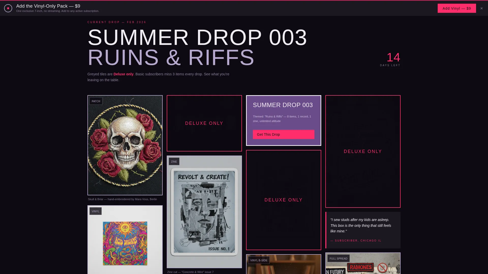
- A masonry unboxing grid with greyed-out "DELUXE ONLY" tiles that make tier differences feel immediate
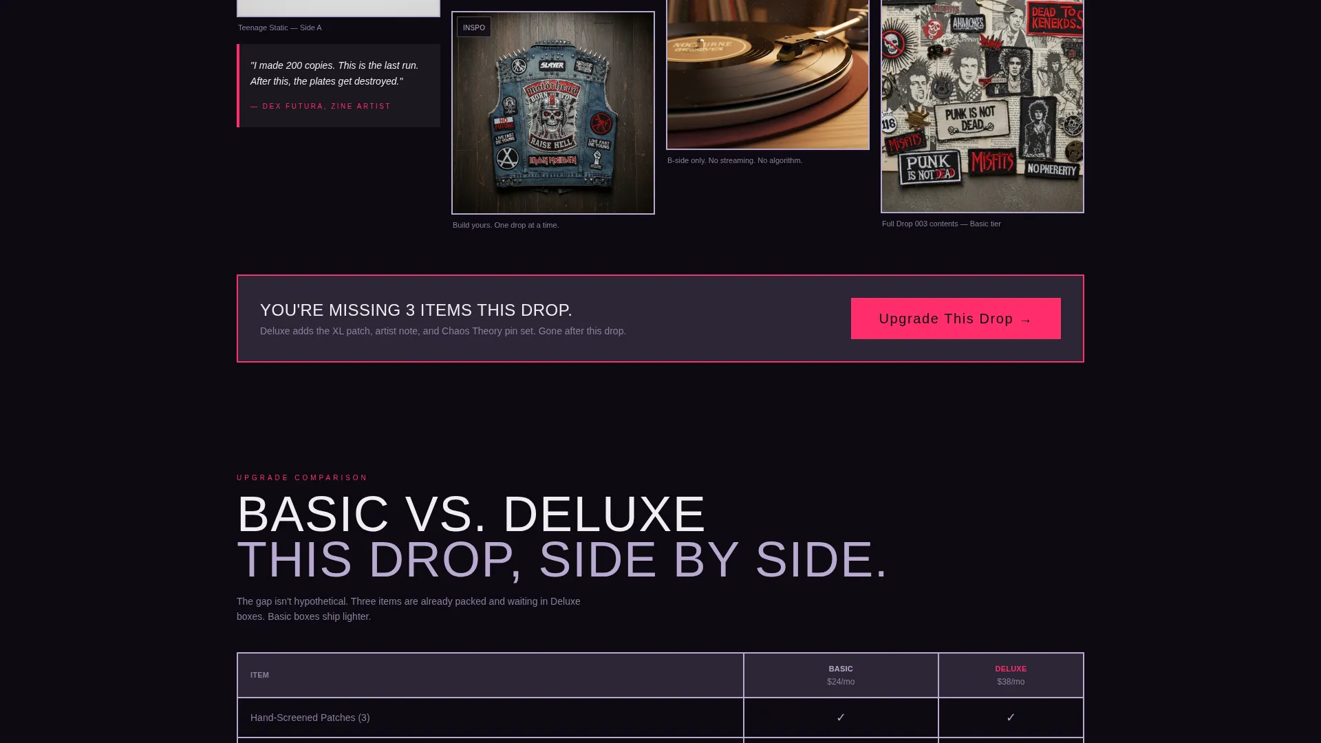
- A brutalist side-by-side tier comparison table, a primary upgrade call-to-action, and a sticky vinyl add-on banner
Feature list
This section covers the core functional and visual components built into the Crate template.
Type-Over-Image Hero Header
The header uses a grain-heavy overhead photograph of an open box spilling its contents across a scuffed hardwood floor. Enormous uppercase condensed type overlaps the image edge-to-edge, set in cracked plaster white with a hot-pink stroke. The composition feels like a ransom note placed over evidence.
Masonry Unboxing Grid
The masonry layout stacks tiles unevenly and deliberately. Each tile represents one item from the current drop: a patch close-up, a vinyl clip, or a zine pull-quote. As the visitor scrolls, content shifts from current-drop reveals to past-subscriber exclusives, building scarcity with every row.
Greyed-Out Tier Gating
Tiles marked "DELUXE ONLY" are scattered through the masonry grid in a greyed-out state. This design choice makes the difference between the Basic and Deluxe tiers feel visceral and immediate, not hypothetical. Subscribers who arrived from an email see exactly what they are missing.
Brutalist Tier Comparison Table
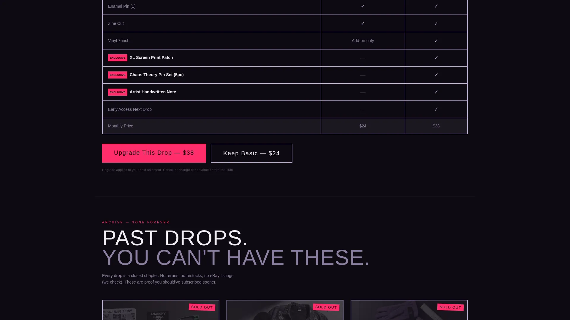
A side-by-side table with visible grid lines and sharp ninety-degree corners sits directly after the masonry grid. It compares the Basic and Deluxe tiers in plain, blunt language. The primary call-to-action button, "Upgrade This Drop," appears in hot safety-pink immediately after the table.
Sticky Add-On Banner
A persistent banner anchored to the bottom of the page offers "Add the Vinyl-Only Pack" as a one-click add-on. It stays visible throughout the scroll, giving the visitor a low-commitment entry point before committing to a full upgrade.
Lavender Dream Color System
The palette pairs washed violet, bruised lilac, cracked plaster white, and hot safety-pink. The combination feels like a pastel gig flyer wheat-pasted over a concrete wall: soft colors held inside blunt, heavy containers with visible borders. Buttons and price callouts use the hot-pink to demand attention.
Page sections overview
| Section | Purpose |
|---|---|
| Hero Header | Introduces the seasonal drop with type-over-image treatment and urgent uppercase copy |
| Masonry Unboxing Grid | Reveals current drop items tile by tile, building desire and scarcity as the user scrolls |
| Greyed-Out Deluxe Tiles | Visually communicates tier differences inline without interrupting the browsing flow |
| Past Drops Archive | Shows what previous subscribers received and can never get again, reinforcing exclusivity |
| Tier Comparison Table | Side-by-side brutalist table comparing Basic and Deluxe tiers with blunt copy |
| Upgrade Call-to-Action | Hot-pink primary button placed at peak desire after the full unboxing reveal |
| Sticky Add-On Banner | Persistent bottom banner offering the Vinyl-Only Pack as a low-friction one-click add-on |
Design & branding system
The Crate template uses the Lavender Dream color system inside a Bold Brutalist visual framework. Every container is hard-edged, every border is visible, and nothing is softened by rounded corners or drop shadows. The result feels like a well-designed zine: raw in texture, deliberate in structure.
- Color palette: washed violet (#B8A9D0), bruised lilac (#6B4C8A), cracked plaster white (#F0ECF3), and hot safety-pink (#FF2D6B) for buttons and price callouts
- Typography: enormous condensed grotesque uppercase for headers, with a two-pixel hot-pink stroke on hero text
- Visual texture: grain-heavy photography, uneven masonry tile stacking, and ninety-degree corners throughout all containers and tables
Mobile & speed optimization
The masonry layout and heavy hero image are structured to reflow cleanly on smaller screens. Tiles that stack unevenly on desktop condense into a readable single-column format on mobile without losing the raw visual character of the design.
- The sticky add-on banner remains accessible on mobile without blocking primary scroll content
- The brutalist comparison table adjusts to a stacked format on narrow viewports so tier differences remain clear
- Image-heavy sections use visible cropping and intentional framing so key details stay readable at smaller sizes
How this template helps you convert
The Crate template is engineered around a single commercial goal: getting an existing subscriber to upgrade or add on before they leave the page. Every structural decision serves that goal.
- The masonry grid with greyed-out "DELUXE ONLY" tiles creates visible desire before the upgrade ask ever appears, so the call-to-action lands on a visitor who already feels the gap.
- The side-by-side tier table and hot-pink "Upgrade This Drop" button appear immediately after peak desire, removing the need for the visitor to hunt for the next step.
- The sticky vinyl add-on banner gives hesitant visitors a smaller commitment to make, keeping revenue on the table even when a full upgrade feels like too much.
Other information about this template
The Crate template was designed around the Seasonal/Moment creative direction, meaning the entire page is framed around a specific quarterly drop rather than an evergreen product listing. This approach makes each deployment of the template feel time-sensitive and fresh.
- The template style is Masonry/Pinterest, which suits brands with rich visual content across multiple product items in a single drop
- The header concept is Type Over Image, a brutalist technique where large-scale copy physically overlaps the photography to create tension between text and subject
- The landing page direction is Upsell/Upgrade, making it best suited for email-driven campaigns where the visitor already has a relationship with the brand
- The template fits the Fashion and Lifestyle category with a specific focus on punk fashion and the punk subscription box niche
Theme
Bold Brutalist
Creative direction
Seasonal/Moment
Color system
Lavender Dream
Style
Masonry/Pinterest
Direction
Upsell/Upgrade
Page Sections
Type-over-image Hero Header
Masonry Unboxing Grid
Greyed-out Deluxe Tier Tiles
Brutalist Tier Comparison Table
Sticky Vinyl Add-on Banner
Lavender Dream Color System
Related questions
Who is this landing page template designed for?
Can I use this template for a new subscriber acquisition campaign?
How does the masonry grid handle different types of content?
What makes the tier comparison section effective?
Is the sticky add-on banner always visible during the scroll?



