E-Commerce Parcel Logistics Specialist Professional Website Template
Crate is a split-screen landing page template built for e-commerce parcel packaging and crating operations. It combines an animated carrier route map, live stat callouts, and a Spec Sheet scroll structure to convert fulfillment managers into packaging audit leads. The design runs on a deep charcoal and industrial amber palette that feels like a warehouse terminal at 5 AM.
by Rocket studio
Quick summary
Crate is a high-impact, single-page landing page template for outbound packaging and crating services. It pairs a live-styled carrier map with hard operational data to build an undeniable cost case. Every section escalates from parcel specs to pallet engineering to container crating, pushing fulfillment managers toward one action: running a packaging audit.
Who this template is for
This template is built for B2B logistics and fulfillment service providers who need to speak the language of operations managers. It targets buyers who run complex, high-volume outbound operations and need proof before they commit to a vendor conversation.
- Fulfillment managers and third-party logistics leads overseeing 10,000-plus SKUs
- E-commerce brand owners and VP Operations roles with direct margin accountability
- Packaging and crating service businesses converting cold traffic into audit leads
What problem this template solves
Fulfillment operations bleed margin through damage claims, dimensional weight surcharges, and carrier chargebacks. A generic service page cannot communicate the financial stakes quickly enough to hold a busy operations manager's attention. This template solves that by building an evidence-first scroll experience where every section adds another cost number until the audit call to action feels urgent.
- Damage claims and carrier chargebacks erode fulfillment margins every quarter
- Standard service pages fail to quantify the operational cost of poor packaging
- Fulfillment decision-makers need data, not lifestyle imagery, to justify a vendor switch
What you get with this template
You get a fully structured, desktop-first landing page layout designed around a click-through conversion flow. No form sits on the page itself. The template earns commitment by stacking cost data across three scroll tiers before routing visitors to a short qualification page.
- A 50/50 split-screen hero with an animated carrier route map and a live stat stack
- Three data-driven scroll sections covering parcel specs, pallet engineering, and container crating
- A persistent bottom call-to-action bar that appears after the second section
Feature list
This template ships with purpose-built components designed specifically for high-stakes B2B logistics conversion. Each feature below is grounded in the brief.
Animated Carrier Route Map Header
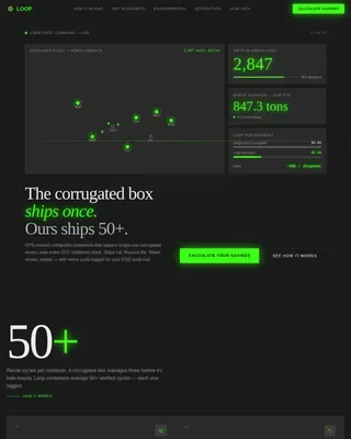
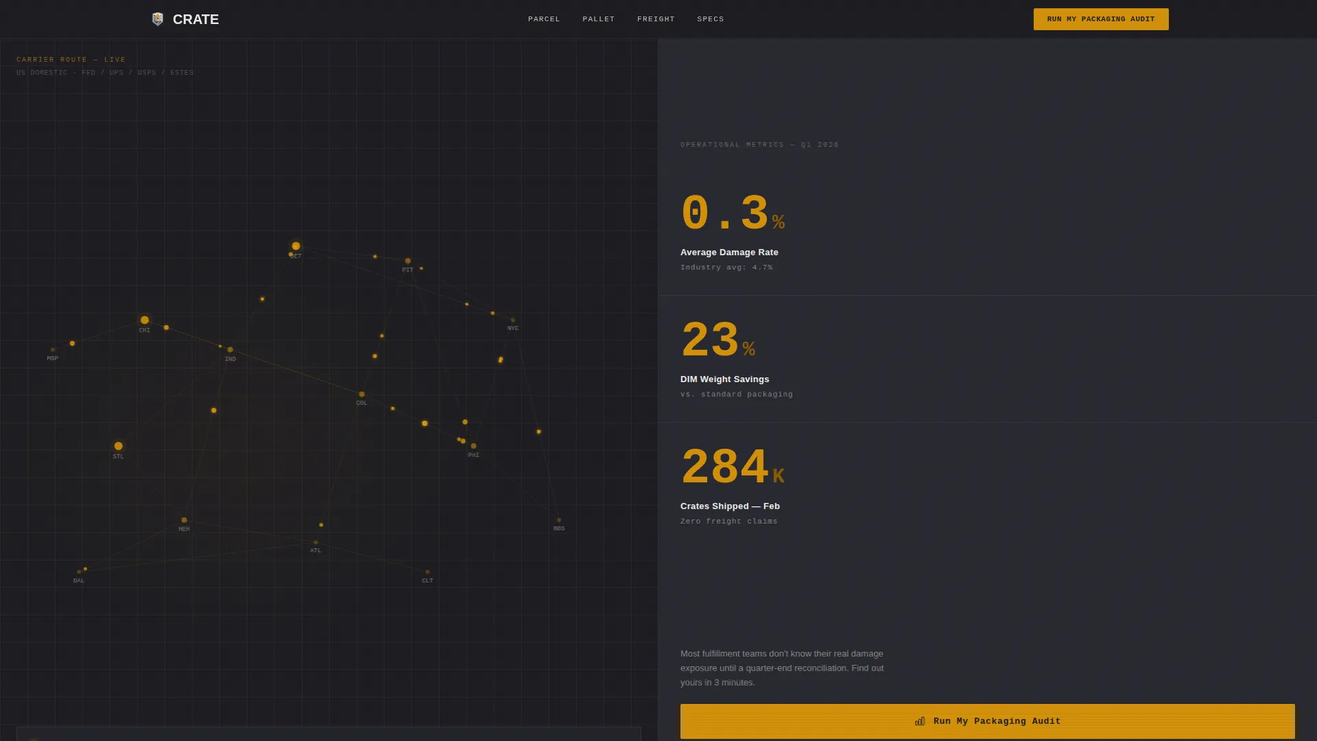
The left panel of the hero fills with a dark-mode carrier route map. Animated parcel dots flow from warehouse nodes to regional hubs, and a live-style counter displays parcels packed today. The map replaces lifestyle imagery with operational proof.
Live Stat Stack with Amber Callouts
The right hero panel holds three oversized data points: average damage rate, dimensional weight savings percentage, and crates shipped this month. Each number renders in industrial amber type to create immediate visual authority.
Spec Sheet Scroll Structure
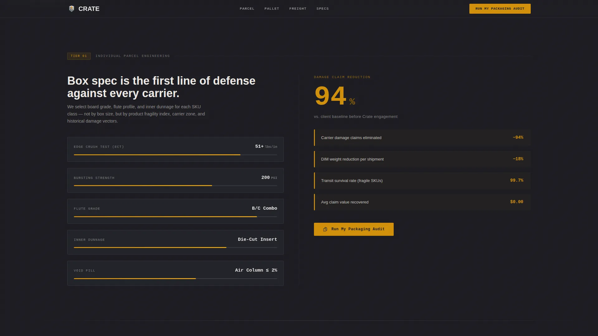
Each scroll section splits left and right. The left side shows a technical specification such as crush test PSI, board flute grades, crate load ratings, or inner dunnage options. The right side shows the operational outcome it produces, like claim reduction percentage or transit survival rate.
Escalating Data Tiers
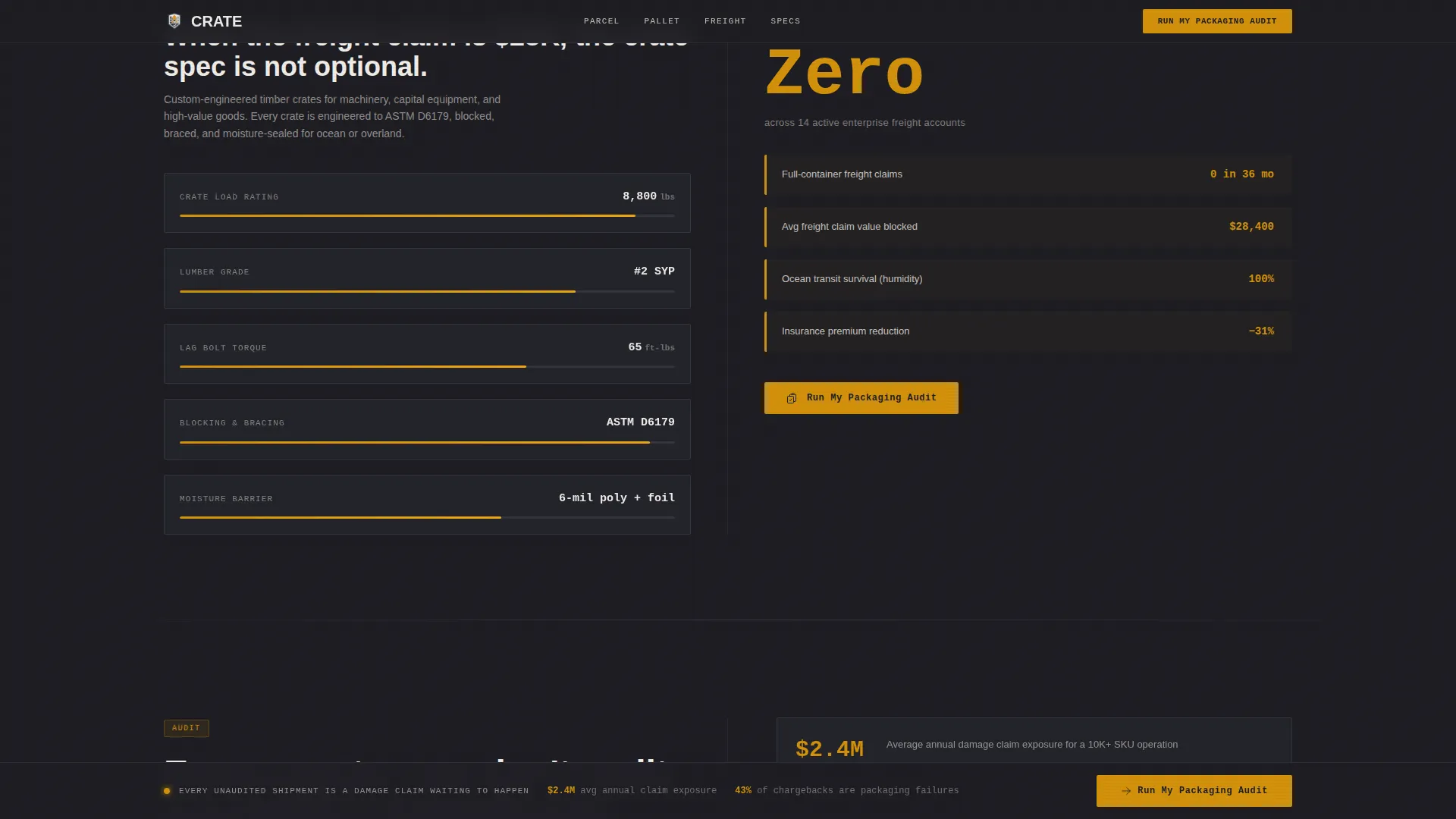
The page builds in three tiers of complexity: individual parcel specs, pallet-level engineering, and full-container crating for freight. Stakes and savings figures grow as the visitor scrolls, maintaining forward momentum toward the audit call to action.
Persistent Audit Call-to-Action Bar
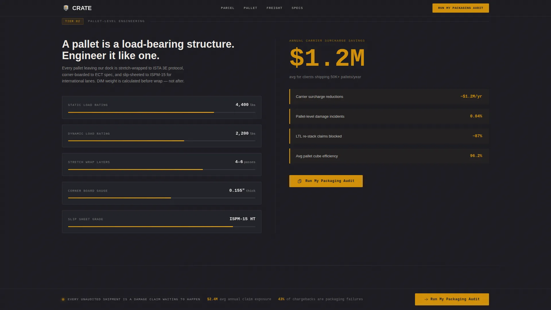
After the second content section, a fixed bottom bar appears and stays visible for the rest of the scroll. The call to action reads "Run My Packaging Audit" in amber on charcoal and links to a short qualification page asking monthly parcel volume, top product categories, and current damage claim rate.
Click-Through Qualification Flow
No form lives on the landing page. The template routes visitors to a separate qualification page only after they have absorbed the cost data. This earns a stronger commitment and filters for serious fulfillment leads.
Page sections overview
| Section | Purpose |
|---|---|
| Hero Split Screen | Map animation plus live stat stack and primary call to action |
| Parcel-Level Specs | Crush PSI and board grades versus claim reduction percentage |
| Pallet Engineering | Load ratings and dunnage options versus carrier surcharge savings |
| Container Crating | Freight specs versus transit survival rate |
| Persistent Audit Bar | Sticky call to action appearing after section two |
| Footer Linear Row | Single-row footer closing the page |
Design & branding system
The visual identity runs on a Data Command theme built for a warehouse terminal aesthetic. Every color choice and type pairing reinforces operational authority rather than decoration.
- Color palette: deep freight charcoal (#1E1E24), corrugated mid-gray (#3A3A42), dock-light white (#F0EDE8), and industrial amber (#D4920B) for data callouts, hover states, and call-to-action pulses
- Typography: JetBrains Mono for data figures and callouts, DM Sans for body copy
- Visual tone: sodium-lit warehouse at 5 AM, functional and alert with zero decorative elements
Mobile & speed optimization
The template is designed desktop-first to match the workstation habits of fulfillment managers and operations leads. Animations are canvas-optimized and use a request animation frame-based approach to keep motion fluid without blocking the main thread.
- Canvas-optimized map animation for smooth parcel dot flows across the hero panel
- GSAP-powered scroll reveals and counter animations timed to data escalation
- Desktop-first layout prioritizing the 50/50 split-screen experience on large monitors
How this template helps you convert
The conversion strategy is built around a single insight: fulfillment managers act on cost data, not marketing copy. The template removes every friction point between arriving and clicking the audit call to action.
- The hero stat stack delivers three hard numbers immediately, establishing financial credibility before a single line of body copy is read.
- The Spec Sheet scroll structure pairs every technical claim with a direct savings outcome, so each section adds to a growing cost case rather than repeating a generic value proposition.
- The persistent audit bar keeps the call to action visible across the final two sections, so the decision to click requires no scrolling back.
Other information about this template
This template sits at the intersection of logistics and supply chain operations and e-commerce parcel logistics, making it a strong fit for third-party logistics providers, contract packaging operations, and outbound fulfillment specialists. The click-through flow, rather than an on-page form, is an intentional qualification filter suited to high-ticket B2B service engagements.
- Template style: Split Screen (50/50), single-page landing page flow
- Theme: Data Command, industrial, zero decoration
- Header concept: Map-Based, animated, dark-mode carrier route visualization
- Creative direction: Spec Sheet cadence with escalating data tiers
- Conversion direction: Click-through to a standalone packaging audit qualification page
- Localization: English, United States dollar pricing, US date format
Theme
Data Command
Creative direction
Spec Sheet
Color system
Charcoal & Amber
Style
Split Screen (50/50)
Direction
Click-Through
Page Sections
Animated Carrier Route Map
Live Amber Stat Stack
Spec Sheet Scroll Layout
Escalating Three-tier Structure
Persistent Audit Call-to-action Bar
Click-through Qualification Flow
Related questions
Who is this landing page template designed for?
Does this template include a contact form on the page?
What sections are included in this template?
Can I edit the stat numbers and specification data?
Why does the hero use a map instead of product photography?