Micro-SaaS & Developer Tools Professional Website Template
Crawl is a dashboard-style broken link checker landing page built for technical SEO managers, agency teams, and developers. It simulates a live site scan in the header, visualizes link equity loss and crawl waste in the problem section, then flips to an after-state showing repairs and recovery. The design uses a dark Data Command palette with sky-blue data highlights throughout.
by Rocket studio
Quick summary
Crawl is a single-page broken link checker landing page built around a dashboard aesthetic. It opens with a simulated live scan already running, shows the visitor the cost of broken links in real numbers, then pivots to the repaired state. Every section maintains the monitoring-terminal feel, and the primary call to action stays within reach from header to footer.
Who this template is for
This template is designed for people who work with site health at scale. The layout and data-forward messaging speak directly to users who understand what a 404 costs and why redirect chains matter.
- Technical SEO managers auditing enterprise sites with tens of thousands of pages
- Agency teams managing client portfolios where a single broken navigation link can cascade across hundreds of pages
- Solo developers who have just completed a content management system migration and need to identify what broke in transit
What problem this template solves
Most landing pages for diagnostic tools talk about features before they show the problem. Crawl reverses that. The visitor sees the scale of the damage first, in live-feeling numbers, before any pitch is made.
- Visitors arrive without knowing how many broken links their site has, so the simulated scan creates immediate personal relevance
- Abstract SEO concepts like crawl budget waste and lost link equity become concrete through graphs and percentage bars
- The page removes doubt about needing a tool by making the visitor feel the problem before presenting the solution
What you get with this template
You get a fully structured, single-page layout that takes a visitor from problem awareness to a motivated click. Each section serves a deliberate role in that journey, and the visual system is consistent from header to footer.
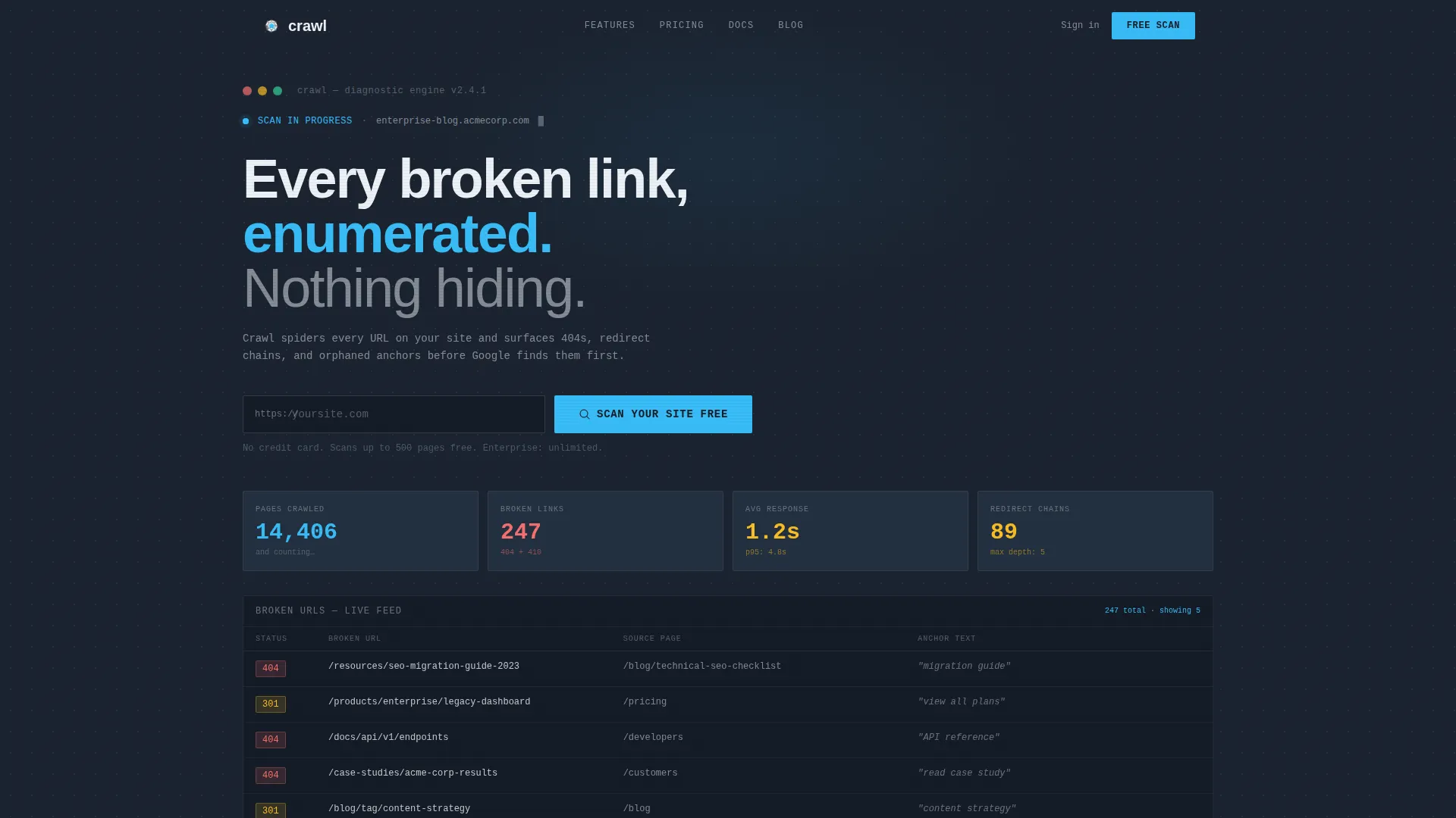
- A live-stats header panel with a simulated scan in progress, three metric cards, and a domain URL input with a call-to-action button
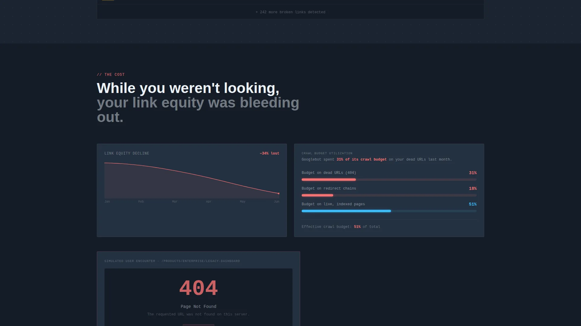
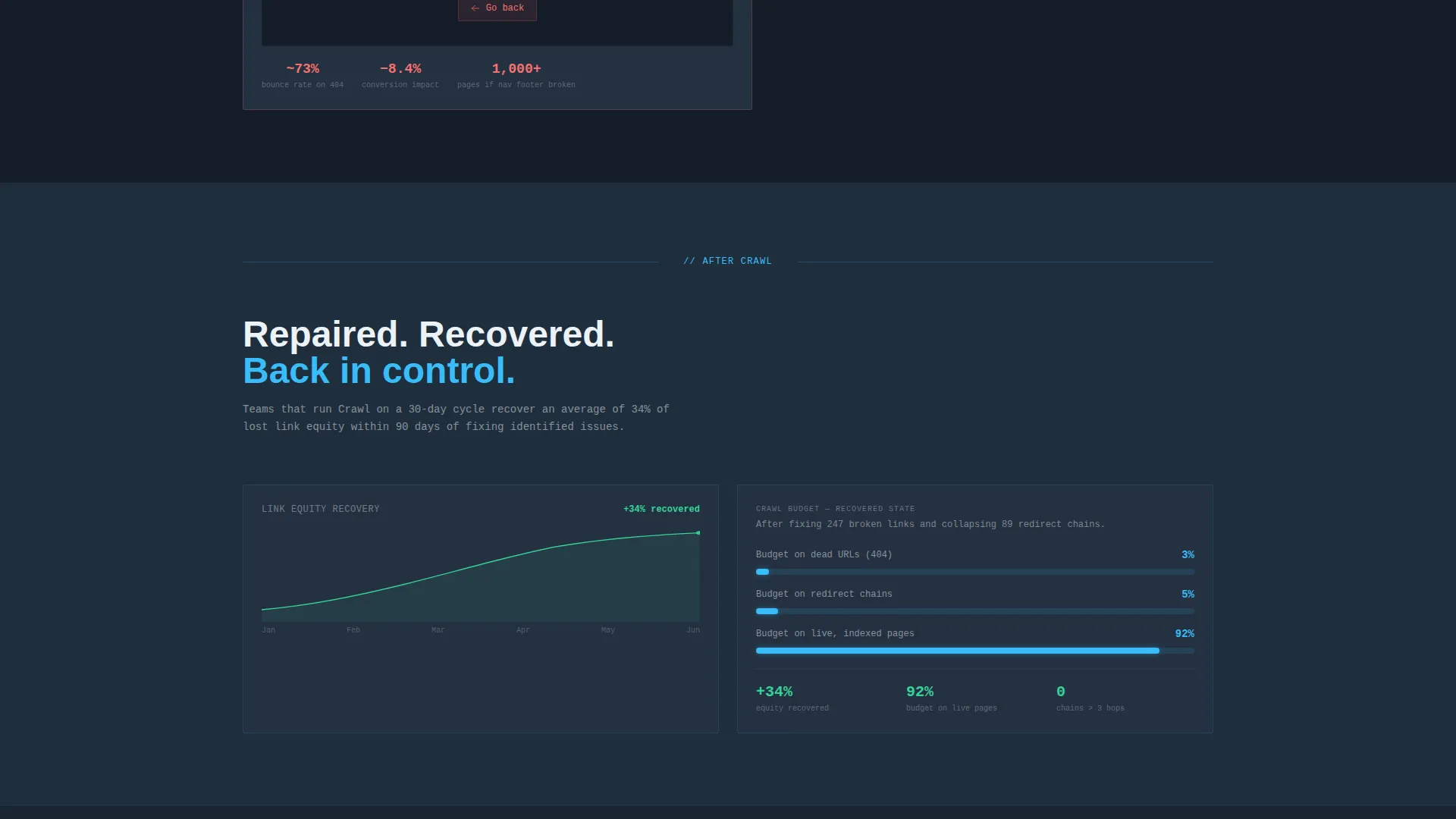
- A problem section with declining graph, crawl budget percentage bar, and simulated 404 encounter, followed by a pivot to the after-state with repaired metrics
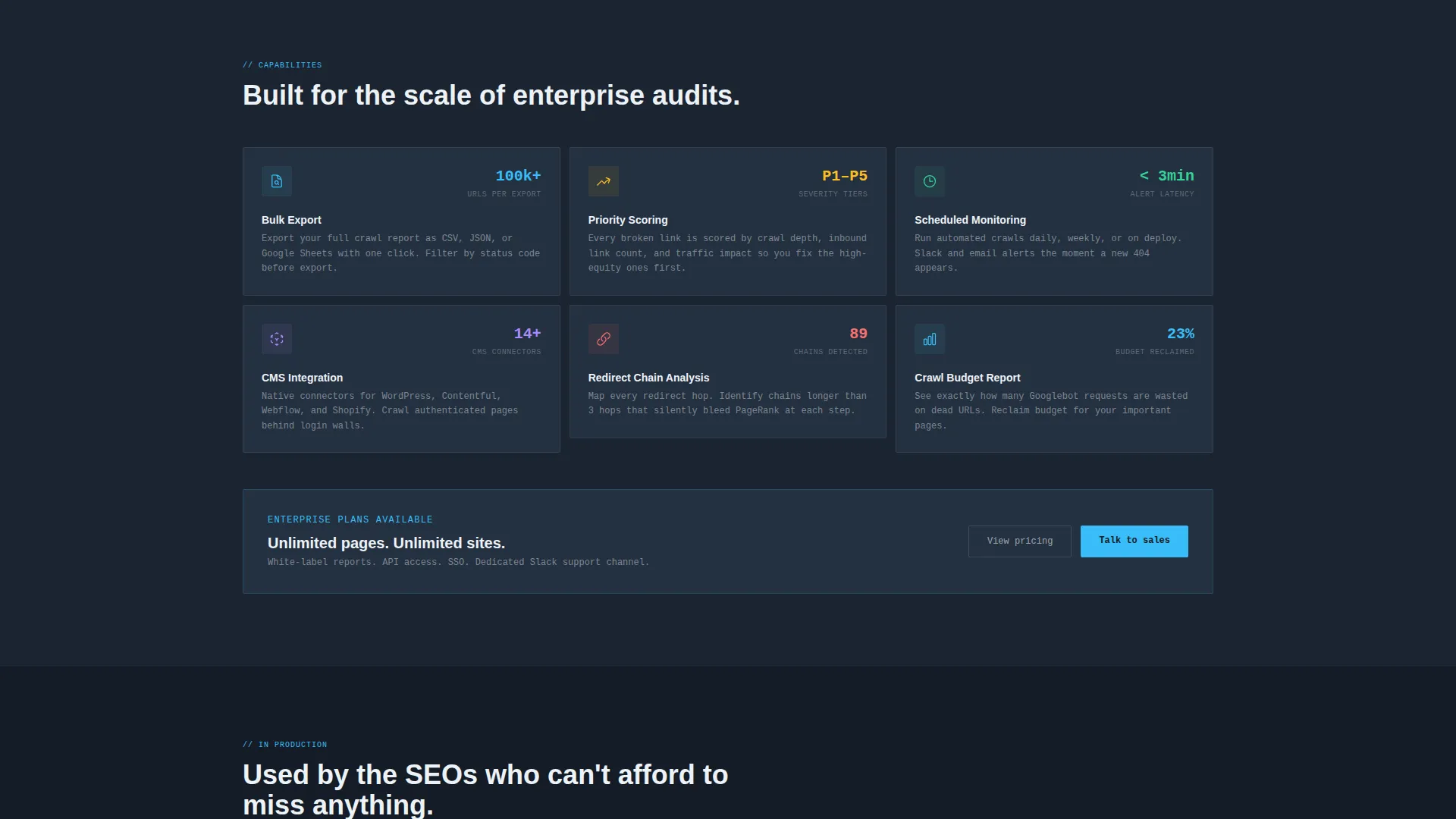
- A feature grid at the bottom presenting bulk export, priority scoring, scheduled monitoring, and integration capabilities as individual data cards with micro-stats
Feature list
This template includes a focused set of components, each designed to carry a specific message inside the dashboard metaphor.
Live Scan Simulation Header
The header opens with a counter ticking upward showing pages crawled, alongside three metric cards displaying broken links found, average response time, and redirect chains detected. Numbers are large, monospaced, and rendered in sky blue on gunmetal, making the data feel operational and immediate.
Truncated Broken URL Data Grid
Directly below the header metrics, a five-row data grid shows broken URLs with their status codes, source pages, and anchor text. The rows are specific enough to feel like a real audit output, giving visitors an instant sense of what the tool surfaces.
Problem Visualization Section
This section uses three distinct visuals: a declining graph for lost link equity, a percentage bar for crawl budget waste, and a simulated 404 encounter for user experience impact. Together they translate abstract SEO damage into concrete, readable evidence.
Before-and-After State Pivot
A horizontal rule marks the transition from the problem section to the solution section. The background lightens one shade, and every data visualization flips to show the repaired state: links fixed, equity recovered, crawl efficiency restored.
Feature Data Card Grid
The bottom third of the page presents each tool capability as an individual data card. Each card carries its own micro-stat, keeping the dashboard metaphor consistent and giving each feature a concrete, credible anchor.
Persistent Bottom call to action Bar
After the problem section, a bottom bar slides into view and stays visible as the visitor continues scrolling. It repeats the primary call to action without interrupting the content flow, lowering the effort required to act at any point on the page.
Page sections overview
| Section | Purpose |
|---|---|
| Header Metrics Panel | Opens with a simulated live scan, metric cards, and the primary URL input with call-to-action button |
| Broken URL Grid | Shows a five-row sample of broken links with status codes, source pages, and anchor text |
| Link Equity Graph | Visualizes declining link equity as a graph to make SEO loss tangible |
| Crawl Budget Bar | Displays crawl budget waste as a percentage bar to quantify the operational cost |
| 404 Experience Sim | Illustrates the user-facing impact of broken links through a simulated 404 page encounter |
| After-State Pivot | Marks the problem-to-solution transition and mirrors each visualization in its repaired state |
| Feature Card Grid | Presents bulk export, priority scoring, scheduled monitoring, and integration as data cards |
| Persistent call to action Bar | Slides in after the problem section and repeats the scan call to action throughout the scroll |
Design & branding system
The visual identity follows a Data Command theme built entirely around the feeling of a monitoring terminal running a late-night audit. Color is used with restraint: sky blue appears only where it carries information, never as decoration.
- Deep gunmetal (#1B2431) as the primary page background, mid-slate (#3D4F5F) for card surfaces and secondary panels, sharp sky blue (#38BDF8) for active states and data highlights, and chalk white (#EDF2F7) for typography and grid lines
- Monospaced typography for all metric numbers, giving counters and status codes a terminal-accurate appearance
- Sky blue used surgically on status indicators, progress bars, and key statistics so every colored element signals meaning rather than style
Mobile & speed optimization
The layout is built so the dashboard components read cleanly at any viewport width. The data-heavy sections are structured to reflow without losing their visual hierarchy on smaller screens.
- Metric cards and the data grid are arranged to stack vertically on narrow viewports while preserving label-to-value relationships
- The persistent bottom call-to-action bar is sized and positioned to remain accessible on mobile without obscuring content
- The before-and-after pivot transition is designed to be visible and meaningful even on a single-column mobile layout
How this template helps you convert
The page is structured as a Problem-to-Solution Arc, earning the click before asking for it. Every design and copy decision is in service of one outcome: a visitor who enters their domain into the URL field.
- The header delivers immediate relevance by showing a scan already running against a recognizable-looking domain, so the visitor sees their potential results before reading a single feature claim.
- The problem section quantifies the cost of inaction through graphs, percentage bars, and a simulated 404 encounter, making the need for a broken link checker feel personal and urgent before the solution is presented.
- The persistent bottom call-to-action bar ensures the primary action is always one scroll away, reducing friction at the exact moment a visitor decides they are ready to act.
Other information about this template
This template is categorized under Technology, specifically within the Micro-SaaS and Developer Tools subcategory, and is built for the broken link checker niche. A few additional details are worth noting for anyone evaluating this template for their project.
- The template style is Dashboard and Data Grid, meaning the visual language is drawn from monitoring interfaces rather than conventional marketing pages
- The call-to-action flow is designed so the visitor enters only a domain URL, with no additional form fields, keeping the conversion path as short as possible
- The page is built as a single-page landing page, not a multi-page site, so all content and conversion elements live within one scrollable experience
- The color system, typography choices, and data visualization components can be adapted to match a specific product's branding while maintaining the dashboard character of the layout
Theme
Data Command
Creative direction
Problem→Solution Arc
Color system
Slate & Sky
Style
Dashboard/Data Grid
Direction
Click-Through
Page Sections
Live Scan Simulation Header
Broken URL Data Grid
Problem Visualization Section
Before-and-after State Pivot
Feature Data Card Grid
Persistent Bottom Call to Action Bar
Related questions
Who is this landing page template built for?
Can I customize the simulated scan numbers and data grid content?
Does the template include more than one call-to-action placement?
What does the before-and-after pivot section include?
Is this template suitable for a product that offers scheduled monitoring?



