Cycling Helmet Landing Page Template - Neo-Retro Immersive
Crest is a full-width immersive landing page template built for a cycling helmet brand that blends vintage racing aesthetics with modern impact science. The Neo-Retro design uses a Merlot and Smoke palette, gallery-style scroll sections, and copper-highlighted upgrade calls to action to guide visitors from admiration to purchase in a single, friction-reduced flow.
by Rocket studio
Quick summary
Crest is a single-page, full-width immersive template designed for a cycling helmet brand where craft and science meet. It guides visitors through a dim, warm gallery experience, presenting each helmet model as a standalone exhibit. The copper-accented upgrade path reduces friction and moves confident buyers toward the premium tier in one tap.
Who this template is for
This template is built for helmet brands and cycling lifestyle labels that sell on visual credibility and material quality. It works best when the product story is strong enough to carry a page on its own.
- Weekend club cyclists and gravel racers who prioritize both performance and aesthetics
- City commuters who want a helmet that looks considered, not functional-ugly
- Helmet brands launching a premium or limited-edition model that needs a dedicated showcase
What problem this template solves
Most cycling helmet pages bury the product in spec tables and small thumbnails. Buyers who care about finish quality, colorways, and upgrade tiers leave before they find the information that would convert them.
- Visitors scroll past uninspiring layouts without ever leaning into the product
- The gap between a base model and a premium tier is never made tangible or desirable
- Size selection and colorway choice create friction that kills single-session purchases
What you get with this template
You get a complete, ready-to-customize landing page structured around a gallery-walk creative direction. Every section is purpose-built for product storytelling and upsell conversion.
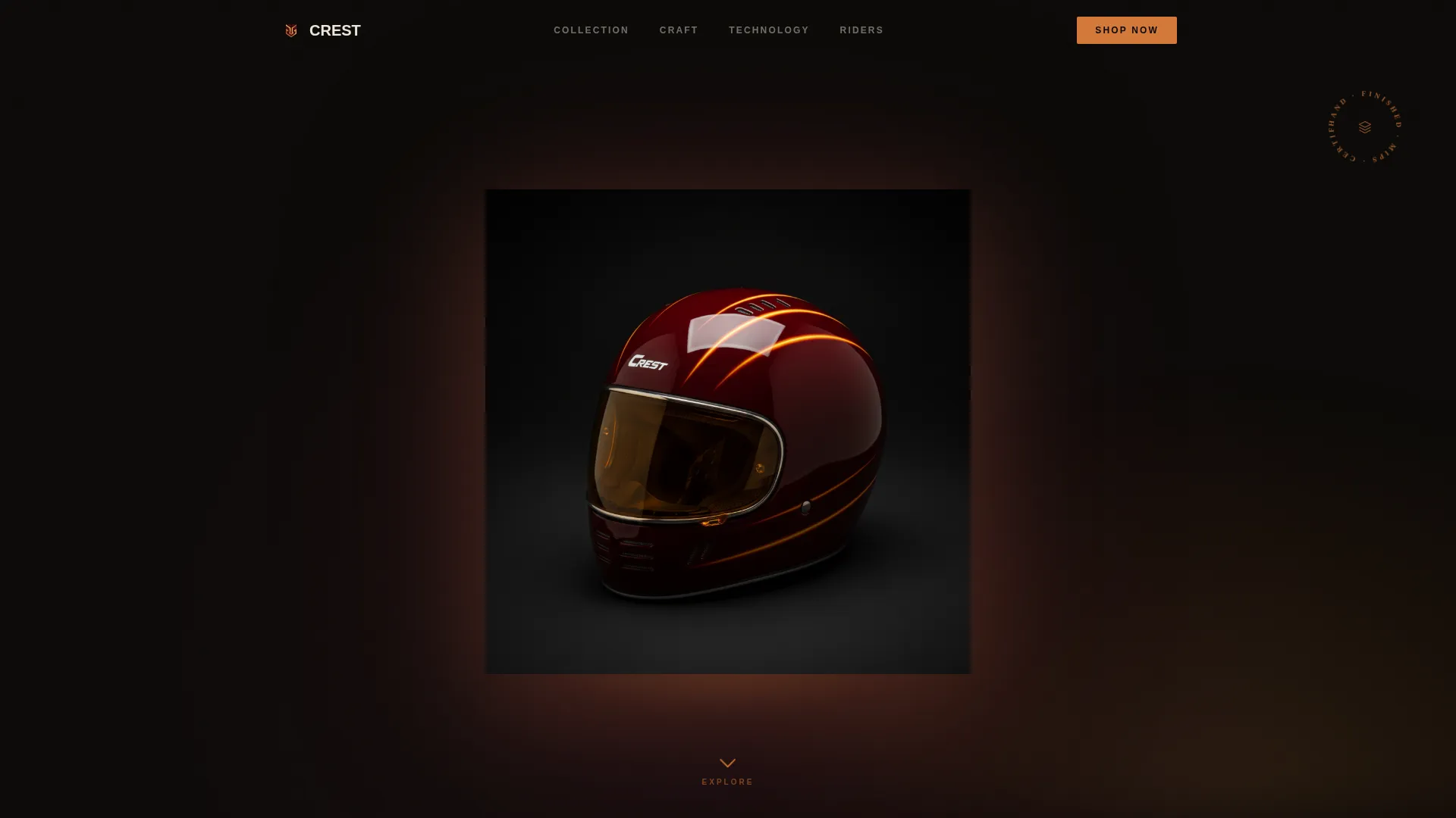
- A dark full-bleed header scene with a floating helmet, warm amber glow, and a copper scroll cue
- Six gallery exhibit sections alternating between full-bleed beauty shots and tight macro detail views
- A sliding upgrade drawer, a comparison strip, a sticky bottom bar, and a one-tap size and colorway selector
Feature list
This template ships with a focused set of visual and interactive components. Each one is grounded in the brief and designed to serve the gallery-walk experience.
Dark Full-Bleed Header Scene
The opening fold places a single helmet center-frame against pure black, lit from below with warm amber light. A pulsing copper scroll cue is the only interactive element on the first fold, keeping all attention on the object.
Scroll-Triggered Shell Color Shift
As the visitor scrolls past the header, the helmet shell color transitions subtly, hinting at the colorway selector below. This effect creates a sense of continuity between the hero scene and the product configuration section.
Gallery Walk Exhibit Sections
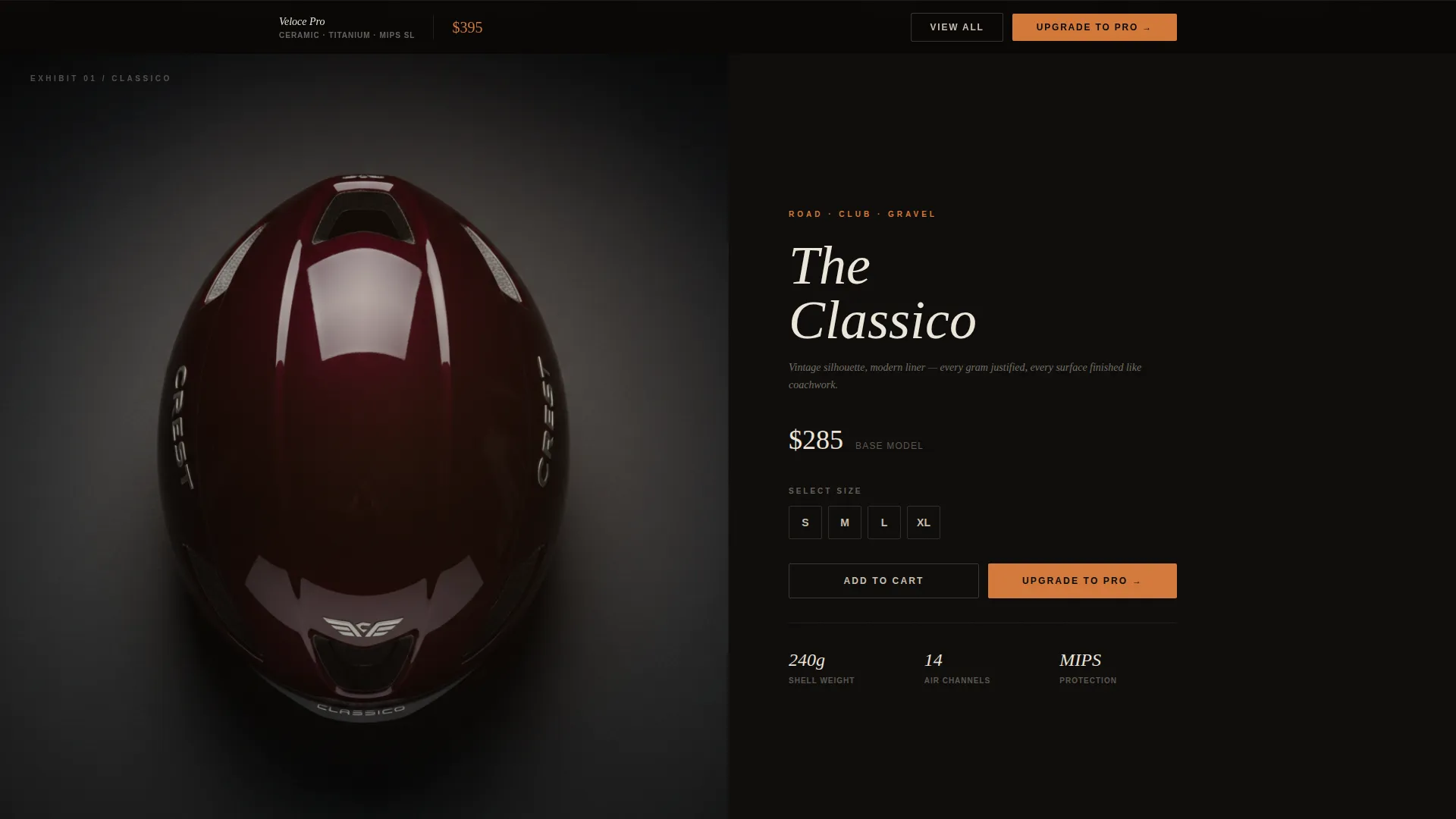
Each scroll section fills the full viewport with one helmet model. A 15-word design note appears in small serif type, and a material callout slides in on hover like a museum placard. Sections alternate between beauty shots and macro detail views.
Comparison Strip with Upgrade Tier
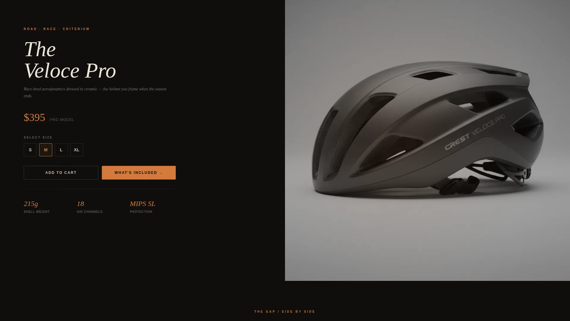
A dedicated mid-page strip places the current model beside the premium upgrade tier. Dimensions and safety ratings appear side by side, making the quality gap visible and the upgrade decision easy to justify.
Sliding Upgrade Drawer with Pro Extras
Every helmet card carries two calls to action. The glowing copper "Upgrade to Pro" button opens a sliding drawer that reveals the premium tier's extras, including ceramic finish, titanium buckle, and anti-microbial liner details.
Sticky Bottom Bar with Primary call to action
After the visitor passes the third exhibit section, a sticky bottom bar appears with the "Upgrade to Pro" call to action. The bar stays visible through the rest of the scroll, keeping the conversion path within reach at all times.
Page sections overview
| Section | Purpose |
|---|---|
| Dark Full-Bleed Header | Establishes brand mood and draws immediate product focus |
| Exhibit One | Presents first helmet model as a full-viewport gallery piece |
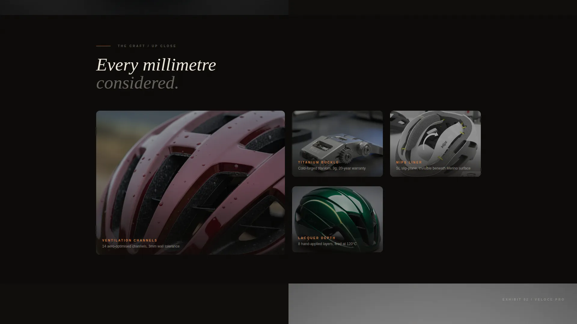
| Macro Detail View | Shows ventilation channels, buckle machining, and liner cross-sections up close |
| Exhibit Two | Introduces second helmet model with design note and hover placard |
| Macro Detail View | Rotates to a second set of tight material and finish close-ups |
| Comparison Strip | Places base and premium models side by side with specs |
| Exhibit Three | Presents third helmet model and triggers sticky bar visibility |
| Colorway Selector | Lets visitors choose shell color and size in a single interaction |
| Sticky Bottom Bar | Keeps the primary upgrade call to action accessible through the lower page |
Design & branding system
The template uses a Neo-Retro visual identity anchored in the Merlot and Smoke color system. Every color decision reinforces the feeling of a vintage racing artifact displayed in a modern gallery.
- Deep burgundy (#5B1A2E), charcoal smoke (#2E2E30), and warm pearl (#EDE6DB) form the base palette, with hot copper (#D4793A) reserved for price badges, toggle switches, and hover states
- Small serif type carries the 15-word design notes inside each exhibit section, adding an editorial, analog warmth to the layout
- Section backgrounds shift between near-black and deep smoke tones to separate exhibits without breaking the gallery atmosphere
Mobile & speed optimization
The full-width immersive layout is structured to translate cleanly to smaller screens without losing the gallery atmosphere or the conversion path.
- Exhibit sections stack vertically on mobile, preserving the full-viewport hero shot and keeping design notes readable
- The sliding upgrade drawer and sticky bottom bar remain accessible on touch devices, with the size selector and colorway swatch reachable in a single tap
- Macro detail alternations are maintained on mobile so the close-up rhythm continues even on a narrow viewport
How this template helps you convert
The entire page is built around a single conversion goal: move a visitor who already respects the brand from browsing to upgrading. Every layout decision supports that path.
- The gallery-walk rhythm builds desire slowly and deliberately, so by the time the comparison strip appears, the visitor is already emotionally invested in the product
- The two-call to action card structure keeps the base model available while making the premium tier feel like the obvious next step, and the sliding drawer reveals exactly what the upgrade adds without a separate page visit
- The sticky bottom bar ensures the "Upgrade to Pro" call to action is never more than a glance away once the visitor has moved through three exhibit sections
Other information about this template
This template belongs to the Fashion and Lifestyle category under the Hat and Headwear Brand subcategory, with a specific focus on the cycling helmet niche. It pairs a high-craft visual tone with a practical, low-friction purchase structure.
- The template style is Full-Width Immersive, meaning section backgrounds extend edge to edge with no card or container borders visible
- The header concept is Dark Full-Bleed with Glow, which uses light sourced from below the product rather than from a softbox or studio setup
- The landing page direction is Upsell and Upgrade, so the layout is not optimized for first-time discovery but for visitors who already know the brand and are ready to move up
- No form or checkout flow is included; the template ends at a single-click add interaction with size selector and colorway swatch
Theme
Neo-Retro
Creative direction
Gallery Walk
Color system
Merlot & Smoke
Style
Full-Width Immersive
Direction
Upsell/Upgrade
Page Sections
Dark Full-bleed Header with Amber Glow
Scroll-triggered Shell Color Shift
Gallery Walk Exhibit Sections
Mid-page Comparison Strip
Sliding Upgrade Drawer
Sticky Bottom Bar with Upgrade Call to Action
Related questions
Is this template designed for a single product or a full helmet lineup?
Can I update the color palette to match my own brand identity?
What if I only have one helmet model to feature?
Does the template include product photography or placeholder images?
Who is the 'Upgrade to Pro' call to action designed for?



