Preppy Accessories Landing Page Template
Crest is a dark, immersive masonry landing page built for a refined preppy accessories brand. It pairs a moody, full-viewport header with a scrollable gallery organized into curated collections. Hover-triggered "Add to Bag" buttons, a monogramming upsell modal, and a tarnished brass cart icon keep the buying experience clean and intentional from first glance to checkout.
by Rocket studio
Quick summary
Crest is a single-page masonry layout for a premium preppy accessories brand. The design leans on deep editorial black, aged vellum typography, and tarnished brass accents to create a mood closer to a wood-paneled library than a typical product grid. Every scroll interaction, hover state, and purchase prompt is built around quiet confidence and intentional detail.
Who this template is for
This template is designed for accessories brands that want their storefront to feel as considered as the products inside it. It suits sellers who lead with craft, heritage, and a specific customer personality rather than discount promotions.
- Preppy accessories brands selling grosgrain ribbons, needlepoint belts, enamel cufflinks, and similar pieces
- Gift-oriented retailers targeting buyers who want monogrammed or personalised items
- Direct-to-consumer fashion labels that need a gallery-style landing page with built-in purchase intent
What problem this template solves
Most product grid templates flatten every item into a uniform tile. For a brand built on quiet distinction, that sameness undercuts the entire story. Crest solves the presentation problem by treating the scroll like a curated walk through exhibition rooms.
- Generic templates break brand atmosphere with bright calls to action and cluttered layouts
- Buyers cannot feel the quality or curation of accessories when products are dropped into identical white boxes
- The monogramming upsell moment is often lost because it arrives too late or too abruptly
What you get with this template
You get a fully composed single-page layout that handles discovery, atmosphere, and purchase flow without asking visitors to leave the mood behind. Every component has been placed with the same inherited intention the brand itself communicates.
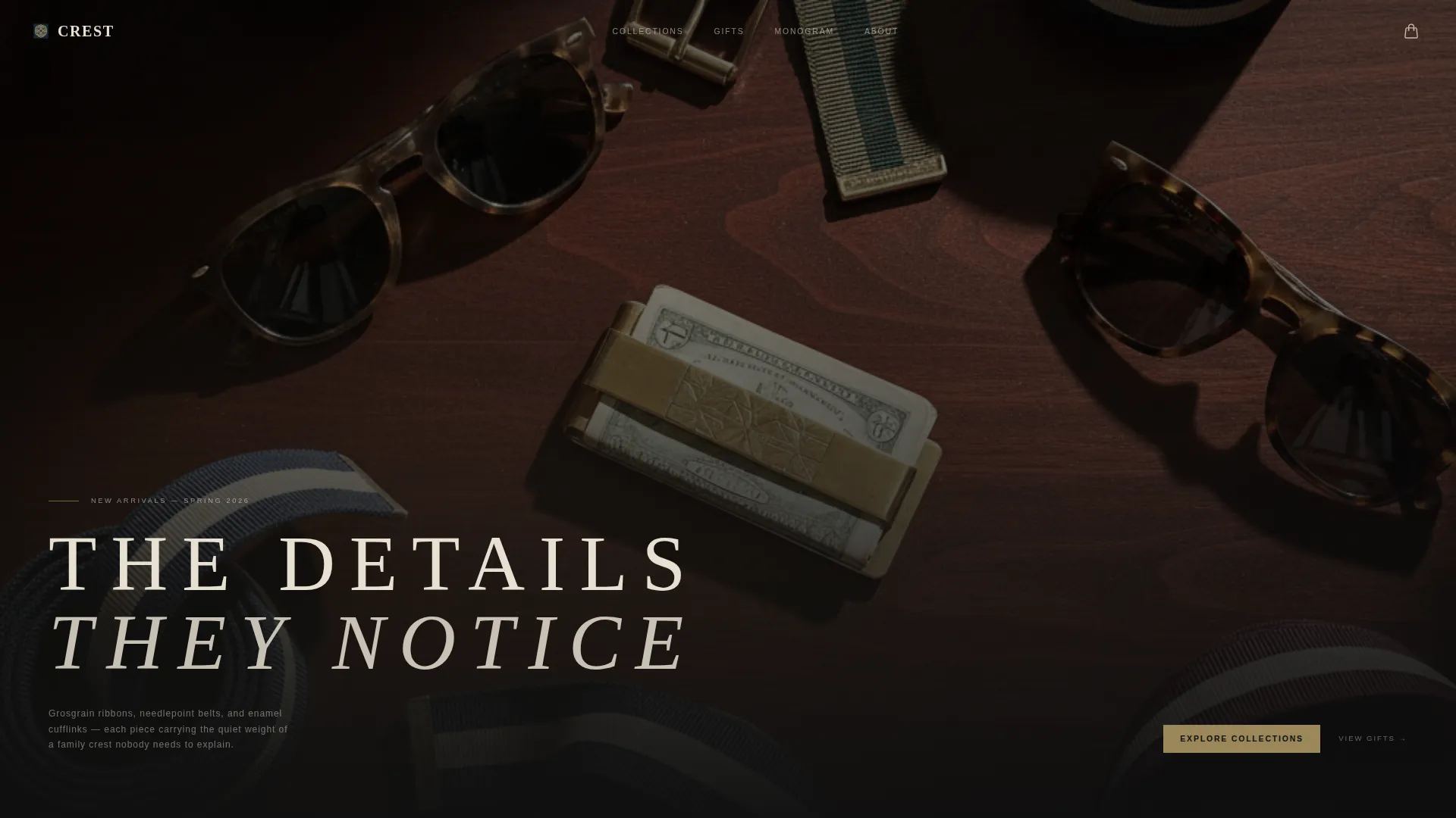
- A full-viewport header with a type-over-image treatment and wide-letterspaced serif headline
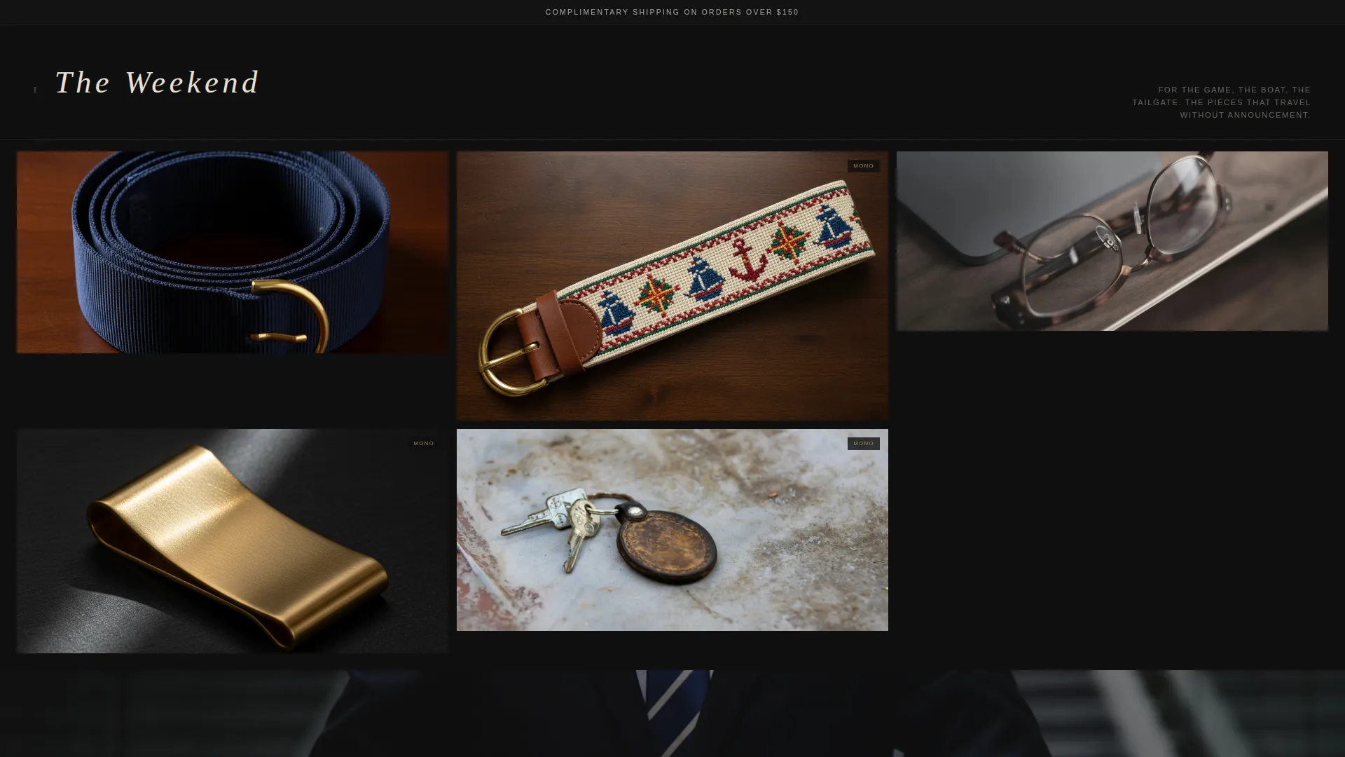
- A scrollable masonry gallery divided into named collections such as "The Weekend," "The Interview," and "The Gift"
- Hover-revealed second product angles, brass "Add to Bag" buttons, a sticky cart icon, a shipping threshold banner, and a monogramming upsell modal at cart
Feature list
This template includes a focused set of components built specifically for the preppy accessories buying experience.
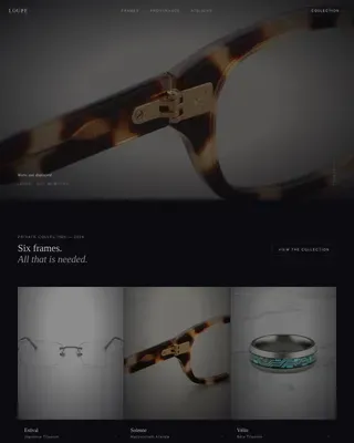
Full-Viewport Header with Type Over Image
The header is a single dark, overhead photograph of accessories arranged on a mahogany desk. A serif headline in aged vellum sits low in the frame, letterspaced at display scale, so the objects above it breathe naturally. The composition references Dutch still-life lighting to set tone before a single product tile appears.
Curated Masonry Gallery Walk
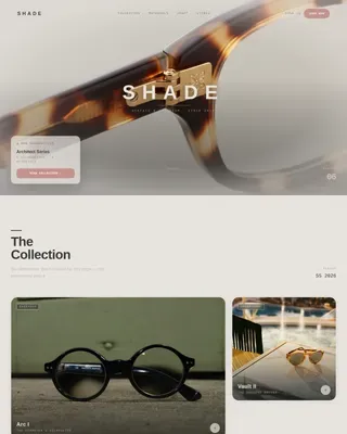
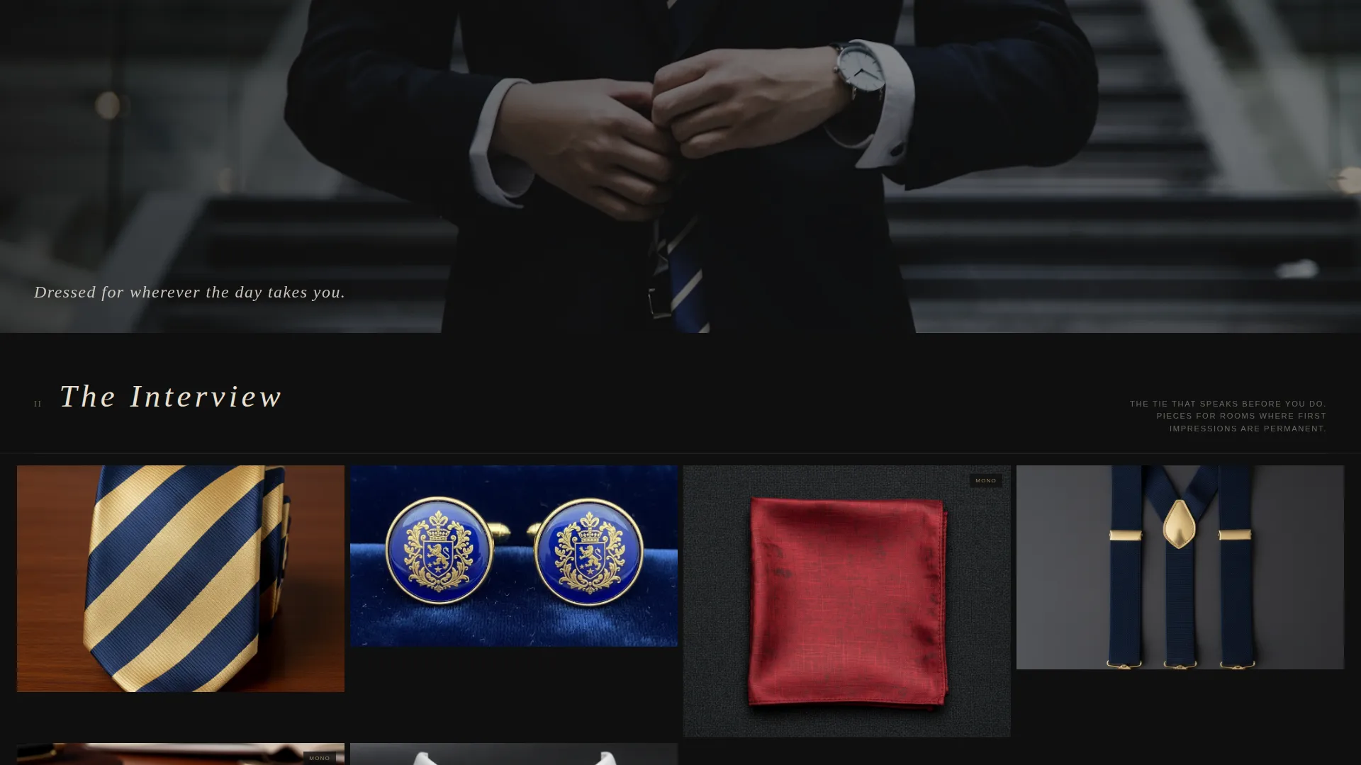
The gallery is divided into named collection clusters. Grid density starts sparse at the top and grows tighter as visitors scroll deeper, mimicking the sensation of discovering more the further they explore. This rhythm replaces a static product grid with something closer to a moving exhibition.
Hover-State Product Reveal and Add to Bag
Hovering over any masonry tile reveals a second product angle shot against the same dark field, keeping visual continuity across the page. At the same moment, a tarnished brass "Add to Bag" button appears, so the gallery stays clean until a visitor signals intent.
Monogramming Upsell Modal
When a visitor opens their cart, a modal prompts them to add initials to their selected item. A three-letter input field and a live preview rendered in gold thread on the product image make the upsell feel like a natural next step rather than an interruption.
Sticky Cart Icon with Item Count
A cart icon anchored to the top-right corner stays visible as visitors scroll. A vellum-coloured badge displays the current item count, giving buyers a persistent and understated reference point without covering content.
Lifestyle Image Separators
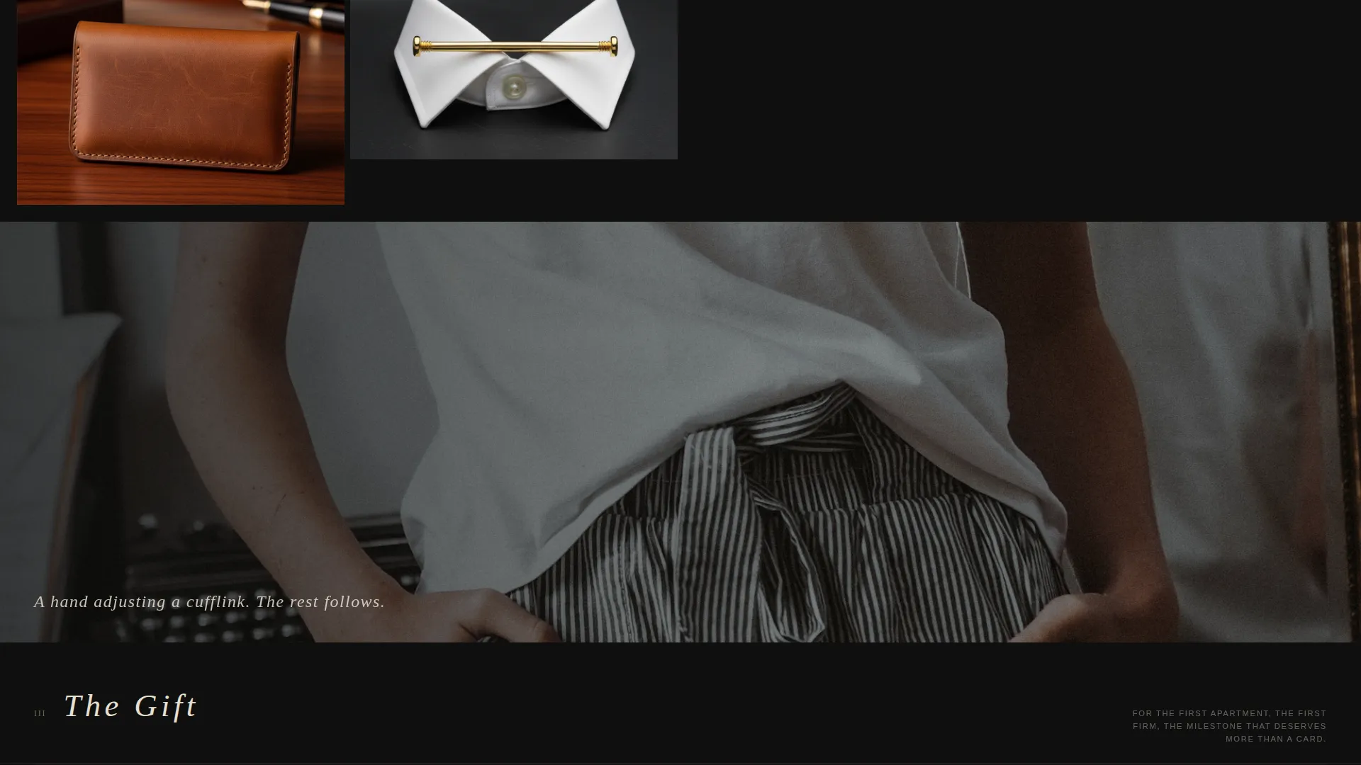
Between each collection cluster, a full-width lifestyle photograph resets the eye and reinforces brand world. Images such as a hand adjusting a cufflink or a belt looped through chinos on a sailboat cleat maintain the editorial pace of the page.
Page sections overview
| Section | Purpose |
|---|---|
| Shipping Threshold Banner | Communicates complimentary shipping above $150 in a slim, understated strip |
| Viewport Header Image | Sets brand mood with a moody overhead product photograph and serif headline |
| Collection Cluster: The Weekend | Presents casual accessories in a sparse opening masonry arrangement |
| Lifestyle Image Break | Resets visual rhythm between gallery clusters with a full-width editorial photo |
| Collection Cluster: The Interview | Showcases formal accessories in a denser masonry arrangement |
| Lifestyle Image Break | Continues editorial pacing between the second and third collection |
| Collection Cluster: The Gift | Displays gift-ready and monogrammed pieces in the richest grid density |
| Cart and Monogram Modal | Delivers the add-to-bag flow and initialled personalisation upsell |
Design & branding system
The Ink & Paper color system builds a palette that feels like a leather-bound ledger opened under a warm light. Black dominates the background. Vellum carries all body and display typography. Brass appears only on price tags, cart icons, and action buttons, functioning like foil-stamped details on fine stationery.
- Core palette: editorial black (#0F0F0F), aged vellum (#E8E0D2), tarnished brass (#9B8759), and disciplined navy (#1C2A3A) for hover states and category labels
- Typography uses serif display faces at wide letter-spacing for headlines, maintaining the formal-casual register the brand requires
- The Dark Immersive theme keeps the atmosphere consistent from header to cart, ensuring no section breaks the editorial tone
Mobile & speed optimization
The masonry layout adapts its column density to smaller screens without sacrificing the curated feeling. Hover interactions translate to tap states on touch devices, so the product reveal and "Add to Bag" flow remain accessible on mobile.
- Masonry grid columns reduce gracefully, preserving the sparse-to-dense scroll rhythm on narrower viewports
- Lifestyle image separators scale to full width on mobile, keeping the editorial pace intact between collection clusters
- The sticky cart icon and shipping banner remain visible at all scroll positions across screen sizes
How this template helps you convert
The conversion architecture is quiet but deliberate. Nothing shouts, and yet every element nudges the visitor forward.
- The hover-triggered "Add to Bag" button keeps the gallery atmosphere clean and only surfaces the purchase prompt when a visitor demonstrates intent by pausing over a product.
- The monogramming upsell modal at cart increases average order value by presenting personalisation as a natural, last-step upgrade rather than a separate product page visit.
- The free shipping threshold banner below the header sets a spending target early, giving visitors a quiet incentive to reach the next collection cluster rather than bouncing.
Other information about this template
This template is part of a broader set of landing page designs built around the Gallery Walk creative direction, pairing a masonry layout with the Dark Immersive theme and Ink & Paper color system. It is specifically matched to direct sales flows within the Fashion and Lifestyle category.
- Template style: Masonry/Pinterest single-page layout
- Theme: Dark Immersive with Ink & Paper color system
- Creative direction: Gallery Walk with Type Over Image header concept
- Landing page direction: Direct Sales with hover-gated purchase prompts and cart-level upsell
- Category fit: Fashion and Lifestyle, Preppy Fashion subcategory, Preppy Accessories Brand niche
- The monogramming modal supports a three-letter personalisation field with a live gold-thread preview rendered on the selected product image
Theme
Dark Immersive
Creative direction
Gallery Walk
Color system
Ink & Paper
Style
Masonry/Pinterest
Direction
Direct Sales
Page Sections
Full-viewport Header with Type Over Image
Curated Masonry Gallery Walk
Hover-state Product Reveal and Add to Bag
Monogramming Upsell Modal
Sticky Cart Icon with Item Count
Lifestyle Image Separators
Related questions
Can I change the collection cluster names from The Weekend, The Interview, and The Gift?
How does the hover product reveal work on mobile devices?
Is the monogramming modal connected to a specific fulfilment system?
Can I add more lifestyle image separators between collection clusters?
Does the shipping threshold banner update automatically when the cart value changes?