Construction Company Specialist Professional Website Template
Crew is a modular card-grid landing page built for tech-forward construction companies. It showcases your team with interactive flip cards, filter tabs by trade or site, and a sticky app-download call to action. The Electric Indigo color system and product screenshot header give it the energy of a construction crew at 6 AM, already moving.
by Rocket studio
Quick summary
Crew is a single-page construction company team landing page that feels more like a live crew dashboard than a staff directory. Modular flip cards reveal certifications, site assignments, and personal voice-note transcriptions. A full-width product screenshot header, tactile filter tabs, and a smart sticky download bar make the page as functional as it is fast to navigate.
Who this template is for
This template is built for construction companies that operate with the speed and structure of a technology startup. If your team manages multiple active job sites and dispatches crews through a dedicated app, this page fits your workflow and your brand.
- Field superintendents and project managers who want a team page that reflects real operational complexity
- Construction companies promoting a proprietary crew management app to new hires or clients
- Growing firms that need to present layered teams, from general laborers up to licensed engineers, in one cohesive page
What problem this template solves
Most construction team pages look like static org charts. They do not communicate how modern, app-driven crews actually work. This template closes that gap by presenting each person as an active, on-site contributor rather than a headshot with a job title.
- Visitors cannot easily understand crew depth, trade specialization, or project assignments from a traditional staff list
- Generic team pages fail to support app-download goals or connect the human roster to a digital product
- Flat layouts cannot show the pyramid of competence that separates entry-level laborers from licensed engineers
What you get with this template
You get a fully designed landing page built around an interactive card grid that turns team browsing into an experience. Every visual and structural decision in the template points back to the prompt: a construction crew running at startup velocity.
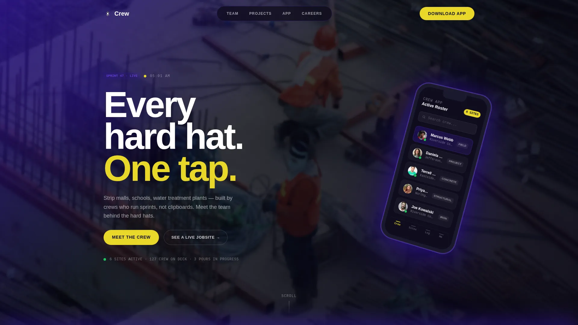
- A full-width product screenshot header with a tilted phone render, pulsing availability indicators, and a cinematic blurred time-lapse background
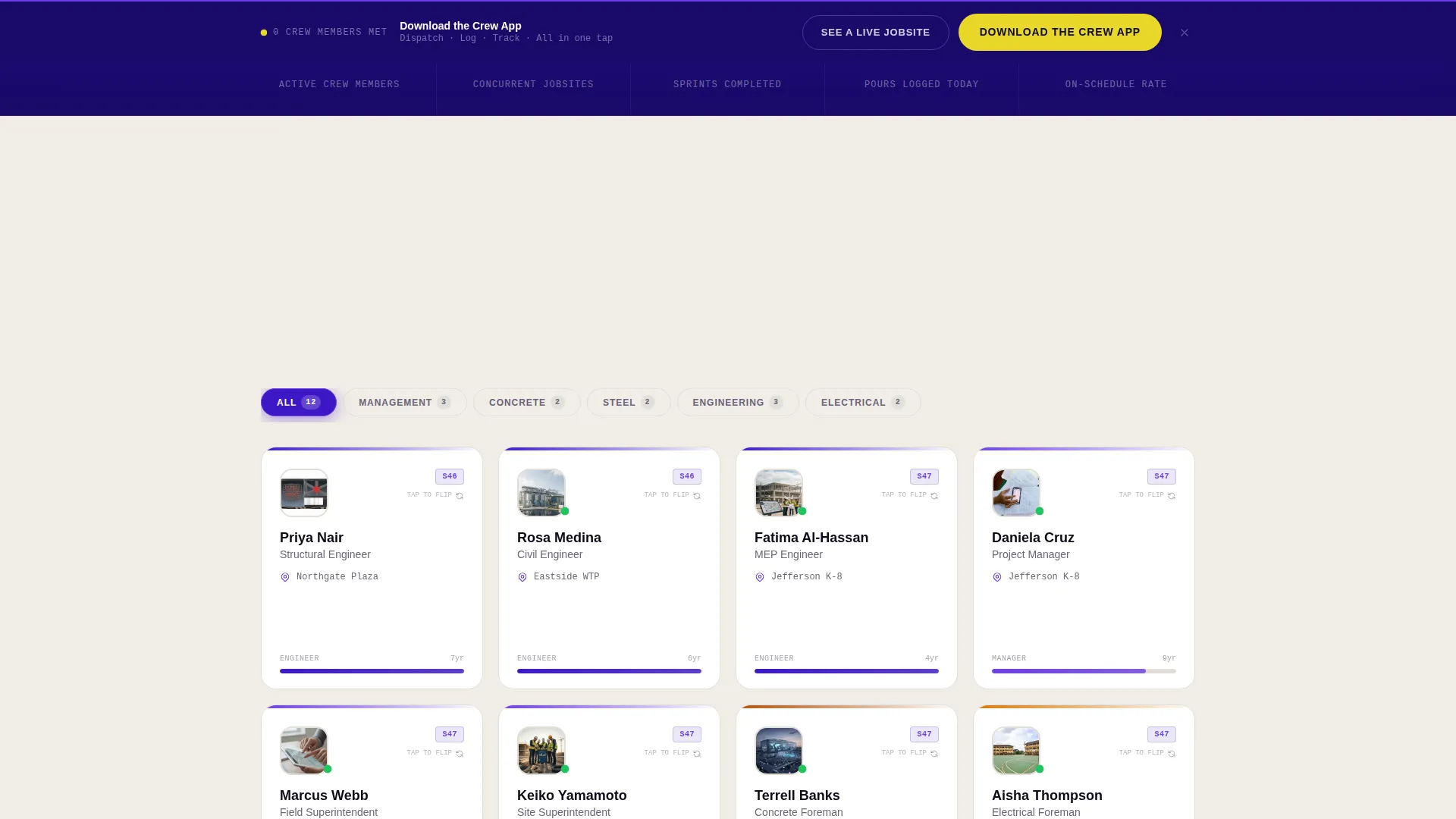
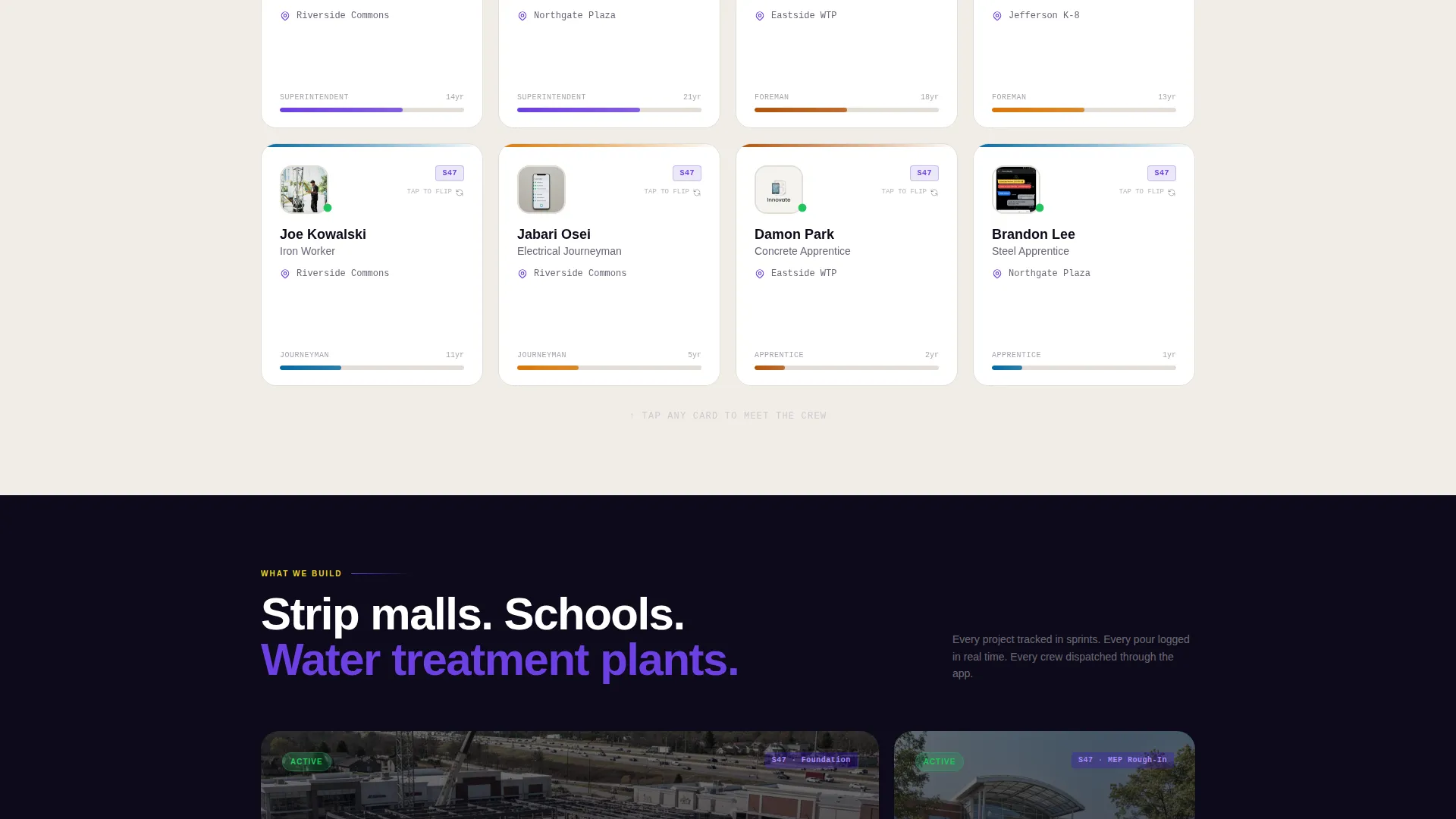
- Modular team cards that flip or expand to show certifications, current project, years on crew, and a voice-note transcription in each member's own words
- Filter tabs that sort cards by trade, site, or seniority with tactile snap animations, and a behavior-triggered sticky download bar tied to card exploration depth
Feature list
This section walks through the core built-in components that make the Crew template distinct.
Interactive Flip Card Grid
Each team member lives inside a self-contained modular card. Tap or hover and the card flips or expands to reveal certifications, current project assignment, years on crew, and a short voice-note transcription written in that person's own words. Scrolling the grid feels like walking a jobsite and stopping to meet each person.
Smart Filter Tabs
Three filter tabs let visitors sort the card grid by trade, by active site, or by seniority. The tabs respond with a tactile snap animation so the interaction feels physical, not digital. As visitors scroll deeper, the crews shift from general laborers toward specialized engineers, building a visible pyramid of competence.
Product Screenshot Header
The header renders a full-width, pixel-perfect phone mockup tilted fifteen degrees. The phone screen shows a live team roster complete with thumbnail portraits, site assignments, and green pulsing availability dots beside each name. A blurred time-lapse of steel framing fills the background, and the headline "Every hard hat. One tap." fades in beside the device.
Behavior-Triggered Sticky Download Bar
The primary call to action does not appear immediately. It surfaces as a sticky bar after the visitor has explored at least three team cards. The bar detects platform and displays the appropriate App Store or Google Play badge. Desktop visitors see a phone-number field so they can receive the download link by text message.
Ghost Button Secondary call to action
A secondary ghost button labeled "See a Live Jobsite" sits alongside the primary download prompt. It links to a demo walkthrough, giving visitors who are not ready to download a low-commitment next step that still moves them deeper into the product.
Electric Indigo Color System
The visual identity uses a precise four-color palette built for industrial-digital contrast. Deep jobsite indigo anchors the brand, charged violet activates hover and card states, poured-concrete off-white grounds card backgrounds, and high-vis safety yellow is reserved exclusively for calls to action and notification badges.
Page sections overview
| Section | Purpose |
|---|---|
| Product Screenshot Header | Introduces the app and team with a cinematic phone mockup and headline |
| Filter Tab Bar | Lets visitors sort the card grid by trade, site, or seniority |
| Interactive Card Grid | Displays each crew member with expandable detail on tap or hover |
| Sticky Download Bar | Surfaces the app download call to action after three cards have been explored |
| Demo Walkthrough call to action | Offers a ghost-button path to a live jobsite demo for undecided visitors |
Design & branding system
The Startup Velocity theme drives every design decision in this template. The palette pairs industrial materials with digital energy, making the page feel like a fluorescent vest caught under ultraviolet light at a rooftop pour.
- Four-color Electric Indigo system: deep jobsite indigo (#3D17C6) as the primary anchor, charged violet (#6C3FE2) for hover and active card states, poured-concrete off-white (#F0EDE8) for card backgrounds, and high-vis safety yellow (#E8D72A) exclusively for calls to action and notification badges
- Typography and spacing follow the Startup Velocity theme, keeping the layout dense enough to feel like a real dashboard while remaining readable on any screen size
- Animations are intentional and light: the card flip, filter tab snap, and headline fade-in each reinforce the idea that this crew is already in motion
Mobile & speed optimization
The card grid and sticky bar are built to work on the same phone screen a field superintendent would use at 6:15 AM on a job site. Every interaction was designed for touch first.
- Flip cards and filter tabs are touch-optimized so tap targets are large enough to use with work gloves on a tablet or phone
- The platform detection logic in the sticky download bar automatically shows the correct App Store or Google Play badge based on the visitor's device, removing friction from the download moment
- The SMS fallback field on desktop keeps the conversion path open for visitors who prefer to receive the app link by text message rather than tapping a store badge
How this template helps you convert
The Crew template earns the download ask rather than forcing it. Every conversion element is sequenced to match the visitor's level of engagement with the team content.
- The behavior-triggered sticky bar only appears after the visitor has explored at least three team cards, so the download prompt arrives at a moment of demonstrated interest rather than on page load.
- Platform detection removes the decision of which store badge to tap, and the SMS fallback ensures desktop visitors have a frictionless path to the app without needing to switch devices.
- The secondary ghost button captures visitors who are curious but not yet ready to download, routing them to a live demo walkthrough that keeps them inside the product experience.
Other information about this template
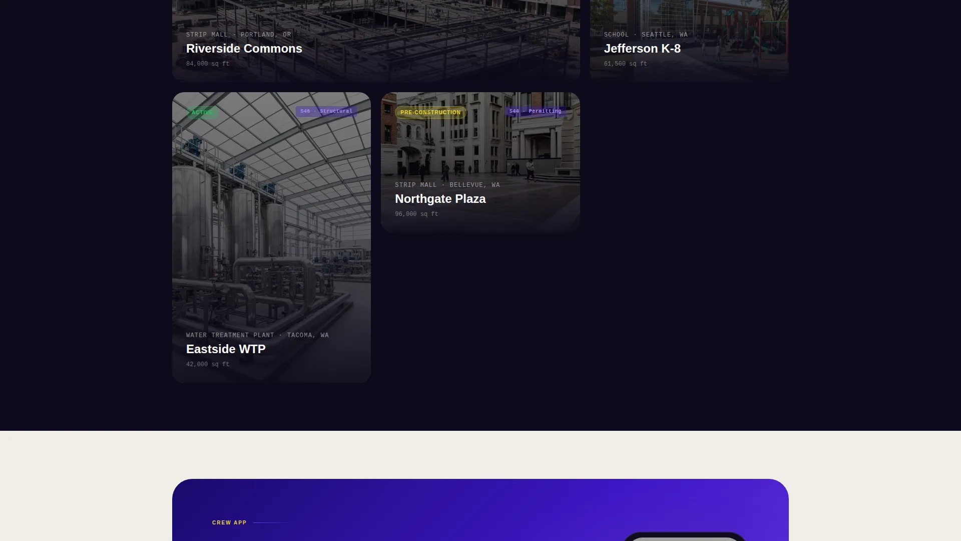
This template is categorized under Construction Company Website Templates and is specifically designed for the Construction Company Team Page niche. It sits at the intersection of technology and construction, making it a strong fit for companies that lead with their app as a competitive differentiator.
- The template style is Card Grid (Modular), which means it can scale naturally as your team grows by adding new cards without redesigning the layout
- The creative direction is Interactive Explorer, meaning the page rewards visitors who engage rather than passively scroll, which aligns with audiences who already use app-based tools in their daily work
- The header concept is Product Screenshot, and the landing page direction is App Download, so the entire visual and functional structure is purpose-built to move visitors from team discovery to app installation
Theme
Startup Velocity
Creative direction
Interactive Explorer
Color system
Electric Indigo
Style
Card Grid (Modular)
Direction
App Download
Page Sections
Interactive Flip Card Grid
Smart Filter Tabs with Snap Animation
Product Screenshot Header
Behavior-triggered Sticky Download Bar
Ghost Button Secondary Call to Action
Electric Indigo Color System
Related questions
Can I add or remove team member cards easily?
What information appears when a team card is expanded?
How does the sticky download bar know when to appear?
Does the app download call to action work on both mobile and desktop?
Is this template suitable for a company without a crew management app?



