Expert Retail Software & SaaS Professional Website Template
Roster is a bold brutalist landing page template built for retail staff scheduling platforms. It uses a split-screen layout, a product screenshot header, and an industry-report scroll structure to build a compelling case for ditching manual rotas. Every section funnels toward a single click-through call to action, making it ideal for SaaS products targeting store managers and retail ops teams.
by Rocket studio
Quick summary
Roster is a single-page, click-through landing page template designed for retail staff scheduling software. It pairs hard workforce statistics with matching product screenshots in a 50/50 split-screen layout. The bold brutalist visual style and electric indigo color system make every section feel urgent and credible. The entire page drives toward one goal: getting store managers to click and start their first week free.
Who this template is for
This template is built for SaaS founders and product marketers selling retail workforce tools to operations-focused buyers. It speaks directly to the people who live inside weekly schedules and shift rosters.
- Regional retail operations directors managing multi-store labor compliance
- District managers tracking shift costs and coverage across large teams
- Floor managers building next week's rota under time pressure
What problem this template solves
Manual scheduling creates real, measurable damage in retail businesses. The template is designed to make that cost impossible to ignore, then immediately show the solution.
- Hours lost each week to spreadsheet-based shift planning and last-minute swap texts
- Financial exposure from shift no-shows, overtime overruns, and poor labor cost visibility
- Staff turnover driven by unstable or confusing schedules
What you get with this template
You get a fully structured, single-page landing page designed to convert operations-minded buyers. Every visual and content decision is grounded in the retail scheduling context.
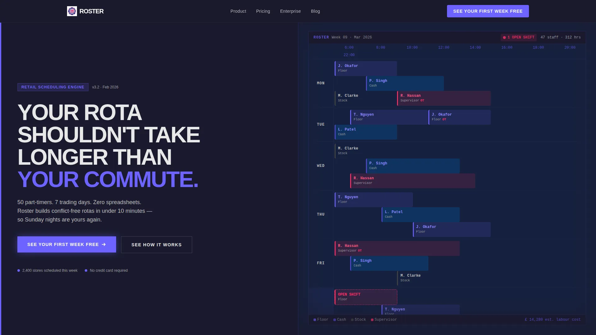
- A split-screen header with a product screenshot filling the right half and a brutalist slab-serif headline on the left
- An industry-report scroll structure pairing workforce statistics with feature screenshots across three escalating cost sections
- A sticky bottom bar that appears after the second section, repeating the call to action alongside a social proof line
Feature list
This template is built around a set of deliberate structural and visual choices that work together to drive action.
Split-Screen 50/50 Layout
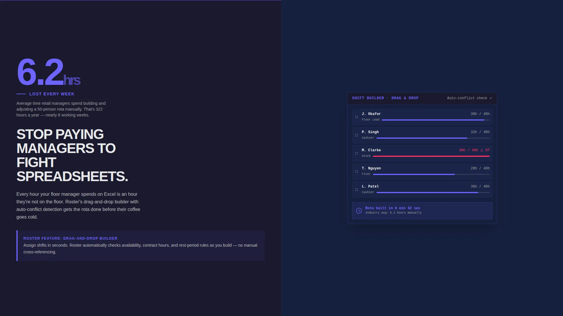
The page divides every major section into two equal halves. The left panel carries data, headlines, and copy. The right panel shows product screenshots that answer each left-side claim directly. The two columns create a natural reading rhythm that builds confidence as visitors scroll.
Product Screenshot Header
The header fills the right half of the viewport with a pixel-crisp weekly schedule grid. Shift blocks are color-coded by department. Overtime flags appear in signal magenta, and an open-shift alert pulses visibly. The left half holds a single slab-serif headline on a deep charcoal background, with no gradients or decorative softness.
Industry Report Scroll Structure
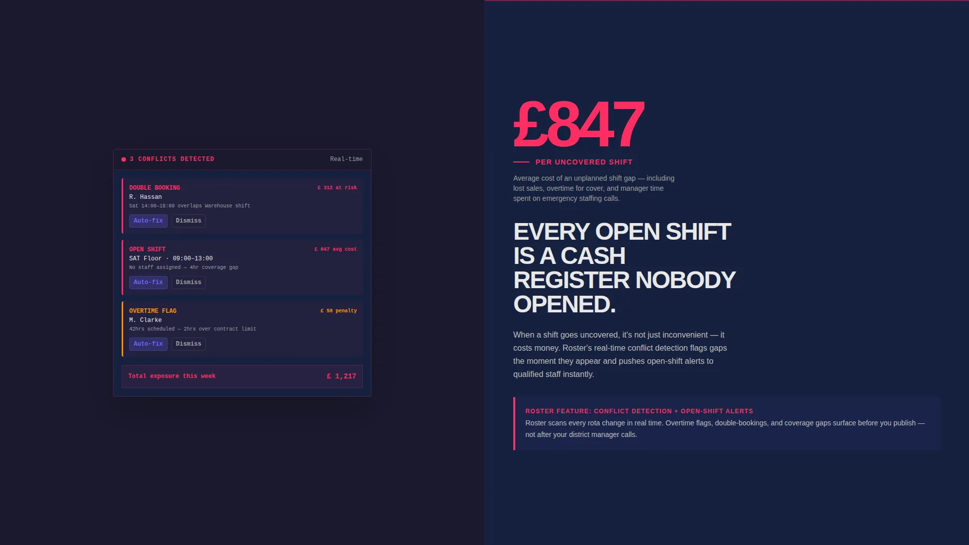
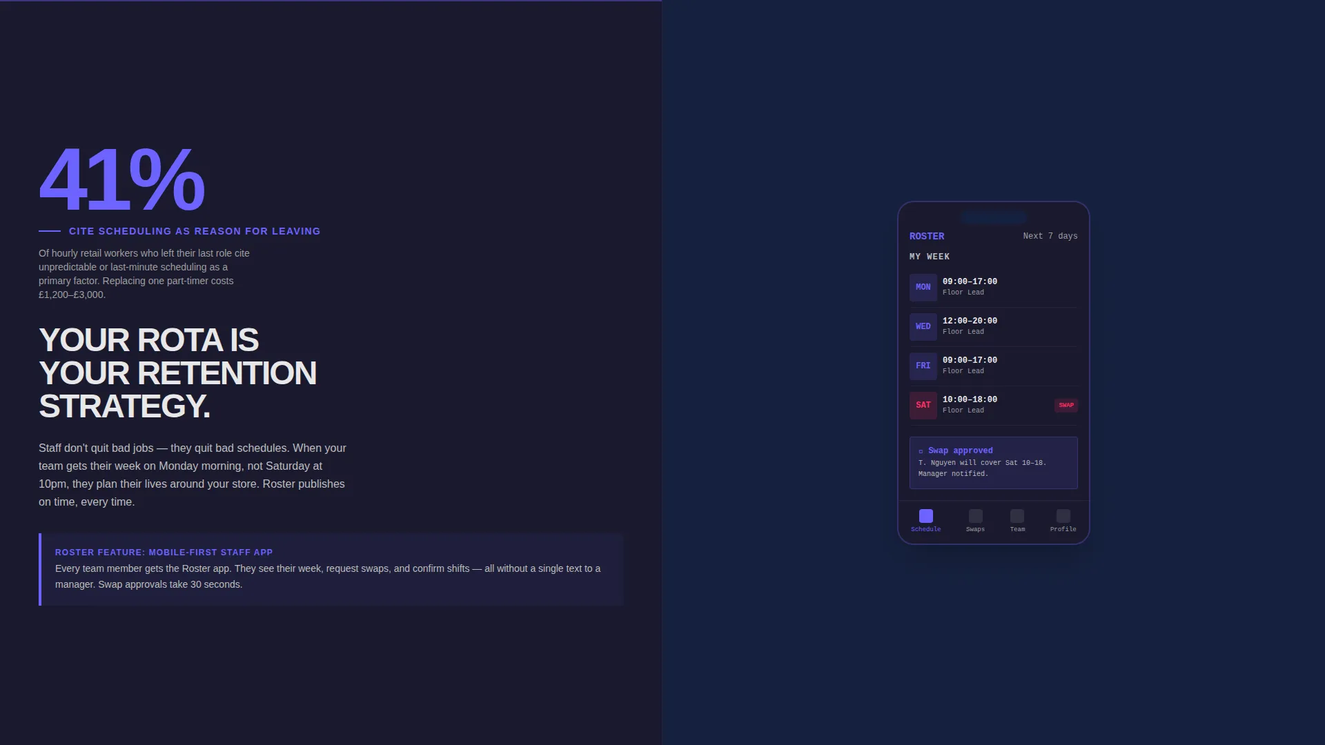
Scrolling past the header reveals three escalating cost sections. Each one leads with a hard retail workforce statistic on the left and responds with a product screenshot on the right. The sequence moves from time wasted, to money lost, to staff quitting. The structure reads like a consultant's brief written in brutalist typography.
Single Click-Through Call to Action
Every section funnels toward one button: "See Your First Week Free." There is no on-page form. The button pushes visitors into a guided onboarding flow where they enter store count and average headcount. This removes friction and keeps the page focused on one conversion goal.
Sticky Bottom Bar
A persistent bottom bar activates after the visitor passes the second scroll section. It repeats the primary call to action and displays a single proof line confirming platform scale. The bar stays visible without blocking content, providing a low-effort conversion path at any scroll depth.
Bold Brutalist Visual System
The electric indigo color system uses deep charcoal for backgrounds, electric indigo for button accents and data highlights, raw concrete off-white for content panels, and signal magenta for alerts and urgency cues. Slab-serif typography and hard edges replace soft gradients throughout.
Page sections overview
| Section | Purpose |
|---|---|
| Split-Screen Header | Anchors the product with a live schedule screenshot and a direct headline |
| Time Cost Panel | Opens the cost-of-inaction case with hours lost to manual scheduling |
| Money Lost Panel | Escalates the argument with shift no-show and overtime cost data |
| Staff Turnover Panel | Closes the three-part case by connecting schedule instability to employee churn |
| Sticky Bottom Bar | Keeps the call to action accessible throughout the scroll journey |
| Click-Through call to action | Sends visitors to a guided onboarding flow with no on-page form barrier |
Design & branding system
The template uses an electric indigo color system built for instant readability in high-noise environments. Every color decision is intentional and functional, not decorative.
- Deep slab charcoal (#1A1A2E) for all primary backgrounds, electric indigo (#6C63FF) for buttons and data highlights, raw concrete off-white (#E8E8E8) for content panels
- Sharp signal magenta (#FF2E63) reserved exclusively for overtime flags, open-shift alerts, and urgency cues
- Brutalist slab-serif typography with hard-edged layouts and no gradients, creating a warehouse-lit, industrial visual identity
Mobile & speed optimization
The split-screen structure is designed to translate cleanly across device sizes. The layout prioritizes clarity and speed of comprehension at every breakpoint.
- Each 50/50 panel is structured to stack vertically on smaller screens without losing the stat-and-screenshot pairing
- The sticky bottom bar is sized and positioned to remain usable on mobile without covering key content
- No decorative gradients, complex animations, or heavy visual layers are used, keeping the page lean and direct
How this template helps you convert
The entire page is engineered around a single conversion path. Every structural and visual decision reduces hesitation and builds toward the click.
- The industry-report scroll structure builds a three-stage cost-of-inaction case, making the product feel necessary before the visitor reaches the call to action
- The sticky bottom bar with a social proof line ("2,400 stores scheduled this week") removes scale doubt and keeps the conversion option visible throughout the scroll
- The click-through flow sends visitors directly to guided onboarding, replacing a cold form with a contextual setup sequence that feels like forward momentum
Other information about this template
This template sits at the intersection of bold visual design and retail operations messaging. It is built for a specific buyer psychology: operations professionals who respond to data, not lifestyle imagery.
- The template style is classified as Split Screen (50/50) with a Bold Brutalist theme
- The header concept is a Product Screenshot, making the scheduling grid itself the first and strongest sales argument
- The creative direction follows an Industry Report structure, giving the page authority without requiring testimonials or case study sections
- The landing page direction is Click-Through, meaning the page carries no embedded lead form and relies entirely on call to action button momentum
- This template is well-suited to retail software and SaaS products where the buyer is a time-pressured operations professional rather than a technical evaluator
Theme
Bold Brutalist
Creative direction
Industry Report
Color system
Electric Indigo
Style
Split Screen (50/50)
Direction
Click-Through
Page Sections
Split-screen 50/50 Layout
Product Screenshot Header
Industry Report Scroll Structure
Single Click-through Call to Action
Sticky Bottom Conversion Bar
Bold Brutalist Visual System
Related questions
Who is this landing page template designed for?
Does this template include a lead capture form?
Can I update the workforce statistics used in the industry report sections?
What makes the brutalist design a good fit for retail operations buyers?
How does the sticky bottom bar work on this landing page?



