Rapid Construction Landing Page Template
Hardhat is a split-screen landing page template built for a construction social media management app. It opens with a live calculator that quantifies wasted reach before a visitor scrolls past the header. The design runs terminal black, safety yellow, and cyan across a bold Startup Velocity layout built to drive app downloads from contractors, GC owners, and marketing coordinators.
by Rocket studio
Quick summary
Hardhat is a high-impact, single-page landing page template designed for a construction social media management app. The header drops visitors straight into a live three-field estimator. From there, each scroll section reads like an industry benchmark report, pairing data findings with app screens. Every design decision pushes toward one action: downloading the app.
Who this template is for
This template is built for founders, marketers, and developers launching a social media tool aimed squarely at the construction industry. If your product helps contractors post consistently and look professional online, this page was made with your audience in mind.
- General contractor (GC) owners running active crews who have neglected their social presence
- Marketing coordinators at mid-size commercial firms managing multiple platforms without a clear strategy
- Specialty subcontractors who just finished a standout project and want to turn it into new business
What problem this template solves
Most contractors are great at their trade and terrible at social media. Their Instagram goes quiet between jobs, their progress photos never get posted, and the leads that should come from visible, active feeds never show up. A generic SaaS landing page cannot speak to that reality. Hardhat does.
- Visitors do not immediately understand why inaction is costing them, so the calculator makes the cost personal and visible before they scroll
- Construction-focused buyers distrust polished stock-photo pages, so the raw Acid Digital aesthetic signals that this product understands their world
- App download conversion is typically low without a strong hook, so the data-driven Industry Report scroll structure builds the case before the call to action appears
What you get with this template
You get a fully structured single-page layout that moves a skeptical contractor from "what is this?" to "I need this" in one scroll session. The template is organized around proof, not promises.
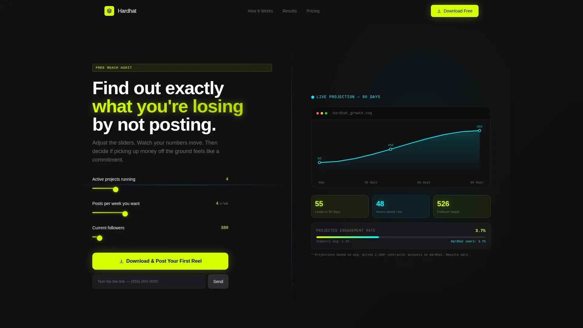
- A live calculator/estimator header with three adjustable fields and a real-time projected growth curve
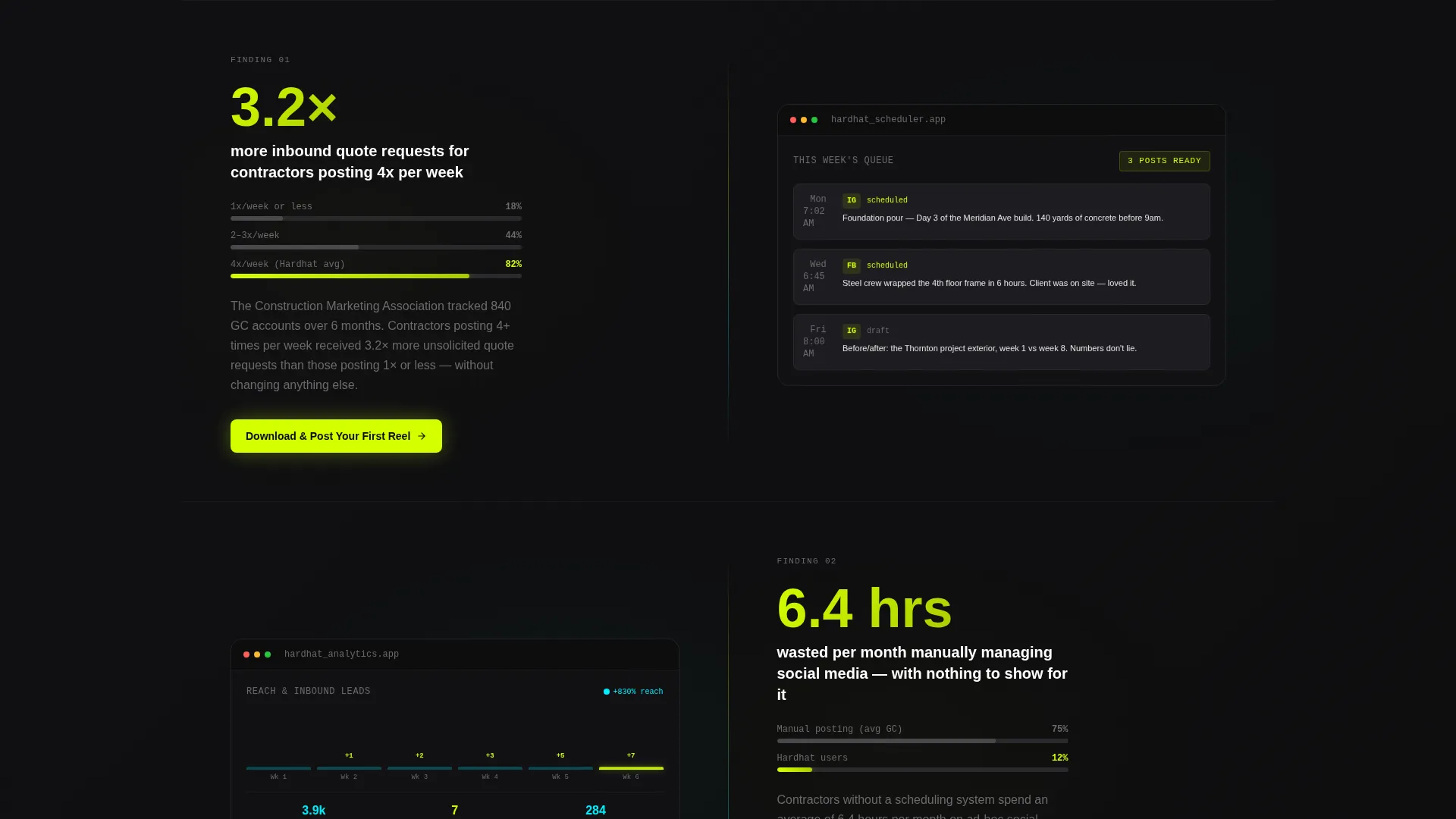
- A sequenced scroll flow that pairs benchmark statistics with app screen visuals, building a bid-proposal-style argument for the product
- Two conversion paths: a primary app download call to action in safety yellow and a secondary "Text Me the Link" SMS field for mobile-first visitors
Feature list
The template ships with purpose-built sections that work together to earn the download.
Live Growth Calculator Header
The header splits 50/50. The left panel holds three sliders: number of active projects, desired posts per week, and current follower count. The right panel renders a live cyan growth curve on black, with safety yellow callouts showing estimated leads generated, hours saved per month, and 90-day follower trajectory. The numbers update as sliders move, making the cost of inaction feel personal before the visitor reads a single line of body copy.
Industry Report Scroll Sections
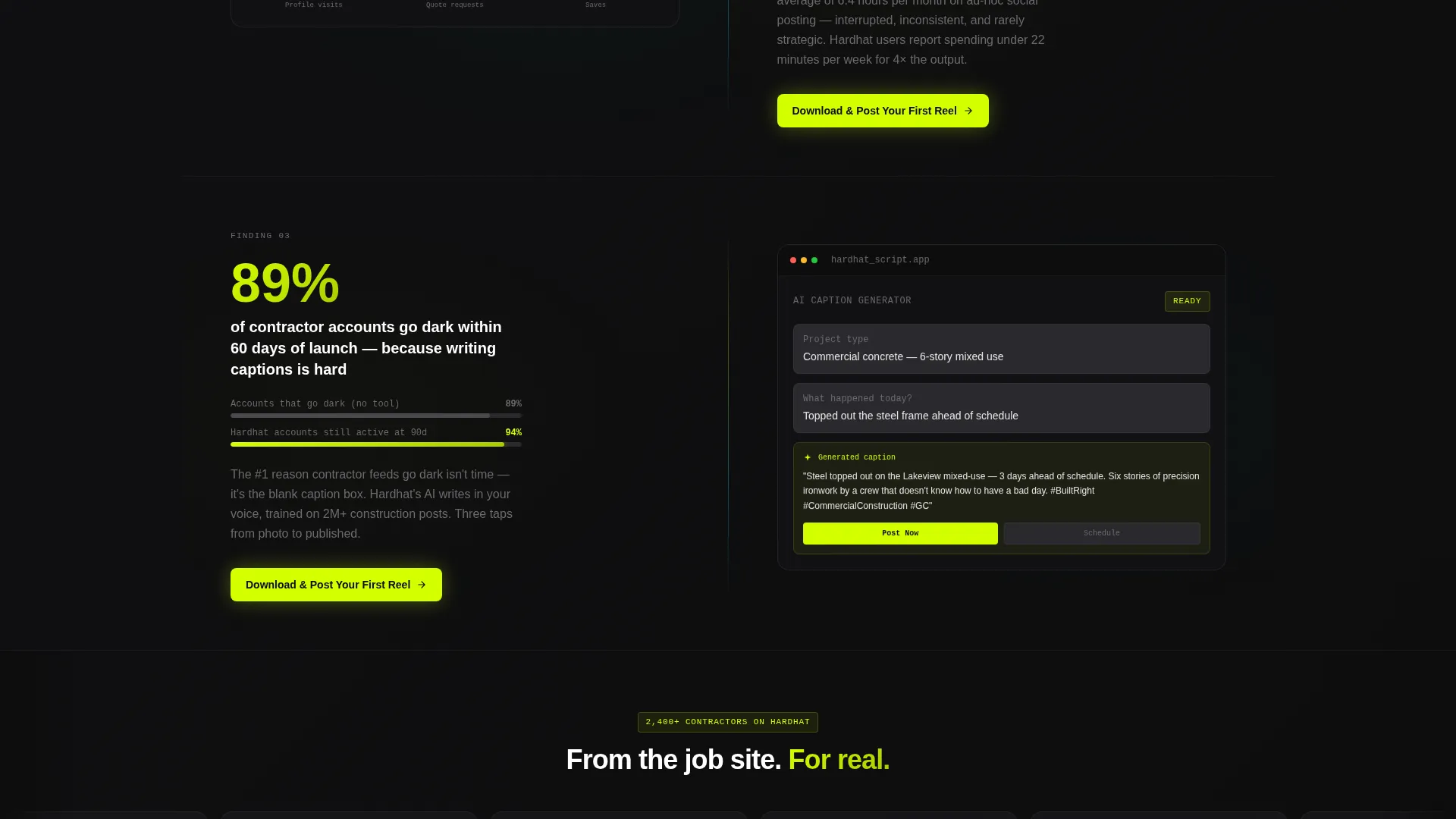
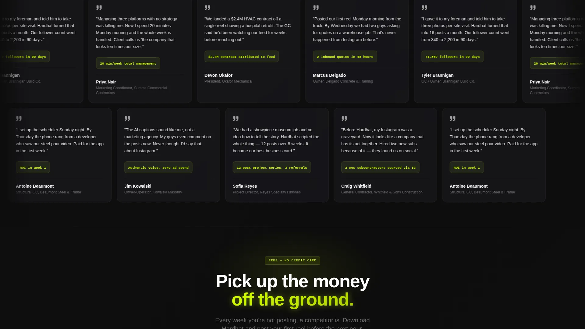
Each section below the header presents a construction social media data finding on the left panel and the matching app screen on the right. The scroll escalates from problem data through solution evidence to real user results. The structure is methodical and numbered, so the argument builds like a formal bid proposal rather than a typical marketing page.
Dual Conversion Path Design
The primary call to action, "Download and Post Your First Reel," appears in safety yellow. On mobile it is pinned to the bottom of the viewport. On desktop it appears inline after every second section. A secondary path offers SMS delivery with a single phone number field, reducing friction for visitors who are browsing on a job site from a phone.
Acid Digital Color System
Terminal black (#0D0D0D) dominates all backgrounds. High-vis safety yellow (#D4FF00) owns every call-to-action element and progress indicator. Scanner-line cyan (#00F0FF) traces analytics lines, engagement graphs, and data highlights. Rebar charcoal (#2A2A2E) holds body text and card surfaces. The palette creates a laser-level-on-dark-slab visual tension that feels native to the construction industry.
No-Photography Visual Identity
There are no stock photos and no hero illustrations anywhere on the page. The live calculator IS the hero. App screens, data charts, and cyan graph lines carry all the visual weight. This removes the disconnect that typically appears when a trade-industry audience lands on a polished consumer-style SaaS page.
Page sections overview
| Section | Purpose |
|---|---|
| Calculator Header | Quantifies wasted reach with live slider inputs and a projected growth curve |
| Problem Data Section | Opens the Industry Report scroll with the first benchmark statistic and app screen pairing |
| Solution Evidence Section | Pairs mid-funnel data findings with app screens showing how the product solves each problem |
| User Results Section | Presents real-outcome data as the final stage of the bid-proposal argument |
| Inline call to action Block | Drops the primary download call to action after every second section on desktop |
| SMS Delivery Row | Offers a single phone number field as a secondary, low-friction conversion path |
| Pinned Mobile call to action | Keeps the primary download button fixed to the bottom of the viewport on mobile |
Design & branding system
The Startup Velocity theme runs through every element of the page. The aesthetic is deliberately raw and electric, designed to feel like a tool built by people who understand job sites, not a generic productivity app dressed up for construction.
- Four-color Acid Digital palette: terminal black for backgrounds, safety yellow for calls to action, cyan for data and hover states, and charcoal for text and card surfaces
- No decorative imagery; visual hierarchy relies entirely on typography weight, color contrast, and live data rendering
- Split-screen 50/50 grid holds every section, creating a consistent left-data, right-visual rhythm from header to footer
Mobile & speed optimization
The template is structured with a mobile-first contractor audience in mind. The 5:47 AM truck-cab experience described in the brief is a real use case, not a metaphor, so the mobile layout receives direct attention.
- The primary call-to-action button is pinned to the bottom of the viewport on mobile so it is always one tap away
- The SMS delivery path requires only a phone number, reducing the form friction for visitors who are on a job site and unlikely to type a full email address
How this template helps you convert
The page is designed as a sequential argument, not a brochure. Every section earns the next click by increasing the visitor's confidence that the app will solve a real, quantified problem.
- The calculator header turns an abstract problem into a personal number. Once a visitor sees their own projected leads and wasted reach expressed in cyan digits, the download feels less like a commitment and more like picking up money they already earned.
- The Industry Report scroll structure presents data findings in a format construction professionals already trust, because it reads like a benchmark study or a bid proposal rather than a marketing pitch.
- The dual conversion path removes the single-point-of-failure risk. Visitors who are not ready to download can still hand over a phone number, keeping them in the funnel from a low-commitment entry point.
Other information about this template
This section covers additional practical context that helps buyers evaluate the template before they commit.
- The template is categorized under Technology and Construction Software, making it relevant for app founders building tools for the construction social media management niche
- The Startup Velocity theme and Acid Digital color system are matched intersection fields from the template library, meaning this combination was validated as a high-fit pairing for this niche and landing page direction
- The template style is Split Screen (50/50) and the landing page direction is App Download, two context fields that drive every layout and copy decision on the page
- The header concept is a Calculator/Estimator, which serves as both the visual hero and the primary conversion hook, replacing the hero image pattern common in SaaS templates
- The creative direction follows an Industry Report cadence, a format that performs well with professional trade audiences who respond to evidence-based arguments over lifestyle-oriented copy
Theme
Startup Velocity
Creative direction
Industry Report
Color system
Acid Digital
Style
Split Screen (50/50)
Direction
App Download
Page Sections
Live Calculator/estimator Header
Industry Report Scroll Structure
Dual Conversion Path Layout
Acid Digital Color System
No-photography Visual Identity
Startup Velocity Theme Integration
Related questions
Can I customize the calculator fields and output metrics?
Does this template work if my app is not yet launched?
Is the split-screen layout responsive on smaller screens?
Why does the template avoid stock photography?



