Fine Arts Flashcard App Landing Page Template
Crit is a fine arts flashcard and review app landing page built around a Comparison Table layout. It targets art history students, museum docents, and educators who need a fast, reliable way to retain visual works. The page opens with live session metrics, walks visitors through the spaced-repetition method, and converts on a Freemium model with an in-browser demo.
by Rocket studio
Quick summary
Crit is a precision-built landing page for a fine arts flashcard app that uses spaced-repetition to help users retain art history. The page opens with a live metrics dashboard, guides visitors through the app's method, and closes with an interactive five-round demo. Free and paid tiers are compared side by side in a structured table.
Who this template is for
This template is designed for teams launching an art history study or review app. It suits edtech founders, fine arts educators, and product marketers who need a conversion-focused single page that explains a freemium offer clearly.
- Undergrad art history programs looking to offer a branded study tool
- Museum education teams promoting docent training resources
- Edtech teams marketing a tiered subscription app to students and institutions
What problem this template solves
Many study-app landing pages bury the product's value under generic hero images and vague promises. Visitors leave without understanding what makes the tool different or why they should upgrade. This template fixes that by leading with proof before explanation.
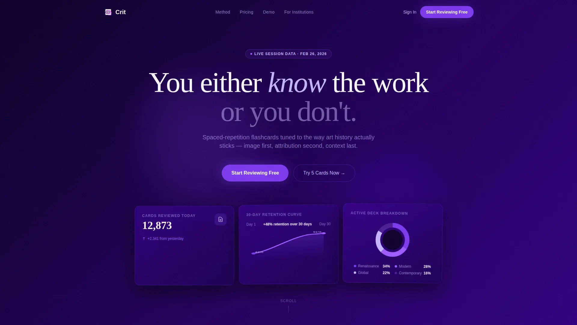
- The live metrics dashboard shows real usage data before any marketing copy appears
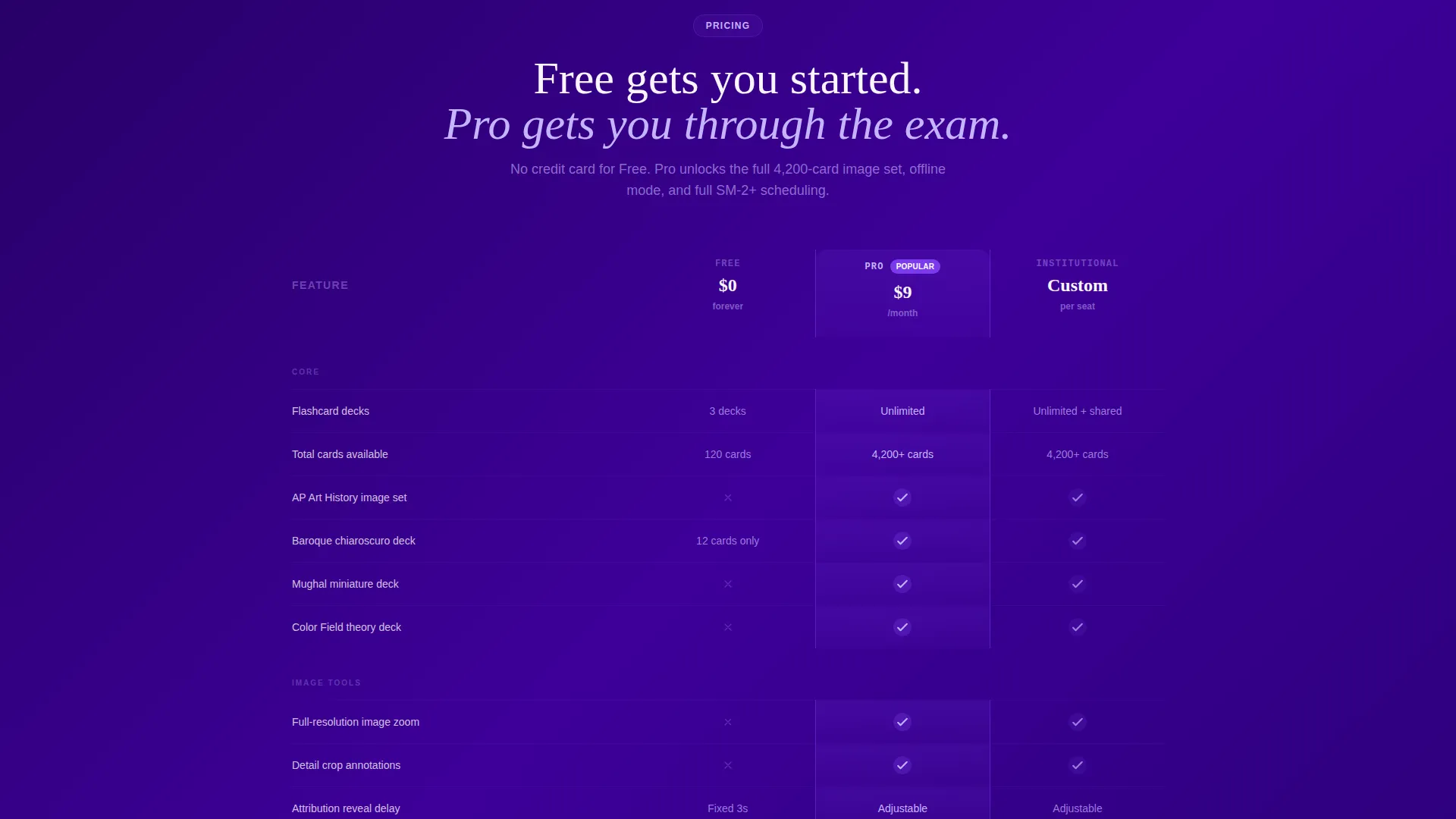
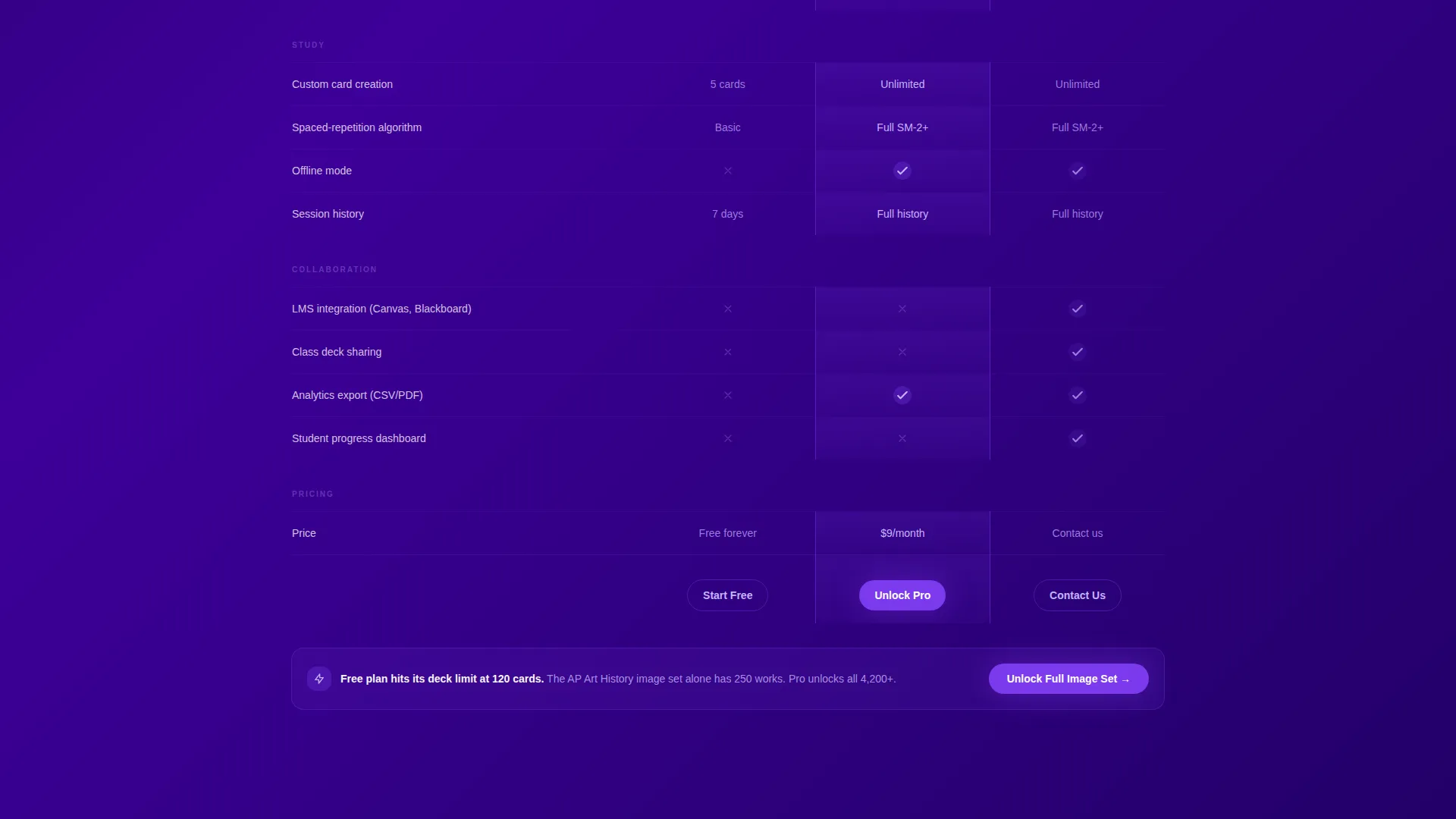
- The Comparison Table makes Free, Pro, and Institutional tier differences immediately clear
- The interactive demo lets visitors experience the product's core loop before committing
What you get with this template
You get a fully structured single-page layout built specifically for a fine arts flashcard app on a freemium model. Every section serves a role in the visitor's decision journey, from first impression through conversion.
- A live Stats and Metrics header with animated counters and a retention curve visual
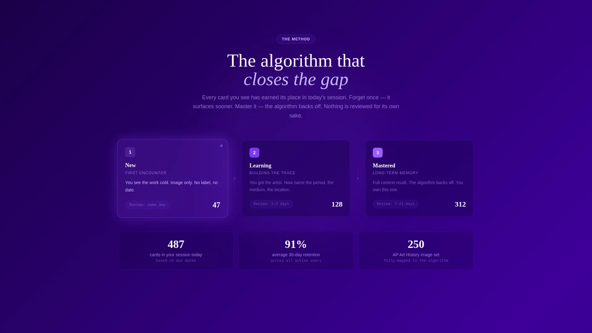
- A three-bucket spaced-repetition diagram, a full Comparison Table, testimonial cards, and an interactive demo section
- Two strategically placed calls to action: one after the header metrics and one alongside the visitor's live demo score
Feature list
This section describes the key functional and design components built into this template.
Live Metrics Dashboard Header
The header displays real-time session statistics: total flashcards reviewed today, a 30-day retention curve climbing from 43% to 91%, and a subject breakdown wheel. Numbers tick upward with micro-animations, making the data itself the first persuasive element on the page.
Spaced-Repetition Method Visualizer
A clean three-bucket diagram explains the app's spaced-repetition algorithm in a single glance. It serves as the page's mentor moment, building trust in the method before the visitor reaches the pricing section.
Free, Pro, and Institutional Comparison Table
The core conversion section lays out three tiers row by row. Each row covers a specific capability: number of decks, image zoom, custom card creation, LMS (Learning Management System) integration, offline mode, and analytics export. The Pro column is visually highlighted in UV-light violet with a secondary call to action anchored at the deck-limit row.
Interactive Five-Round Flashcard Demo
Visitors play five rapid-fire flashcard rounds directly in the browser. The session ends with a personal accuracy score displayed beside the primary call to action, using the sting of not knowing a work to motivate sign-up.
Testimonial Cards Section
Three user testimonial cards appear below the Comparison Table. Each card names a real role and a specific exam or professional moment the app addressed. Roles include a Sotheby's intern, a doctoral candidate, and a high-school art teacher.
Dual Call-to-Action Placement
Two instances of the primary call to action appear on the page. The first floats after the header metrics. The second appears below the interactive demo with the visitor's live score alongside it. Both use a single email field and a Google single sign-on button with no form required upfront.
Page sections overview
| Section | Purpose |
|---|---|
| Live Metrics Header | Opens with real-time usage data and animated retention stats |
| Algorithm Diagram | Visualizes the three-bucket spaced-repetition method |
| Comparison Table | Contrasts Free, Pro, and Institutional tier capabilities row by row |
| Testimonial Cards | Builds trust through role-specific user stories |
| Interactive Demo | Delivers five live flashcard rounds ending with a personal score |
| Primary call to action Block | Converts with email field and Google sign-on beside the live score |
Design & branding system
The visual identity follows a Corporate Precision theme. The palette is built around an Electric Indigo color system that evokes a museum after hours: deep, controlled, and precise. Every color choice reinforces the sense that the tool is serious about the discipline.
- Primary background in deep exhibition-wall indigo (#3D0099), body text in controlled graphite (#2E2E38), and card surfaces in docent-card white (#F7F5FA)
- Interactive highlights and toggle states rendered in glowing UV-light violet (#7C3AED), used to spotlight the Pro column and hover states
- Typography set in Helvetica throughout, keeping every label razor-sharp and every surface engineered to stay behind the content
Mobile & speed optimization
The layout is structured to remain functional and readable across device sizes. The Comparison Table and interactive demo are the most complex components, and both are designed with compact, scrollable behavior in mind.
- Animated counters and the retention curve in the header are built as lightweight micro-animations, avoiding heavy asset loads
- The Comparison Table collapses gracefully on smaller screens so tier differences stay scannable without horizontal scrolling
How this template helps you convert
This template earns the conversion by letting the product speak before the pitch does. Every section is ordered to build confidence, not just awareness.
- The live metrics header removes doubt immediately by showing real usage numbers and a climbing retention curve, so visitors see proof before they read a single marketing claim.
- The Comparison Table does the upselling quietly, with the Pro column highlighted and a secondary call to action placed exactly where the Free tier hits its limit, making the upgrade case without pressure.
- The interactive demo closes the loop: visitors who miss a flashcard feel the gap themselves, and their personal accuracy score appears beside the sign-up button at exactly the right moment.
Other information about this template
This template was designed for the fine arts flashcard and review app niche within the broader Education and Training category. It combines a Hero's Journey creative direction with a Comparison Table layout to move visitors from skepticism to sign-up in a single scroll.
- The Hero's Journey structure maps each page section to a narrative stage: ordinary world, mentor, threshold crossing, road of trials, and climax
- The freemium conversion model is supported by a no-form first step: just an email field and a Google SSO (Single Sign-On) button, lowering friction at the entry point
- Subject coverage displayed in the header breakdown wheel includes Renaissance, Modern, Global, and Contemporary art periods, signaling breadth to prospective users
Theme
Corporate Precision
Creative direction
Hero's Journey
Color system
Electric Indigo
Style
Comparison Table
Direction
Freemium/Trial
Page Sections
Live Metrics Dashboard Header
Spaced-repetition Method Diagram
Three-tier Comparison Table
Interactive In-browser Demo
Role-specific Testimonial Cards
Dual Low-friction Call to Action Placement
Related questions
Who is this landing page template built for?
What sections are included in this template?
How does the Comparison Table support the freemium model?
Can this template be adapted for other study or review apps?
What is the primary call to action on this page?



