Agriculture Digital Presence Cost Calculator Website Template
Cultivate is a dashboard-style agriculture email newsletter landing page built for the data-driven farming world. It combines an interactive ROI calculator, a twelve-row comparison grid, and a product screenshot hero to convert visitors who arrive with questions and leave with a decision. The template targets extension agents, ag-tech founders, and farm operations managers who need organized, actionable data fast.
by Rocket studio
Quick summary
Cultivate is a single-page, data-grid landing page built to promote an agriculture email newsletter template. It leads with a live-looking product screenshot, earns attention through an interactive ROI calculator, then closes the argument with a detailed side-by-side comparison grid. Every visual choice reinforces the newsletter's own identity: organized, industrial, and built for people who read grain futures before breakfast.
Who this template is for
This landing page is designed for creators and operators in the agricultural data space who need to communicate serious value quickly. It speaks the language of people who measure everything and tolerate nothing vague.
- County extension agents who forward USDA updates and crop advisories to growers
- Ag-tech startup founders curating investor-ready market data and sector newsletters
- Family farm operations managers who track grain futures, equipment auctions, and weather alerts daily
What problem this template solves
Most email newsletter landing pages look like generic marketing fluff. For an agriculture audience, that destroys credibility before the visitor reads the headline. Cultivate fixes that by leading with the product itself, proving value through a calculator, and eliminating alternatives through a structured comparison.
- Visitors arrive skeptical and leave with a clear answer, thanks to the comparison grid
- The calculator converts passive browsers into engaged prospects before any signup ask appears
- The dark, data-forward visual identity matches the mindset of the target reader, not a lifestyle brand
What you get with this template
You get a complete, conversion-focused landing page built around three core elements: a hero product screenshot, an interactive ROI calculator, and a twelve-row comparison grid. Each section is designed to do one specific job in a deliberate conversion sequence.
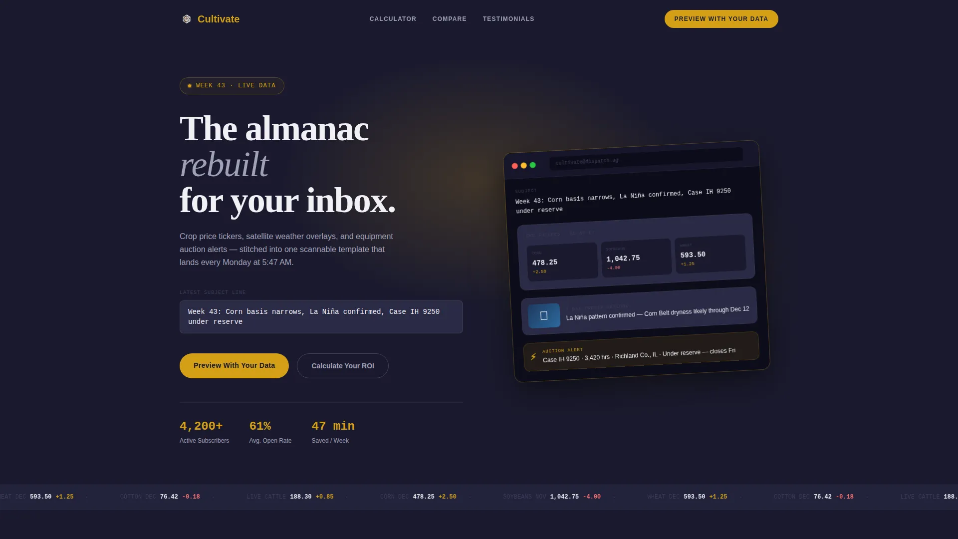
- A pixel-perfect newsletter product screenshot displayed inside a dark email client frame, tilted at a subtle 3-degree angle with ambient shadow
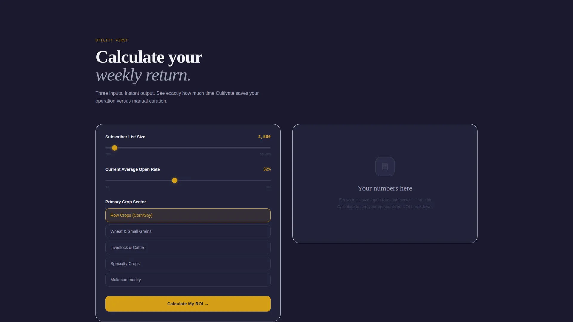
- An interactive ROI calculator with three inputs (subscriber list size, average open rate, and primary crop sector) that outputs time-saved estimates and engagement lift projections
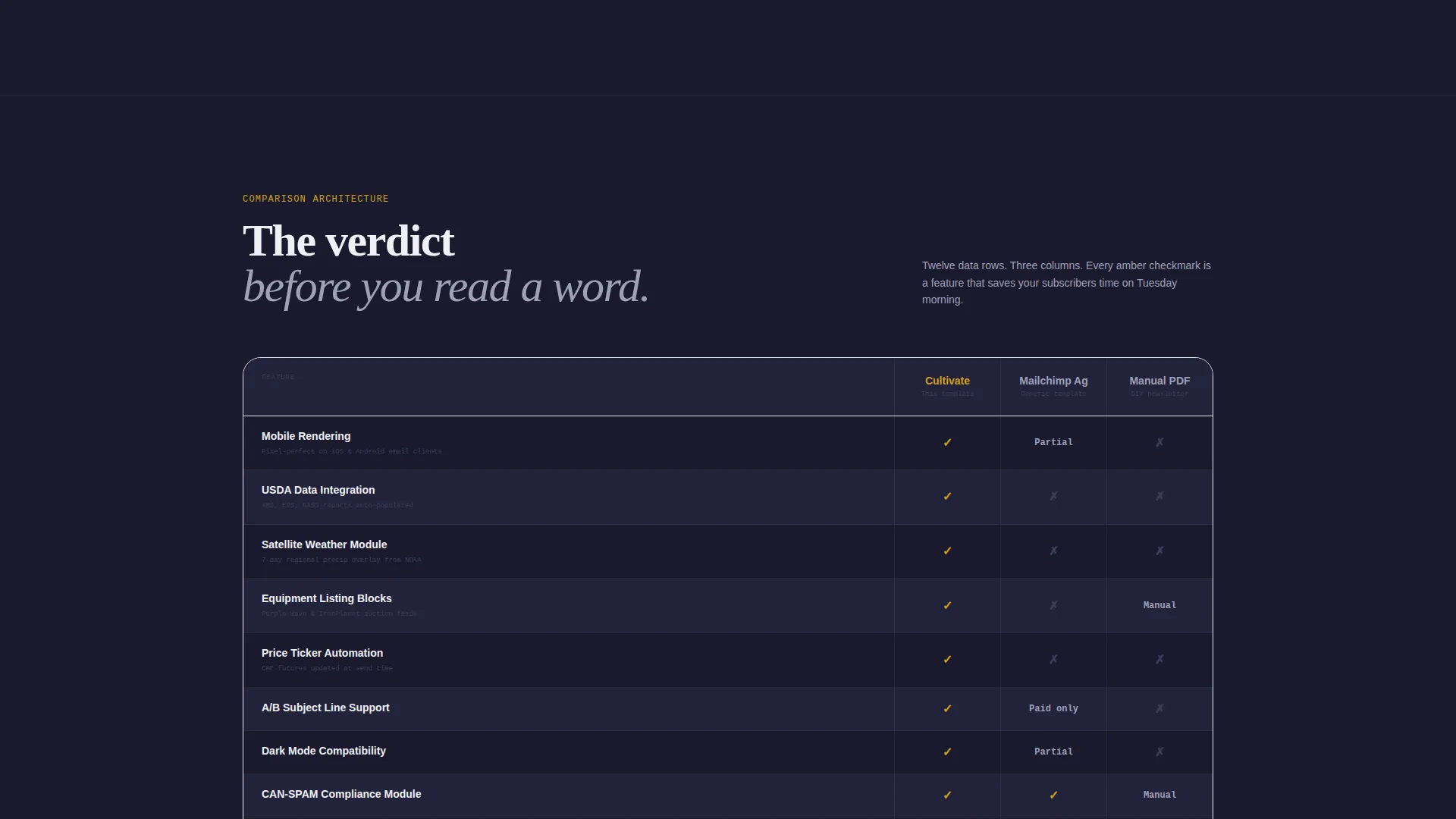
- A side-by-side comparison grid across twelve data rows, using harvest amber checkmarks and gunmetal X marks to communicate verdicts visually
Feature list
This section covers the core built-in capabilities that make Cultivate work as a high-conversion agriculture newsletter landing page.
Interactive ROI Calculator
The calculator is the first interactive element visitors encounter. It takes three inputs: subscriber list size, average open rate, and primary crop sector. It instantly outputs estimated weekly time savings versus manual curation and projected engagement lift against industry benchmarks. It earns visitor attention through genuine utility before any marketing message appears.
Twelve-Row Comparison Grid
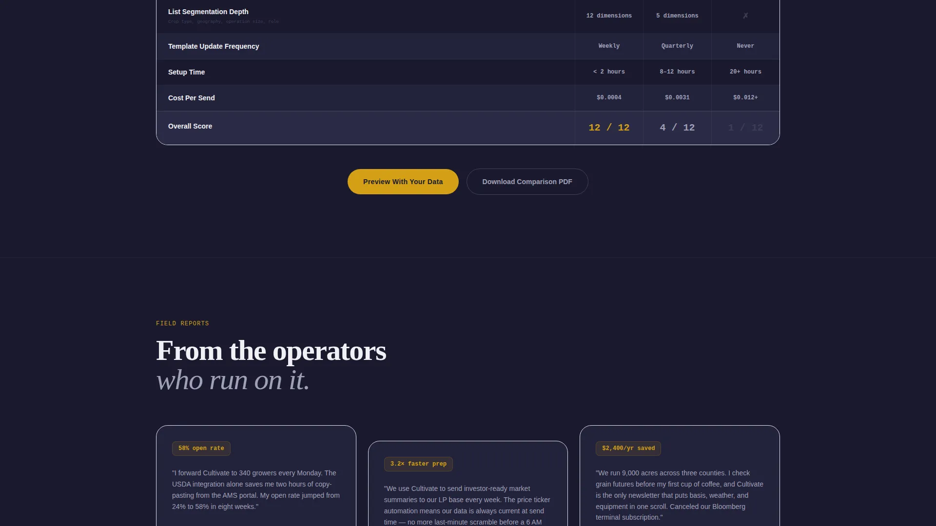
The comparison grid is the page's primary conversion architecture. It runs side-by-side columns covering twelve data points: mobile rendering, USDA data integration, weather module, equipment listing blocks, price ticker automation, A/B subject line support, dark mode compatibility, CAN-SPAM compliance modules, list segmentation depth, template update frequency, setup time, and cost per send. Harvest amber checkmarks and gunmetal X marks deliver the verdict before a word is read.
Product Screenshot Hero
The header opens with a pixel-perfect rendering of the newsletter template inside a dark email client frame. The screenshot shows a live-data grid with crop futures, a regional precipitation map thumbnail, and a trending equipment listing. A subtle 3-degree tilt and soft ambient shadow make the product float against a forge black background, communicating quality without lifestyle imagery.
Dual Conversion Paths
The primary call to action reads "Preview With Your Data" and triggers a modal that captures email platform preference, subscriber count range, and email address. A secondary path offers "Download the Comparison PDF," gated behind email-only capture. This gives research-mode visitors a low-commitment entry point while keeping the primary conversion path clean.
Dashboard Data Grid Layout
The entire page is structured around a dashboard and data grid visual language. Information is organized the way a farm operator expects to find it: dense but scannable, with every number and status indicator in a predictable position. The layout reflects the weekly dispatch format of the newsletter itself, reinforcing product authenticity.
Monochrome Steel Color System
The color system uses four core tones: forge black, brushed gunmetal, galvanized silver, and silo white. A single functional accent, harvest amber, is reserved exclusively for interactive elements and live data points. Color carries meaning in this system. Amber means something is actionable; everything else stays neutral.
Page sections overview
| Section | Purpose |
|---|---|
| Hero Screenshot | Displays the newsletter product inside a dark email client frame to lead with the product itself |
| ROI Calculator | Lets visitors input their list size, open rate, and crop sector to see personalized value estimates |
| Comparison Grid | Runs a twelve-row side-by-side comparison to systematically eliminate alternative options |
| Primary call to action Modal | Captures email platform, subscriber range, and email address to trigger the preview experience |
| PDF Download Gate | Offers the comparison summary as a gated PDF for visitors still in the research phase |
Design & branding system
The visual identity follows a Directory and Discovery theme executed through a Monochrome Steel color system. The aesthetic is deliberately industrial: it feels like the steel wall of a grain elevator at dusk, where everything has a function and nothing is decorative for its own sake.
- Core palette: forge black (#1A1A2E), brushed gunmetal (#3D3D5C), galvanized silver (#A0A0B8), and silo white (#F0F0F5)
- Single functional accent: harvest amber (#D4A017) used only for interactive elements, live data points, and comparison grid checkmarks
- No lifestyle imagery; the product screenshot is the only visual, keeping the focus on the tool itself
Mobile & speed optimization
The dashboard and data grid layout is structured to translate cleanly across screen sizes. The comparison grid, calculator inputs, and modal capture are each built to remain readable and usable on smaller displays without sacrificing the data-dense visual identity.
- The comparison grid reflows for narrow viewports so all twelve data rows remain legible
- Calculator inputs and call to action modal fields are sized for comfortable thumb interaction on mobile devices
- The dark color system reduces visual noise on smaller screens, keeping the most important data points visible at a glance
How this template helps you convert
Cultivate is engineered around a deliberate conversion sequence. Each section earns the next interaction rather than demanding it upfront.
- The ROI calculator delivers immediate, personalized value before any signup ask, converting passive visitors into engaged prospects through demonstrated utility
- The twelve-row comparison grid systematically eliminates alternatives using visual signals, so visitors have already formed a preference by the time the primary call to action appears
- The dual-path conversion structure (preview modal and PDF download) captures both decision-ready visitors and those still in a research phase, widening the total addressable conversion window
Other information about this template
Cultivate is built specifically for the agriculture email newsletter niche, where generic templates fail to resonate with a technically literate, data-first audience. A few additional details worth noting before you commit:
- The newsletter template itself is the only visual asset on the page, reinforcing that the product speaks for itself
- The page uses a Calculator/Tool First creative direction, meaning value is demonstrated before any marketing message is presented
- The comparison structure is designed for a Comparison/Versus conversion intent, making it well-suited for visitors who arrive having already considered alternatives
- The template style is a Dashboard/Data Grid, consistent with how the target audience already consumes information in their daily workflow
- The subject line sample shown in the product screenshot ("Week 43: Corn basis narrows, La Niña confirmed, Case IH 9250 under reserve") signals content depth and editorial specificity to the right reader immediately
Theme
Directory & Discovery
Creative direction
Calculator/Tool First
Color system
Monochrome Steel
Style
Dashboard/Data Grid
Direction
Comparison/Versus
Page Sections
Interactive ROI Calculator
Twelve-row Comparison Grid
Product Screenshot Hero
Dual-path Conversion Capture
Dashboard Data Grid Layout
Monochrome Steel Visual System
Related questions
Who is this landing page template designed for?
What does the ROI calculator actually do?
How does the comparison grid work?
What are the two conversion paths included in this template?
Does this template use any lifestyle imagery?



