Gothic Boot Landing Page Template | Cinematic Upsell Design
Crypt is a cinematic, overlap-layered landing page template built for gothic shoe brands ready to sell up. It uses a full-bleed cobblestone header, scroll-driven film-cut transitions, an annotated boot cross-section, and a three-tier comparison table to move visitors from curiosity to commitment. Every section earns the upgrade before the call to action arrives.
by Rocket studio
Quick summary
Crypt is a single-page, overlap-layered landing page template designed for artisan gothic footwear brands. It opens with a full-bleed ankle-height photo, then guides visitors through a cinematic scroll sequence: workshop close-ups, an annotated cross-section panel, editorial night shots, and a three-tier product comparison. The page is built to earn premium upgrades before asking for a click.
Who this template is for
This template is made for footwear brands and independent makers who sell handcrafted gothic or dark-aesthetic boots at a premium price point. It fits sellers who need to justify craft, material quality, and tiered pricing to a discerning audience.
- Gothic and dark-fashion shoe brands running a standard-to-premium upgrade funnel
- Independent artisan bootmakers or small workshops selling hand-finished footwear
- Theater costume suppliers and editorial stylists sourcing distinctive silhouettes
What problem this template solves
Most product pages show a boot. This template makes a visitor feel the boot. Premium handmade footwear fails online when the page cannot communicate craft, material depth, or the reason a higher tier is worth the price difference. Crypt solves that trust gap with pacing, detail, and visual storytelling before a single call to action appears.
- Buyers arriving from product pages or emails need more than a photo to justify a premium price
- Standard layouts cannot communicate hand-finishing, layered materials, or construction quality at a glance
- A flat product grid cannot distinguish three tiers of the same silhouette in a meaningful way
What you get with this template
You get a fully structured single-page layout that unfolds like a short film. Every section is designed to reveal information at the right moment, building desire before presenting a purchase decision.
- A full-bleed cinematic header with a single fading gold serif wordmark
- A scroll-driven overlap sequence covering workshop process, materials cross-section, and editorial lifestyle shots
- A three-column tier comparison and two distinct calls to action placed at high-intent moments
Feature list
This template includes a focused set of layout components, each built to serve the upgrade funnel from first impression to final click.
Full-Bleed Cinematic Header
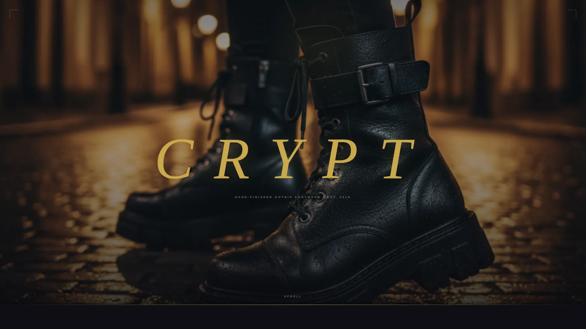
The header opens with an ankle-height cobblestone photo that bleeds past viewport edges. No navigation interrupts the image. A single spaced gold serif word fades in after a held breath, setting the tone before the visitor scrolls.
Overlap Scroll Sequence
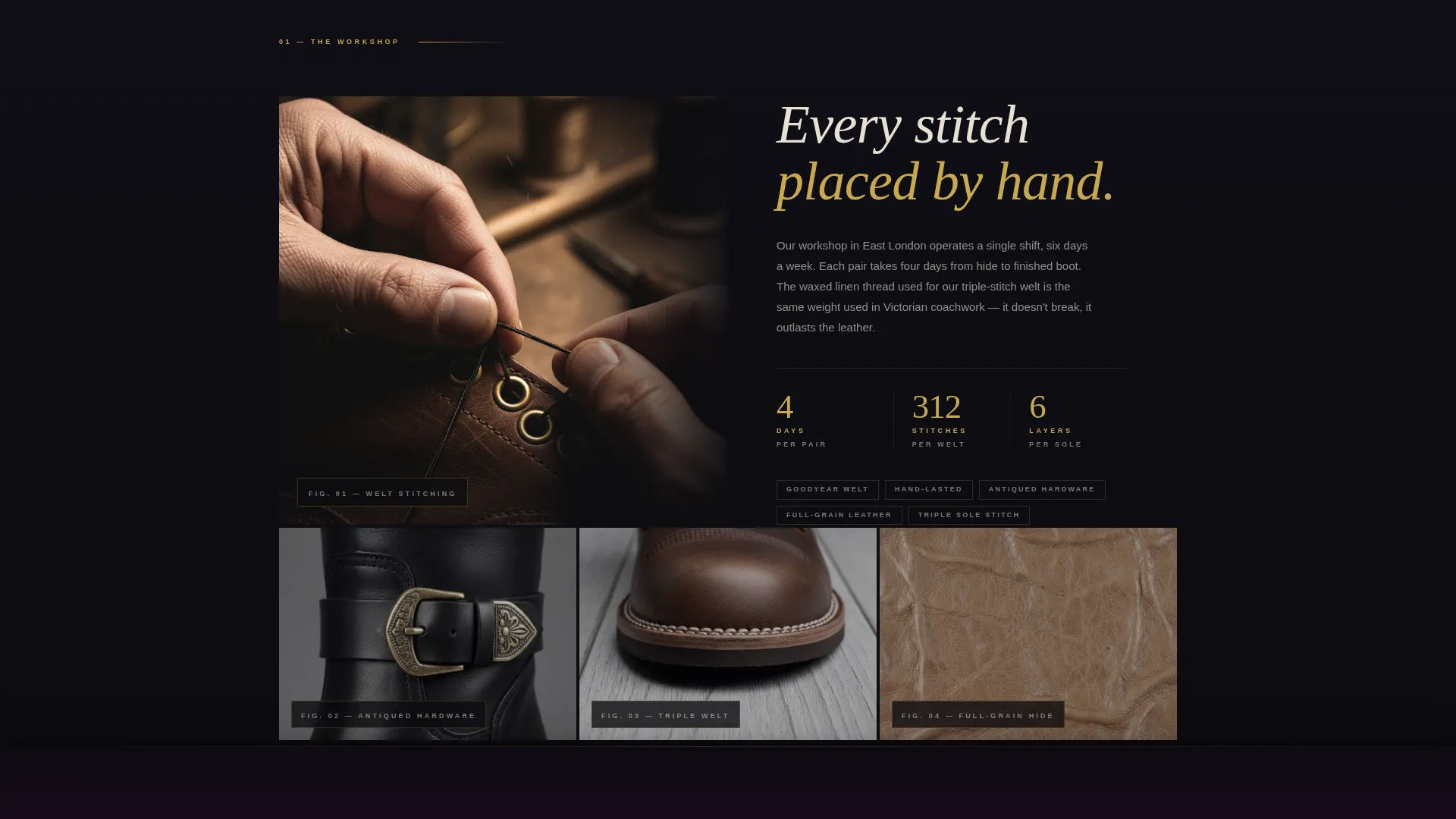
Layered panels slide over one another as the visitor scrolls, mimicking hard film cuts. Each transition reveals a new scene: workshop hands pulling waxed thread, an exploded cross-section view, then editorial night shots of models against club walls and cemetery iron.
Annotated Boot Cross-Section Panel
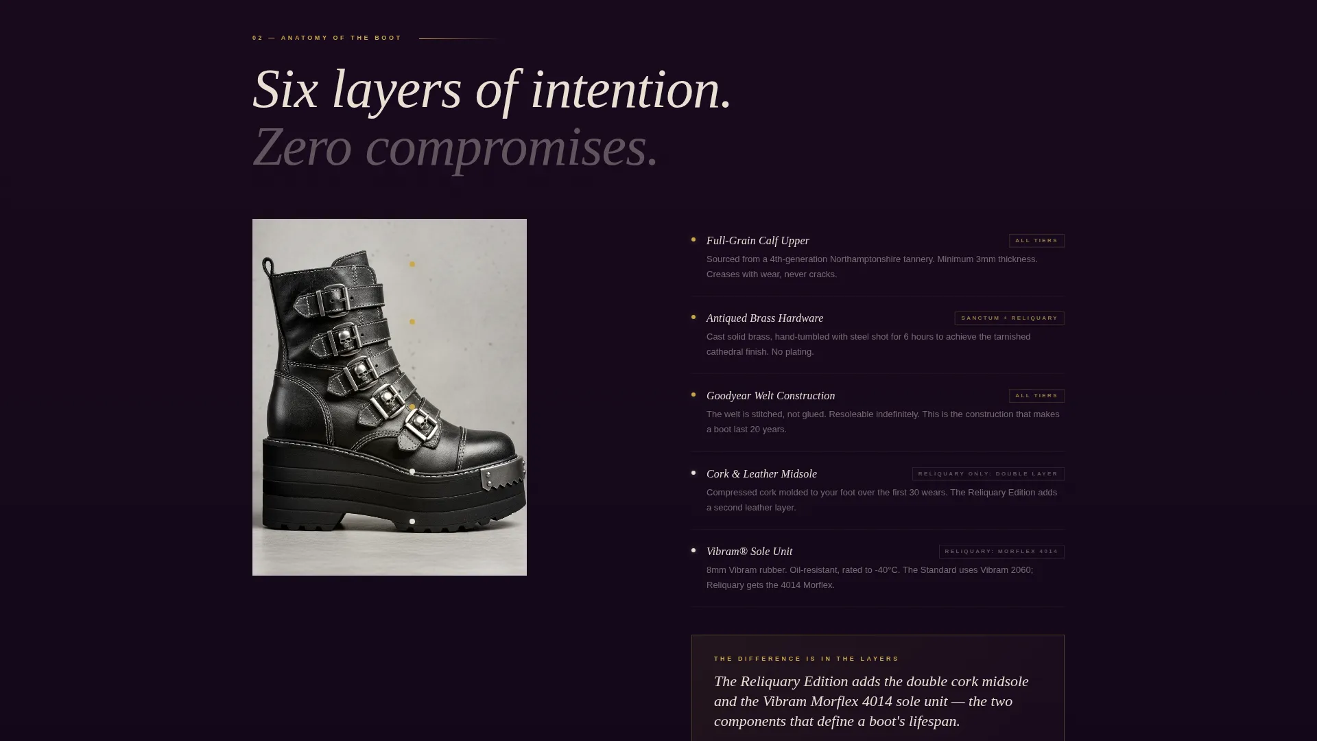
One dedicated panel explodes the boot into its material layers, each labeled in bone ivory type. This section does the work of a salesperson: it names every premium component and shows exactly what separates the standard build from the top-tier Reliquary Edition.
Three-Tier Comparison Layout
A three-column side-by-side layout presents the Standard, Sanctum, and Reliquary tiers at once. The structure is calibrated so the middle tier reads as the sensible choice and the top tier reads as a considered investment, not an impulse.
Dual Call-to-Action Placement
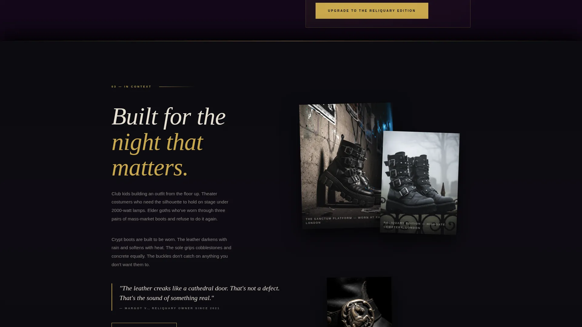
The primary call to action, "Upgrade to the Reliquary Edition," lands in gold on obsidian directly after the cross-section reveal. A secondary "Build Your Pair" call to action follows the editorial shots, linking visitors to a customizer for those who want to configure before committing.
Overlapping Editorial Shot Stack
Multiple editorial photographs are stacked at overlapping angles, showing boots in motion against real environments. The layout mirrors the layered sole construction of the product itself and keeps the page feeling like a curated editorial spread rather than a catalog.
Page sections overview
| Section | Purpose |
|---|---|
| Full-Bleed Header | Opens with boots, single fading wordmark |
| Workshop Reveal Panel | Shows hand-finishing and construction craft |
| Materials Cross-Section | Labels every material layer in detail |
| Editorial Night Sequence | Positions boots in lifestyle context |
| Three-Tier Comparison | Differentiates Standard, Sanctum, Reliquary |
| Primary Upgrade call to action | Prompts Reliquary Edition upgrade decision |
| Secondary Builder call to action | Links to custom pair configurator |
Design & branding system
The visual identity follows a Neo-Retro theme built on an Obsidian and Gold color system. The palette reads like a Victorian daguerreotype gilded at the edges: precious metal oxidizing against deep darkness, opulent but controlled. Gold never dominates; it glints on edges and hover states while obsidian black holds the frame.
- True obsidian black (#0B0B0F) as the dominant ground, deep coffin velvet (#1A0A1E) for layered mid-panels, and bone ivory (#E8E0D4) for body text
- Tarnished cathedral gold (#C9A84C) reserved for accent lines, hover states, and all calls to action
- Layered sections carry slight shadow offsets so each panel reads as a physical layer, like stacked leather soles
Mobile & speed optimization
The overlap and layered layout is structured to translate across screen sizes without losing the cinematic pacing that drives the funnel. Scroll transitions and panel overlaps are defined within the template layout so the sequence remains legible on smaller viewports.
- Full-bleed imagery and layered panels are sized to maintain visual impact on both desktop and mobile displays
- The editorial shot stack and three-column comparison reflow cleanly at narrower widths to keep tier differences clear
- Call-to-action buttons remain prominent and correctly spaced at all viewport sizes so no key action is buried on mobile
How this template helps you convert
Crypt is built as an upgrade funnel, not a general storefront. The page sequence is engineered to create desire, build justification, and then present a decision, in that order.
- The cinematic scroll sequence reveals craft and materials before any price or tier is shown, so the visitor arrives at the comparison table already valuing the product
- The annotated cross-section panel gives the visitor specific, named reasons to choose a higher tier, reducing the price objection before the call to action appears
- The dual call-to-action structure captures two buyer states: those ready to upgrade directly and those who want to configure a custom pair first
Other information about this template
Crypt is a strong fit for any dark-aesthetic or alternative fashion brand that needs a landing page capable of carrying a premium price story. The template style, tone, and funnel logic also translate well to related niches beyond gothic footwear.
- Suitable for corsetry, leather accessory, or dark-aesthetic apparel brands using a similar tier upgrade model
- The Neo-Retro theme and Obsidian and Gold palette can be adapted to other luxury artisan goods with minimal restyling
- The Cinematic Sequence creative direction and Full-Bleed Photo header concept are defined intersection-level design choices, meaning the template was purpose-built for this combination of visual style and funnel direction
- The overlap and layered template style means panels physically stack on scroll, giving depth to the page without requiring complex custom code
Theme
Neo-Retro
Creative direction
Cinematic Sequence
Color system
Obsidian & Gold
Style
Overlap/Layered
Direction
Upsell/Upgrade
Page Sections
Full-bleed Cinematic Header
Overlap Scroll Sequence
Annotated Boot Cross-section
Three-tier Comparison Layout
Dual Call-to-action Structure
Stacked Editorial Shot Layout
Related questions
Who is this landing page template designed for?
Can I use this template for a brand that sells more than boots?
What makes the scroll experience feel cinematic?
How does the three-tier comparison work?
Where do the two calls to action appear on the page?



