Dark Gothic Subscription Box Landing Page Template
Crypt is a Bold Brutalist gothic subscription box landing page built around an Obsidian and Gold visual identity. The masonry layout mimics the unboxing experience tile by tile, guiding visitors from a cinematic letter-cutout header through product reveals, past box galleries, and trust-building grids to a single high-intent click-through to checkout.
by Rocket studio
Quick summary
Crypt is a single-page, click-through landing page for a dark gothic subscription box. It uses a masonry layout, a parallax letter-cutout header, and a deliberate unboxing scroll rhythm to move ritual-minded shoppers from first impression to checkout. The design is unrelenting void black with earned tarnished gold accents.
Who this template is for
This template is built for independent brands that sell curated dark lifestyle products on a subscription basis. It suits founders who want their page to match the mood of what they ship.
- Gothic subscription box operators shipping monthly or quarterly parcels
- Independent makers and curators selling occult, apothecary, or dark jewelry collections
- Lifestyle brand builders whose audience includes tarot readers, horror enthusiasts, and alternative-style collectors
What problem this template solves
Mystery boxes create purchase anxiety. Shoppers wonder whether the value justifies the commitment, especially for niche or underground products with no mainstream shelf presence. This template resolves that tension.
- It balances mystery-box excitement with a clear "What's Always Inside" trust grid showing item count and retail value floor
- It removes the need for a form or on-page sign-up, routing visitors directly to a dedicated checkout via a sticky call-to-action bar
- It gives underground makers a visual stage that feels authentically dark rather than borrowing from mainstream e-commerce aesthetics
What you get with this template
You get a fully structured gothic subscription box landing page with every section pre-built for a click-through purchase flow. The layout handles visual storytelling, product presentation, social proof, and the subscription tier decision in a single scroll.
- A cinematic parallax header, staggered masonry product tiles, a past-boxes gallery, testimonial placements, and a full-width call-to-action block
- Three subscription tier options (Monthly Rite, Quarterly Séance, Annual Covenant) wired to carry selection through to checkout
- A "What's Always Inside" trust grid that guarantees item count, retail value floor, and exclusive-to-box pieces
Feature list
This template is built from distinct, purposeful components. Each one earns its place in the scroll.
Letter Cutout Parallax Header
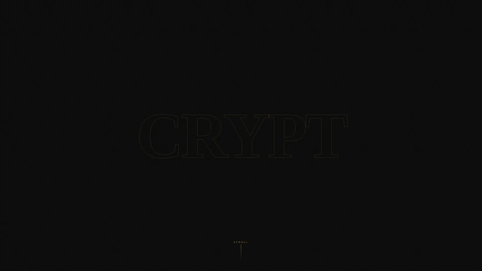
The word CRYPT fills the entire viewport in massive, jagged brutalist type. Through each letterform, a slow parallax video plays showing gloved hands unwrapping box contents. The letters act as a cinematic window; no supporting text appears until the visitor scrolls.
Masonry Unboxing Scroll Layout
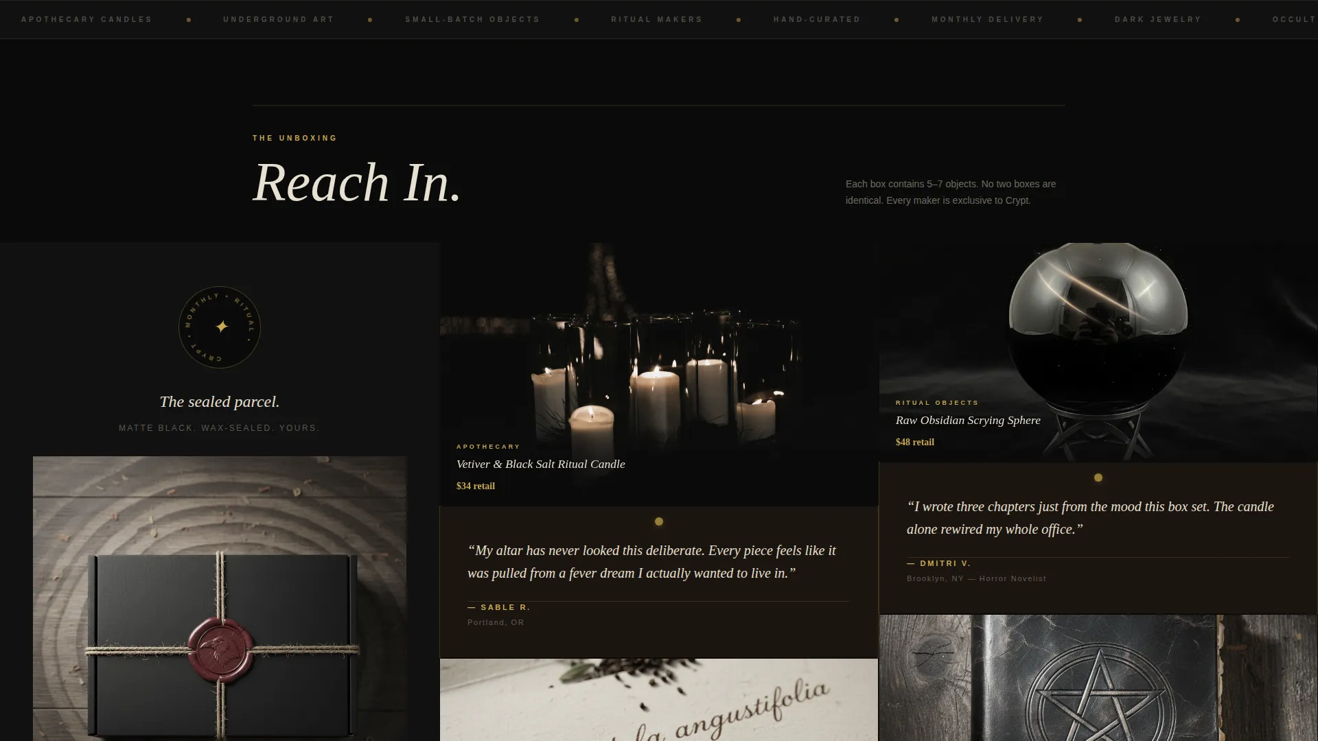
Tiles enter the viewport one at a time in staggered heights, mimicking the rhythm of lifting items from a physical box. The layout alternates between tight product clusters and deliberate breathing room so the scroll pace never feels rushed.
Sticky Click-Through Call-to-Action Bar
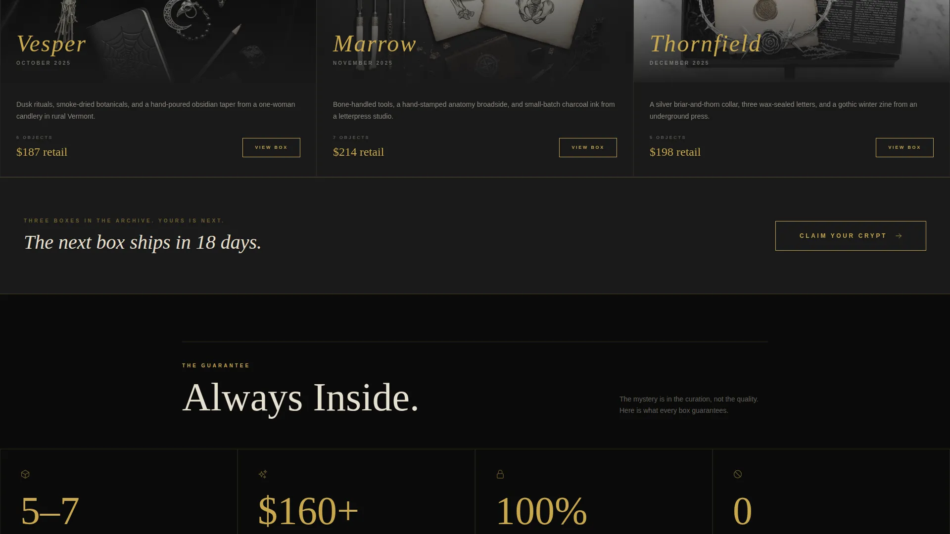
A "Claim Your Crypt" bar in tarnished gold on black appears as a persistent anchor once the header clears. It reappears as a full-width block after the past-boxes gallery, keeping the purchase action close without interrupting the story.
Named Past Boxes Gallery
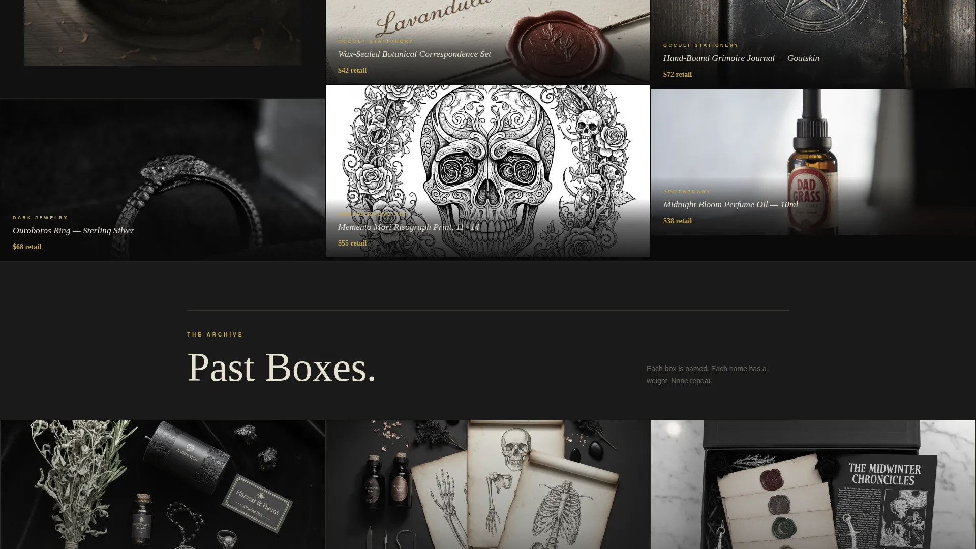
A full-width gallery presents previous months as named collections, such as Vesper, Marrow, and Thornfield, each paired with a moody flat-lay photograph. The naming system reinforces the ritual character of the brand and builds confidence in curation quality.
Handwritten Testimonial Pins
Social proof appears as handwritten-style quotes on torn-paper textures, pinned between product tiles. The placement feels organic rather than added as an afterthought, matching the tactile, underground tone of the brand.
Trust Grid for Value Transparency
A "What's Always Inside" grid communicates guaranteed item count, retail value floor, and exclusive-to-box pieces. It removes the core anxiety of blind subscription boxes while keeping the excitement of the reveal intact.
Page sections overview
| Section | Purpose |
|---|---|
| Parallax header | Cinematic brand entry via letter-cutout video mask |
| Sealed parcel tile | First masonry tile establishing unboxing narrative |
| Product card cluster | Three to four staggered tiles with item previews and bone ivory descriptions |
| What's Always Inside | Trust grid covering item count, value floor, and exclusives |
| Past boxes gallery | Full-width named monthly collection showcase |
| Testimonial pins | Handwritten-style social proof woven between tiles |
| Subscription tier block | Three-tier selector routing to dedicated checkout |
| Full-width call to action block | Final "Claim Your Crypt" conversion anchor |
Design & branding system
The visual identity is Bold Brutalist, built entirely around an Obsidian and Gold color system. Every design decision is deliberate and heavy, with no decorative softness.
- Core palette: void black (#0B0B0B) for backgrounds, sarcophagus charcoal (#1A1A1A) for card surfaces, tarnished gold leaf (#C9A84C) for borders and hover states and price tags, and bone ivory (#E8E0D0) for body text
- Typography uses massive, jagged brutalist letterforms in the header; no rounded corners appear anywhere in the layout
- Gold is used sparingly and intentionally, appearing only on borders, hover interactions, and price displays, so each instance feels earned rather than decorative
Mobile & speed optimization
The masonry layout is structured to reflow cleanly for smaller viewports without losing the sequential unboxing rhythm. The visual hierarchy remains intact at every screen width.
- The parallax header video and tile stagger adapt to single-column display on mobile so the scroll story still lands
- Heavy visual components such as the past-boxes gallery and full-width call to action block are built to maintain layout integrity without requiring additional configuration
How this template helps you convert
The page is designed as a single conversion path with no distractions. Every section builds toward one action: clicking through to the subscription checkout.
- The parallax header creates immediate emotional investment before any copy appears, so visitors are drawn in on atmosphere alone before reading a single word
- The unboxing scroll rhythm and trust grid work together to build desire and remove doubt at the same time, so the visitor arrives at the call-to-action already convinced
- The sticky call-to-action bar and the full-width closing block give two natural moments to convert without ever forcing a decision mid-scroll
Other information about this template
This template is built specifically for the gothic fashion and dark lifestyle niche. It is not a general subscription box template adapted for aesthetics; every component reflects the source material.
- Template style: Masonry and Pinterest-style layout
- Theme: Bold Brutalist
- Color system: Obsidian and Gold
- Header concept: Letter Cutout and Mask with parallax video
- Creative direction: Unboxing Experience scroll narrative
- Landing page direction: Click-Through to dedicated subscription checkout
- Niche alignment: Gothic subscription box, occult lifestyle, dark jewelry, apothecary, and underground art
- The three subscription tiers (Monthly Rite, Quarterly Séance, Annual Covenant) are named to reinforce the ritual identity of the brand
- No on-page form is included; the design intentionally routes all conversion through the checkout click
Theme
Bold Brutalist
Creative direction
Unboxing Experience
Color system
Obsidian & Gold
Style
Masonry/Pinterest
Direction
Click-Through
Page Sections
Letter Cutout Parallax Header
Masonry Unboxing Scroll Layout
Sticky Click-through Call-to-action
Named Past Boxes Gallery
What's Always Inside Trust Grid
Handwritten Testimonial Pins
Related questions
Does this template include a sign-up form?
Can I change the subscription tier names?
What kind of video works best in the parallax header?
Is the masonry layout fixed or can I add more product tiles?
Do I need to keep the exact color values from the template?



