Cultivar - Dynamic Agriculture Landing Page Template
Cultivar is a single-page agriculture AI voice assistant landing page built around animated comparison tables, a cinematic dark header, and a field-proven narrative arc. It guides corn-belt row croppers, dairy managers, and agronomists from striking field data to a confident app download, proving dollar savings before asking for any commitment.
by Rocket studio
Quick summary
Cultivar is a Dynamic Motion landing page designed to convert working farmers and agronomists into app users. It opens with a drone-captured nighttime header, walks visitors through animated industry-report data comparing traditional and voice-assisted workflows, and closes with a friction-free app download call to action backed by an equipment-match onboarding form.
Who this template is for
This template is built for agriculture technology companies and app developers targeting production-scale farm operators. It speaks directly to people who make decisions in the field, not at a desk.
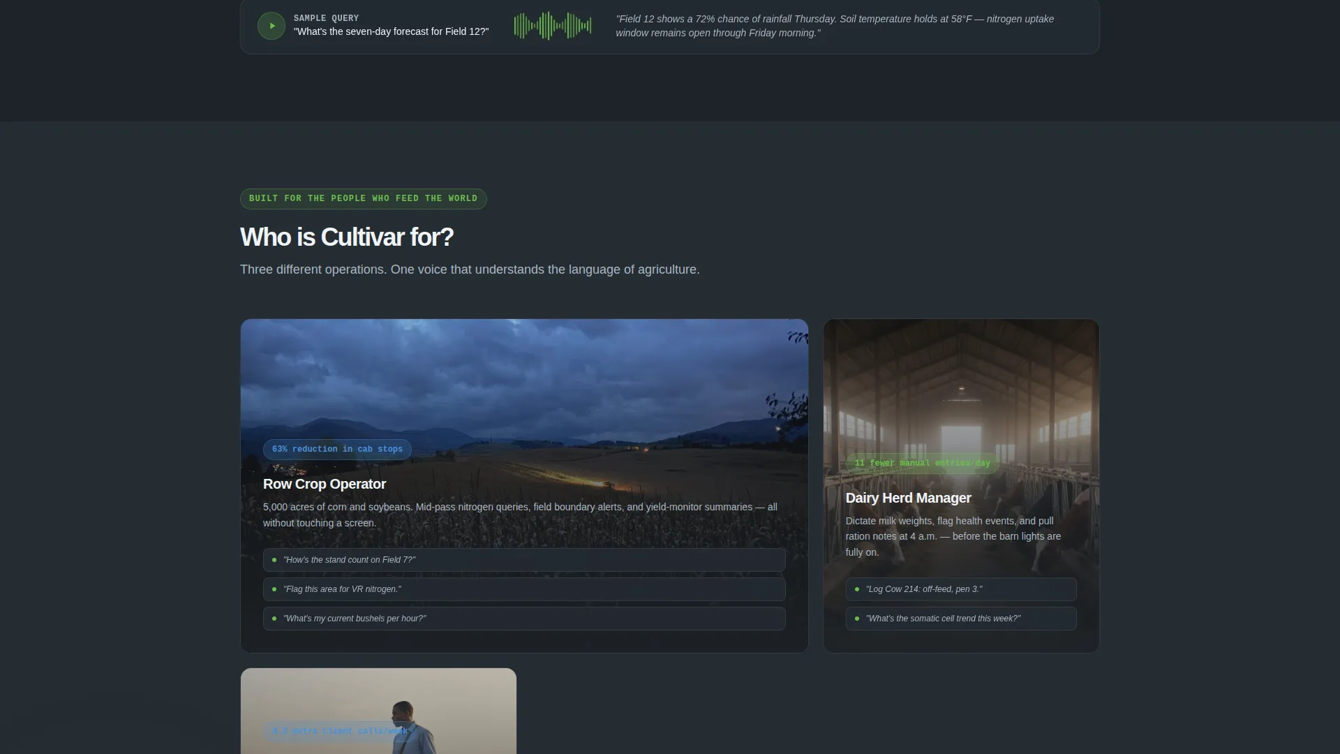
- Corn-belt row croppers who need nitrogen and soil moisture data during active passes
- Dairy operation managers logging herd health notes before sunrise
- Agronomists managing multiple client fields simultaneously and needing fast, hands-free summaries
What problem this template solves
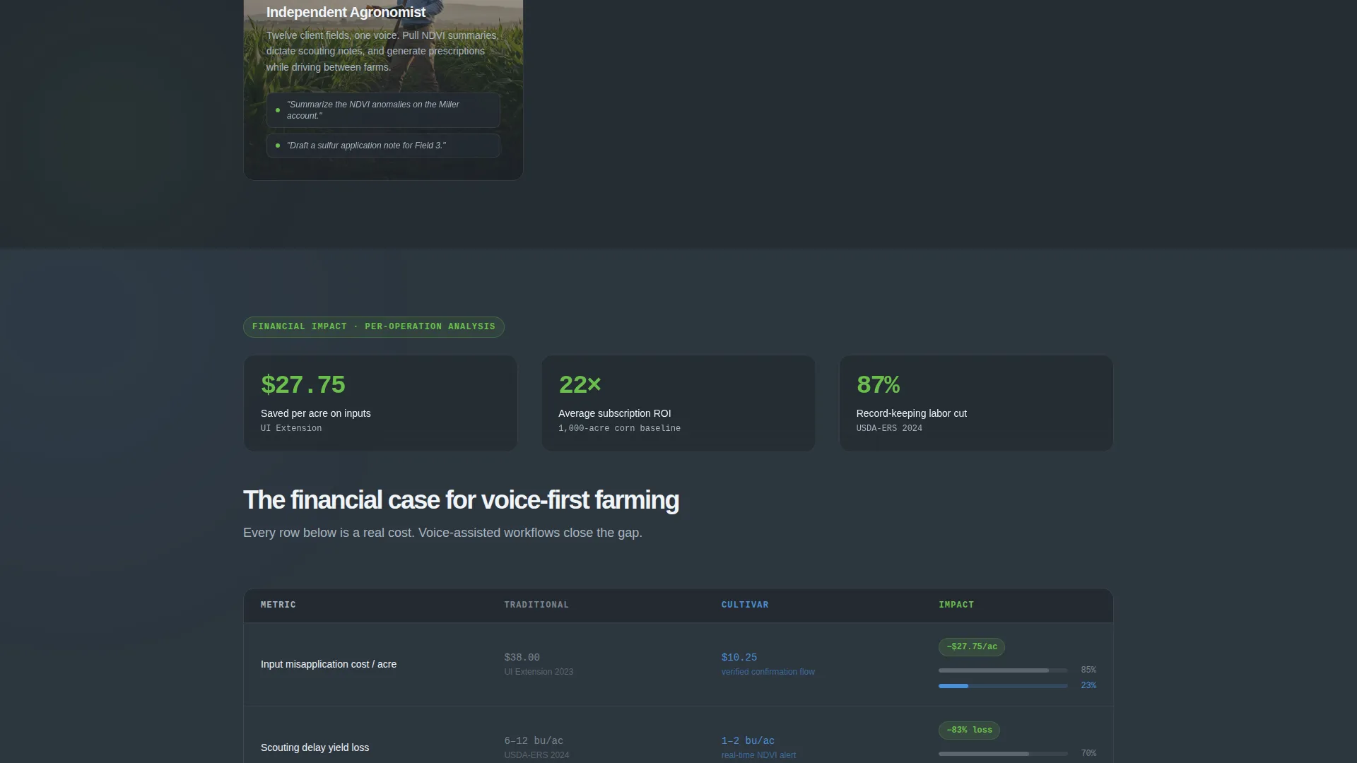
Farm operators lose time and money when information workflows interrupt physical work. Manual record-keeping, delayed scouting, and misapplied inputs all carry measurable costs. This template gives an agriculture AI voice assistant a credible, data-first stage to make that case visually.
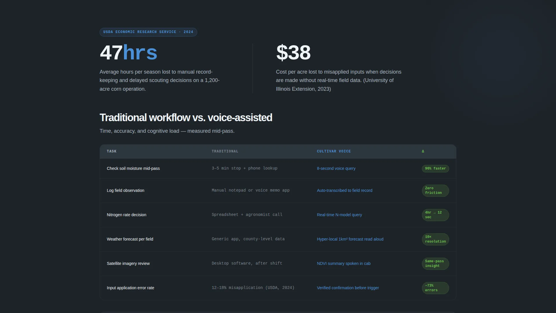
- Visitors arrive skeptical; the Industry Report structure earns trust with USDA-backed and extension-data statistics before asking for a download
- Traditional versus voice-assisted workflow tables answer the core objection of whether switching is worth it
- The equipment-match form removes setup anxiety by showing the app will feel familiar on day one
What you get with this template
The template delivers a complete, section-led single-page layout ready to be customized for any agriculture AI voice product. Every section serves a specific role in moving the visitor toward a confident download decision.
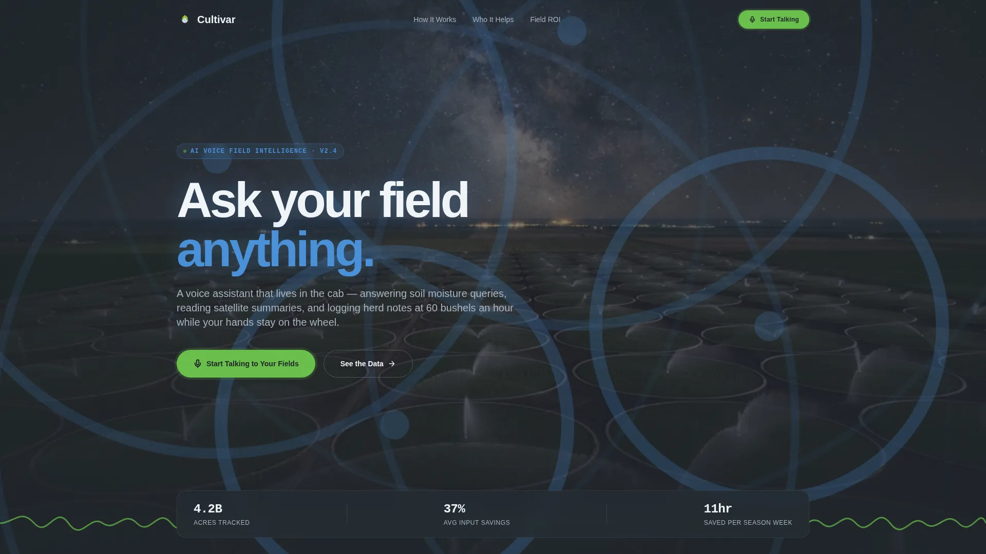
- A dark full-bleed hero with animated sonar rings and a real-time voice-waveform line built in spring-shoot green
- Scroll-triggered animated comparison tables with live-counting numeric values across time, accuracy, and cost columns
- Dual call-to-action paths: a primary app download button with device-detection routing and a secondary equipment-match short form
Feature list
This section covers the core built-in components that define Cultivar's layout and interactive behavior.
Cinematic Dark Hero Section
The header uses a nighttime aerial scene of center-pivot irrigation circles with subtle luminous rings pulsing outward. A voice-waveform line animates across the bottom of the viewport in spring-shoot green before the headline "Ask your field anything." appears. The primary call-to-action button does not appear until the waveform completes its pass, creating a natural moment of attention before the ask.
Animated Comparison Tables
Each comparison table pits traditional agricultural workflow against a voice-assisted workflow across three columns: time, accuracy, and cost. Rows animate into view as the visitor scrolls, and numeric values count up in real time. The animation reinforces the financial argument without requiring the visitor to read long paragraphs.
Industry Report Data Sections
Every major section opens with a bold statistic drawn from USDA or university extension research. The data points cover yield loss from delayed scouting, hours spent on manual record-keeping, and cost per misapplied input. This structure mirrors a published findings document and builds credibility before presenting each product claim.
Auto-Playing Audio Clips
Short audio clips are embedded between comparison tables and auto-play as the visitor scrolls past. Each clip demonstrates a real voice query, such as asking for a seven-day forecast for a specific field, answered by the assistant in a calm, clear tone. This gives visitors a direct sensory preview of the product before they download.
Dual Conversion Path Layout
The primary call to action reads "Start Talking to Your Fields" and links to both the App Store and Google Play with device-detection auto-routing. A secondary path labeled "Hear It on Your Equipment" presents a short form collecting equipment brand, acreage, and primary crop for pre-configured onboarding. Both paths appear after the second comparison table, once the financial case has been made.
Escalating Narrative Structure
The page is organized so that each section's data is more compelling than the last. The sequence moves from convenience to financial impact to competitive advantage, ensuring that visitors who scroll deeper encounter stronger reasons to convert. This pacing is built into the section order and cannot be accidentally disrupted by reordering blocks.
Page sections overview
| Section | Purpose |
|---|---|
| Dark Hero Header | Establishes atmosphere and delays call to action until waveform completes |
| Stat Opening Block | Anchors each section with a credible industry data point |
| Comparison Table One | Contrasts time spent in traditional versus voice-assisted tasks |
| Audio Clip Interlude | Lets visitors hear the assistant in a realistic field scenario |
| Comparison Table Two | Expands contrast to accuracy and cost impact columns |
| Primary call to action Block | Delivers the app download prompt after financial proof is shown |
| Equipment Match Form | Collects setup context to reduce onboarding friction |
| Competitive Advantage Section | Escalates argument from savings to market positioning |
Design & branding system
The Slate and Sky color system is built around four purposeful tones that mirror the visual experience of watching a storm front clear over open farmland. The palette is not decorative; every color carries meaning in the interface.
- Deep tillage charcoal (#1E2328) and overcast steel (#5C6670) form the base, keeping the page grounded and readable against field imagery
- Open-sky blue (#4A90D9) carries primary interactive elements, headings, and structural contrast
- Spring-shoot green (#6ABF4B) appears exclusively for success states, active toggles, and the hero waveform animation, preserving its signal value
Mobile & speed optimization
The template is designed with field conditions in mind. Users may be checking it on a phone with one hand, in low light, or on a variable connection between rows. The layout accounts for these realities.
- Full-bleed hero imagery and animated elements are structured to remain visually coherent on smaller viewports without cropping critical content
- Comparison tables reflow cleanly on narrow screens so column data stays readable without horizontal scrolling
- The device-detection call to action routing ensures that mobile visitors reach the correct app store link without any manual selection
How this template helps you convert
The page is engineered around a proven earning-the-ask sequence. It does not lead with the download prompt; it builds toward it through compounding evidence.
- The Industry Report structure front-loads credible cost and yield data so that by the time the first call-to-action appears, the visitor has already seen financial justification for the switch
- The equipment-match secondary path directly addresses the most common reason agricultural app downloads stall: uncertainty about whether the tool will work with existing equipment and crop types
Other information about this template
Cultivar is a strong foundation for any agriculture AI voice assistant go-to-market page, particularly products positioning against legacy paper-based or spreadsheet-based farm management habits. The template's Industry Report creative direction aligns well with content strategies that reference extension office research or crop science publications. Its Dynamic Motion theme supports a modern technology brand without abandoning the earthy credibility that agricultural audiences expect.
- The template style is a Comparison Table layout, making it well suited for products that need to demonstrate measurable workflow improvements over existing methods
- The App Download landing page direction means the entire conversion funnel is designed around a single, frictionless action rather than a lead form or consultation request
- The Dark Full-Bleed header concept with glow effects is particularly effective for drone or satellite imagery assets, which are common in precision agriculture marketing
Theme
Dynamic Motion
Creative direction
Industry Report
Color system
Slate & Sky
Style
Comparison Table
Direction
App Download
Page Sections
Cinematic Dark Hero with Waveform Animation
Scroll-triggered Animated Comparison Tables
Industry Report Data Sections
Auto-playing Field Audio Clips
Dual Conversion Path with Device Routing
Escalating Narrative Page Structure
Related questions
Who is the primary audience for this landing page template?
Can I customize the comparison table data for my own product metrics?
What do the auto-playing audio clips require to work?
Does the template support both App Store and Google Play download paths?
Is the equipment-match form connected to a backend or onboarding system?



