Bold Brutalist Event Planning Social Media Landing Page
Curate is a bold brutalist event planning social media landing page template built for planners who need scroll-stopping graphics fast. It combines a modular card grid layout, industrial Monochrome Steel visuals, and a freemium conversion flow. Grab five free templates instantly with a single email field. No design skills, no credit card, no delay.
by Rocket studio
Quick summary
Curate is a single-page, card-grid landing page template designed for event planners who need ready-to-deploy social media graphics. The design draws on neo brutalism principles, using forge-black backgrounds, heavy grotesque typography, and sharp gunmetal card borders. The page moves visitors from a bold headline through a modular template grid to a frictionless email capture, converting browsers into active users in seconds.
Who this template is for
This landing page template is built for time-pressed event professionals who need creative assets without the wait. It is also a strong fit for design-forward brands that want to stand out and inform their audience with raw visual clarity.
- Solo wedding coordinators managing multiple events each weekend
- Corporate event managers who need LinkedIn-ready recap graphics fast
- Festival promoters dropping lineup announcements under deadline pressure
What problem this template solves
Most event planners struggle to produce platform-ready social media visuals quickly. Generic tools slow users down with too many options and too little direction. This landing page solves that by presenting a focused toolkit in a layout that reduces cognitive load and guides visitors straight to action.
- Event graphics are hard to produce at speed without a dedicated designer
- Cluttered web design makes it difficult for users to find and act on what they need
- Freemium barriers like credit card requirements stop conversions before they start
What you get with this template
The template delivers a complete, single-page layout built on bold brutalist web design principles. Every section is laid out with function and clarity in mind. The structure covers everything from hero to footer in one focused scroll.
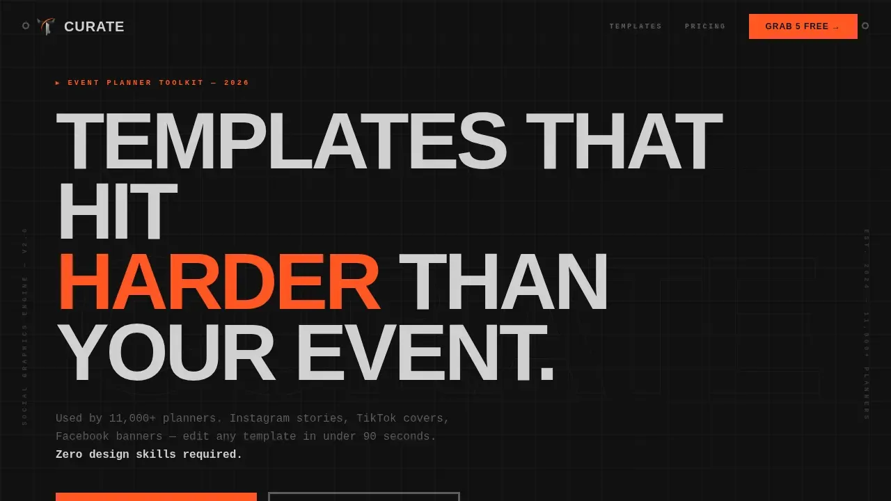
- A brutalist hero section with an all-caps headline, a mechanical marquee logo bar, and a prominent primary call-to-action button
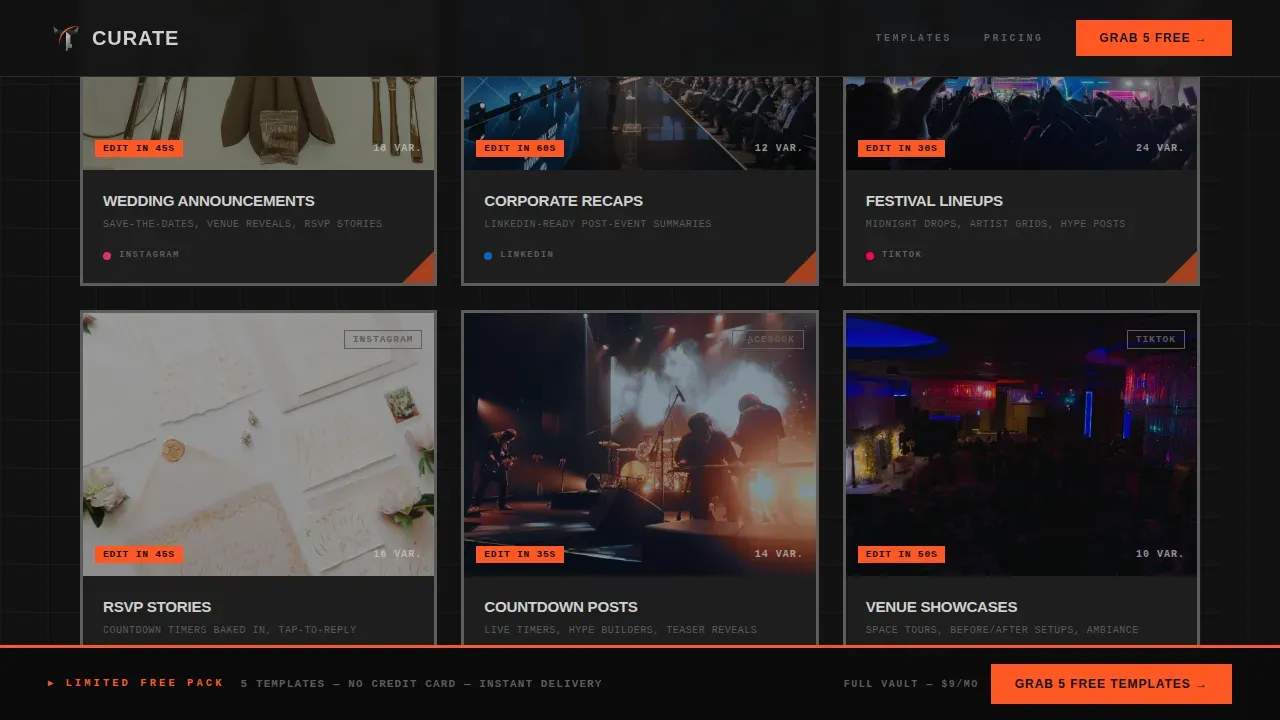
- A six-category modular card grid showing template previews, platform icons, edit-time badges, and format counts
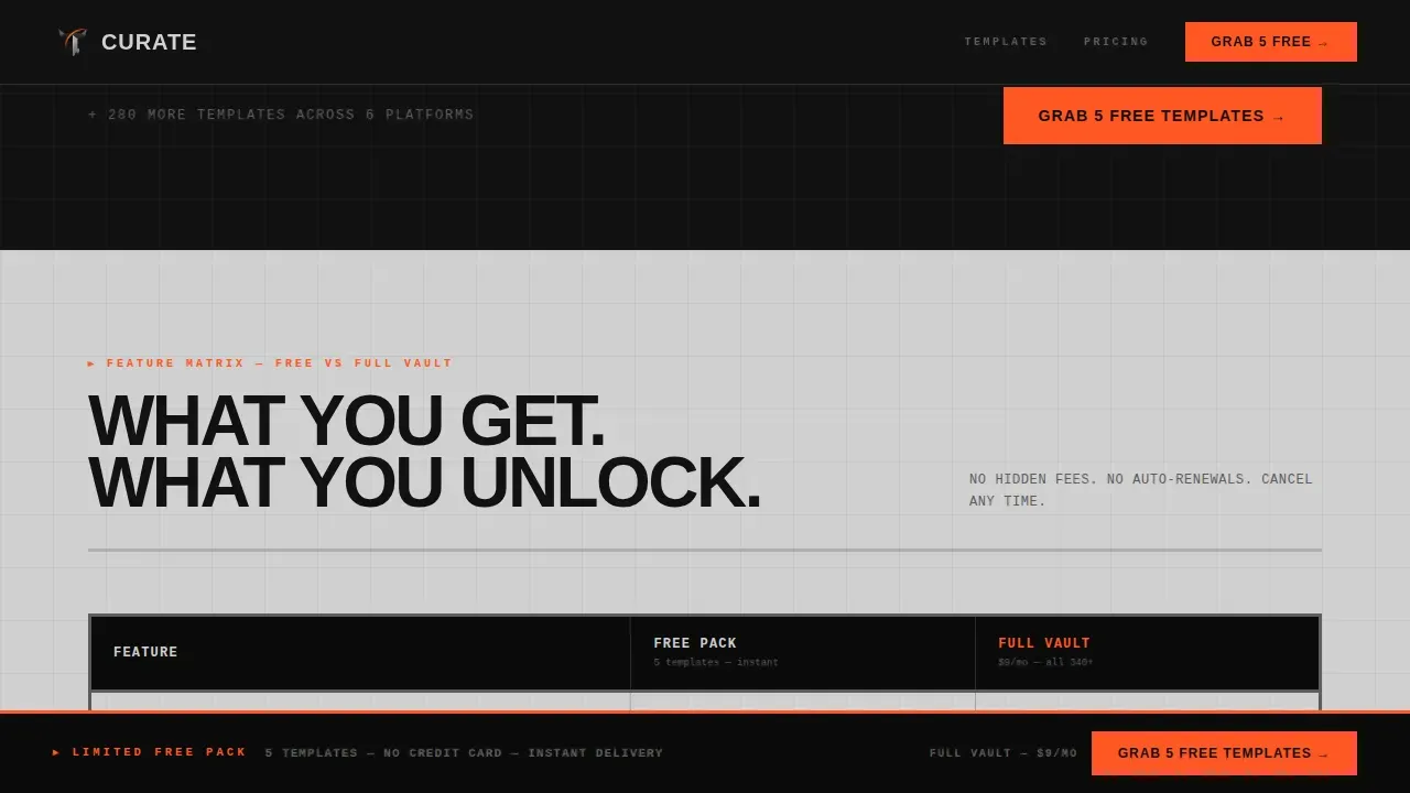
- A raw HTML comparison matrix table with padlock icons, an inline upgrade row, and a sticky bottom conversion bar
Feature list
This section describes the core design and functional features built into the Curate landing page template.
Bold Brutalist Card Grid Layout
The page layout uses a modular card grid where each steel-panel card represents a distinct template category. Cards carry sharp 3px gunmetal borders with zero border-radius, keeping every corner crisp. Hovering a card triggers an arc-weld orange border and a subtle parallax lift, giving the grid strong interactive energy without heavy ornamentation.
Mechanical Marquee Logo Bar
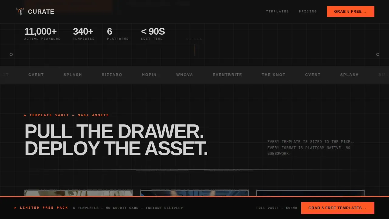
The header opens with a slow-scrolling conveyor-belt marquee rendered in monochrome steel gray. It functions as instant social proof, establishing credibility before the first template card appears. The marquee sits between the brutalist headline and the subline stat, anchoring the hero section with industrial rhythm.
Freemium Email Capture Flow
The primary call-to-action leads to a single-field email capture form. No credit card is required and no account setup is needed. Visitors check a secondary box to opt into monthly new-drop alerts, and templates deliver instantly to the inbox, making the conversion path as raw and direct as the design itself.
Sticky Conversion Bar
A sticky bottom bar appears after the visitor scrolls past the first card row. It repeats the primary call-to-action in arc-weld orange, keeping the conversion prompt visible without interrupting the browsing experience. This is a proven landing page web design practice for improving sign-up rates on scroll-heavy pages.
Raw HTML Comparison Matrix
The comparison matrix is a clean, undecorated HTML table that maps each template pack against key features. Locked features appear in gunmetal with a small padlock icon. An inline upgrade row sits inside the table, offering the full vault plan to visitors who are already excited and ready to commit.
Heavy Grotesque Typography System
The typography pairing uses Manrope in heavy grotesque weights for all headlines and body copy, stamping bold statements onto the screen. Badge and label text is set in JetBrains Mono for a technical, data-precise appearance. Together, these choices reflect the raw, unpolished aesthetics of neo brutalism while keeping the user interface readable and functional.
Page sections overview
| Section | Purpose |
|---|---|
| Hero Headline Bar | Deliver the bold brand statement and primary call-to-action |
| Marquee Logo Strip | Build social proof with a mechanical scrolling logo bar |
| Template Card Grid | Present six template categories in a modular, browsable layout |
| Comparison Matrix Table | Map template pack features and surface the upgrade path |
| Email Capture Form | Convert visitors with a single-field, no-credit-card form |
| Sticky Bottom Bar | Keep the call-to-action visible throughout the scroll |
| Footer Flow | Close the page with structured horizontal link layout |
Design & branding system
The visual identity is grounded in a Monochrome Steel color system that channels the raw feel of brutalist architecture: exposed surfaces, hard edges, and a single accent color reserved for action. The design deliberately rejects gradients and soft curves in favor of industrial precision.
- Colors: forge-black (#121212) as the primary background, brushed aluminum (#D0D0D0) for type and secondary surfaces, gunmetal (#5C5C5C) for borders and mid-tones, and arc-weld orange (#FF5722) exclusively for interactive states and call-to-action elements
- Typography: Manrope heavy grotesque for all display and body text, JetBrains Mono for badges, labels, and data-style details
- Borders and geometry: 3px solid gunmetal card borders, zero border-radius on all components, and repeating rectangular shapes that channel the geometric characteristics found in brutalist buildings
Mobile & speed optimization
The template is built desktop-first to match how corporate event managers and coordinators work at their desks. Strong mobile support is layered in so the landing page remains fully functional on smaller screens without sacrificing its industrial character.
- Static server components power non-animated sections, keeping the page load efficient for all users
- Client-side components handle GSAP ScrollTrigger animations, marquee motion, parallax card lift, and the sticky bottom bar
- The card grid reflows cleanly across screen sizes, and the email capture form stays accessible and tap-friendly on mobile
How this template helps you convert
This landing page is engineered around a freemium conversion model. Every design and layout decision promotes a specific action, reducing hesitation and guiding users toward the email capture or the paid upgrade path.
- The hero call-to-action and the sticky bottom bar work together to keep the primary offer visible at every scroll depth, so users never have to jump back up to act
- The comparison matrix makes the value gap between the free and paid tiers immediately visible, informing the upgrade decision without requiring a separate sales page
- The zero-barrier email capture, with no credit card and instant delivery, removes the last friction point and lets users feel excited to try the product before committing
Other information about this template
The Curate bold brutalist event planning social media landing page template sits at an interesting crossroads in current design trends. Web design brutalism has seen a cyclical emergence, with its history rooted in both brutalist buildings and the brutalist architecture movement that defined parts of postwar Europe. In web design, brutalism emerged as a reaction to overly polished, corporate aesthetics. It is characterized by raw honesty and a mix of stark visuals over decorative flourishes.
Neo brutalism in web design carries these same principles into the modern user interface. It trades white background softness and smooth gradients for exposed structure and bold contrast. This template applies those neo brutalism concepts in a context where clarity and speed of comprehension matter most: an event planner's landing page.
Brutalist landing page templates like Curate are well-suited to creatives, artists, and portfolio-style pages because the aesthetic signals transparency and purpose over corporate gloss. The off-the-grid layout and raw, repeating geometric card forms make a strong visual statement that helps the brand stand out. Users who might otherwise struggle to describe what makes a landing page feel trustworthy often respond intuitively to brutalism's honesty.
Key takeaways for anyone exploring this template:
- The design can support a portfolio-style browsable structure and is fully customizable to tweak colors, copy, and card content without writing custom code
- The landing page layout is presented as a complete, ready-to-deploy site with minimal setup, making it one of the strongest examples of functional brutalist web design for event professionals
- Creative teams can tweak individual card categories, matrix rows, and badge labels to reflect their own brand identity and promote their specific template offerings
Theme
Bold Brutalist
Creative direction
Feature Matrix
Color system
Monochrome Steel
Style
Card Grid (Modular)
Direction
Freemium/Trial
Page Sections
Bold Brutalist Card Grid Layout
Mechanical Marquee Logo Bar
Freemium Email Capture Form
Raw HTML Comparison Matrix
Sticky Bottom Conversion Bar
Heavy Grotesque Typography System
Related questions
Who is this landing page template built for?
Do I need design or coding skills to use this template?
What makes this a brutalist web design template?
How does the freemium conversion flow work?
Can I use this template for a portfolio or showcase site?



