Specialist AI for Entertainment Cost Estimator Website Template
Curate is a Bold Brutalist landing page template built for an AI-powered entertainment recommendation engine. A split-screen layout pairs a live taste estimator with a scrolling data narrative, guiding binge-fatigued streamers, music obsessives, and avid readers toward a single action: downloading the algorithm that already knows what they want to watch, hear, or read next.
by Rocket studio
Quick summary
Curate is a single-page, split-screen landing page template for an AI entertainment recommendation engine. It opens with an interactive taste estimator, unfolds into a personal data report, and closes with a high-conviction app download prompt. The design is Bold Brutalist with a Midnight Blue palette, built to feel stark, intelligent, and oddly personal.
Who this template is for
This template is made for founders and product teams launching an AI-driven entertainment recommendation product. It speaks directly to audiences who are overwhelmed by infinite scroll and exhausted by generic "best of" lists.
- Teams building AI recommendation engines for film, music, or books
- Startups promoting an app that uses personal consumption history to surface tailored picks
- Creators who want a high-impact landing page that proves value before asking for a download
What problem this template solves
Most entertainment apps ask for a sign-up before showing any value. Visitors leave before they ever trust the product. Curate flips that sequence by letting the algorithm prove itself first.
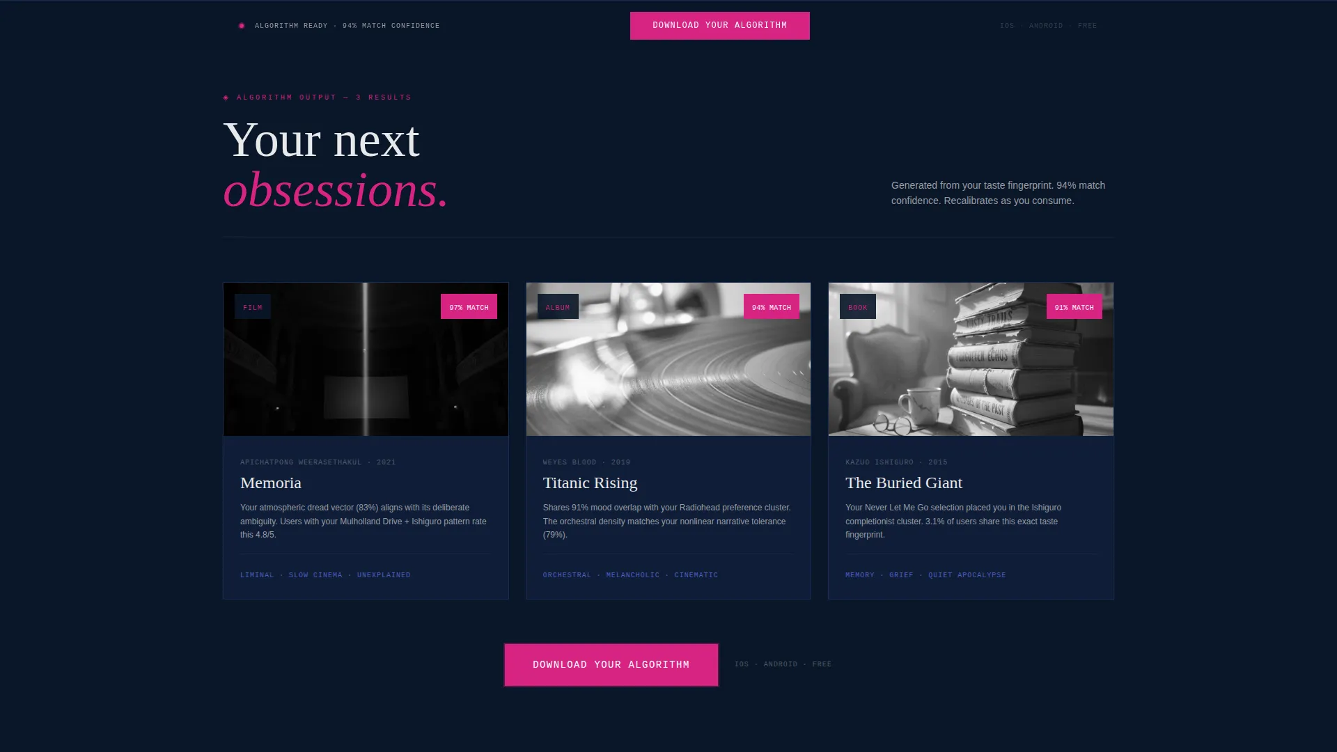
- Visitors see three personalized recommendations before any download prompt appears
- The page earns trust through a data-driven taste profile rather than marketing copy
- The friction of sign-up is removed entirely, replaced by a single phone number field
What you get with this template
You get a fully structured, single-page landing page that moves through three clear acts: input, insight, and action. Every section is designed with purpose and visual weight.
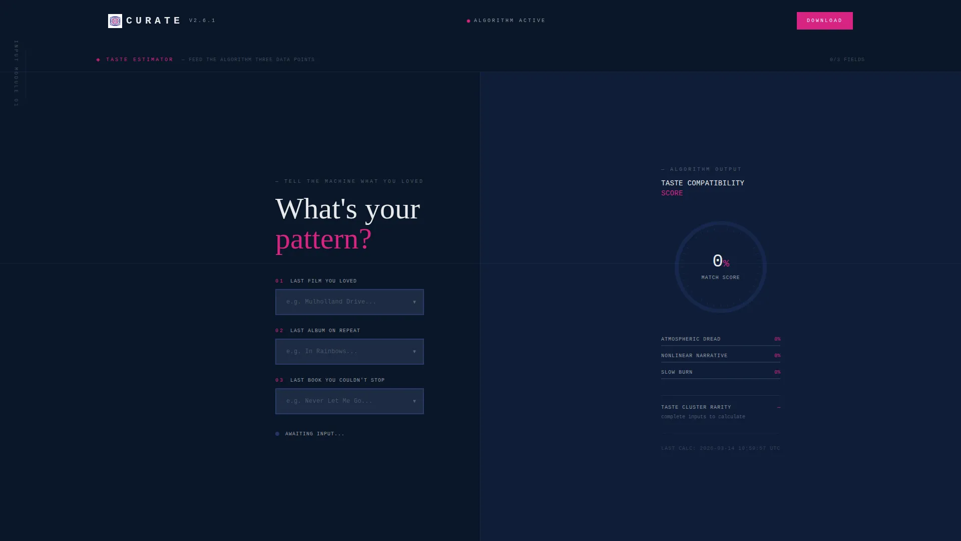
- A split-screen estimator header with three dropdown selectors and a live recommendation score meter
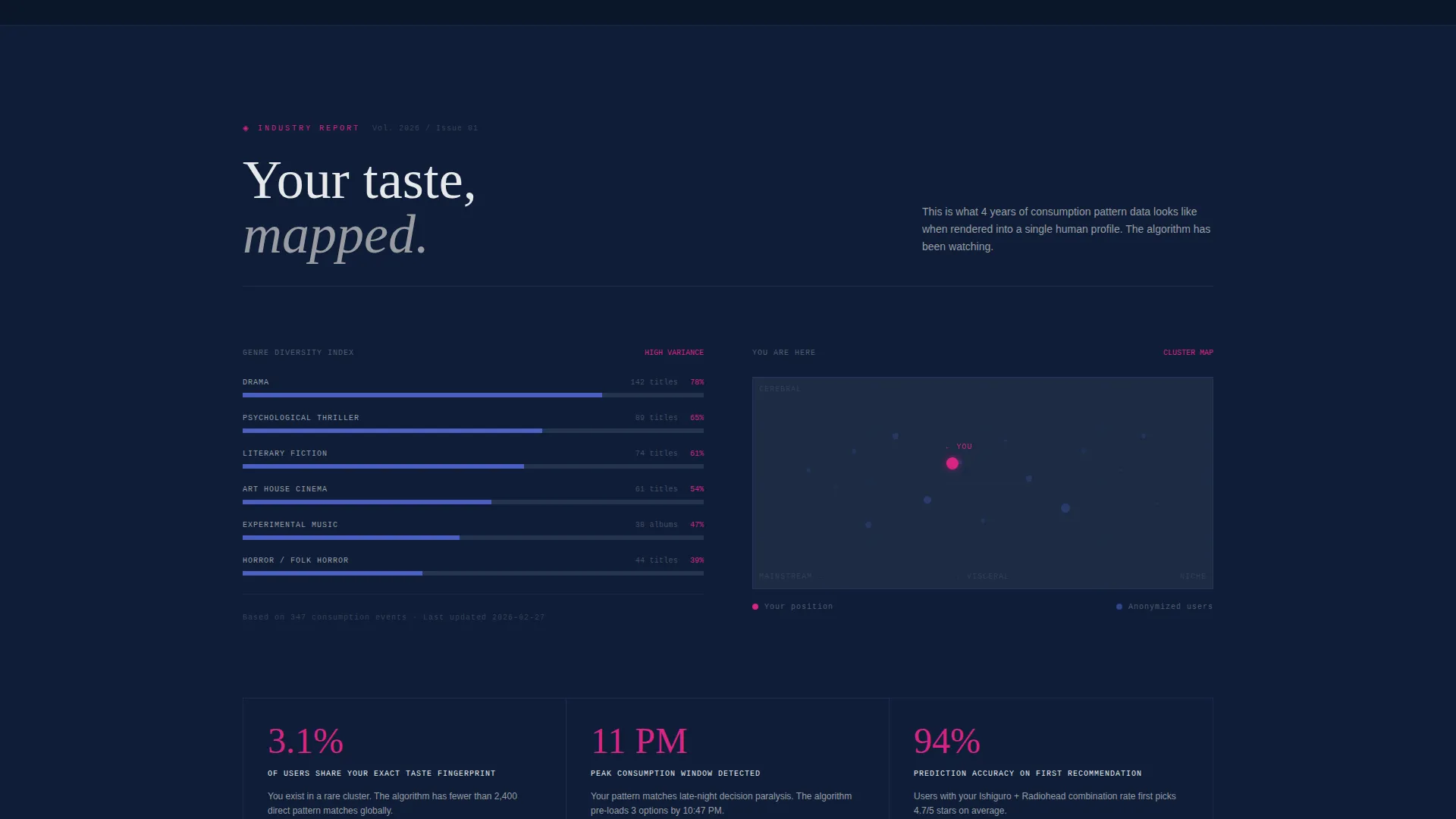
- A scrolling industry-report section featuring consumption graphs, genre diversity indexes, and a taste-cluster map
- A persistent app download call-to-action fixed to the viewport bottom, plus a secondary "Text Me the Link" input for desktop visitors
Feature list
This template is built around a specific conversion sequence. Each feature below is drawn directly from the design brief and serves a defined role in the page flow.
Split-Screen Estimator Header
The header divides into two equal halves. The left side holds three oversized dropdown selectors for last loved film, last album on repeat, and last book finished. The right side displays a radial score meter that fills with signal magenta as each field populates, surrounded by monospaced micro-text showing genre vectors, mood mapping, and taste-cluster percentages.
Live Recommendation Score Display
As the visitor completes each dropdown, the right panel recalculates in real time. The radial meter and surrounding data labels update to reflect each new input, creating a visible sense of the engine thinking. This immediate feedback loop is the page's primary trust-building mechanism.
Scrolling Industry Report Sections
Once the estimator delivers its first three recommendations, the page transitions into a data narrative styled as a published research document. Sections present consumption pattern graphs, a genre diversity index, and a "You Are Here" cluster map that places the visitor among anonymized user groups. Each section increases the specificity of the profile.
Fixed Viewport Call-to-Action Bar
The primary call-to-action, "Download Your Algorithm," appears first below the estimator results and then anchors to the bottom of the screen throughout the report scroll. It remains visible without interrupting reading, maintaining conversion pressure at every point in the journey.
Phone Number Download Path
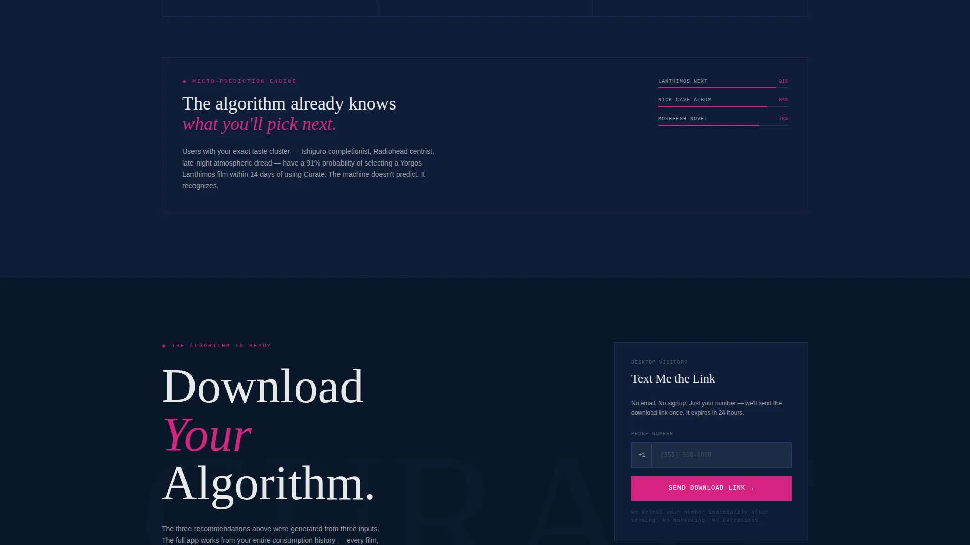
A secondary conversion field labeled "Text Me the Link" accepts a phone number only. No email address. No account creation. This low-friction path is designed for desktop visitors who want the app on their phone without navigating away from the page.
Brutalist Typography System
Headlines and data labels are set in heavy monospaced type at large scale. Every statistic reads like a front-page headline, and every insight is framed as a concrete, immovable fact. The typographic system reinforces the template's core tone: the algorithm is certain, and so is the design.
Page sections overview
| Section | Purpose |
|---|---|
| Split-Screen Estimator | Captures taste inputs and displays a live AI recommendation score |
| First Recommendations Block | Delivers three personalized picks, validating the engine before any ask |
| Consumption Pattern Graph | Visualizes the visitor's viewing, listening, and reading history as data |
| Genre Diversity Index | Shows the breadth of the visitor's taste across categories and formats |
| Taste Cluster Map | Places the visitor within anonymized peer groups on a visual coordinate |
| Micro-Prediction Section | Escalates to highly specific, personal predictions based on pattern data |
| Primary Download call to action | Presents "Download Your Algorithm" with signal magenta emphasis |
| Fixed Viewport call to action Bar | Keeps the download prompt visible throughout the report scroll |
| Text Me the Link | Secondary phone-number input for frictionless desktop-to-mobile handoff |
Design & branding system
The visual identity is Bold Brutalist, using a Midnight Blue color system. The palette is built around contrast and industrial weight, with one warm accent color reserved entirely for conversion moments.
- Abyssal navy (#0A1628) fills the background, reading like a powered-down home theater; electric indigo (#4A5FC1) activates interactive surfaces and hover states; chalk white (#E8E9EB) drives the heavy monospaced typography
- Signal magenta (#D72483) is the sole warm accent, used only for the radial meter fill, call-to-action buttons, and key data highlights
- Heavy monospaced type is set loud and large throughout, treating every stat as a headline and every section break as a concrete slab dropped onto the page
Mobile & speed optimization
The template is structured as a single-page flow, which keeps the asset load focused and the scroll path linear. The split-screen layout adapts to a stacked single-column format on smaller screens.
- The estimator header stacks vertically on mobile, placing the dropdown selectors above the radial score display
- The fixed viewport call-to-action bar is included in the mobile layout, keeping the download prompt accessible throughout the scroll
- The report sections maintain their data-visual hierarchy on smaller screens, preserving readability of graphs, indexes, and cluster maps
How this template helps you convert
This template is engineered around a specific insight: people download apps they already trust. The page builds that trust before it ever asks for anything.
- The estimator delivers three accurate recommendations immediately, making the engine feel real and personal before the visitor reads a single line of marketing copy.
- The industry report deepens the perceived intelligence of the product section by section, so by the time the visitor reaches the download prompt, the app already feels like it belongs on their phone.
- The phone-number-only secondary path removes every standard sign-up barrier, reducing the decision to a single tap.
Other information about this template
Curate sits at the intersection of AI entertainment technology and high-stakes conversion design. A few additional details worth knowing before you build with it.
- The template is designed for a single landing page flow, not a multi-page site structure
- The Bold Brutalist theme is intentional and opinionated; it is best suited to products that want to signal intelligence and confidence rather than warmth and approachability
- The Midnight Blue color system and signal magenta accent can be adapted to match a specific product's brand while preserving the structural contrast logic
- The "Industry Report" creative direction makes the page feel like a research artifact, which works especially well for AI products where credibility is a primary purchase driver
Theme
Bold Brutalist
Creative direction
Industry Report
Color system
Midnight Blue
Style
Split Screen (50/50)
Direction
App Download
Page Sections
Split-screen Estimator Header
Live Recommendation Score Meter
Scrolling Industry Report Layout
Fixed Viewport Download Call to Action
Phone-number-only Secondary Path
Brutalist Monospaced Typography System
Related questions
What kind of product is this landing page template designed for?
Can I edit the color system to match my own brand?
Does the estimator connect to a live AI recommendation model?
Can I adapt the template if my product covers only one media type?
How does the "Text Me the Link" field work in the template?



