Interactive Digital Menu Event Planning Landing Page
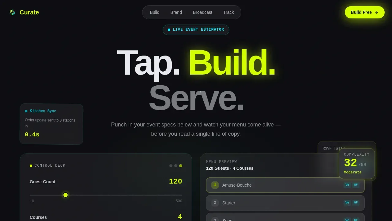
Curate is a hub-and-spoke landing page template built for digital menu platforms serving event planners. It opens on a glowing estimator that previews menu layouts in real time, then fans outward through four anchor-nav spokes: Build, Brand, Broadcast, and Track. The design runs on void black backgrounds, electric chartreuse buttons, and frosted glass card surfaces for an instantly memorable first impression.
by Rocket studio
Quick summary
Curate is a single-page, anchor-nav landing page template designed for an interactive digital menu platform targeting corporate coordinators, wedding planners, and festival organizers. Visitors land on a live estimator control deck, explore four feature spokes, and tap a zero-friction download prompt. The Tech Glass visual identity and Launch Energy pacing make every scroll feel purposeful.
Who this template is for
This template speaks directly to professionals who manage complex food-and-drink experiences at scale. If your product helps event teams build, broadcast, and track digital menus on tablets and screens, this page gives your platform the stage it deserves.
- Corporate event coordinators juggling large guest counts and multiple allergy restrictions at galas and conference-style dinners.
- Wedding planners who want a tasting menu to feel luxurious on a glowing tablet at the venue.
- Festival organizers managing dozens of vendor stalls and needing real-time kitchen sync from a single dashboard.
What problem this template solves
Event organizers lose leads and credibility when their platform's landing page fails to communicate speed, elegance, and control. A generic page cannot showcase an interactive product. This template is purpose-built to solve that mismatch.
- Visitors cannot sense what the product does from static screenshots alone, so the live estimator proves speed before a word of copy is read.
- Complex events with many dietary restrictions demand a page that signals precision, not just aesthetic polish.
- Without clear ctas at every scroll depth, attendees and planners bounce before they reach the download prompt.
What you get with this template
You get a fully structured, high-interactivity landing page designed specifically for a digital menu platform. Every section is production-ready and grounded in the product's core value proposition.
- A floating estimator hero that accepts guest count, course number, and dietary split inputs, then renders an animated menu preview with a chartreuse complexity score badge.
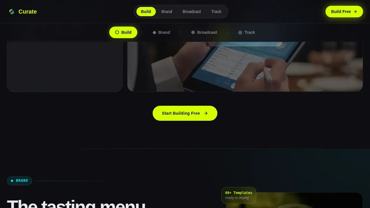
- Four anchor-nav spokes (Build, Brand, Broadcast, Track) with kinetic section transitions, looping tablet video segments, and a pulsing "Build Your First Menu Free" call to action at each close.
- A platform-detect download modal that routes iOS visitors to the App Store, Android visitors to Google Play, and desktop visitors to a frosted-glass QR code display.
Feature list
This landing page template includes a focused set of interactive and visual features drawn directly from the brief. Each one serves a specific role in moving visitors from curiosity to download.
Live Estimator Control Deck
The hero section is a glowing input panel, not a static headline. Visitors punch in guest count, course count, and dietary split using live sliders. The estimator instantly renders a miniature animated preview of their digital menu layout, complete with card stacks and a pulsing complexity score badge in chartreuse. This proves the product's speed before attendees read a single line of copy.
Anchor-Nav Hub and Spoke Structure
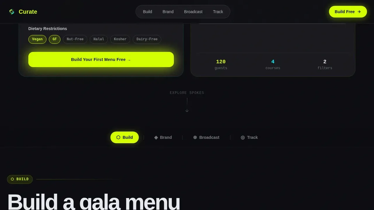
A pinned navigation bar anchors four spokes: Build, Brand, Broadcast, and Track. Each spoke covers a distinct platform capability and ends with a chartreuse download button. Cards fan in like a dealt hand. Typography snaps into place with micro-bounce easing. The energy never plateaus as visitors scroll from one section to the next.
Drag-and-Drop Bento Grid Showcase
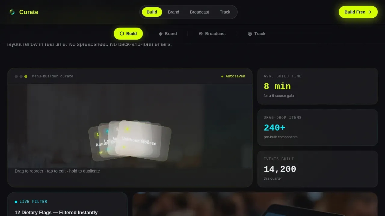
The Build spoke presents a bento-grid feature showcase that demonstrates the drag-and-drop course builder. Visitors can see how the interface lets planners arrange dishes, assign dietary filters, and reorder courses without any coding knowledge required. The layout signals that the product is powerful but approachable.
Real-Time Kitchen Sync Terminal
The Broadcast spoke features a live terminal visual that simulates real-time RSVP tallies updating the kitchen in seconds. This speaks directly to corporate clients and festival teams who cannot afford delays between front-of-house changes and back-of-house execution.
Platform-Detect Download Modal
Tapping any primary call-to-action button triggers a smart modal. The page detects the visitor's device. iOS routes to the App Store, Android to Google Play, and desktop shows a QR code on a frosted glass panel. There are no form fields, so registration friction drops to near zero and conversion rates improve.
Case Study Reel Secondary Path
A secondary call-to-action labeled "See It at a Real Event" opens a 45-second video reel shot at an actual event. The reel closes on the same download prompt, giving skeptical visitors social proof before they commit. High-quality food photography and looping video segments can increase engagement compared to static displays by a significant margin.
Page sections overview
| Section | Purpose |
|---|---|
| Hero Estimator Deck | Live guest-count and dietary inputs render an animated menu preview with a complexity score |
| Build Feature Spoke | Drag-and-drop bento grid demonstrates the course builder and dietary filter tools |
| Brand Identity Spoke | Asymmetric split layout showcases luxury visual branding options for custom menus |
| Broadcast Sync Spoke | Live terminal visual proves real-time kitchen updates and RSVP tally speed |
| Track Analytics Spoke | Analytics dashboard bento displays key metrics and event data at a glance |
| Footer Row | Linear single-row footer with download prompt, links, and venue logo strip |
Design & branding system
The visual identity follows a Tech Glass aesthetic driven by the Acid Digital color system. The palette feels like a phone screen glowing face-up on a dark banquet table. Every color decision serves the product story.
- Void black (#0B0B0F) dominates all backgrounds, giving neon accents maximum contrast and making photos and food imagery pop without distraction.
- Electric chartreuse (#D4FF00) fires on primary buttons, progress indicators, the complexity score badge, and scroll-reveal highlights, ensuring clear ctas never get missed.
- Phosphor cyan (#00F0FF) traces hover states, navigation rail highlights, and border beam animations, while frosted panel white (#E8EAF0) floats as translucent card surfaces with backdrop-blur glass effects.
Mobile & speed optimization
This template takes a mobile first approach because the product's primary use case is tablet and handheld screens at live events. The design adapts cleanly from a 320-pixel phone to a widescreen desktop display.
- GPU-accelerated transforms power all float animations, card fan reveals, and scroll-triggered Intersection Observer sequences, keeping motion smooth without layout jank.
- The platform-detect modal and QR code path ensure desktop visitors can still access the app download flow without needing a mobile device in hand.
- A mobile first approach also means the estimator sliders, bento grids, and looping video segments are touch-optimized so visitors using tablets at a venue can interact naturally.
How this template helps you convert
An effective event landing page moves visitors from awareness to action without unnecessary detours. This template is structured to do exactly that, with conversion logic baked into the page order and every design decision.
- The estimator hero converts passive visitors into active participants immediately. The first thing they do is interact with the product, not read about it, which builds confidence and improves event ROI for your marketing campaign.
- Anchor navigation keeps attendees oriented as they scroll through spokes, reducing drop-off between sections and ensuring leads reach the download prompt rather than bouncing at mid-page.
- The case-study reel and looping event video segments serve as trust signals for skeptical planners, letting past events speak for the platform's capability before a commitment is made.
Other information about this template
This template sits within the Event Planning Digital Presence subcategory and is built for teams hosting events of any scale. Below are additional details that matter when evaluating this template for your use case.
- No coding knowledge required: the template uses no-code-compatible structure, so your team can customize copy, swap photos, update the event title and date, and adjust colors without touching code. Templates that demand no coding knowledge make real-time editing accessible to any member of your company.
- Design tips built into the layout: clean layouts limit visible items per screen and use ample white space to reduce decision fatigue for guests. Large, high-contrast typography follows display readability standards, with font sizes suited for viewing at a distance.
- Dietary filter and dynamic filtering display: the Build spoke is designed to showcase the platform's live dietary filtering, letting guests filter dishes for allergens, vegan options, or gluten-free alternatives directly on screen.
- Registration and opt-in flow: streamlining the registration flow can minimize form abandonment. The template's zero-field download modal keeps the opt-in path short. Confirmation details and next steps can be delivered post-download via the platform itself.
- Analytics and key metrics support: the Track spoke includes an analytics dashboard bento that can support integration with tools like Google Analytics to monitor key metrics such as app opens, event page visits, and campaign performance over time.
- Carousel format in spoke sections: feature details within spokes can be presented in carousel format, letting visitors page through use cases at their own pace without overwhelming the screen.
- Sponsors and community signals: the footer logo strip can showcase venue partners, sponsors, or community organizations that add credibility and trust signals for new visitors.
- Inspiration for your next event: the "See It at a Real Event" reel and case study content give event organizers real-world inspiration. Seeing how other teams have run a successful event with the platform makes the value concrete.
- Platforms referenced in the market context: tools like Flipsnack (which offers over 30 customizable interactive digital menu templates) and Yodeck (which allows quick updates of digital menu boards at events) represent the broader category this template competes within. Several platforms offer interactive digital menu templates with real-time updates, QR code integration, and mobile-friendly viewing, and this landing page is designed to help Curate stand out in that space.
Theme
Tech Glass
Creative direction
Launch Energy
Color system
Acid Digital
Style
Hub & Spoke (Anchor Nav)
Direction
App Download
Page Sections
Live Estimator Hero with Menu Preview
Hub-and-spoke Anchor Navigation
Drag-and-drop Bento Grid for Build
Real-time Broadcast Terminal Visual
Platform-detect Zero-friction Download Modal
Case Study Reel with Social Proof Path
Related questions
Do I need coding knowledge to customize this template?
Can this landing page support multiple event types?
How does the platform-detect modal work for desktop visitors?
How does the estimator hero help with conversion?
Can the Track spoke display analytics data?



