Classic Fashion Pricing & Packages Website Template
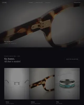
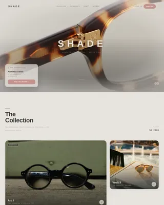
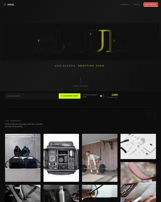
Curate is a masonry-style subscription box landing page built for design-conscious lifestyle brands. It opens with a full-screen, slow-motion unboxing video and guides visitors through a staggered product grid, sticky pricing toggle, and minimal sign-up form. The Merlot and Smoke color system creates a candlelit, editorial atmosphere that lets the objects sell themselves.
by Rocket studio
Quick summary
Curate is a single-page subscription box template designed for premium lifestyle curation brands. A full-screen unboxing video opens the experience. A masonry grid unfolds past items as polaroid-style cards. A sticky pricing toggle and a short sign-up form close the loop. The entire page is built to earn trust through atmosphere before asking for a sale.
Who this template is for
This template is built for subscription box brands that sell taste as much as product. It suits founders and creative directors who need a page that feels editorial, not transactional, while still converting visitors into subscribers.
- Lifestyle subscription brands launching or refreshing a landing page
- Independent curators selling monthly, quarterly, or gift boxes
- Creative teams who want visual storytelling to drive sign-ups directly
What problem this template solves
Most subscription box pages look like online stores. They list SKUs, stack grids, and push discounts. That approach does not work for a brand that is selling curation itself. Visitors need to feel what is inside the box before they commit to a recurring charge.
- Generic templates flatten the mood that premium brands spend months building
- Cluttered layouts bury the product stories that justify a higher price point
- Standard sign-up flows ask for too much too soon, causing drop-off before intent forms
What you get with this template
You get a fully structured landing page that moves visitors from curiosity to purchase through atmosphere and rhythm. Every section is designed to do a specific job, and nothing is decorative without a reason.
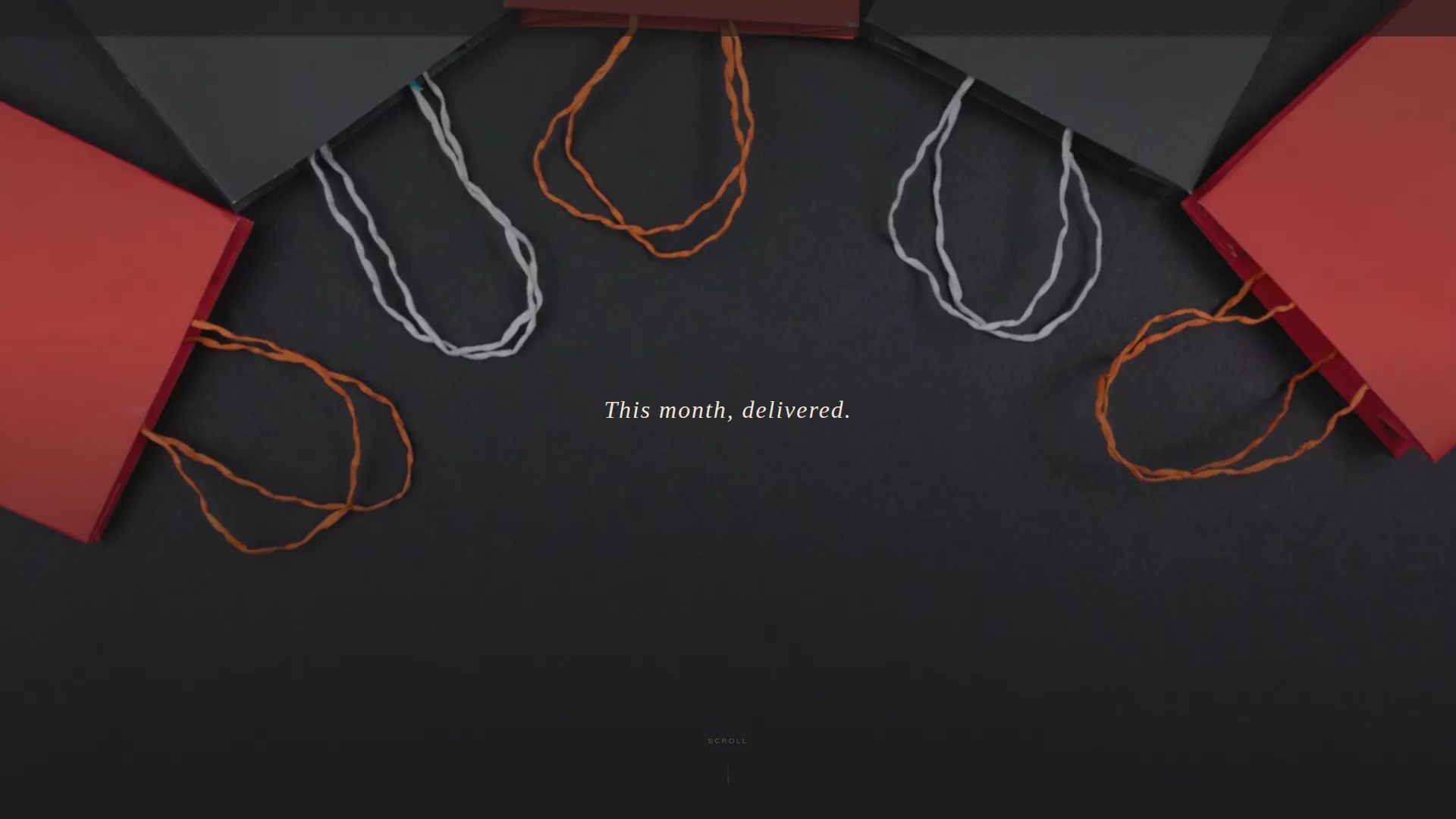
- A full-screen video header with centered, timed headline copy
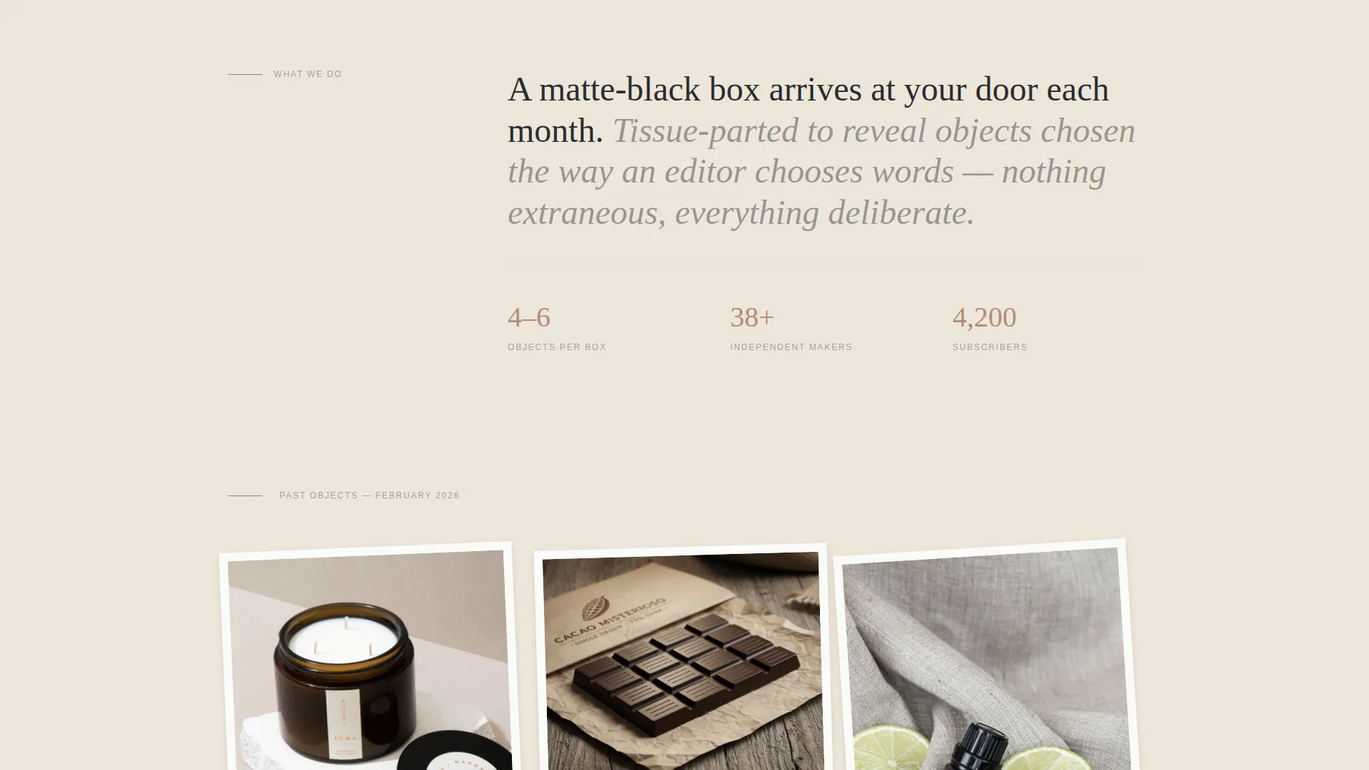
- A staggered masonry product grid with expandable polaroid-style item cards
- A sticky pricing toggle bar, a minimal sign-up form, and a secondary gift call to action
Feature list
A short paragraph introduces the features before the items below. Each component in this template was chosen to move a visitor one step closer to subscribing, without feeling like a push.
Full-Screen Video Header
The header plays slow macro footage of a box being opened in a dimly lit room. Hands pull a ribbon, tissue paper folds back, and each object turns in soft directional light. A single cream headline appears mid-sequence. No logo interrupts until the visitor begins to scroll.
Masonry Product Grid
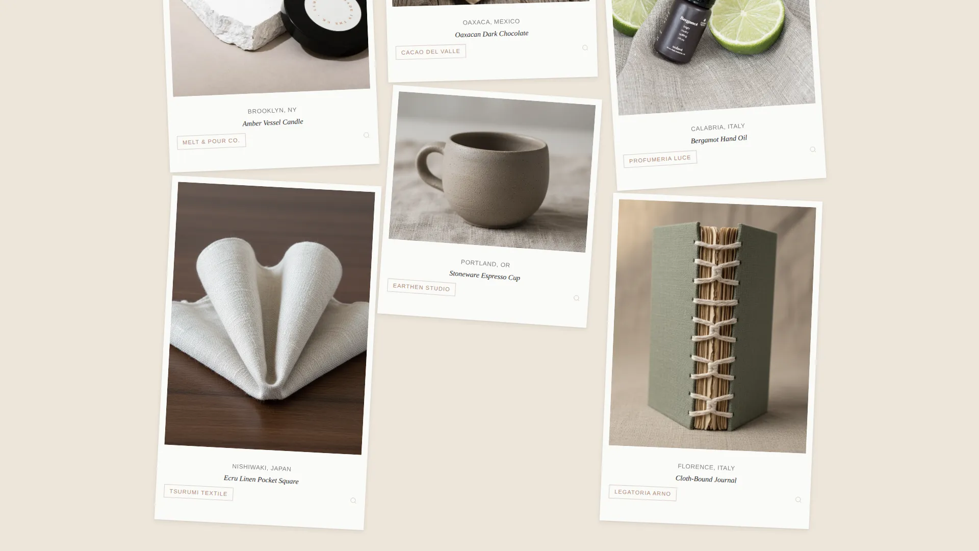
Past box items are presented as staggered, slightly shadowed polaroid-style cards arranged in a masonry layout. Each card expands on click to reveal the item's provenance, maker story, and a close-up detail shot. The grid tightens and the background darkens as the visitor scrolls deeper, building mood rather than catalog density.
Sticky Pricing Toggle Bar
A merlot-background bar appears after the second scroll fold. It holds a three-way toggle between monthly, quarterly, and gift pricing options. Rose-gold text rewards interaction with a quiet glow. The bar stays visible throughout the rest of the page so the purchase decision is always one click away.
Lifestyle Image Break
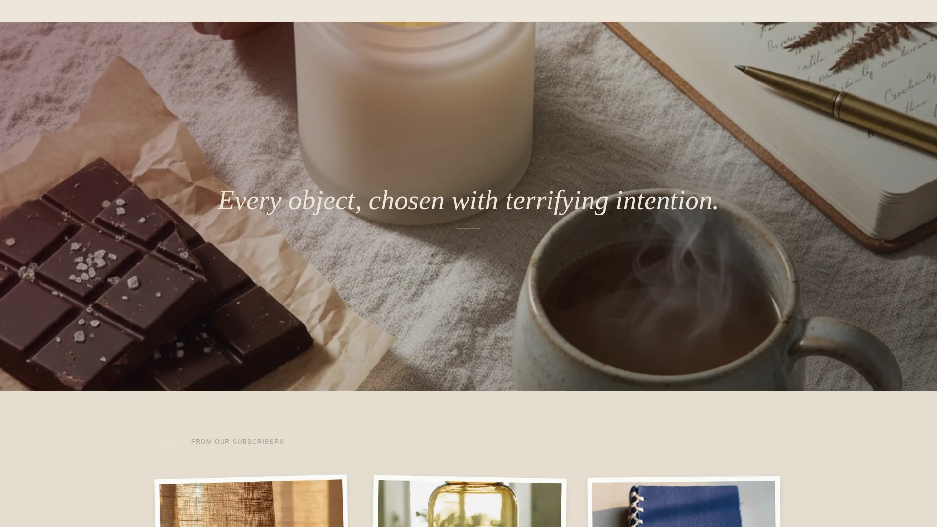
A single full-width flat-lay photograph on rumpled linen interrupts the masonry grid at the midpoint. It resets the visual rhythm, gives the eye a resting point, and reinforces brand mood before testimonials appear.
Handwritten-Style Testimonials
Subscriber quotes appear in a handwritten-style typographic treatment, pinned between product cards. They feel personal rather than corporate, matching the intimate tone of the overall page without breaking the visual flow.
Minimal Sign-Up Form
Below the masonry grid, a short form asks only for plan selection and an email address. Shipping details are collected after the click. This keeps friction low at the moment of decision and reduces drop-off from premature information requests.
Page sections overview
| Section | Purpose |
|---|---|
| Video header | Opens with slow unboxing footage and a timed headline |
| Masonry product grid | Showcases past items as expandable polaroid cards |
| Lifestyle image break | Resets page rhythm with a full-width styled flat-lay |
| Testimonial strip | Displays handwritten-style subscriber quotes |
| Sticky pricing bar | Keeps monthly, quarterly, and gift options persistent |
| Sign-up form | Collects plan and email with minimal friction |
Design & branding system
The visual identity follows a Luxe Minimal theme. Every color and typographic choice is restrained on purpose, so the objects and their stories carry the visual weight. The palette feels like a candlelit dinner on a slate tablecloth.
- Deep wine (#4A0E1B) for section dividers and selected states, charcoal smoke (#2C2C2E) for all body typography, and warm parchment (#EDE6DB) for backgrounds
- Muted rose-gold (#B08D79) reserved exclusively for hover states and price tag labels, rewarding interaction without competing for attention
- Polaroid card shadows, darkening scroll backgrounds, and timed headline reveals reinforce the immersive, editorial atmosphere throughout
Mobile & speed optimization
The masonry layout and video header are structured to adapt to narrower viewports without losing the tactile, intimate quality of the desktop experience. The sticky pricing bar remains accessible on mobile so visitors can act on intent at any point in the scroll.
- The masonry grid reflows to a single-column view on small screens, keeping card detail and expandable stories readable
- The sticky toggle bar scales to full viewport width on mobile, keeping plan selection visible without covering content
How this template helps you convert
Every design decision in this template is directed at reducing hesitation and building desire before the ask arrives. By the time the sticky bar appears, the visitor has already engaged with the product grid and the brand story.
- The video header establishes brand world and emotional tone immediately, so visitors qualify themselves before reading a single line of product copy.
- The expandable polaroid cards let objects communicate their own value through provenance and detail shots, removing the need for hard-sell copy.
- The minimal form and secondary gift call to action capture both the self-buyer and the impulse gift shopper in the same scroll path, with no extra pages required.
Other information about this template
This template sits inside the Fashion and Lifestyle category under the Classic Subscription Box niche. It is a strong match for brands in the classic fashion space who want an editorial landing page with a direct-sales conversion structure built in.
- The template style is Masonry and Pinterest-inspired layout, suited for visual-first brands with rich product photography
- The creative direction is Immersive Visual, meaning each section is sequenced to deepen mood and attention rather than deliver information all at once
- The header concept is Full-Screen Video Background, which requires a short looping video asset from the brand to activate fully
- This template is a single-page layout intended for direct sales, not a multi-page site structure
Theme
Luxe Minimal
Creative direction
Immersive Visual
Color system
Merlot & Smoke
Style
Masonry/Pinterest
Direction
Direct Sales
Page Sections
Full-screen Video Header
Masonry Polaroid Product Grid
Sticky Pricing Toggle Bar
Lifestyle Image Interruption
Handwritten Testimonial Treatment
Minimal Two-field Sign-up Form
Related questions
Do I need a video asset to use this template?
Can the pricing toggle support a gift subscription option?
How much does the sign-up form ask visitors to fill in?
How many product cards do I need for the masonry grid to look right?
Can I change the color palette to match my own brand?